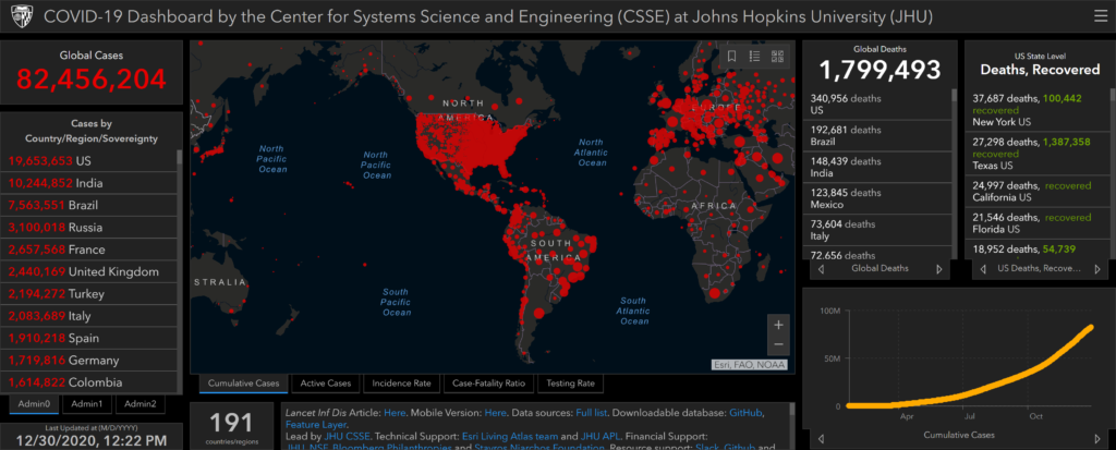
Screenshot of the COVID-19 Dashboard by the Center for Systems Science and Engineering (CSSE) at Johns Hopkins University (JHU) on 30 December 2020. Graphic: JHU
30 December 2020 (Desdemona Despair) – 2020 was the year that everybody got cozy with graphs showing exponential growth. A number of high-quality data sources showing the progression of the pandemic were published online, so anybody could rummage through the grim numbers and estimate their local risk.
A few standout sites made it into Desdemona’s daily tour of the morbidity and mortality data, but the COVID-19 Dashboard by John Hopkins University was always the first stop. Indispensable for anyone with a compulsion to follow the pandemic’s progression, the JHU data set is the gold standard for tracking the virus as it colonizes human biomass.
It’s 30 April 2020, and the entire world is under lockdown. Unprecedented measures, aiming to combat a disease we have never seen before. In such conditions of isolation, few resources have proven to be as indispensable as the data collected and provided by the John Hopkins University. Video: JHU
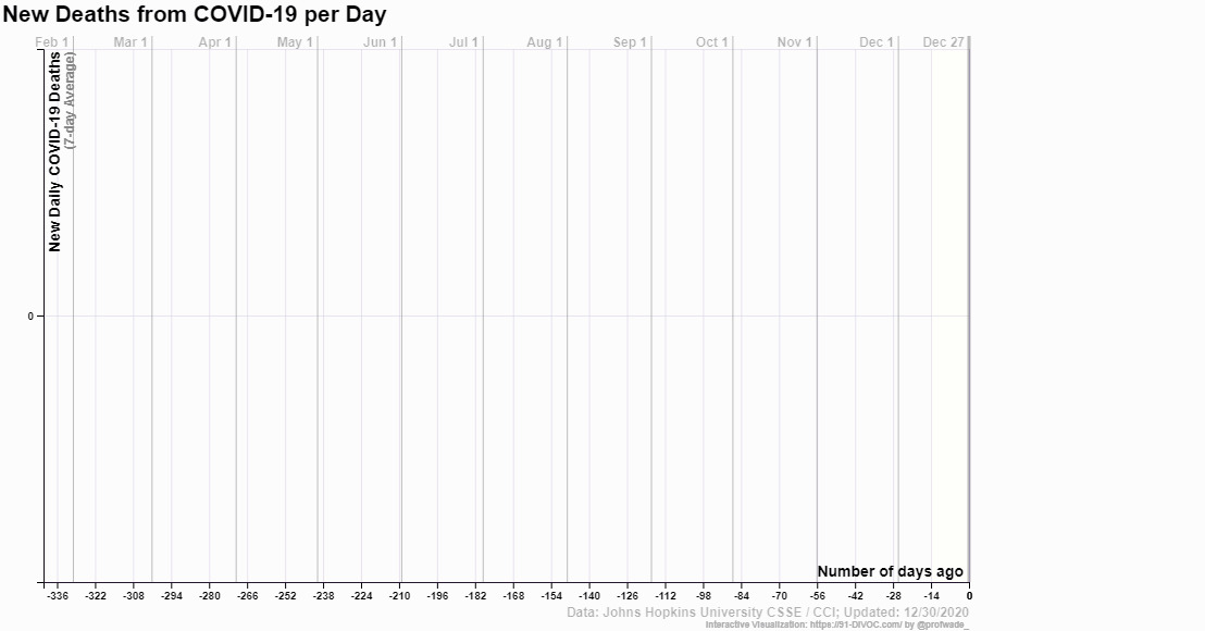
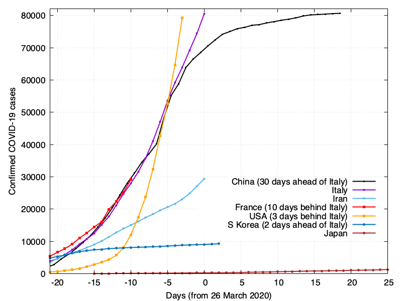
One of the best graphing tools for the JHU data came from Prof. Wade Fagen-Ulmschneider, who created 91-Divoc. With these graphs, it’s easy to browse the data by nation and compare which ones are succeeding and which have failed to contain the virus. You can graph daily morbidity and mortality rates, display them by country or U.S. state, and create animated GIFs of your graphs.
Animation showing COVID-19 daily deaths in the Top Ten countries, 28 February 2020 – 30 December 2020 (306 days). Graphic: 91-DIVOC
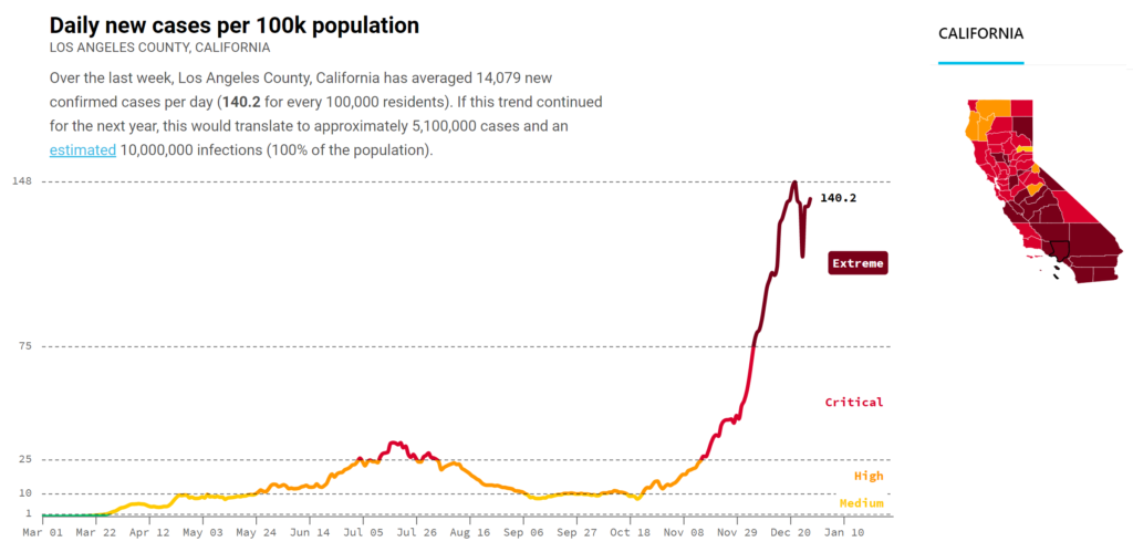
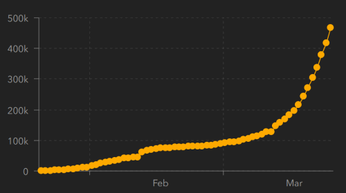
In the U.S., the Covid Act Now map is a great tool for keeping tabs on your county’s progress in containing the virus, showing ICU capacity, infection rates, and daily new cases. Here’s the current dire situation in Los Angeles County, on 30 December 2020:
Covid Act Now daily cases per 100k for Los Angeles County, California, on 30 December 2020. Graphic: Covid Act Now
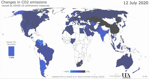
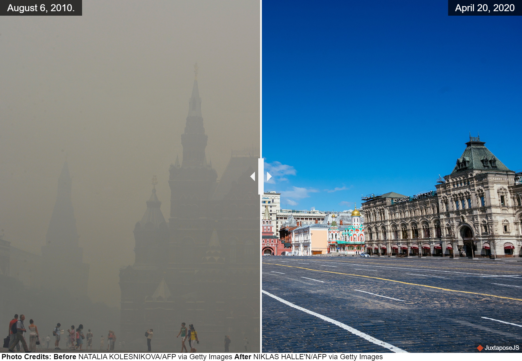
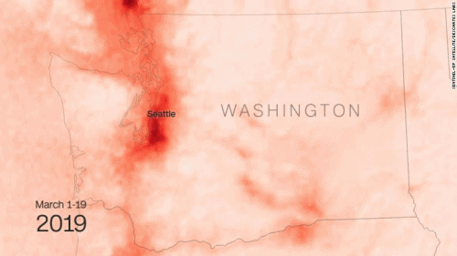
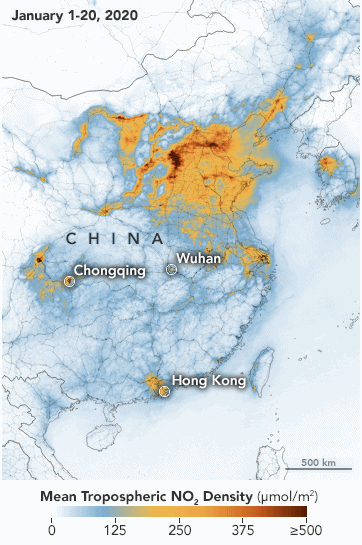
Satellite imagery and ground-based photos show the stark difference in pollution levels when the world’s industrial infrastructure is largely idled.
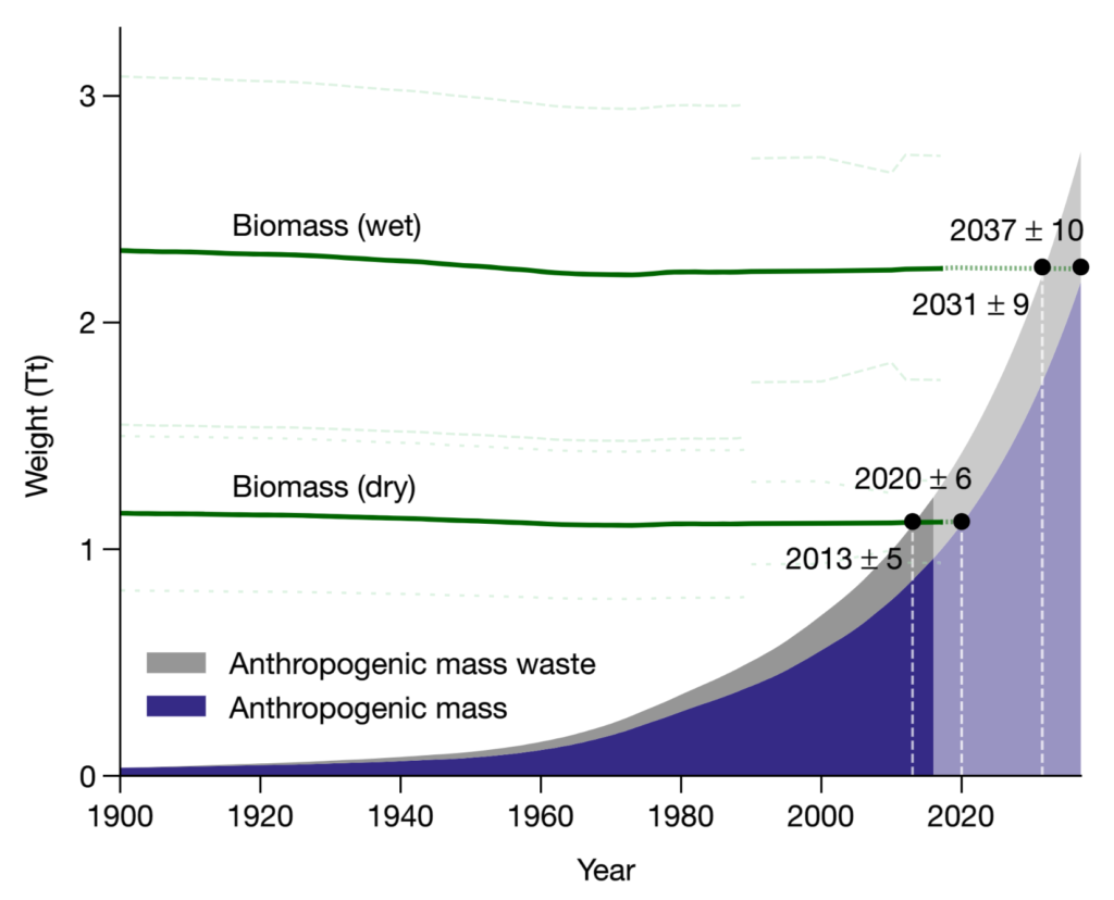
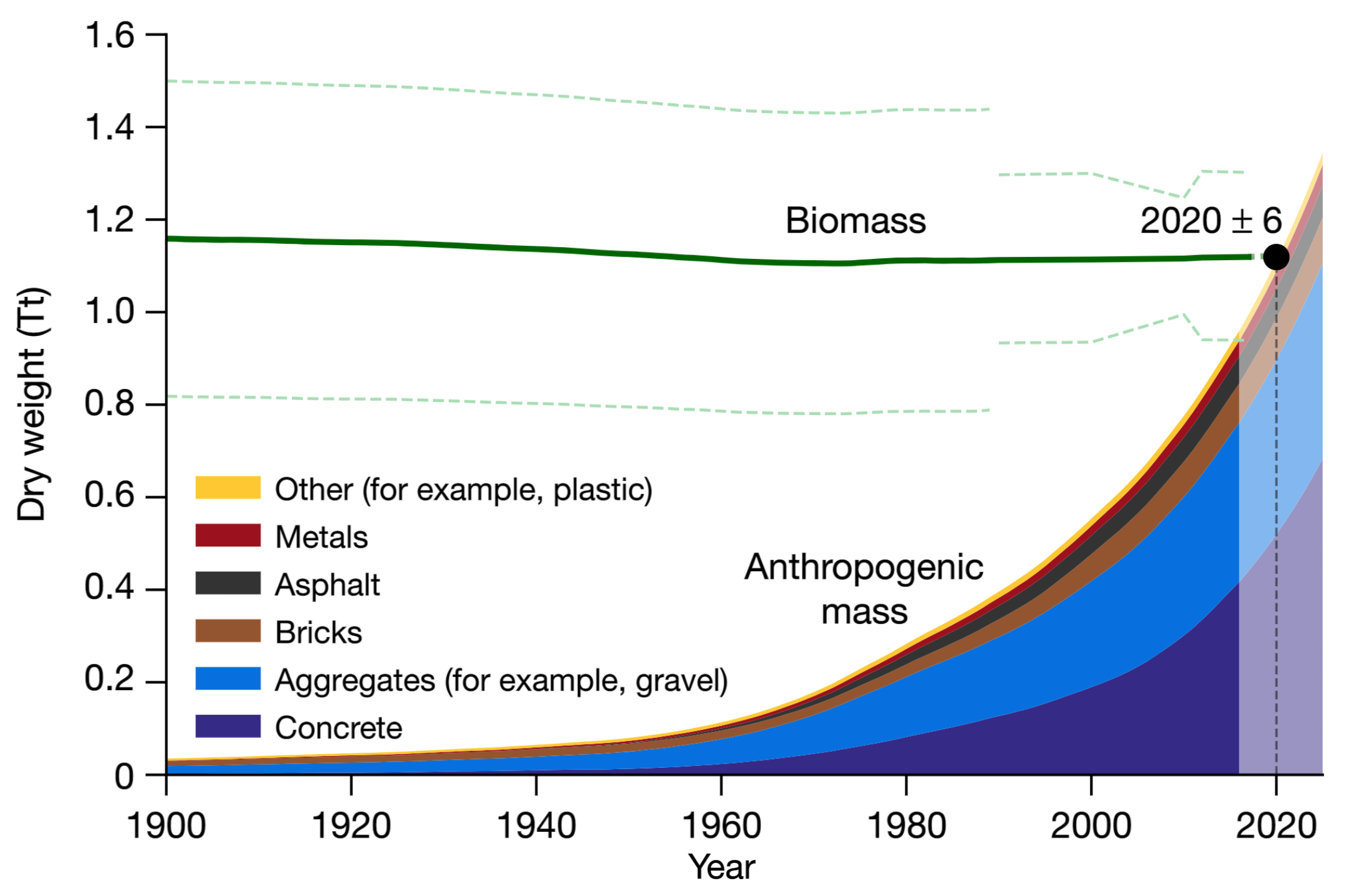
But possibly the most evocative graph arrived late in the year, showing a new angle on another exponential curve, the so-called “Great Acceleration”:
Biomass (dry and wet), anthropogenic mass and anthropogenic mass waste estimates since the beginning of the twentieth century. Green lines show the total weight of biomass (± 1 s.d.). Anthropogenic mass weight is plotted as an area chart. Graphic: Elhacham, et al., 2020 / Nature
This study finds that the mass of human-made materials now equals the total biomass of the entire planet, and this “anthropogenic mass” is doubling every twenty years. After reading this paper, my first reaction was that we may yet see Isaac Asimov’s Caves of Steel come to pass.
The first installment of Isaac Asimov’s novel, The Caves of Steel, took the cover of the October 1953 issue of Galaxy Science Fiction, illustrated by Ed Emshwiller. Graphic: Ed Emshwiller / Galaxy Science Fiction
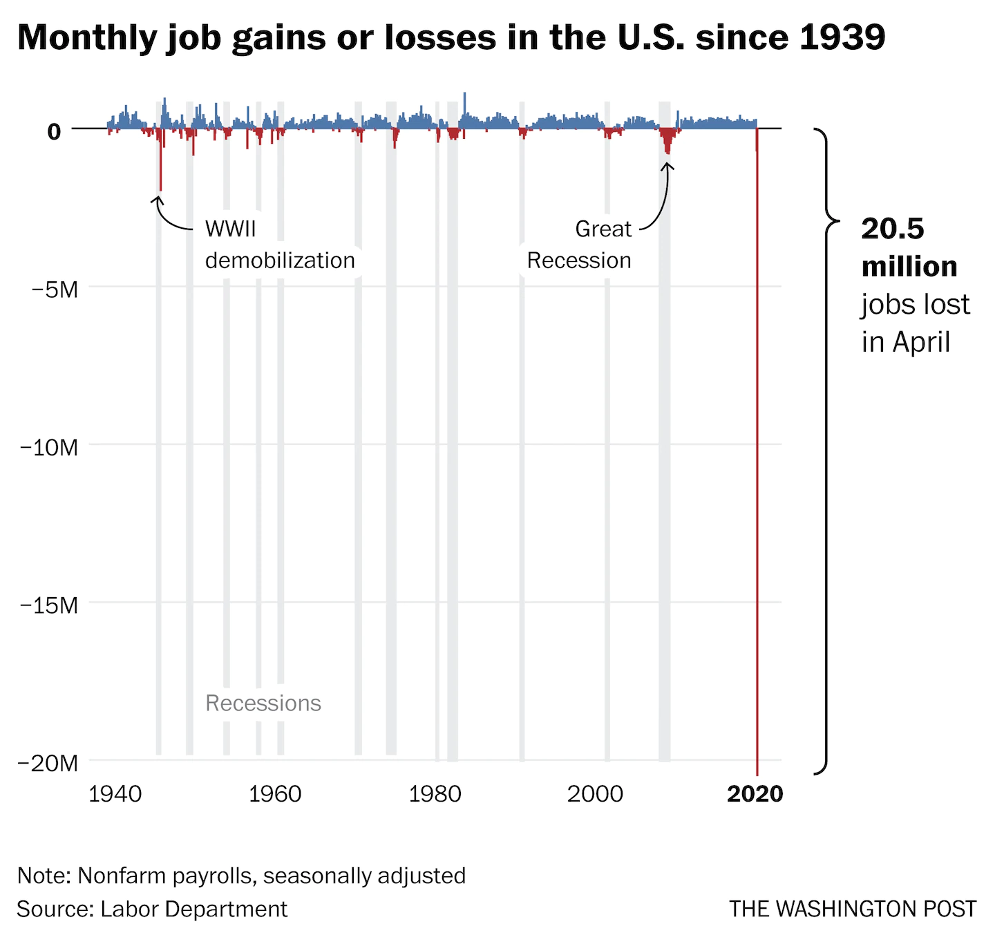
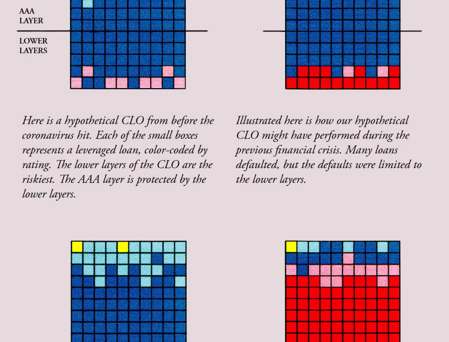
By Frank Partnoy 14 June 2020 (The Atlantic) – After months of living with the coronavirus pandemic, American citizens are well aware of the toll it has taken on the economy: broken supply chains, record unemployment, failing small businesses. All...
Smoke from a forest fire covers Yakustk, the capital of the republic of Sakha also known as Yakutia, Russia Far East, on 19 July 2021. Each year, thousands of wildfires engulf wide swathes of Russia, destroying forests and shrouding broad...
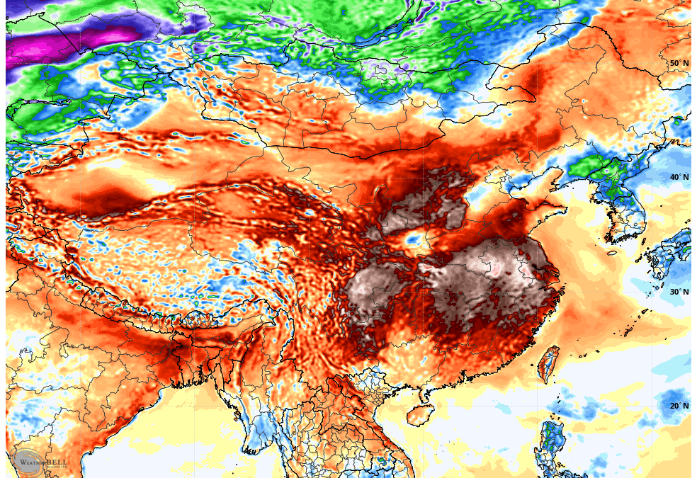
The European model shows temperatures across Southeast Asia rising well above normal on Monday, 17 April 2023. Numerous heat records were broken across Southeast Asia, China and other parts of the continent in mid-April, with Thailand in particular experiencing unusually...


One Response
Comments are closed.