Doomiest images and graphs index

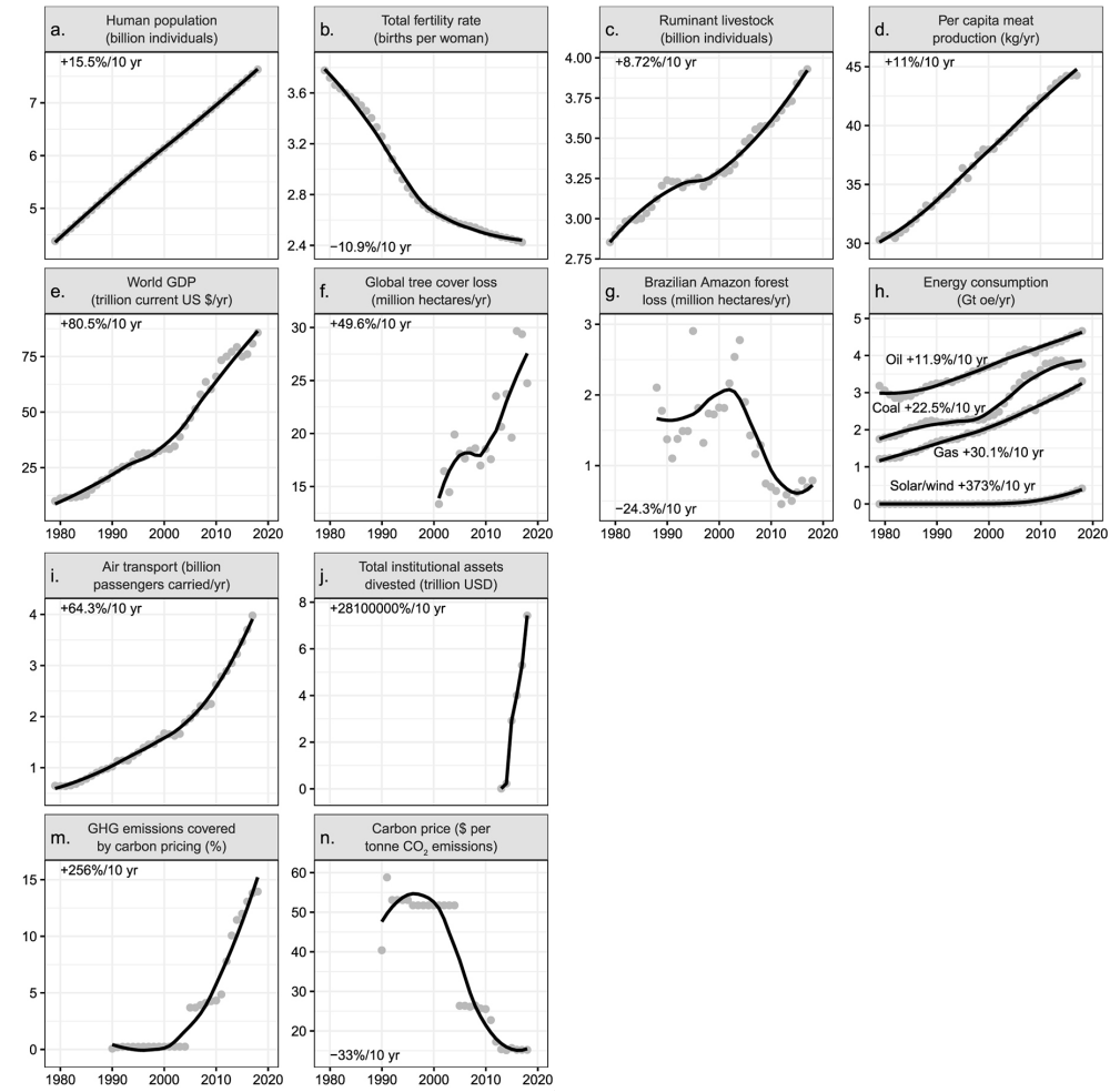
Every year since 2010, Desdemona has collected the “doomiest” pictures and graphs for the year. The doomiest content hopefully conveys a slice of the experience of living in the Anthropocene and the epoch of abrupt climate change. The doomiest scientific data reveals the perilous situation for life on Earth in greater detail, showing how the inevitable, irreversible change to a new climate state continues unabated or even accelerates, in spite of (or because of) our puny efforts to stop it.
- 2023 doomiest graphs and images
- 2022 doomiest graphs and images
- 2021 doomiest graphs and images
- 2020 doomiest graphs and images
- 2019 doomiest graphs and images
- 2018 doomiest graphs and images
- 2017 doomiest graphs, images, and stories
- 2016 doomiest graphs, images, and stories
- 2015 doomiest graphs, images, and stories
- 2014 doomiest graphs, images, and stories
- 2013 doomiest graphs, images, and stories
- 2012 doomiest graphs, images, and stories
- 2011 doomiest graphs, images, and stories
- 2010 doomiest graphs, images, and stories