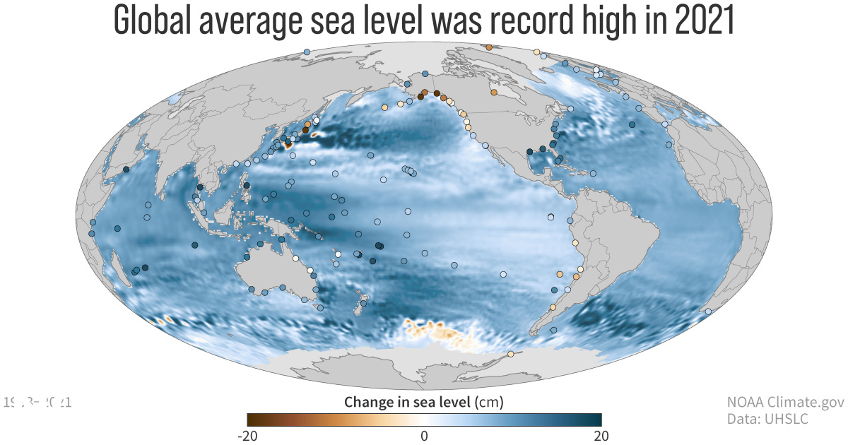
31 August 2022 (NOAA) – Greenhouse gas concentrations, global sea levels and ocean heat content reached record highs in 2021, according to the 32nd annual State of the Climate report. The international annual review of the world’s climate, led by scientists from NOAA’s National Centers for Environmental Information and published by the Bulletin of the […]
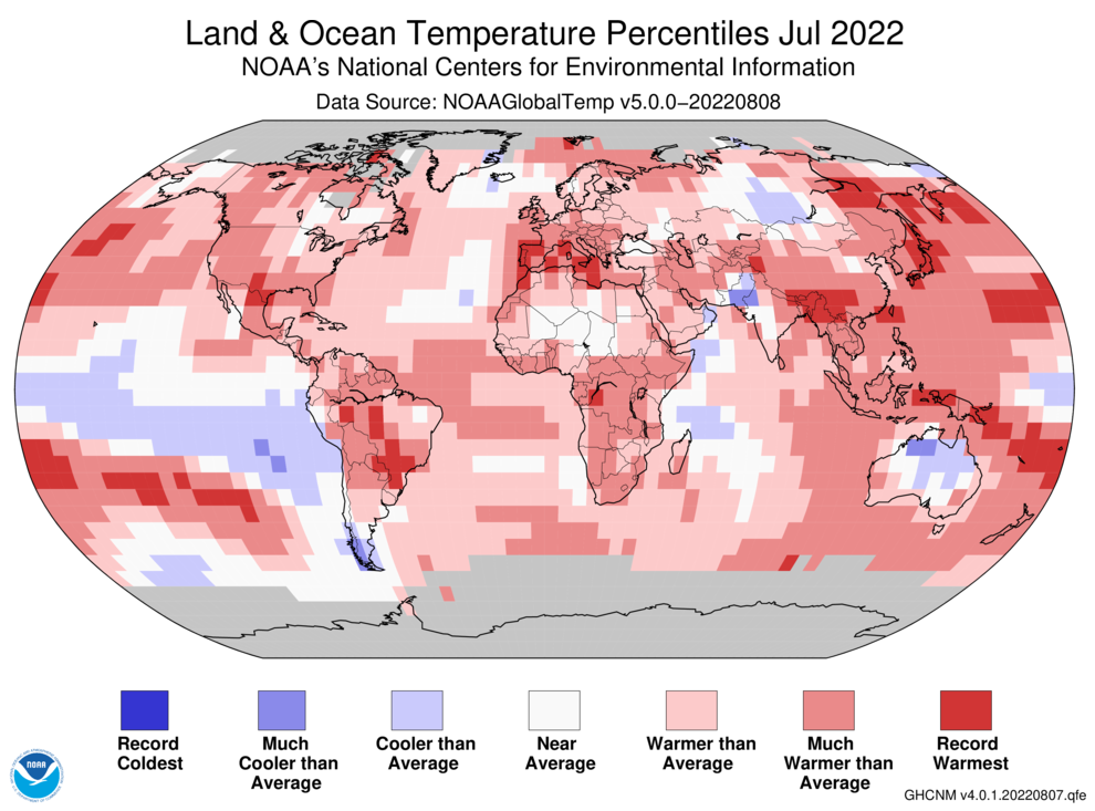
By Jeff Masters and Bob Henson 12 August 2022 (Yale Climate Connections) – July 2022 was Earth’s sixth warmest July on record since global record-keeping began in 1880, 0.87 degrees Celsius (1.57°F) above the 20th-century average, NOAA’s National Centers for Environmental Information, NCEI, reported on August 12. NASA rated the month as tied for the third warmest […]
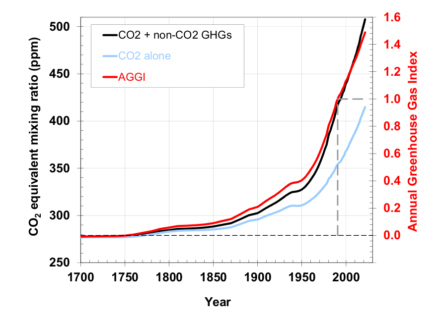
23 May 2022 (NOAA) – Greenhouse gas pollution caused by human activities trapped 49 percent more heat in the atmosphere in 2021 than they did in 1990, according to NOAA scientists. NOAA’s Annual Greenhouse Gas Index, known as the AGGI, tracks increases in the warming influence of human emissions of heat-trapping gases, including carbon dioxide, methane, […]
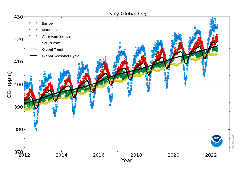
By Ethan Freedman 6 May 2022 NEW YORK (The Independent) – Monthly average carbon dioxide (CO2) levels have reached above 420 parts per million (ppm) for the first time on record. The new data, from Hawaii’s Mauna Loa Observatory, were released by the National Oceanic and Atmospheric Administration (NOAA). Atmospheric CO2, driven higher in large part […]
By Stephanie Elam 29 April 2022 (CNN) – The U.S. West is in the grips of a climate change-fueled megadrought, and Lake Mead — the largest manmade reservoir in the country and a source of water for millions of people — has fallen to an unprecedented low. The lake’s plummeting water level has exposed one of the reservoir’s original water […]
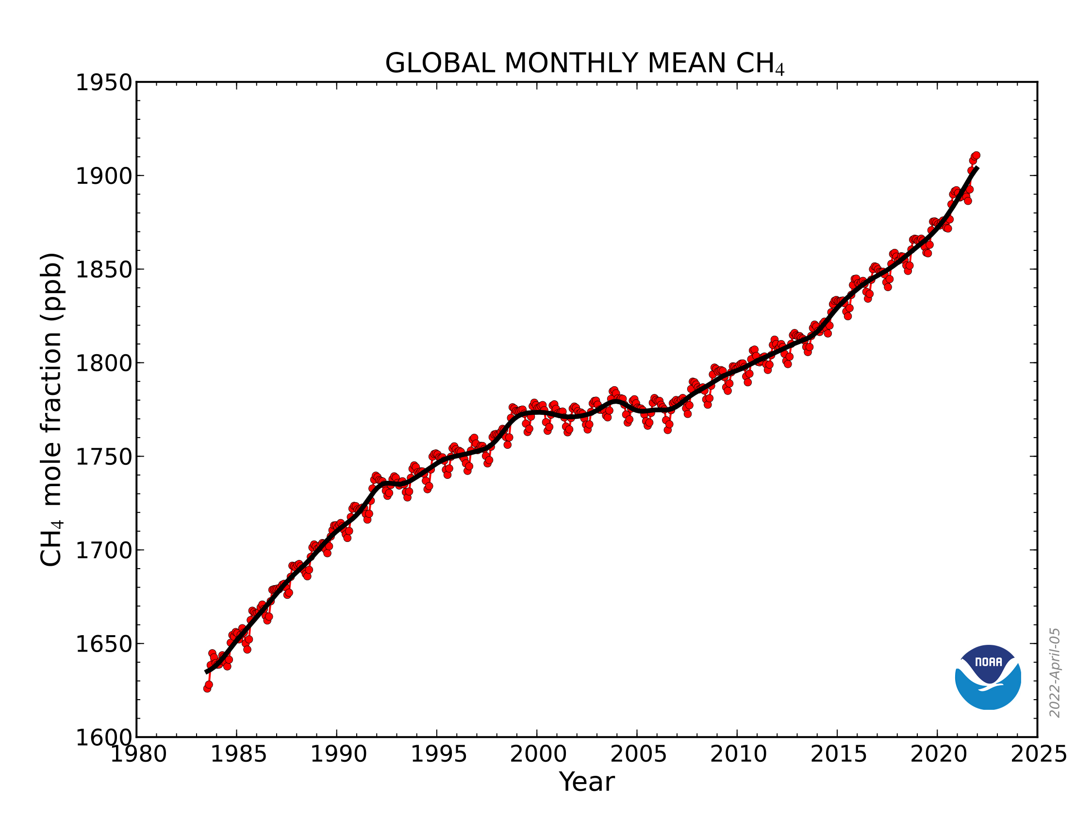
7 April 2022 (NOAA) – For the second year in a row, NOAA scientists observed a record annual increase in atmospheric levels of methane, a powerful, heat-trapping greenhouse gas that’s the second biggest contributor to human-caused global warming after carbon dioxide. NOAA’s preliminary analysis showed the annual increase in atmospheric methane during 2021 was 17 […]
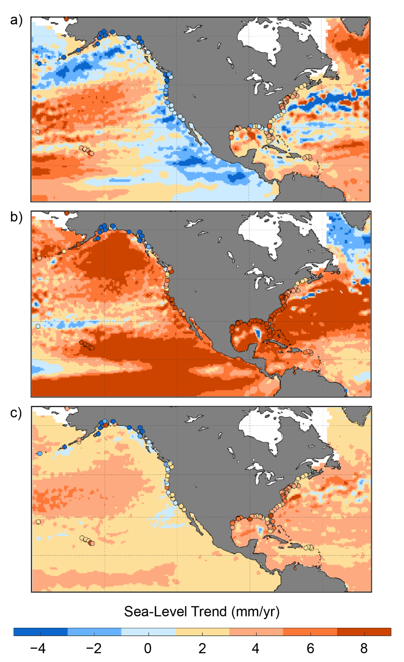
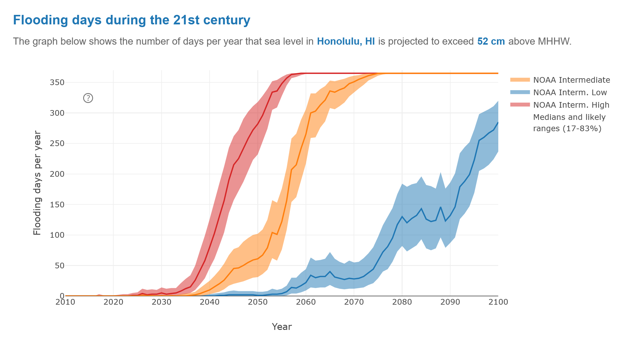
15 February 2022 (NOAA) – The United States is expected to experience as much sea level rise by the year 2050 as it witnessed in the previous hundred years. That’s according to a NOAA-led report updating sea level rise decision-support information for the U.S. released today in partnership with half a dozen other federal agencies. […]
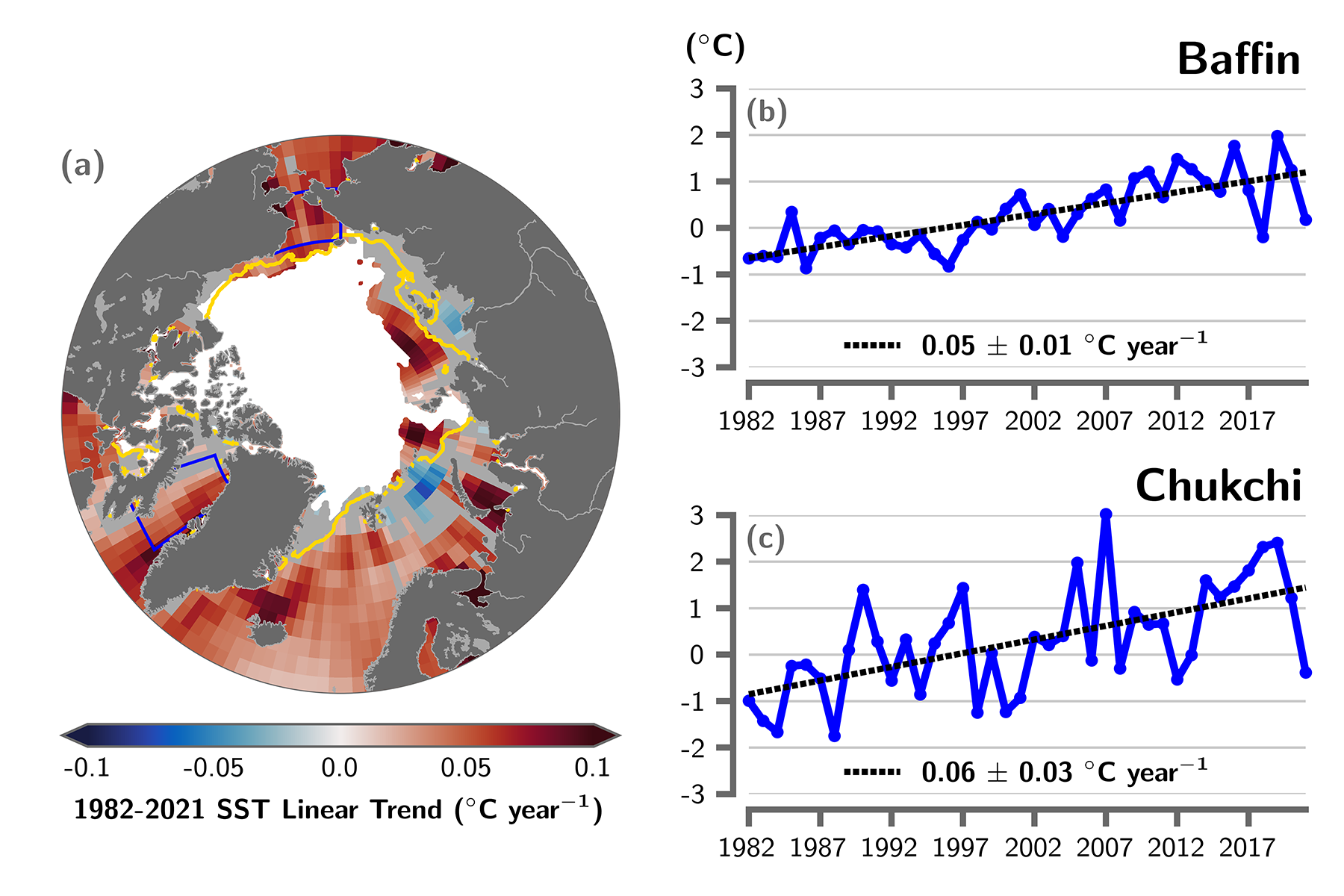
By T. A. Moon, M. L. Druckenmiller, and R. L. Thoman 6 December 2021 (NOAA) – As the influences of human-caused global warming continue to intensify, with the Arctic warming significantly faster than the globe overall, the 2021 Arctic Report Card (ARC2021) brings a broad view of the state of the Arctic climate and environment. […]
By Jeff Masters and Bob Henson 15 November 2021 (Yale Climate Connections) – October 2021 was Earth’s fourth-warmest October since global record-keeping began in 1880, 0.89 degree Celsius (1.60°F) above the 20th-century average, NOAA’s National Centers for Environmental Information, NCEI, reported November 15. NASA also reported October 2021 as the fourth-warmest October on record, 1.23 degrees Celsius (2.21°F) […]
By Jim Morrison 2 August 2021 (WIRED) – During the summer of 2017, the tide rose to historic heights again and again in Honolulu, higher than at any time in the 112 years that records had been kept. Philip Thompson, director of the Sea Level Center at the University of Hawaii, wanted to know why. […]