Map shows striking vaccination divide between rich countries and the rest of the world – “We are making conscious choices right now not to protect those in need”

By Sinéad Baker
19 July 2021
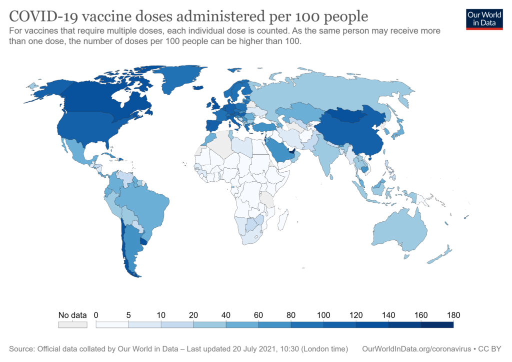
(Business Insider) – A map shows the huge difference in vaccination rights between some rich countries and the rest of the world.
The graph, produced by Max Roser of the site Our World in Data, shows the proportion of each country to receive at least one dose of a coronavirus vaccine.
It shows European countries, North America, and some in South America with high rates, with especially low rates across Africa.
Tedros Adhanom Ghebreyesus, the head of the World Health Organization, blamed “greed” for the disparity last week, and said rich countries should donate their excess vaccines instead of using them as boosters.
“We are making conscious choices right now not to protect those in need,” he said.
Experts have warned that the unequal vaccine rates means some countries will end up being more heavily affected by the pandemic. They also warn that it will likely prolong the pandemic, even for those richer countries, as the virus keeps mutating and circulating. [more]
Striking map shows the vaccination divide between a few rich countries and the rest of the world


