Graph of the Day: Carbon emissions and human population, 1751-2013
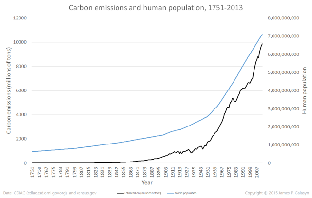
13 June 2015 (Desdemona Despair) – Data show that growth of human carbon emissions in the modern era is pretty close to exponential (cf. “Graph of the Day: Global carbon emissions from fossil fuels, 1751-2013”). But what about carbon emissions per person? The Carbon Dioxide Information Analysis Center (CDIAC) maintains a database of fossil-fuel CO2 emissions, and the U.S. Census Bureau keeps track of world population. Above are the two data sets plotted together (click to enlarge).
Population estimates for the years before 1950 are linearly interpolated – see the spreadsheet, Global CO2 Emissions 1751-2010 CDIAC.xlsx, for details. With these data sets, it’s easy to compute the average amount of carbon emitted per person per year. The per-capita graph brings out some interesting details.
Per-capita carbon emissions increase at a supralinear rate
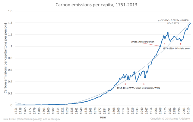
Excel’s default polynomial curve fit shows quadratic growth, with an R2 value of 0.977. This curve fit probably isn’t physically meaningful, but it might be useful for extrapolation. Carbon emitted per capita surpassed 1 ton per person in 1968 and has never fallen below this value since then. Extrapolating the quadratic curve, emissions per capita will surpass 2 tons per person around the year 2050.
The growth curve breaks for only two time periods

Human carbon emissions increase relentlessly over modern history, except for two sharply defined periods: 1914-1945 and 1973-1999. The first period of flat growth is clearly related to the global disruption of trade and industry caused by World War 1, the Great Depression, and World War 2. The second period of flat growth clearly begins with the 1973 oil shock caused by the OPEC oil embargo. Its end is less clear, starting in 1999 and returning to strong growth in 2002.
Two candidate events for the return of growth are the establishment of the euro in 1999, and the signing of the Strategic Offensive Reductions Treaty by Russia and the U.S. in 2002. If you have ideas of what happened in this period to return to the “natural” growth rate, please tell us in comments. (UPDATE: Anonymous nails it: “Post 1999 China happened. They joined WTO in 2001 and you can see the effects of that in usage of all resources since then:”
The Great Recession of 2007-2009 barely shows up, as a small dip.
The “natural” growth rate of per-capita emissions is exponential
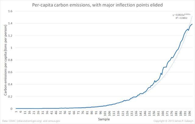
Removing the two periods of flat growth, the “natural” rate of emissions growth is very nearly exponential, with an R2 value of 0.985 for the default Excel curve fit. This analysis suggests an interesting conclusion: as human population grows, it emits carbon at an exponentially greater rate per person. Only two periods in modern history have broken this rule, both characterized by abrupt, global, economic dislocations. As soon as the conditions that caused the dislocations are resolved, exponential growth returns immediately.
If humans are to avoid catastrophic climate change, it’s critical that we deflect this curve downward from its inexorable climb. Knowing that the only two interruptions in the growth of carbon emissions happened during periods of global economic distress, we get an idea of the scale of change that’s needed to save the planet.
You can get the data and related graphs here: Global CO2 Emissions 1751-2010 CDIAC.xlsx.


Post 1999 China happened. They joined WTO in 2001 and you can see the effects of that in usage of all resources since then, e.g. https://en.wikipedia.org/wiki/File:China_coal_prod.PNG
Awesome. Post updated.
It wouldn't just be China that experienced accelerated growth since 1999, but all BRIC countries and now Africa looking to join the "Great Acceleration'.
http://www.hktdc.com/resources/MI_Portal/Article/ef/2012/06/369691/1340936939075_Nigeria1-2_369691.jpg
As Tim Garrett has shown, civilization's power consumption and wealth are linearly related ~ 9.7 milliwatts per 1990 dollar.
http://www.inscc.utah.edu/~tgarrett/Economics/Economics.html
"This analysis suggests an interesting conclusion: as human population grows, it emits carbon at an exponentially greater rate per person."
Probably due to increased human consumption (economic growth / resource demand and usage, ie., "higher standards of living" per person) as the population grows. It's a well known fact that the more humans there are, the more resources EACH human consumes (up to a point, where changes occur downward due to resource collapse / population decline).
It has been very obvious for several decades that while the Earth can "provide" for large numbers of humans, humanity has exceeded sustainability. Actual numbers of humans living under truly sustainable conditions would be less then 1 billion living at a very high standard of living.
I have yet to see an honest, accurate definition of what sustainable actually means. Nothing mined out of the ground is "sustainable". Only what is naturally replenished and consumed at balanced rates (both being equal) is truly sustainable. Otherwise, it is over production which leads to over consumption and leads to over population (birth rates / life spans go up).
Excess production (primarily of food) has led to over population and over consumption. All of this is of course tied to carbon emissions by humans and a destabilized climate.
In 25 years we will pass the ultimate tipping point for all life on earth. This is when mass extinction reaches critical mass and goes into runaway mode, which is unstoppable and irreversible once started. Global warming is only one out of six direct drivers of mass extinction. Mass extinction is the ultimate threat to humanity, even more than global warming. But wait, it gets much, much worse.
Scientific American says humanity only has 60 years of human agriculture left to us because of the rate of soil degradation, depletion and outright loss.
Also, because we add 1 million new people to earth every 4½ days, we will have to grow more food over the next 50 years than we ever grew in all of the last 10,000 years, combined.
To do this, we will need 12 million acres of NEW farmland every year for the next 30 years. But, we are actually losing 24 million acres of farmland every year. That's twice the rate it needs to grow. We also only have a 20 year supply of cheap, irreplaceable fertilizers left. (see: Collapse Data Cheat Sheet)
On top of all this, in just 10 years from now, 66% of humanity, or roughly 4-5 billion people, will be short of fresh water, with nearly 2 billion people being severely short of fresh water. Try growing food without water and soil and see how far you get.
In order for us to stay below 2°C, the IPCC says we will need 1 billion acres of new farmland by 2100 because we will have to extract CO2 directly from the air using what they call, Bio Energy Carbon Capture & Storage. The acronym for this is BECCS. The real acronym for this is BS. One billion acres of farmland is about the size of India. That's a lot of Farmland. Yet, we are losing soil at twice the rate we need to grow it just to be able to eat, never mind some pie in the sky carbon-negative bio energy for which the technology does not even exist.
If a little honesty won't kill ya, check out this…
Get your Collapse Data Cheat Sheet here:
http://www.reddit.com/r/collapse/comments/311m7d/collapse_data_cheat_sheet/
"Mass extinction is the ultimate threat to humanity." We can only hope.