NOAA’s “new normal” climate report is anything but normal – “We’re really seeing the fingerprints of climate change in the new normals”
By Jeff Berardelli
8 May 2021
(CBS News) – Just a quick glance at the new U.S. Climate Normals maps published by the National Oceanic and Atmospheric Administration (NOAA) on Tuesday is enough for most climate scientists to say, “I told you so.” And it’s not just because the maps show a warmer and wetter nation, as one would expect with global warming; it’s also the specific geographic pattern of those changes.
That’s because for decades climate scientists and their computer models have projected the regions that should expect the most warming, the most drying and the biggest increase in precipitation due to human-caused climate change. NOAA’s new maps are clear evidence that this impact is now being felt.
It doesn’t take a climate scientist to see the changes that have occurred. In the maps below, using NOAA data, Climate Central illustrates the warmer temperatures the U.S. has experienced. When comparing the latest “normals” to what used to be normal a century ago, the difference is clear — seen in red from coast to coast.
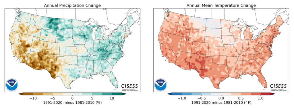
The map on the left depicts the updated climate “normals” compared to the normal temperatures of the early 20th century (1901-1930). In that time the U.S. has warmed an average of 1.7 degrees Fahrenheit. But the shades of the map show that not all areas are warming uniformly, with the darker red indicating temperature increases in some regions of 2 to 4 degrees Fahrenheit.
The map on the right is more muted in tone and shows the difference between recent 30-year averages, comparing the 1981-2010 normals to the new 1991-2020 normals. While the new normals are just 10 years removed from the earlier set, the changes are still significant. In that time the nation has warmed an average of half a degree Fahrenheit.
That may not sound like much, but small changes in the normals mean much larger changes in the extremes like heat waves, droughts, wildfires, floods, and hurricanes. And hidden within the pattern of changes are interesting clues into how climate change will impact us now and into the future.
What the data reveal
Since the 1800s the globe has warmed by around 2 degrees Fahrenheit. Nine out of 10 of the warmest years on record worldwide have all occurred in the past decade.
A recent study by NASA proves that all recent warming is related to humans’ burning of fossil fuels and the resultant amount of heat-trapping greenhouse gases and aerosols in the atmosphere.
But because of regional variations in geography like ice cover, water and land type, some regions warm much more or less rapidly than others. For instance, the Arctic regions are warming at three times the average global rate due partly to rapid changes in ice cover and the impact of local feedback.
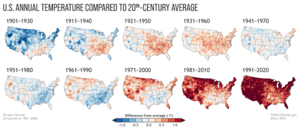
In the United States, NOAA’s new climate normals reveal that our nation is about on pace with the global average of warming. What’s more, the pattern of recent regional changes in our climate validate scientists’ understanding of how man-made climate change is unfolding.
“We’re really seeing the fingerprints of climate change in the new normals,” said Michael Palecki, the project manager of NOAA’s latest climate normals update. “We’re not trying to hide that. We’re in fact reflecting that.”
These climate change fingerprints are best illustrated by using side-by-side comparisons of previous 30-year climate normals, pictured above. The warming trend could not be more apparent when comparing the early 20th century (the map at the top left) with the latest two decades (bottom right). [more]
