50 doomiest graphs of 2014
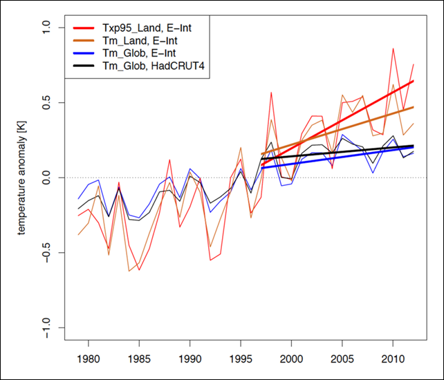
From charismatic megafauna to insect pollinators, 2014 was a bad year for wildlife. The London Zoological Society updated the Living Planet Index and found that during the 40 years from 1970 to 2010, more than half of vertebrate species, and more than three-quarters of freshwater species, met their end. 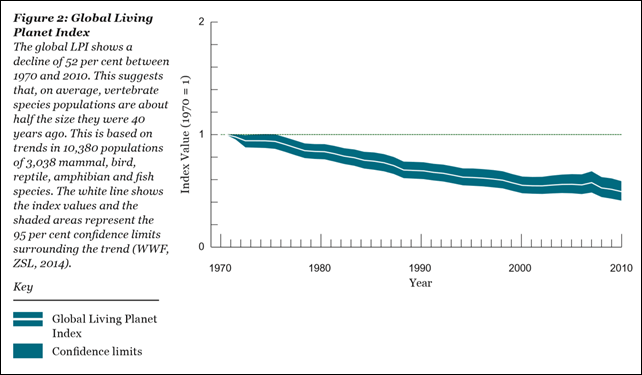 Stanford biology professor Rodolfo Dirzo calls this mass-extinction event the “Anthropocene defaunation”. In the words of the Ol Pejeta Conservancy, it’s “a sorry testament to the greed of the human race.” If these trends continue – and there’s no reason to expect that they won’t – the next 40 years will see almost all vertebrate species extirpated. 2014 gave us a much clearer view of the scale of plastic pollution in the oceans: more than 5 trillion plastic particles weighing more than the entire biomass of the human species. And the irreversible meltdown of the cryosphere delivered a surprise: enormous concentrations of microplastics – at least 100 times greater than what’s in the ocean gyres – have accumulated in Arctic sea ice. Global warming continued its dreary, inexorable rise, causing the usual record temperatures and flooding that we’re all becoming accustomed to. The chances of a record-cold year are now astronomically small; the last one was in 1909. 2014 put to rest any notion that global warming has “slowed down” in recent years, with 2014 almost certainly the hottest year ever recorded. A paper by Seneviratne, et al., showed clearly a continued increase in hot extremes over land during this so-called global warming hiatus.
  New data brought the global freshwater depletion crisis into sharper focus. Since 2013, the U.S. West has lost 63 trillion gallons of groundwater to the mega-drought. Humans are drilling deep and depleting aquifers at an immensely unsustainable rate. James Famiglietti, a hydrologist at the NASA Jet Propulsion Laboratory, sounded the alarm:
From North Africa to the Middle East to South Asia, regions where it is already common to drill over 2 kilometers to reach groundwater, it is highly likely that disappearing groundwater could act as a flashpoint for conflict.
Human responses to these dire signals ranged from woefully insufficient to perverse. Australia repealed its carbon tax, causing its emissions to soar. Canada largely withdrew from the Convention on International Trade in Endangered Species (CITES). Afghanistan exploited new deep-well technology to use its groundwater for boosting opium poppy cultivation to a record high. Wealthy Californians trucked in water to keep their lawns green; in some places, residential water use exceeded 500 gallons per person per day. The ballyhooed COP 20 conference in Lima kicked the can down the road to the 2015 meeting in Paris. The interim agreement may put developing nations in an even worse situation than before the talks. Scroll down for more of the year’s doomiest data, and check out Desdemona’s doomiest posts of previous years:
- 2013 doomiest graphs, images, and stories
- 2012 doomiest graphs, images, and stories
- 2011 doomiest graphs, images, and stories
- 2010 doomiest graphs, images, and stories
—
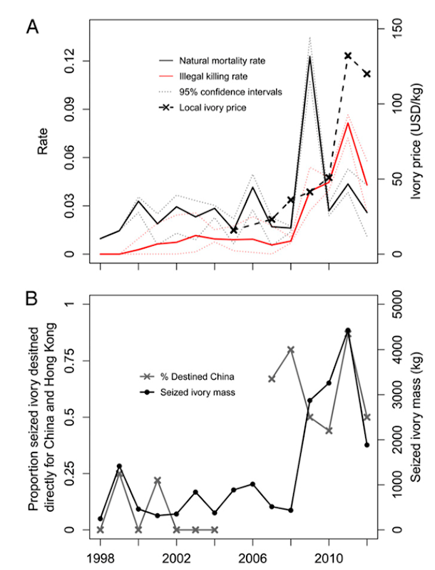
Elephant poaching rates and ivory seizures in Kenya, 1998-2012
19 August 2014 (mongabay.com) – Around 100,000 elephants were killed by poachers for their ivory on the African continent in just three years, according to a new paper in the Proceedings of the National Academy of Sciences. Between 2010 and 2012 an average of 6.8 percent of the elephant population was killed annually, equaling just over 20 percent of the continent’s population in that time. Elephant deaths are now exceeding births, which on average are 5 percent annually. “We are shredding the fabric of elephant society and exterminating populations across the continent,” lead author George Wittemyer with the organization Save the Elephants told the BBC, noting that old elephants are often the first killed. Elephants are being killed for their ivory, which is then smuggled abroad to mostly to China, but also to Thailand, the Philippines, Europe, and the U.S.
20 percent of Africa’s elephants killed in three years – ‘We are shredding the fabric of elephant society and exterminating populations across the continent’ Ivory’s shocking toll: 65 percent of forest elephants killed in 12 years – ‘At least a couple of hundred thousand forest elephants were lost between 2002-2013 to the tune of at least sixty a day, or one every twenty minutes, day and night’ —
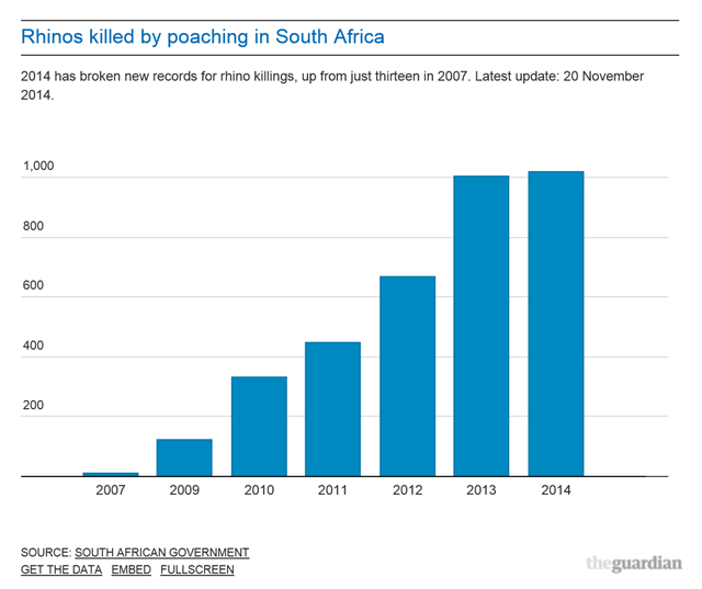
Rhinoceros poaching rate in South Africa, 2007-2014
24 November 2014 (mongabay.com) – South Africa has surpassed last year’s grisly record for slaughtered rhinos—1,004—more than a month before the year ends. In an announcement on November 20th, the South African Department of Environmental Affairs said that 1,020 rhinos had been killed to date. Rhinos are butchered for their horns, which are consumed as curatives in countries like Vietnam and China despite any evidence that rhino horn has medicinal properties.
New blood record: 1,020 rhinos slaughtered by poachers this year in South Africa —
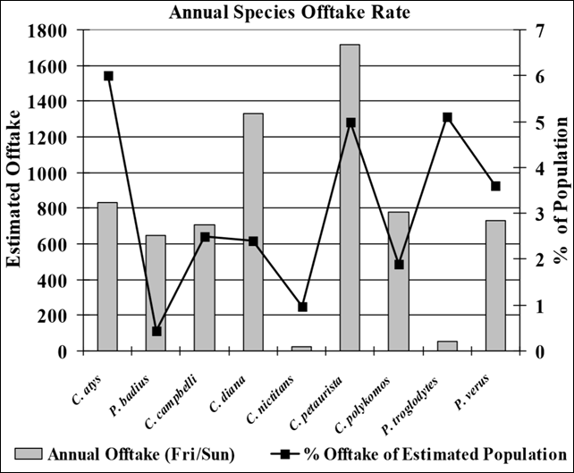
Estimated annual offtake rates for bushmeat in the Ivorian town of Taï
(Tropical Conservation Science) – According to the IUCN, four of the nine anthropoid species found in Liberia are classified as either Vulnerable or Endangered and this number is likely to rise in coming years due to an increase in bushmeat hunting and a growing human population. Bushmeat hunting is the primary cause of primate loss in West Africa and current estimated offtake rates combined with habitat loss have placed four taxa endemic to Upper Guinea forests in danger of extirpation. […] Based on an estimated offtake rate of 2.76%, our preliminary analysis suggests that primates in Liberia’s Konobo District are likely being hunted at rates approaching unsustainable levels and are in danger of extirpation.
Graph of the Day: Annual species offtake rate for one bushmeat market in West Africa —
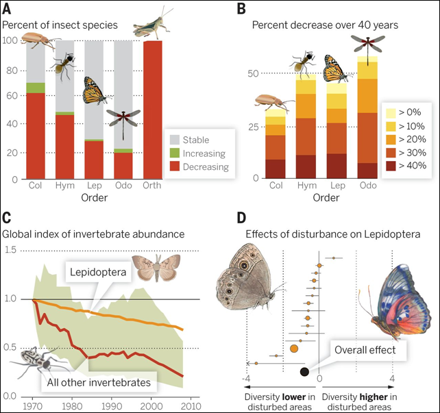
Declines in invertebrate abundance, 1970-2010
18 September 2014 (The Mind Unleashed) – According to a Stanford biology professor, Rodolfo Dirzo, the earth has begun its 6th mass extinction cycle – and it’s our fault. Professor Dirzo is calling our time an era of “Anthropocene defaunation.” Human ignorance and greed are its causes. According to the study:
Across vertebrates, 16 to 33 percent of all species are estimated to be globally threatened or endangered. Large animals – described as megafauna and including elephants, rhinoceroses, polar bears and countless other species worldwide – face the highest rate of decline, a trend that matches previous extinction events.
Stanford Biologist warns Earth’s 6th mass extinction in progress —
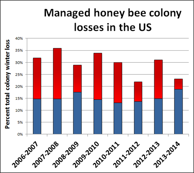
U.S. managed honey bee colony losses, 2006-2014
15 May 2014 (USDA) – A yearly survey of beekeepers, released today, shows fewer colony losses occurred in the United States over the winter of 2013-2014 than in recent years, but beekeepers say losses remain higher than the level that they consider to be sustainable. According to survey results, total losses of managed honey bee colonies from all causes were 23.2 percent nationwide. That number is above the 18.9 percent level of loss that beekeepers say is acceptable for their economic sustainability, but is a marked improvement over the 30.5 percent loss reported for the winter of 2012-2013, and over the eight-year average loss of 29.6 percent.
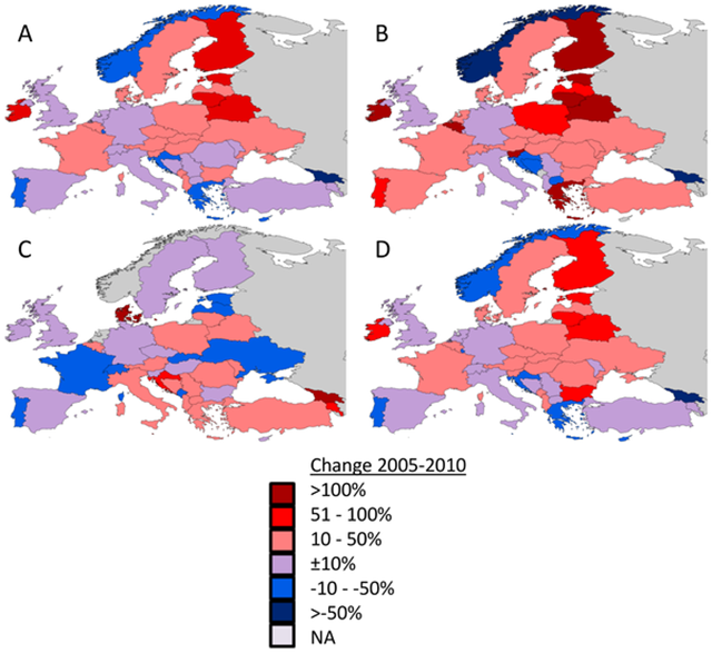
Change in European honeybee stocks, 2005-2010
8 January 2014 (theguardian.com) – The UK faces a food security catastrophe because of its very low numbers of honeybee colonies, which provide an essential service in pollinating many crops, scientists warned. “We face a catastrophe in future years unless we act now,” said Professor Simon Potts, at the University of Reading, who led the research. “Wild pollinators need greater protection. They are the unsung heroes of the countryside, providing a critical link in the food chain for humans and doing work for free that would otherwise cost British farmers £1.8bn to replace.”
Declines in European bird abundance, 1980-2010
3 November 2014 (AFP) – Europe has an estimated 421 million fewer birds than three decades ago, and current treatment of the environment is unsustainable for many common species, a study released on Monday said. The population crash is related to modern farming methods and the loss and damage of habitats, according to the study published in science journal Ecology Letters. “This is a warning from birds throughout Europe. It is clear that the way we are managing the environment is unsustainable for many of our most familiar species,” said Richard Gregory of the Royal Society for the Protection of Birds, which co-led the study.
Graph of the Day: Estimated abundance of European bird species, 1980-2009 Europe has 421 million fewer birds than 30 years ago – ‘The way we are managing the environment is unsustainable for many of our most familiar species’ —
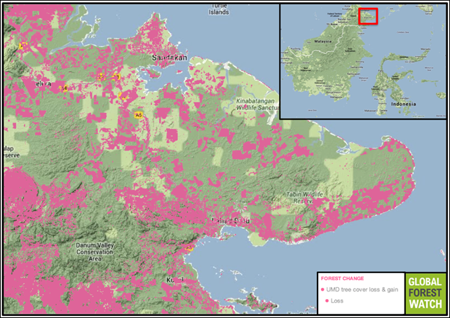
Deforestation in the Kinabatangan region of Borneo, 2000-2013
20 June 2014 (mongabay.com) – In a recent study headed by Dr. Marc Ancrenaz from Borneo Future and Dr. Isabelle Lackman, president of HUTAN-Kinabatangan Orangutan Conservation Project found that while orangutans have adapted to the island’s human-transformed landscapes better than expected, oil palm plantations are unable to sustain orangutan populations in the long-term. The researchers observed evidence of orangutans inhabiting small forest patches scattered among oil palm estates, but also observed evidence of starvation among those orangutans, as well as increased conflicts with humans. When a forest is newly converted for agricultural use, orangutans and other wildlife lose not only a place to live, but also access to vital food sources. During the land conversion process, animals are either killed or take refuge in neighboring patches of intact forest. However, these small forest patches often become overcrowded and cannot produce enough food to support the new influx of animals.
The palm oil diet: study finds displaced orangutans have little else to eat The last best place no more: Massive deforestation destroying prime chimp habitat in Uganda —
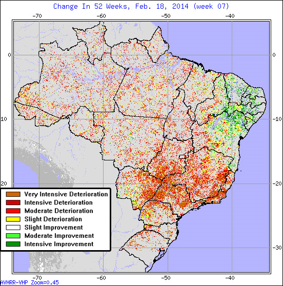
Drought in Brazil, 18 February 2014
25 February 2014 (mongabay.com) – With more than 140 cities implementing water rationing, analysts warning of collapsing soy and coffee exports, and reservoirs and rivers running precipitously low. “The regions where we plant coffee today, especially the ones on lower elevations, will be getting hotter,” Hilton Silveira Pinto of EMBRAPA, Brazil’s government agency for agriculture, told NPR. “And many of the coffee plantations in these areas will probably have to be abandoned.” “By 2020, we will lose 20 to 22 percent of our soybean crop. It will also affect corn, cassava, many of our Brazilian crops.”
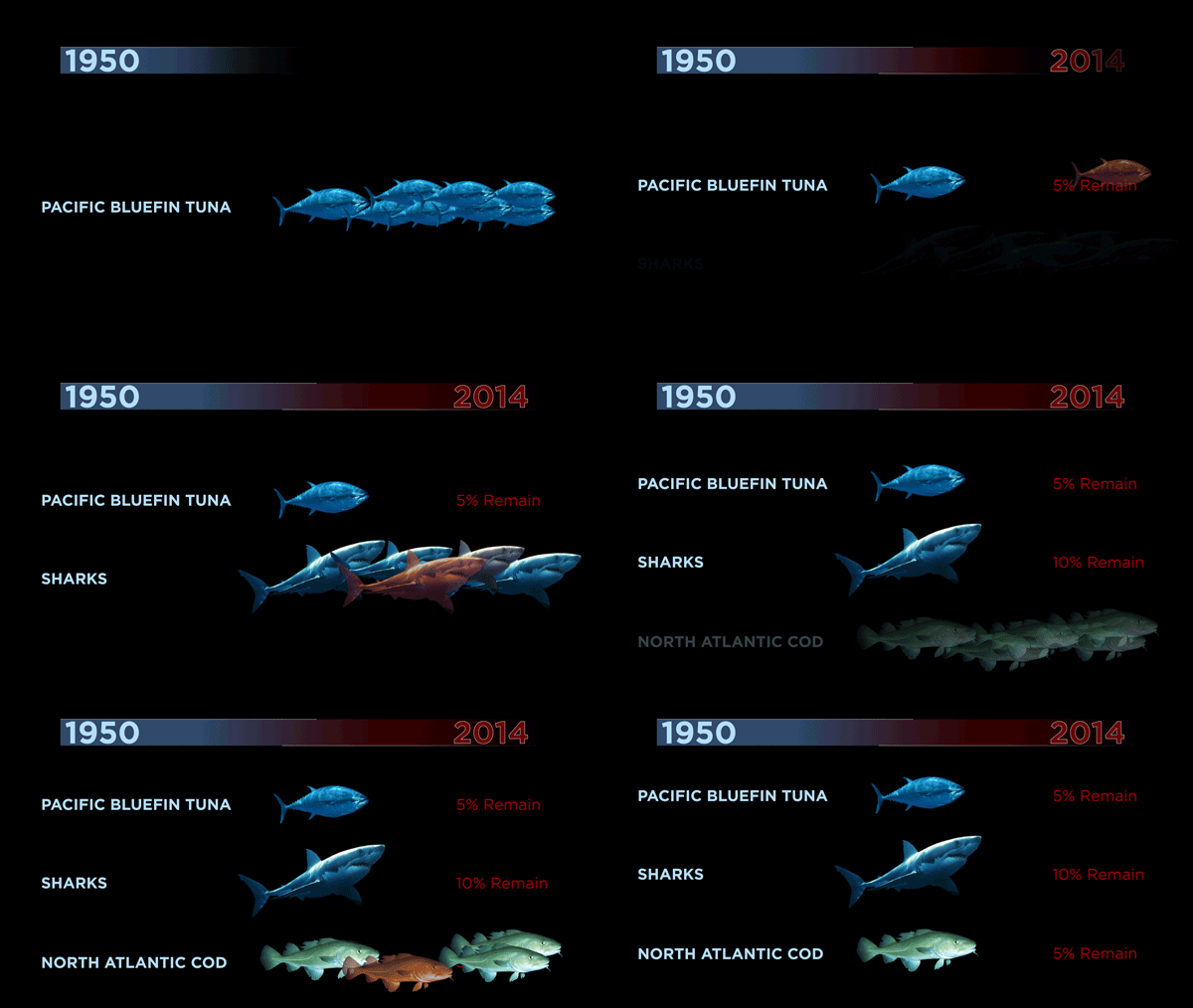
Decline of ocean wildlife: Clips from Mission Blue
15 August 2014 (TED) – Scientist Sylvia Earle (TED Talk: My wish: Protect our oceans) has spent the past five decades exploring the seas. During that time, she’s witnessed a steep decline in ocean wildlife numbers — and a sharp incline in the number of ocean deadzones and oil drilling sites. An original documentary about Earle’s life and work premieres today on Netflix. Watch it here. Below, four ocean infographic gifs from the film.
Beautiful and sad GIFs show the ongoing destruction of the oceans —
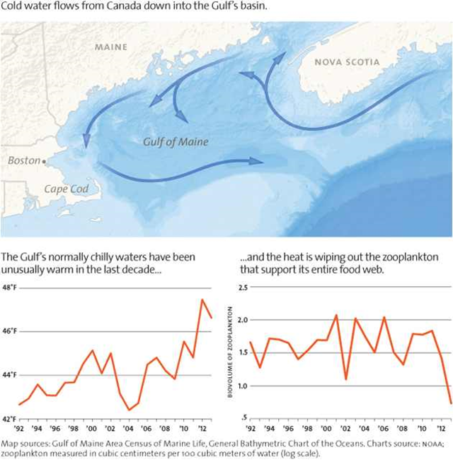
Temperature and zooplankton volume in Gulf of Maine, 1992-2013
May/June 2014 Issue (Mother Jones) – Why would the veteran puffin parents of Maine start bringing their chicks food they couldn’t swallow? Only because they had no choice. Herring and hake had dramatically declined in the waters surrounding Seal Island, and by August, Stephen Kress had a pretty good idea why: The water was much too hot. Cold ocean water flows from Canada into the Gulf of Maine. The Gulf’s normally cold waters have been unusually warm in the last decade, and the heat is wiping out the zooplankton that support its entire food web.
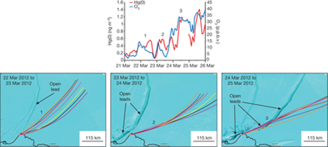
Cracks in sea ice funneling mercury to the Arctic surface, 21-26 March 2012
16 January 2014 (Scientific American) – Cracks in sea ice are funneling additional mercury to the Arctic surface, raising concerns about the toxic element seeping into the food chain of the delicate ecosystem. The research, published in Nature, finds that channels of open water in Arctic ice, known as leads, are stirring up air so that mercury is pumped from higher in the atmosphere to air close to the surface. Warming temperatures are increasing the amount of seasonal sea ice that melts every summer, which in turn helps create the leads, said study lead author Christopher Moore, an assistant research professor at the Desert Research Institute. “As more and more of that seasonal sea ice is around as the Arctic changes, then there is the potential that this mechanism can occur over a larger and larger area,” said Moore. Environment Canada, the Desert Research Institute and NASA jointly funded the research.
Toxic mercury pollution rising with Arctic meltdown Humans have tripled mercury levels in upper ocean – Pollution may soon overwhelm deep seas’ ability to sequester mercury —
Measured number of plastic items per square kilometer in the world’s oceans
10 December 2014 (The Guardian) – More than five trillion pieces of plastic, collectively weighing nearly 269,000 tonnes, are floating in the world’s oceans, causing damage throughout the food web, new research has found. Data collected by scientists from the US, France, Chile, Australia, and New Zealand suggest a minimum of 5.25 trillion plastic particles in the oceans, most of them “micro plastics” measuring less than 5mm. The volume of plastic pieces, largely deriving from products such as food and drink packaging and clothing, was calculated from data taken from 24 expeditions over a six-year period to 2013. The research, published in the journal PLOS One, is the first study to look at plastics of all sizes in the world’s oceans. Large pieces of plastic can strangle animals such as seals, while smaller pieces are ingested by fish and then fed up the food chain, all the way to humans. This is problematic due to the chemicals contained within plastics, as well as the pollutants that plastic attract once they are in the marine environment. […] “You put a net through it for half an hour and there’s more plastic than marine life there,” said Julia Reisser, a researcher based at the University of Western Australia. “It’s hard to visualise the sheer amount, but the weight of it is more than the entire biomass of humans. It’s quite an alarming problem that’s likely to get worse.”
Graph of the Day: Distribution of plastic pollution in the Pacific, Atlantic, and Indian oceans Full scale of plastic pollution in the world’s oceans revealed for first time – More than five trillion pieces weighing 269,000 tons are floating in our oceans —
Count of microplastic pieces found in sea ice at four Arctic sites
27 May 2014 (PhysOrg) – A team of researchers with Dartmouth College in the U.S. and the University of Plymouth in the U.K. has found that a massive amount of tiny bits of rayon, plastics and other man-made materials are embedded in Arctic sea ice. In their paper published in the journal Earth’s Future, the team describes how they found evidence of the materials in core samples taken in 2005 and 2010 and note that as Arctic sea ice melts, the embedded material will be released into the ocean, likely causing problems for marine life. These findings indicate that microplastics have accumulated far from population centers and that polar sea ice represents a major historic global sink of man-made particulates. The potential for substantial quantities of legacy microplastic contamination to be released to the ocean as the ice melts therefore needs to be evaluated, as do the physical and toxicological effects of plastics on marine life.
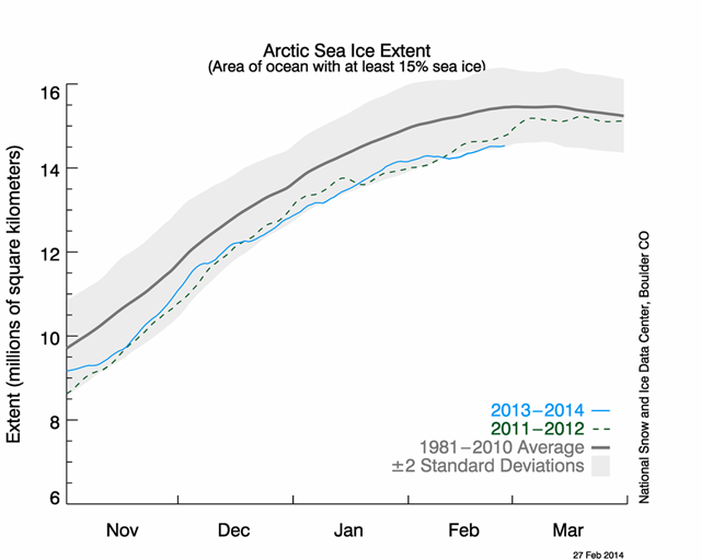
Record low Arctic Sea ice extent for February
19 February 2014 (Climate Central) – Arctic sea ice growth has slowed dramatically in recent weeks, thanks in large part to abnormally warm air and water temperatures. Sea ice now sits at record low levels for mid-February. According to the National Snow and Ice Data Center, as of February 18, sea ice covered about 14.36 million square kilometers in the Arctic. The previous low on this date was 14.37 million square kilometers in 2006. The main culprit — in addition to the overall trend of global warming — is likely the rash of warm temperatures. With the polar vortex bringing cold air down to the U.S. this winter, warmer temperatures have been the norm in the Arctic. From February 1-17, temperatures were 7.2° to 14.4°F above normal for much of the Arctic. Some areas have been even warmer.
Graph of the Day: Arctic sea ice at record low for February —
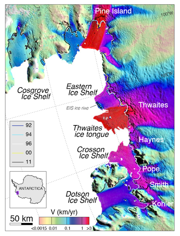
Velocities of retreating glaciers in West Antarctica
12 May 2014 (LiveScience.com) – The biggest glaciers in West Antarctica are hemorrhaging ice without any way to stem the loss, according to two independent studies. The unstoppable retreat is the likely start of a long-feared domino effect that could cause the entire ice sheet to melt, whether or not greenhouse gas emissions decline. “These glaciers will keep retreating for decades and even centuries to come and we can’t stop it,” said lead study author Eric Rignot, a glaciologist at the University of California, Irvine, and NASA’s Jet Propulsion Laboratory in Pasadena, Calif. “A large sector of the West Antarctic Ice Sheet has passed the point of no return.”
Catastrophic collapse of West Antarctic Ice Sheet begins – ‘These glaciers will keep retreating for decades and even centuries to come and we can’t stop it’ Doubling of Antarctic ice loss revealed by European satellite – Continent shedding 160 billion tons per year —
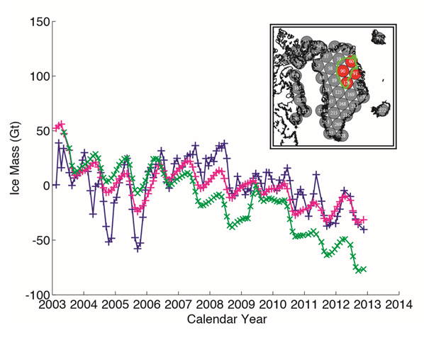
Ice mass loss In Greenland, 2003-2013
25 November 2014(GRL) – We use Gravity Recovery and Climate Experiment (GRACE) monthly gravity fields to determine the regional acceleration in ice mass loss in Greenland and Antarctica for 2003–2013. We find that the total mass loss is controlled by only a few regions. In Greenland, the southeast and northwest generate 70% of the loss (280±58 Gt/yr) mostly from ice dynamics, the southwest accounts for 54% of the total acceleration in loss (25.4±1.2 Gt/yr2) from a decrease in surface mass balance (SMB), followed by the northwest (34%), and we find no significant acceleration in the northeast.
Antarctic ice loss tripled in the last 10 years – ‘The mass loss of these glaciers is increasing at an amazing rate’ Greenland ice loss doubles from late 2000s – Greenland and Antarctica together are losing 500 cubic kilometers of ice each year – ‘To us, that’s an incredible number’ —
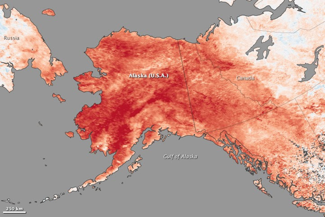
Record land surface temperature anomalies in Alaska for 23–30 January 2014
4 February 2014 (Arctic News) – While much of the continental United States endured several cold snaps in January 2014, record-breaking warmth gripped Alaska. Spring-like conditions set rivers rising and avalanches tumbling. NASA Earth Observatory illustrates these words with the image above. The above map depicts land surface temperature anomalies in Alaska for January 23–30, 2014. Based on data from the Moderate Resolution Imaging Spectroradiometer (MODIS) on NASA’s Terra satellite, the map shows how 2014 temperatures compared to the 2001–2010 average for the same week. Areas with warmer than average temperatures are shown in red; near-normal temperatures are white; and areas that were cooler than the base period are blue. Gray indicates oceans or areas where clouds blocked the satellite from collecting usable data.
As continental U.S. freezes, Alaska gets record high temperatures —
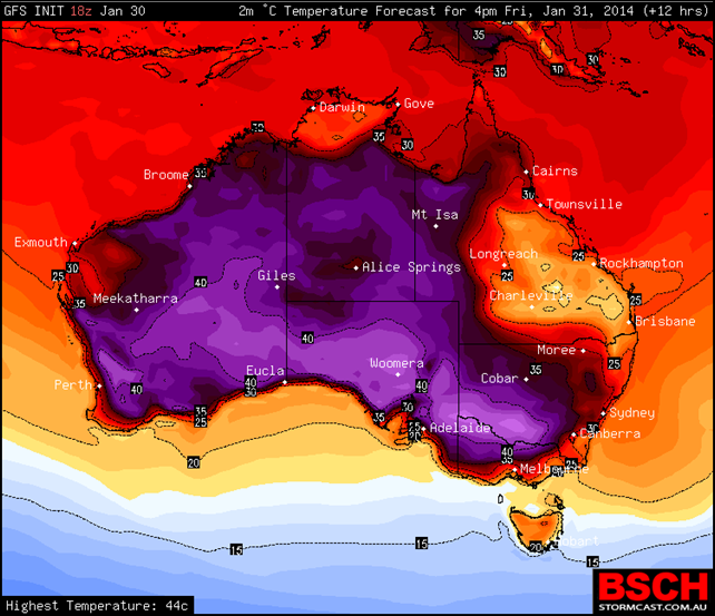
Australia temperature forecast for 31 January 2014
3 February 2014 (The Advertiser) – Australia’s stifling heatwaves are threatening to make summer Australia’s deadliest season, experts have warned, as Adelaide sweltered through its hottest February day on record Sunday. Sixty-six people affected by heat stress have presented to South Australian hospitals since Thursday and ten have been admitted for treatment during a stifling run of 40C-plus maximums, including Sunday’s 44.7C at 2.30pm. The previous February record in Adelaide was 44.3C on 14 February 2004. So intense was the heat blast that Mount Gambier, in the traditionally cooler South East, recorded it highest temperature of 44.9C. The sweltering start to the month follows the hottest January in 13 years – the fourth-hottest on record – when bushfires raged across the state and more than 300 people presented at hospitals with heat-related illness.
South Australia sizzles through hottest February day on record – Scientists project global warming will make summer deaths more common Australia experiences its hottest two years on record – ‘Climate change is here, it’s happening, and Australians are already feeling its impact’ Australia repealed its carbon tax, and emissions are now soaring —
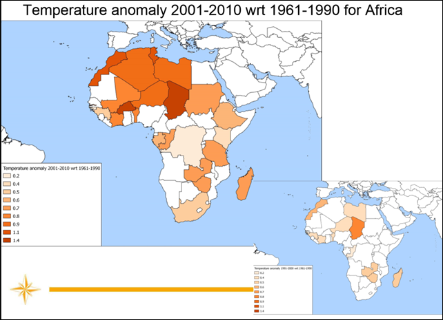
Temperature anomaly for Africa, 2001-2010, relative to 1961-1990
(WMO) – The decade 2001-2010 was characterized by a record in global temperature increase since sufficiently comprehensive global surface temperature measurement began in 1850. For global land-surface air temperatures as well as for ocean-surface temperatures this decade was the warmest on record. This trend is confirmed at national level where 96% of the countries had their warmest decade in 2001 to 2010 and 4% in 1991 to 2000. The rate of temperature increase was particularly high in the northern hemisphere.
Graph of the Day: Temperature anomaly for Africa, 2001-2010 Record warmth in Western Europe – Record cold and snow in Eastern U.S. —
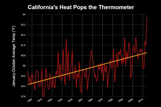
January-October average temperature for California, 1900-2014
5 December 2014 (Bloomberg) – Record rains fell in California this week. They’re not enough to change the course of what scientists are now calling the region’s worst drought in at least 1,200 years. Just how bad has California’s drought been? Modern measurements already showed it’s been drier than the 1930s dustbowl, worse than the historic droughts of the 1970s and 1980s. That’s not all. New research going back further than the Viking conquests in Europe still can’t find a drought as bad as this one. To go back that far, scientists consulted one of the longest records available: tree rings. Tighter rings mean drier years, and by working with California’s exceptionally old trees, researchers from University of Minnesota and Woods Hole Oceanographic Institute were able to reconstruct a chronology of drought in southern and central California. They identified 37 droughts that lasted three years or more, going back to the year 800. None were as extreme as the conditions we’re seeing now.
California’s ‘Hot Drought’ ranks worst in at least 1,200 years California breaks all-time heat record – Heat alerts declared; cooling centers to open —
Five-year global temperature anomalies, 1880-2013
21 January 2014 (NASA) – NASA scientists say 2013 tied with 2009 and 2006 for the seventh warmest year since 1880, continuing a long-term trend of rising global temperatures. With the exception of 1998, the 10 warmest years in the 134-year record all have occurred since 2000, with 2010 and 2005 ranking as the warmest years on record. NASA’s Goddard Institute for Space Studies (GISS) in New York, which analyzes global surface temperatures on an ongoing basis, released an updated report Tuesday on temperatures around the globe in 2013. The comparison shows how Earth continues to experience temperatures warmer than those measured several decades ago. The average temperature in 2013 was 58.3 degrees Fahrenheit (14.6 degrees Celsius), which is 1.1 °F (0.6 °C) warmer than the mid-20th century baseline. The average global temperature has risen about 1.4 °F (0.8 °C) since 1880, according to the new analysis. Exact rankings for individual years are sensitive to data inputs and analysis methods. “Long-term trends in surface temperatures are unusual and 2013 adds to the evidence for ongoing climate change,” GISS climatologist Gavin Schmidt said. “While one year or one season can be affected by random weather events, this analysis shows the necessity for continued, long-term monitoring.”
Five-Year Global Temperature Anomalies from 1880 to 2013 IPCC Synthesis Report warns of ‘severe, widespread and irreversible’ effects of climate change Global warming: No pause in the increase of hot temperature extremes 2014 set to be hottest year on record – Chances of record cold years now ‘astronomically small’ —
Global sea level trends for the period 2003–2013
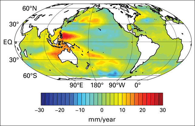
24 March 2014 (WMO) – Preliminary analyses indicate that the global average sea level reached a new record high in March. Some regions of the globe are experiencing greater sea-level rise than others (some are even experiencing declining sea levels) due to local variations in currents, land movements and ocean warming. The region of the Pacific Ocean near the Philippines has observed some of the highest rising sea-level rates over the past half century. This contributed to the enormous devastation in parts of the Philippine islands, when Typhoon Haiyan struck in November and caused a massive storm surge.
Graph of the Day: Global sea level trends, 2003–2013 Rising sea level in Miami is an enormous problem As sea level rises in Jamaica Bay, New York, tidal flooding moves from occasional to chronic —
Poleward migration of the location of tropical cyclone maximum intensity (LMI)
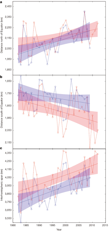
14 May 2014 (MIT News Office) – Powerful, destructive tropical cyclones are now reaching their peak intensity farther from the equator and closer to the poles, according to a new study co-authored by an MIT scientist. The results of the study, published today in the journal Nature, show that over the last 30 years, tropical cyclones — also known as hurricanes or typhoons — are moving poleward at a rate of about 33 miles per decade in the Northern Hemisphere and 38 miles per decade in the Southern Hemisphere. “The absolute value of the latitudes at which these storms reach their maximum intensity seems to be increasing over time, in most places,” says Kerry Emanuel, an MIT professor and co-author of the new paper. “The trend is statistically significant at a pretty high level.”
MIT study: Dangerous storms peaking further north, south than in past —
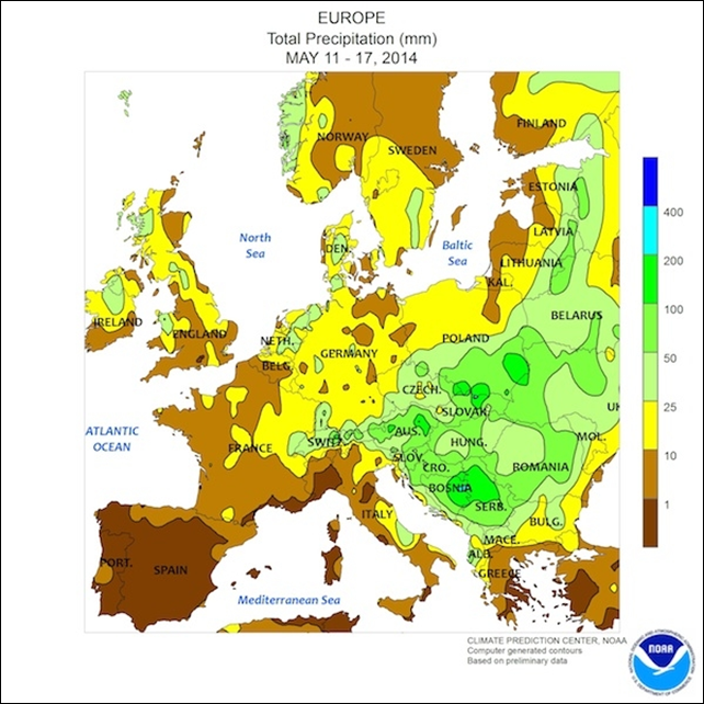
Map of rainfall totals across Europe, 11-17 May 2014
20 May 2014 (Climate Central) – The torrential rains and catastrophic floods that raged through parts of Bosnia and Herzegovina, Serbia, and Croatia were unprecedented in the historical record of the region, going back 120 years. But extreme weather events like this one are something communities may have to contend with more and more as the planet warms, experts say. The flooding event began on May 13 when an area of low pressure developed as warm, moist air from over the Mediterranean Sea clashed with colder air from the north. The low became cut-off from the jet stream, which would ordinarily usher the system across the region — instead, it remained parked over southeast Europe, dumping rain for several days. Authorities in Bosnia and Serbia reported that about 4 inches of rain fell on May 14 and 15, with larger downpours in some locations. In just a few days, some areas received an amount of rain equivalent to one third of their annual total, said Steven Bowen, an associate director and meteorologist with the reinsurance group Aon Benfield. “We’re looking at a pretty unprecedented event,” Bowen told Climate Central. It was at least a 1-in-100 year event for the region, he said.
The climate context for ‘unprecedented’ Balkans flooding – ‘We can see what is quite obviously a trend of extreme weather’ Floods affect over 1 million in Balkans, destruction to cost billions of euros – ‘This country has not experienced such a natural cataclysm ever in its history’ Europe flood losses to soar by 2050 – ‘Due to climate change and GDP growth, by 2050 a one-in-50-years-flood might be one in 30 years, so the frequency of such losses increases dramatically – almost doubling’ —
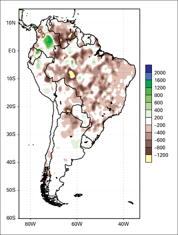
Precipitation anomalies over South America during the active monsoon season, September 2012–May 2013
24 March 2014 (WMO) – Temperatures in South America were dominated by hot conditions in most parts of the continent, except for some limited areas in southern Brazil and the north-central and western parts of South America, which had near to colder than average temperatures. A warm October–December period – including the hottest December on record – contributed to the second warmest year in Argentina since records began in 1961, behind only the record warmth of 2012. In December, the most significant heatwave since 1987 struck central and northern Argentina. North-eastern Brazil experienced its worst drought in 50 years. This followed the 2001–2010 decade, when large parts of the Amazon Basin saw prolonged drought. The Brazilian Plateau, which is the core monsoon region in South America, experienced its largest rainfall deficit since records began in 1979; damages exceeded US$ 8 billion.
Graph of the Day: Precipitation anomalies over South America during the active monsoon season, September 2012 – May 2013 São Paulo drought: Five major reservoirs that serve water to the São Paulo metropolitan area are critically below their normal operating levels —
Decline in greenness of Congo rainforest between 2000 and 2012
23 April 2014 (NASA) – A new analysis of NASA satellite data shows Africa’s Congo rainforest, the second-largest tropical rainforest in the world, has undergone a large-scale decline in greenness over the past decade. The study, led by Liming Zhou of University at Albany, State University of New York, shows between 2000 and 2012 the decline affected an increasing amount of forest area and intensified. The research, published Wednesday in Nature, is one of the most comprehensive observational studies to explore the effects of long-term drought on the Congo rainforest using several independent satellite sensors. It’s important to understand these changes because most climate models predict tropical forests may be under stress due to increasing severe water shortages in a warmer and drier 21st century climate,” Zhou said.
NASA satellites show drought taking toll on Congo rainforest —
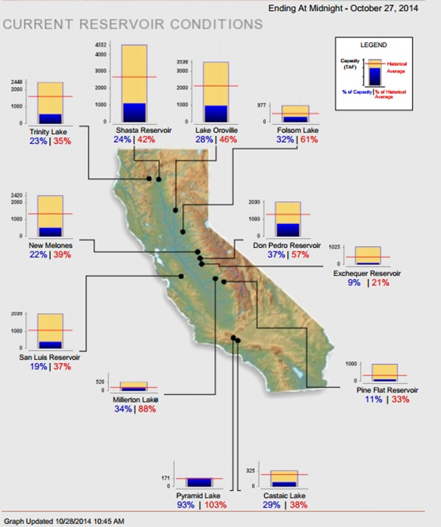
Water levels of California reservoirs, 27 October 2014
28 October 2014 (Pacific Institute) – Statewide, California’s major reservoirs (representing nearly 27.1 million acre-feet of storage), are at about 28% of total capacity and 50% of normal.
Graph of the Day: California reservoir levels, 27 October 2014 New data show residential per capita water use across California – In some areas, residential use averages more than 500 gallons per person per day —
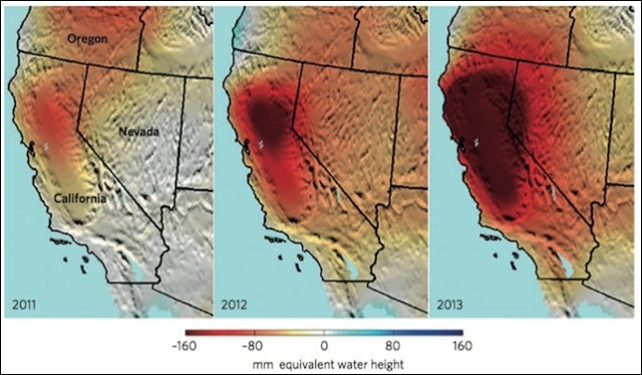
Total California water storage anomalies, 2011-2013
29 October 2014 (Nature Climate Change) – The ongoing California drought is evident in these maps of dry season (Sept–Nov) total water storage anomalies (in millimeter equivalent water height; anomalies with respect to 2005–2010). California’s Sacramento and San Joaquin river basins have lost roughly 15 km3 of total water per year since 2011 — more water than all 38 million Californians use for domestic and municipal supplies annually — over half of which is due to groundwater pumping in the Central Valley.
Graph of the Day: Water storage anomalies in California, 2011-2013 63 trillion gallons of groundwater lost in drought, study finds —
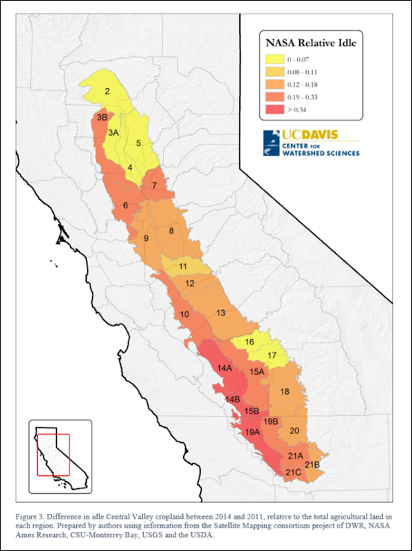
Change in idle cropland in Central Valley, California, between 2014 and 2011
September 2014 (Natural News) – Many of California’s underground aquifers, which are typically drawn upon as a last resort when all else fails, are now the go-to for watering food crops throughout the state. In some areas, these aquifers have dropped by as much as 100 feet, an unprecedented decline that, even if the drought suddenly ended, would likely take several decades or longer to fully recharge. “A well-managed basin is used like a reserve bank account,” said Richard Howitt, a professor emeritus of resource economics from the University of California at Davis. Howitt co-authored a study published in July that estimates a 5.1 million acre-feet loss of water this year from California’s underground reserves, a volume the size of Lake Shasta, the state’s largest water reservoir. “We’re acting like the super rich who have so much money they don’t need to balance their checkbook.”
Water storage declines in major aquifers at arid and semi-arid mid-latitudes, April 2002–May 2013
31 October 2014 (Climate Progress) – An alarming satellite-based analysis from NASA finds that the world is depleting groundwater — the water stored unground in soil and aquifers — at an unprecedented rate. A new Nature Climate Change piece, “The global groundwater crisis,” by James Famiglietti, a leading hydrologist at the NASA Jet Propulsion Laboratory, warns that “most of the major aquifers in the world’s arid and semi-arid zones, that is, in the dry parts of the world that rely most heavily on groundwater, are experiencing rapid rates of groundwater depletion.” The groundwater at some of the world’s largest aquifers — in the U.S. High Plains, California’s Central Valley, China, India, and elsewhere — is being pumped out “at far greater rates than it can be naturally replenished.” The most worrisome fact: “nearly all of these underlie the word’s great agricultural regions and are primarily responsible for their high productivity.”
NASA bombshell: Global groundwater crisis threatens our food supplies and our security —
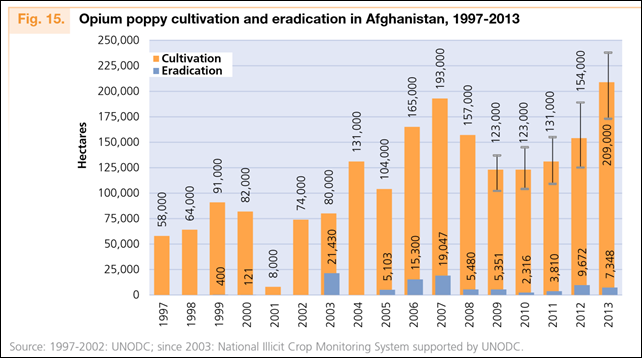
Opium poppy cultivation and eradication in Afghanistan, 1997-2013
21 October 2014 (Reuters) – Opium poppy cultivation in Afghanistan has hit an all-time high despite years of counter-narcotics efforts that have cost the US $7.6bn (£4.7bn), according to a US government watchdog. The UN Office on Drugs and Crime [pdf] reported that Afghan farmers grew an “unprecedented” 209,000 hectares (523,000 acres) of opium poppy in 2013, surpassing the previous high of 193,000 hectares in 2007, said John Sopko, the special inspector general for Afghanistan reconstruction. Affordable deep-well technology brought to Afghanistan over the past decade had enabled Afghans to turn 200,000 hectares of desert in the south-west of the country into arable land, much of it devoted to poppy production.
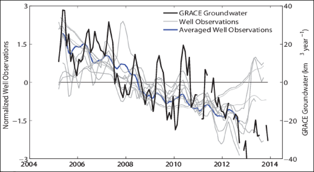
Groundwater storage anomalies for the Colorado River Basin, 2005-2013
4 August 2014 (Mother Jones) – To make up for the gap between what the Colorado River supplies and what people and agriculture demand, farmers, landowners, and municipalities are dropping wells and tapping underground aquifers at a much faster rate than had been assumed. Between December 2004 and November 2013, the Colorado Basin surrendered almost 53 million acre-feet of underground water—roughly equal to about 1.5 full Lake Meads, siphoned away in just nine years. “Quite honestly, we are alarmed and concerned about the implications of our findings,” study coauthor Jay Famiglietti, a senior water scientist at NASA and a professor of at the University of California-Irvine, wrote in a blog post.
40 million people depend on the Colorado River, and now it’s drying up – ‘Quite honestly, we are alarmed and concerned about the implications of our findings’ Afghan opium poppy cultivation hits all-time high – Deep-well technology turns 200,000 hectares of desert into arable land —
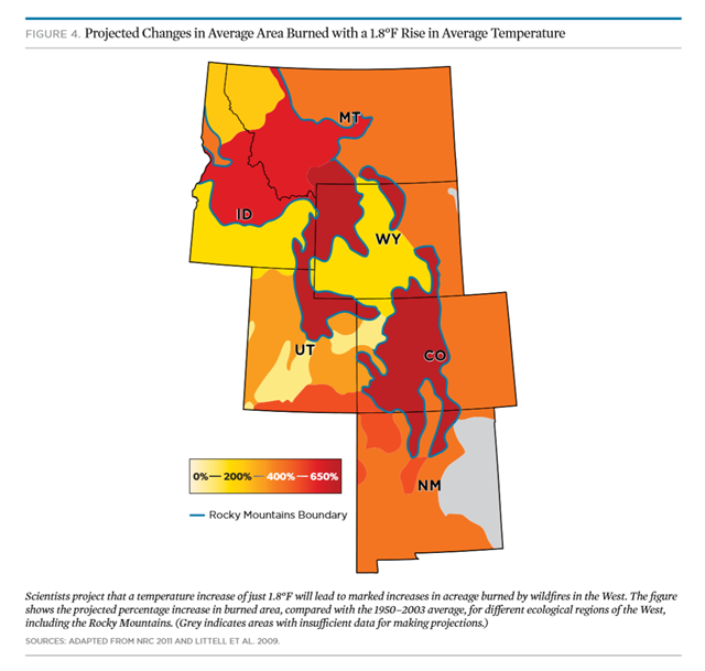
Projected changes in average area burned by wildfires in the U.S. West, if temperatures rise by 1.8F
9 September 2014 (UCS) – Tens of millions of trees have died in the Rocky Mountains over the past 15 years, victims of a triple assault of tree-killing insects, wildfires, and stress from heat and drought. Global warming is the driving force behind these impacts, bringing hotter and drier conditions that amplify existing stresses, as well as cause their own effects. If climate change is allowed to continued unchecked, these impacts will significantly increase in the years ahead, dramatically reduce the ranges of iconic tree species, and fundamentally alter the Rocky Mountain forests as we know them.
Global warming accelerates death of forests in U.S. West – ‘The wildfires, infestations, and heat and drought stress are the symptoms; climate change is the underlying disease’ Graph of the Day: Forest area burned and number of forest fires in Canada, 2003-2013 —
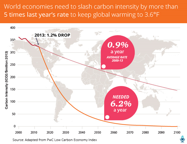
Carbon intensity reduction required to keep global warming to 3.6F
10 September 2014 (Mother Jones) – With every year that passes, we’re getting further away from averting a human-caused climate disaster. That’s the key message in this year’s “Low Carbon Economy Index,” a report released by the accounting giant PricewaterhouseCoopers. The report highlights an “unmistakable trend”: The world’s major economies are increasingly failing to do what’s needed to to limit global warming to 3.6 degrees Fahrenheit above preindustrial levels. That was the target agreed to by countries attending the United Nations’ 2009 climate summit; it represents an effort to avoid some of the most disastrous consequences of runaway warming, including food security threats, coastal inundation, extreme weather events, ecosystem shifts, and widespread species extinction. The chart above compares our current efforts to cut “carbon intensity”—measured by calculating the amount of carbon dioxide emitted per million dollars of economic activity—with what’s actually needed to rein in climate change. According to the report, the global economy needs to “decarbonize” by 6.2 percent every year until the end of the century to limit warming to 3.6 degrees Fahrenheit. But carbon intensity fell by only 1.2 percent in 2013.
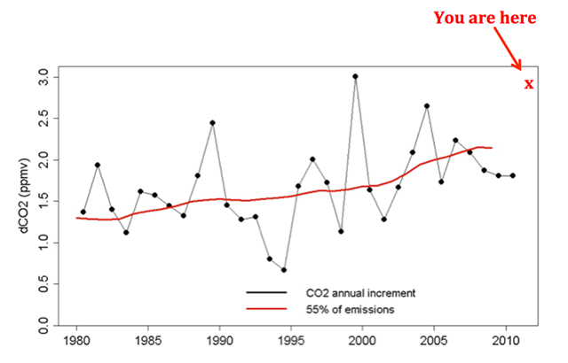
Annual change in atmospheric carbon dioxide concentration, 1980-2013
9 September 2014 (Reuters) – Atmospheric volumes of greenhouse hit a record in 2013 as carbon dioxide concentrations grew at the fastest rate since reliable global records began, the World Meteorological Organization said on Tuesday. “We know without any doubt that our climate is changing and our weather is becoming more extreme due to human activities such as the burning of fossil fuels,” said WMO Secretary-General Michel Jarraud in a statement accompanying the WMO’s annual Greenhouse Gas Bulletin. “Past, present and future CO2 emissions will have a cumulative impact on both global warming and ocean acidification. The laws of physics are non-negotiable,” Jarraud said. “We are running out of time.”
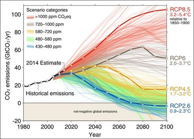
1200 scenarios of future CO2 emissions, projected to 2100
21 September 2014 (Science Daily) – Carbon dioxide emissions continue to track the high end of emission scenarios, eroding the chances to keep global warming below 2°C, and placing increased pressure on world leaders ahead of the United Nations Climate Summit on the 23rd September. Global carbon dioxide emissions from fossil fuel combustion and cement production grew 2.3 per cent to a record high of 36.1 billion tonnes CO2 in 2013. In 2014 emissions are set to increase a further 2.5%, 65 per cent above the level of 1990.
Global warming: Dwindling chances to stay below 2°C temperature increase —
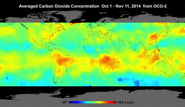
Averaged atmospheric carbon dioxide concentration, October 1 – November 11, 2014
18 December 2014 (BBC News) – NASA’s Orbiting Carbon Observatory (OCO-2) has returned its first global maps of the greenhouse gas CO2. The satellite was sent up in July to help pinpoint the key locations on the Earth’s surface where carbon dioxide is being emitted and absorbed. Clearly evident are the higher concentrations of CO2 over South America and southern Africa. These are likely the result of biomass burning in these regions [deforestation for agriculture –Des]. It is possible to see spikes, too, on the eastern seaboard of the US and over China. These probably include the additional emissions of CO2 that come from industrialisation.
NASA’s carbon dioxide satellite mission returns first global maps —
Growth in the world’s consumption of fossil fuels compared with growth in renewables, 1990-2013
10 October 2014 (Fractional Flow) – […] The race between fossil fuels and renewables: By putting the growth between fossil fuels and renewables into a perspective, it demonstrates how dependent our economies, our wealth and well beings are upon fossil fuels. Looking at the growth in total fossil fuels versus renewables consumption since 1990 we should now ask ourselves if we truly are prepared to wean ourselves completely of fossil fuels and transition into a life within an energy budget made up from only renewables (refer also figure 1). In 2013 an estimated 20% of the world’s total energy consumption came from biomass, hydroelectricity, solar, and wind. From 2012 to 2013 global fossil fuels consumption grew more than what total global consumption of solar and wind was in 2013 (this according to data from BP Statistical Review 2014).
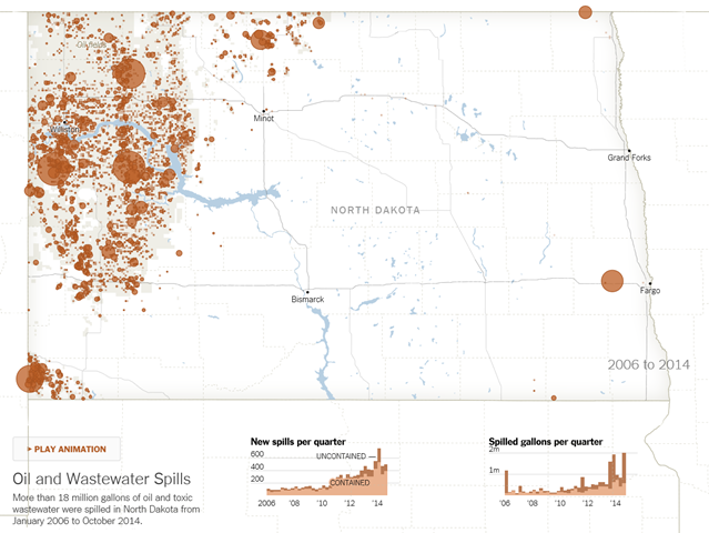
Oil and wastewater spills in North Dakota, 2006-2013
22 November 2014 (The New York Times) – In recent years, as the boom really exploded, the number of reported spills, leaks, fires and blowouts has soared, with an increase in spillage that outpaces the increase in oil production, an investigation by The New York Times found. Yet, even as the state has hired more oil field inspectors and imposed new regulations, forgiveness remains embedded in the Industrial Commission’s approach to an industry that has given North Dakota the fastest-growing economy and lowest jobless rate in the country. […] Over the past nine months, using previously undisclosed and unanalyzed records, bolstered by scores of interviews in North Dakota, The Times has pieced together a detailed accounting of the industry’s environmental record and the state’s approach to managing the “carbon rush.”
The downside of the oil boom in North Dakota —
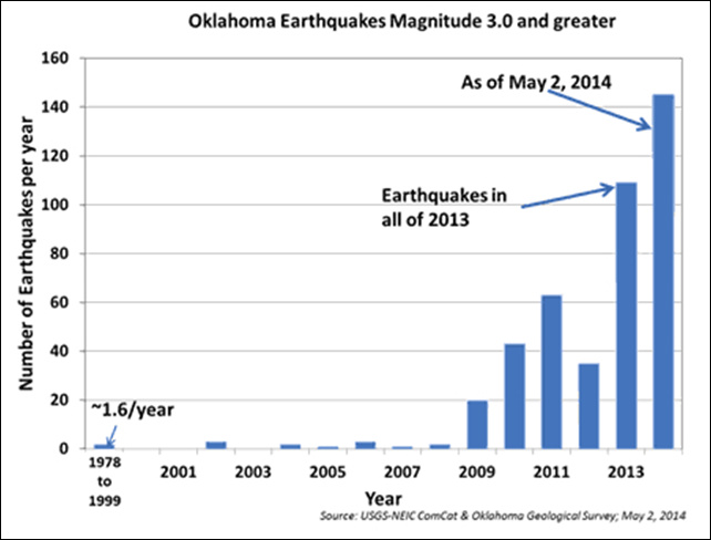
Oklahoma earthquakes of magnitude 3 or greater, 1978-2014
5 May 2014 (LiveScience) – Mile for mile, there are almost as many earthquakes rattling Oklahoma as California this year. This major increase in seismic shaking led to a rare earthquake warning today (May 5) from the U.S. Geological Survey and the Oklahoma Geological Survey. In a joint statement, the agencies said the risk of a damaging earthquake — one larger than magnitude 5.0 — has significantly increased in central Oklahoma. Geologists don’t know when or where the state’s next big earthquake will strike, nor will they put a number on the increased risk. “We haven’t seen this before in Oklahoma, so we had some concerns about putting a specific number on the chances of it,” Robert Williams, a research geophysicist with the USGS Earthquake Hazards Program in Golden, Colorado, told Live Science. “But we know from other cases around the world that if you have an increasing number of small earthquakes, the chances of a larger one will go up.”
Fracking causes rare earthquake warning for Oklahoma – ‘The rate of earthquakes increased dramatically in March and April’ Frack the USA: New map shows 1 million oil, gas wells —
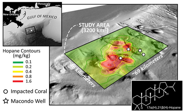
Distribution of hopane contamination from the BP Deepwater Horizon oil spill on the sea floor
24 November 2014 (mongabay.com) – Images from the 2010 Deepwater Horizon disaster endure, from the collapsing platform to oil-fouled coastline. But beneath the surface is a story photographers cannot as easily capture. Two days after the April 20, 2010 explosion that killed 11 and injured 16, the Deepwater Horizon oil rig sank. During the five months it took to seal the Macondo well 1,500 meters below the surface, nearly 5 million barrels of oil gushed into the ocean. In a paper published online on Oct. 27 in the Proceedings of the National Academy of Sciences (PNAS), researchers reported the first solid evidence that some of this oil settled on the seafloor. The team detected the chemical hopane from cores across an area of nearly 3,200 square kilometers. “Hopane is just one of the many compounds in oil from the Macondo well,” biologist Sarah Bagby, a member of Valentine’s team, told mongabay.com. Since it degrades slowly, it is a useful indicator of oil contamination, she added. “This is the first time [scientists] showed that liquid oil or its byproducts settled on the seafloor,” environmental engineer Scott Socolofsky of Texas A&M University, who was not a member of Valentine’s team, told mongabay.com.
Climate Change Concern Index by religious affiliation in North America
21 November 2014 (PRRI) – Americans rank climate change last on a list of important issues. Only five percent of Americans say climate change is the most important issue facing the U.S. today. The issue of climate change ranks behind the lack of jobs (22%), the increasing gap between rich and poor (18%), health care (17%), the budget deficit (13%), immigration reform (10%), and the rising cost of education (9%). White evangelical Protestants are more likely than any other religious group to be climate change Skeptics. Only 27% of white evangelical Protestants are climate change Believers, while 29% are Sympathizers and nearly 4-in-10 (39%) are Skeptics. When asked about these causes separately, Americans are more likely to say that recent natural disasters are the result of climate change (62%) than biblical “end times” (49%).
- The number of Americans who believe natural disasters are evidence of the apocalypse has increased since 2011, when only 44% agreed.
- White evangelical Protestants are much more likely to attribute the severity of recent natural disasters to the biblical “end times” (77%) than to climate change (49%).
Half of Americans think climate change is a sign of the Apocalypse, up from 44 percent in 2011 —
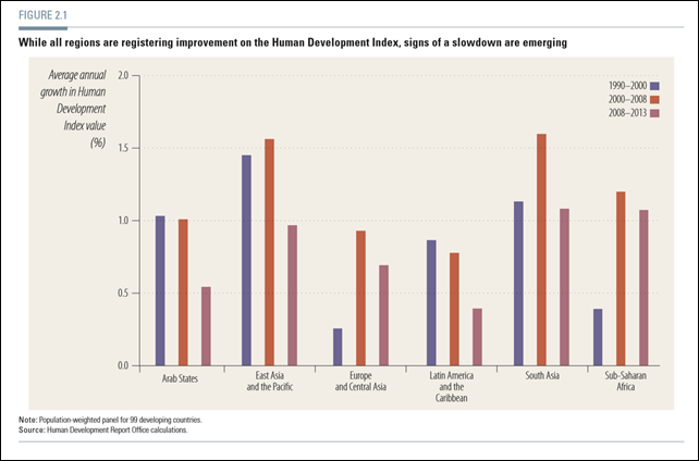
Average annual growth in Human Development Index (HDI) value, by region, 1990-2013
(UNDP) – Since 1990 the Human Development Index (HDI) has been an important measure of progress—a composite index of life expectancy, years of schooling and income. This year’s Report presents HDI values for 187 countries. The global HDI is now 0.702, and most developing countries are continuing to advance, though the pace of progress remains highly uneven. While all regions are registering improvement, signs of a slowdown are emerging—as measured by the growth rate of HDI values (figure 2.1). Although four of the six regions registered faster gains in 2000–2008 than in the 1990s, progress in all regions slowed in 2008–2013. This was particularly noticeable in the Arab States and in Latin America and the Caribbean—where average annual growth dropped by about half—as well as in Asia. The global financial and economic crisis appears to have had a widespread impact. The deceleration is evident in all three components of the HDI. Growth in gross national income (GNI) per capita has declined, particularly in the Arab States and in Europe and Central Asia. Growth rates of life expectancy at birth have recently declined in most regions—especially in Asia—though they increased in Sub-Saharan Africa. And since 2008 the growth of expected years of schooling has also declined.
Graph of the Day: Average annual growth in the Human Development Index, 1990-2013 —
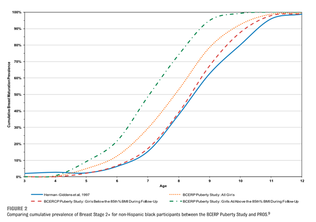
Early onset of puberty in U.S. girls
2 December 2014 (NPR) – Many girls are beginning puberty at an early age, developing breasts sooner than girls of previous generations. But the physical changes don’t mean the modern girls’ emotional and intellectual development is keeping pace. Julianna Deardorff and Louise Greenspan are co-investigators in a long-term study of puberty. They’ve been following 444 girls from the San Francisco Bay area since 2005, when the girls were 6 to 8 years old. The study is funded by the National Cancer Institute and the National Institute of Environmental Health Sciences. Julianna Deardorff: What I find concerning is that puberty is a process that’s very sensitive to the environment and we can move the timing of puberty, unintentionally, vis-a-vis environmental exposures. … Puberty in and of itself in starting early has a lot of disconcerting aspects … I wonder if this is kind of a canary in a coal mine, or a barometer for other things that we’re all being exposed to in our environments that may not be healthy for other reasons — we’re just not seeing those as obviously. […] They’re referred to as endocrine disrupting chemicals, or EDCs, or another term for that is “hormone mimickers.” That’s because in the body, they mimic hormones and, in this case, when we’re talking about girls’ early puberty, estrogen is the hormone that we’re most concerned about. [Greenspan and Deardorff also research how obesity affects the onset of puberty, e.g., “Onset of Breast Development in a Longitudinal Cohort”, 2013. –Des]
Capital mobility and world banking crises, 1800-2012
(UNDP) – Over the past few decades the world has suffered deeper and more frequent financial crises that have spread rapidly to other economic sectors, creating uncertainty, affecting livelihoods and threatening social stability. In the most recent crisis global unemployment increased by nearly 30 million between 2007 and 2009, while current unemployment estimates remain far above pre-crisis levels. Economic shocks can have long-term negative consequences, especially if they trigger a vicious cycle of low human development and conflict. Natural disasters and political shocks—such as droughts and coups d’état—usually have strong negative impacts on human development. But financial shocks—such as banking crises—are the most probable trigger of Human Development Index (HDI) downturns. The number of countries affected by banking crises appears to be higher in periods of high international capital mobility. Between 1950 and 1980, when capital controls were common, few countries had banking crises. But after capital flows were liberalized and financial markets further integrated, the incidence of banking crises soared (figure 2.9). The Nordic banking crisis in the early 1990s, the Asian financial crisis in 1997 and the recent global financial crisis exemplify this growing instability.
Graph of the Day: World banking crises, 1800-2012 —
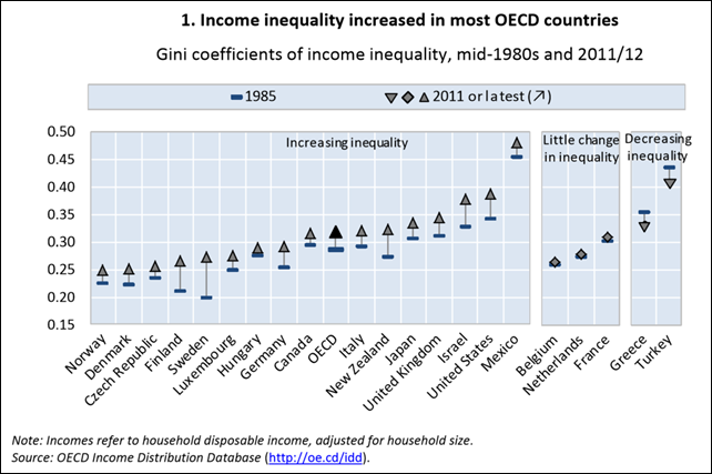
Gini coefficient of income inequality in OECD nations, 1985 and 2011/2012
9 December 2014 (OECD) – The gap between rich and poor is at its highest level in most OECD countries in 30 years. Today, the richest 10% of the population in the OECD area earn 9.5 times more than the poorest 10%. By contrast, in the 1980s the ratio stood at 7:1. The average incomes at the top of the distribution have seen particular gains. However, there have also been significant changes at the other end of the scale. In many countries, incomes of the bottom 10% of earners grew much more slowly during the prosperous years and fell during downturns, putting relative (and in some countries, absolute) income poverty on the radar of policy concerns.
Graph of the Day: Rise of income inequality in OECD nations —
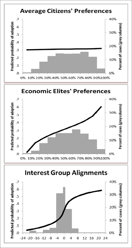
Predicted probability of policy adoption for average U.S. citizens and elite groups
16 April 2014 (PolicyMic) – A new scientific study from Princeton researchers Martin Gilens and Benjamin I. Page has finally put some science behind the recently popular argument that the United States isn’t a democracy any more. And they’ve found that in fact, America is basically an oligarchy. For their study, Gilens and Page compiled data from roughly 1,800 different policy initiatives in the years between 1981 and 2002. They then compared those policy changes with the expressed opinion of the United State public. Comparing the preferences of the average American at the 50th percentile of income to what those Americans at the 90th percentile preferred, as well as the opinions of major lobbying or business groups, the researchers found out that the government followed the directives set forth by the latter two much more often. It’s beyond alarming. As Gilens and Page write, “the preferences of the average American appear to have only a minuscule, near-zero, statistically non-significant impact upon public policy.” In other words, their statistics say your opinion literally does not matter.
Projections of human populations to 2100, per continent
20 September 2014 (Science Alert) – For over a decade, experts worldwide have assumed that population growth would level off by 2050, reaching approximately 9 billion. Now, new projections have turned that analysis on its head. The population analysis, published in Science this week, was conducted by demographer Patrick Gerland from the United Nations and sociologist and statistician Adrian Rafferty from the University of Washington in the US. The study made use of Bayesian probabilistic methodology to show that there is an 80 per cent probability that the world’s population, now 7.2 billion, would increase to between 9.6 and 12.3 billion by 2100. “Projections up to about 10 years ago projected world population to keep growing to about 9 billion in 2050, and then to level off or decline,” Raftery told New Scientist. “But our results suggest this levelling off is unlikely.”
New projection shows human population could reach 12 billion by 2100 —
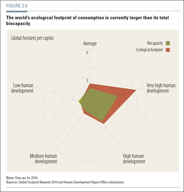
World ecological footprint of human consumption
(UNDP) – Environmental degradation and climate change threaten the long-term survival of humanity. The challenge of sustaining progress is thus about ensuring that present choices and capabilities do not compromise the choices and freedoms available to future generations. The 2011 and 2013 UN Human Development Reports (HDRs) argued that environmental disasters could not only slow human development but even throw it into reverse. Climate change could become the single biggest hindrance to the ambitions of the sustainable development goals and the post-2015 development agendas. Environmental threats highlight potential tradeoffs between the well-being of current and future generations. If current consumption surpasses the limits imposed by our planetary boundaries, the choices of future and current generations will be seriously compromised. Many countries, especially those in the high human development groups, now follow unsustainable development paths. Of 140 countries with data, 82 have ecological footprints above global carrying capacity. As a result, the world per capita footprint is substantially higher than the global sustainability threshold. Carbon dioxide emissions by 90 of 185 countries exceed the global threshold, and their emissions are large enough to push global per capita emissions above global sustainability. Fresh water withdrawals by 49 of 172 countries with data also exceed the global threshold. Overall, correlation is positive between higher HDI achievements and unsustainable ecological footprints and emissions, while water consumption is unsustainable across developing and developed countries. The world’s ecological footprint of consumption is currently larger than its total biocapacity, that is, the biosphere’s ability to meet human demand for material consumption and waste disposal (figure 2.8). The very high human development group, in particular, has a very large ecological deficit—as its ecological footprint is significantly larger than available biocapacity.
Graph of the Day: World ecological footprint of human consumption




![Growth in the world’s consumption of fossil fuels (oil [green], natural gas [red] and coal [dark grey] stacked versus the growth in renewables (solar [yellow] and wind [turquoise]), also stacked and all since 1990 to 2013. Graphic: Rune Likvern Growth in the world’s consumption of fossil fuels (oil [green], natural gas [red] and coal [dark grey] stacked versus the growth in renewables (solar [yellow] and wind [turquoise]), also stacked and all since 1990 to 2013. Graphic: Rune Likvern](http://lh6.ggpht.com/-gRl42nUNR64/VG9xLEAqkgI/AAAAAAAAaHI/pF-MXSv5wpc/image3%25255B1%25255D.png?imgmax=800)



Fantastic job Des! Very important and critical information. Which will be widely ignored and denied.
Not your fault. You’re doing a hell of a job here. The fault is in nearly everyone else. We inhabit a world of idiots, morons and selfish zombies who don’t care about anything other then themselves.
These charts are projections that depict the ongoing collapse of the entire biosphere. We know what happens shortly before or thereafter – total collapse of human ‘civilization’.
We cannot live on a desert planet with no other life. PricewaterhouseCoopers say’s 20 years to collapse – but I rather doubt that. The evidence is OVERWHELMING now that we won’t make it to 2020 before this happens.
An exponential increase in decline, destruction, extinctions, and climate is well underway. What took 40 years to “achieve” a 50% reduction in species (90%+ in other areas, such as ocean fisheries) will only take 5 years or thereabouts to wipe out the remaining rest.
All the year 2100 projections are therefore, totally meaningless imo. We absolutely will not make it (survive) that long.
Humans are insatiably greedy and as shown, they are virtually unstoppable. It quite ludicrous for anyone to believe that we are going to somehow “stop” our appetites and destruction on any meaningful level. There are far, far too many of us now.
The only “chart” that I can think of as missing in this list is the one called “Hopium – Humans Who Still Stupidly Believe That We Can Prevent Our Extinction”. The graph would show 99.99% of the global population still sucking on the tailpipe of ‘civilization’ as a ‘solution’ (to anything).
► 40% Green Energy requires 200% more copper says John Timmer of Ars Technica. Even performance improvements won't be enough in time.
► Peak copper hits 2030 – 2040 says Ugo Bardi.
► Post peak copper production cannot accelerate at any price says Dave Lowell.
► This is true of any post peak mineral production.
► There is no real substitute for copper says Mat McDermott of Motherboard.
► We mined 50% of all the copper in human history in just the last 30 years.
► 100% green energy requires 500% more copper.
► Peak minerals includes more than just copper.
► By 2050, expect to be past peaks for tin, silver, cadmium and more.
► We move some 3 billion tons of earth per year to get 15 millions tons of copper.
► We can’t afford to mine 500% more copper at ever lower concentrations.
► We cannot recycle it into existence.
► We cannot conserve it into existence.
► Substituting aluminum for copper takes 5X the energy and is less safe.
► Google’s own Stanford Phd, green energy experts, Ross Koningstein and David Fork, tell IEEE Spectrum why green energy “simply won’t work” and is a “false dream”.
► Ozzie Zehner explains his book, Green Illusions, at Google Talks in 2012.
https://www.youtube.com/watch?v=v6uVnyjTb58
THE VERY HAIRY SCARY
► Green Energy is our solution to Climate Change.
► But, Climate Change is only 1 of 6 Direct Drivers for Mass Extinction.
► The 6 Direct Drivers of Mass Extinction are:
… 1) Invasive Species
… 2) Over-Population
… 3) Over-Exploitation
… 4) Habitat Loss
….5) Climate Change
….6) Pollution
► Therefore,… GREEN ENERGY WILL NOT STOP MASS EXTINCTION
http://www.cultureunplugged.com/documentary/watch-online/play/7350/Call-of-Life–Facing-the-Mass-Extinction
–
MASS EXTINCTION 101
► 10,000 years ago, humans and livestock occupied 0.01% of earth's vertebrate biomass.
► humans and livestock now occupy 97% of earth's vertebrate biomass.
► 1,000,000 humans, net, are added to earth every 4½ days.
► 50% of vertebrate species died off in the last 50 years.
► 50% of remaining vertebrate species will die off in the next 40 years.
► +50% = Unstoppable Irreversible Catastrophic Cascading Extinctions Collapse.
► 75% Species Loss = Mass Extinction.
► Ocean acidification doubles by 2050, triples by 2100.
► World Bank says we have 5-10 years before we all fight for food and water.
► 97% of Tigers gone since 1914.
► 90% of Lions gone since 1993.
► 90% of Sea Turtles gone since 1980.
► 90% of Monarch Butterflies gone since 1995.
► 90% of Big Ocean Fish gone since 1950.
► 80% of Western Gorillas gone since 1955.
► 75% of River & Riverbank Species gone since 1970.
.. ► 75,000 dams block U.S. rivers built over 75 years.
► 60% of Forest Elephants gone since 1970.
► 50% of Great Barrier Reef gone since 1985.
► 50% of Human Sperm Counts gone since 1950.
► 50% of Fresh Water Fish gone since 1987.
► 40% of Giraffes gone since 2000.
► 30% of Marine Birds gone since 1995.
► 28% of Land Animals gone since 1970.
► 28% of All Marine Animals gone since 1970.
► 93 Elephants killed every single day.
► 2-3 Rhinos killed every single day.
► Bees die from malnutrition lacking bio-diverse pollen sources.
► Malnutrition weakens bee colonies for disease and poisoning.