Graph of the Day: Covid-19 daily deaths in Sweden, compared with neighboring countries
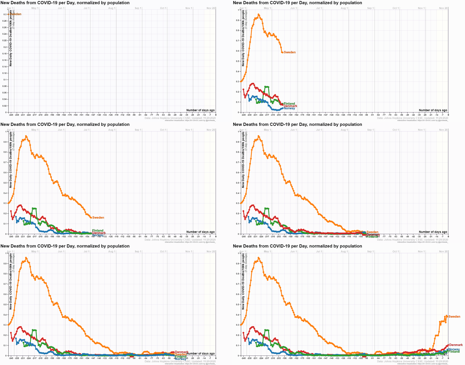
29 November 2020 (Desdemona Despair) – Much has been made of Sweden’s tacit “herd immunity” policy, and people have argued both for and against its effectiveness. Now the data are in, and we can safely make a judgment about it, and the similar policies used in various other countries, like the UK, the US, and Brazil. To nobody’s surprise, the outcome has been catastrophic.
The graph above shows new deaths from COVID-19 per day, normalized by population, for Sweden, Norway, Finland, and Denmark. Data are from Johns Hopkins University CSSE. Early in the pandemic, Sweden’s policy response was hugely more lethal than the much more strict policies of its neighbors.
The daily-cases data show that the situation is dire as Sweden approaches winter. Covid-19 deaths lag diagnoses by around two weeks, so we can expect a spike in mortality there before Christmas.
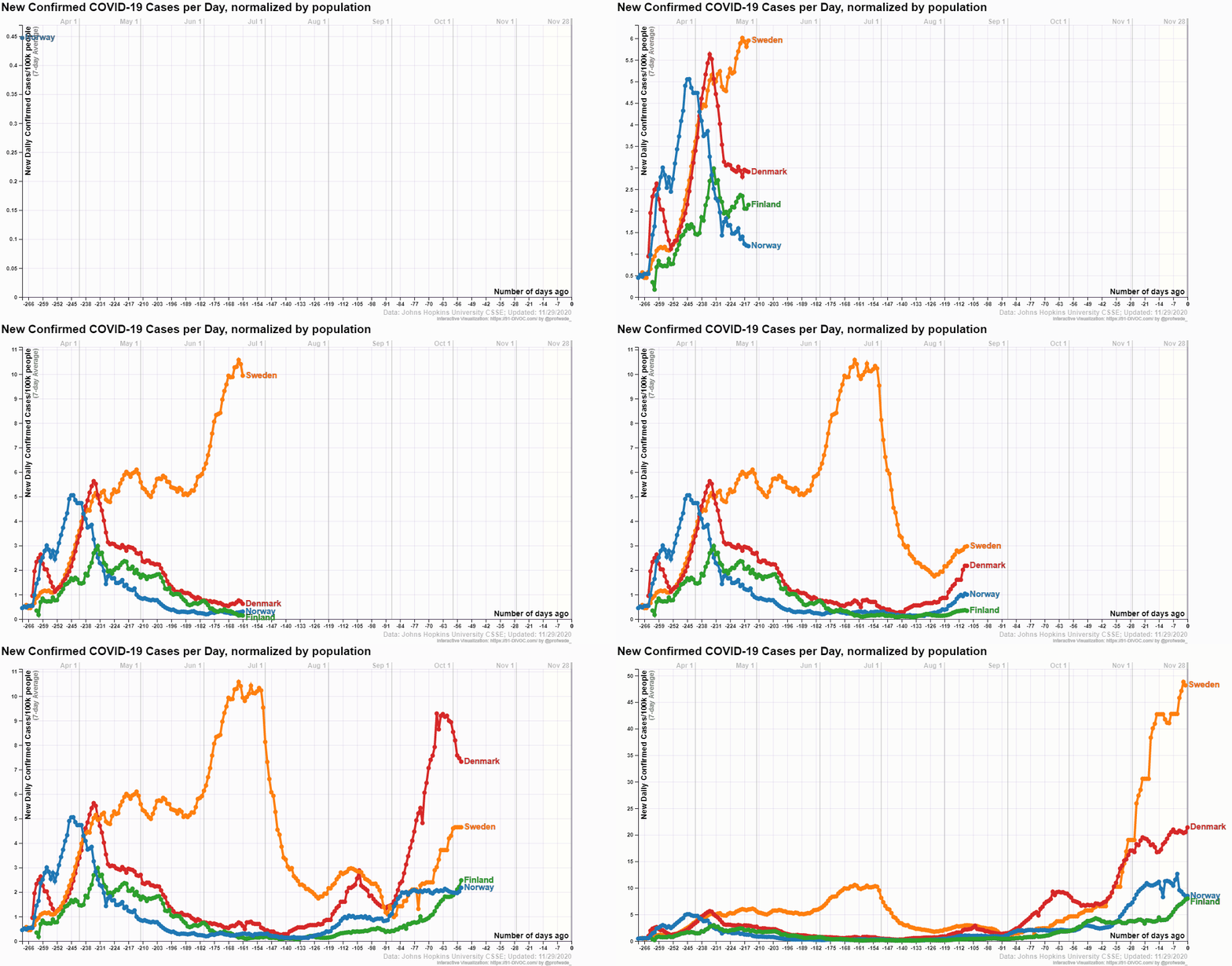
The exponential rise in deaths over the last couple of weeks has prompted the government of Sweden to abandon its disastrous policy for the second Covid-19 wave, so we may hope that the mortality rate there will resemble its neighbors more closely. But the fact remains that in this deplorable “experiment”, many more people died in Sweden than would have under the sensible policies of neighboring countries.
