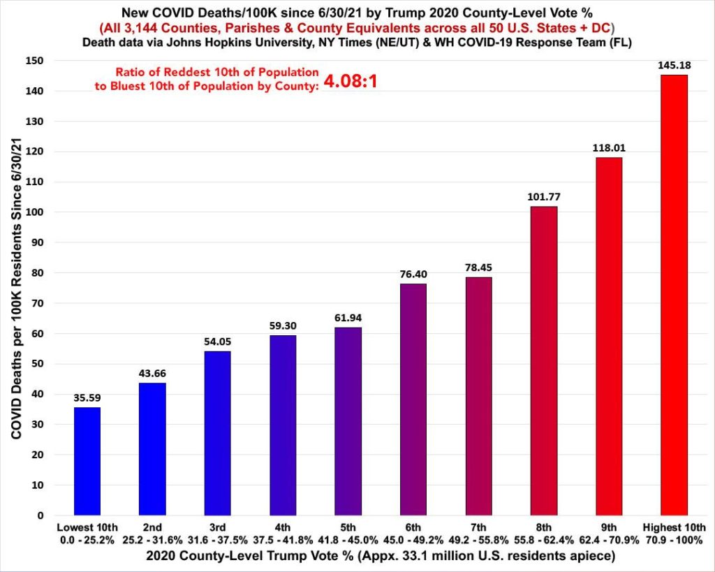
Graph of the Day: New COVID-19 death rates in the U.S. by Trump county-level vote – Death rates are 4.1x higher in reddest decile vs. bluest – “Get vaccinated, for the love of God”
By Charles Gaba
23 January 2022
(ACA Signups) – So, I plugged in the latest COVID case and death rates at the county level, as I do every week. I recently decided to switch from using the beginning of the Delta wave as my starting point (30 June 2021) to using the “start” of the Omicron wave (around 15 December 2021 as far as I can figure) instead.
Last night, however (yes, I know I’m a nerd doing this on a Saturday evening), I decided to see what it looks like if I use June 30th as my starting point again, and this generated a pretty remarkable contrast which goes to show two things: First, just how insanely contagious the new Omicron COVID variant is; and second, how extremely effective the COVID vaccines are (especially with the 3rd/booster dose added to the mix). […]
[The following graph shows] case rates across all 50 states +DC, broken out into 10 roughly equal populations by 2-dose vaccination rate (booster data wasn’t available as of this writing):
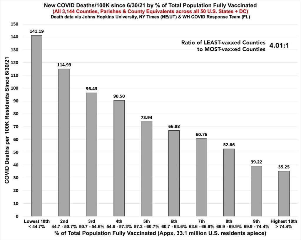
Even with nearly the exact same case rates across all 10 deciles of the U.S. population, the death rate since June is still a whopping four times higher in the least-vaccinated tenth than the most vaccinated tenth.
This is a hell of a testament to how effective the vaccines are at preventing death from Omicron, even if they aren’t so great at preventing actual infection. […]
[The main graph shows] what the death rates since June 30th look like when broken out by 2020 partisan lean as of January 23rd. Both case-rate and death-rate graphs are almost identical to their vaccination rate-based counterparts, except that case rates are still slightly higher in the reddest decile than the bluest, while death rates are still 4.1x higher in the reddest decile than the bluest. [more]
In Which A Twitter Troll Asks A Stupid Question But I Decide To Humor Them Anyway.
