50 doomiest graphs of 2013
2013 began with record heat waves in Australia, and the year ended there with more record heat waves. Australia is the bellwether of abrupt climate change: what happens there will happen soon to the rest of the world. So it’s no surprise that this year’s graphs have a lot of data on Australia and global warming generally. 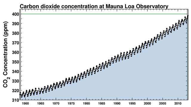 Carbon dioxide (CO2) concentration at Mauna Loa Observatory, 1958-2013 That doesn’t mean the rest of the world was spared; warming hit both hemispheres ferociously, most spectacularly in the Arctic, where Siberia and Alaska experienced record-breaking bikini weather, and in the Philippines, where two giant typhoons leveled towns and displaced 6 million people. When Typhoon Haiyan struck the Philippines in November, it was the most powerful tropical storm to make landfall in recorded history. Elsewhere, humans continued to dismantle the biosphere in numerous ways: razing forests, strip-mining the oceans of biomass, and dumping hundreds of millions of tons of fertilizing elements like phosphorus and nitrogen into the environment. In spite of many well-meaning efforts and a swelling flood of environmental data, nothing seems to deflect these trends. Check out Desdemona’s doomiest posts of previous years:
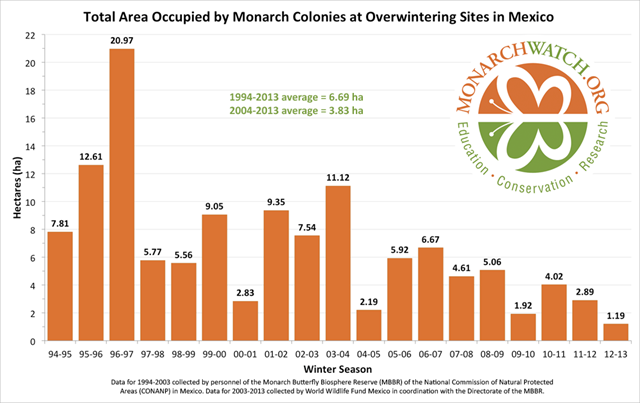
14 March 2013 (Monarch Watch) – The World Wildlife Fund-Mexico / Telcel Alliance, in collaboration with Mexico’s National Commission of Natural Protected Areas (CONANP), held a press conference late on the 13th of March 2013 to announce the results of the status of the monarch populations that overwinter in the oyamel forests of Mexico. Measures of the areas occupied by each of the nine monarch colonies in the states of Michoacan and Mexico totaled 1.19 hectares. This number represents a decline of almost 59% from the area occupied the previous winter. Further, this population is the smallest recorded since the monarch colonies came to the attention of scientists in 1975. A visual inspection of Figure 1 reveals a clear downward trend in the population.
Graph of the Day: Total area occupied by Monarch butterfly colonies at overwintering sites in Mexico, 1994-2013 — Grassland butterfly decline in Europe and the EU, 1990-2011 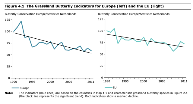
22 July 2013 (EEA) – Figure 4.1 shows the European Grassland Butterfly Indicator, as well as the indicator for the Member States of the EU alone. The indicator is based on the supranational species trends as presented in Chapter 3. As in previous versions, both indicators showed a marked decline between 1990 and 2011. Compared to 1990, the European populations of the 17 indicator species have declined by, on average, almost 50%. The decline seems to have slowed a little in the last few years. The negative trend in the EU Member States alone is a little less than in Europe as a whole, with a decline of almost 30% over the period. When interpreting these graphs it should be remembered that a large decline of butterflies in north‑western Europe (countries all already in the EU for a long time) happened before 1990.
Graph of the Day: Decline of butterfly populations in Europe and EU, 1990-2011 — UK Farmland Bird Indicator, 1970-2011 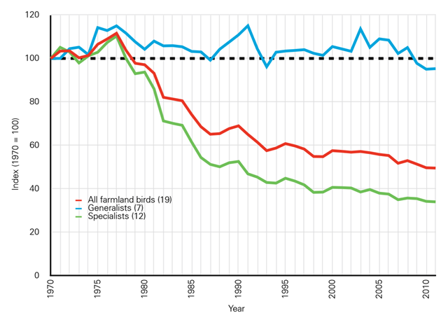
22 May 2013 (RSPB) – Trends in farmland birds, together with those of widespread bats and butterflies, are used as indicators of the state of biodiversity. Farmland bird populations declined rapidly during the 1970s and 1980s, and by 2000 their numbers were just half what they were in 1970. There has been no subsequent recovery, and some species, such as the turtle dove, have continued to decline rapidly. The only bat monitored over the same period was the pipistrelle, which showed an even steeper decline. Data are from the RSPB, BTO, JNCC, and Defra. The numbers in brackets refer to the number of species in each group. Specialist species have decline by over 60% in 40 years.
Graph of the Day: UK Farmland Bird Indicator, 1970-2011 — Decline of U.K. wildlife, 1968-2010 
22 May 2013 (RSPB) – The Watchlist Indicator shows the average population trend for 77 moths, 19 butterflies, 8 mammals and 51 birds listed as UK BAP priorities, 1968-2010. Species are weighted equally. The indicator starts at 100; a rise to 200 would show that, on average, the populations of indicator species have doubled, whereas if it dropped to 50 they would have halved. Dotted lines show the 95% confidence limits. Since 1970, the indicator has dropped by 77%, representing a massive decline in the abundance of priority species. There was a steep decline in the early years of the indicator, but this is to be expected because it was these declines that led many species to be included in priority lists in the first place. What is important is whether the decline has stopped in response to conservation action: worryingly, it has not. The indicator declined by 18% between 2000 and 2010, suggesting ongoing declines in priority species. It may now be stabilising, but more years of data are needed to confirm this.
Graph of the Day: Decline of U.K. wildlife, 1968-2010 — Biomass decline of nine whale species, 1800-2008 
(UBC) – IWC time series of biomass of the nine great whale species with greatest abundance under the management of IWC. Line denotes establishment of IWC (1946). Data: from L. Christensen, unpublished data, University of British Columbia, 2008.
Graph of the Day: Biomass decline of nine whale species, 1800-2008 — Atlantic salmon biomass decline, 1960s-2009 
(UBC) – Atlantic salmon under NASCO management. a-c) Time series of the biomass of the three stocks of Atlantic salmon; line denotes establishment of NASCO (1983). d) Current state of the North American Atlantic salmon stocks. Data from ICES (2009) and NASCO (2008). Graphic: Sarika Cullis-Suzuki
Graph of the Day: Atlantic salmon biomass decline, 1960s-2009 — Biomass of tuna species under management of ICCAT 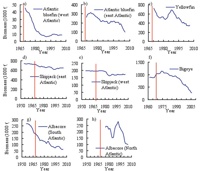
ICCAT time series of the biomass of tuna species under management of ICCAT. Line denotes establishment of ICCAT (1969). Species assessed comprise the “major tuna” that ICCAT manages. Data: a) from ICCAT (2008a), b) ICCAT (2008b), c-e) ICCAT (2008c), f) ICCAT (2008d), g-h) ICCAT (2008e).
Graph of the Day: Biomass decline of tuna species, 1960s-2008 — Global shark landings, 1950-2010 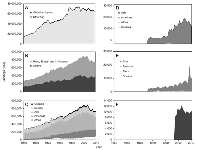
July 2013 (Marine Policy) – The global catch and mortality of sharks from reported and unreported landings, discards, and shark finning are being estimated at 1.44 million metric tons for the year 2000, and at only slightly less in 2010 (1.41 million tons). Based on an analysis of average shark weights, this translates into a total annual mortality estimate of about 100 million sharks in 2000, and about 97 million sharks in 2010, with a total range of possible values between 63 and 273 million sharks per year. Estimates of the average exploitation rate range between 6.4% and 7.9% of sharks killed per year. This exceeds the average rebound rate for many shark populations, estimated from the life history information on 62 shark species (rebound rates averaged 4.9% per year), and explains the ongoing declines in most populations for which data exist.
Graph of the Day: Global shark landing trends, 1950-2010 — Global per capita capture fish production, 2000-2010 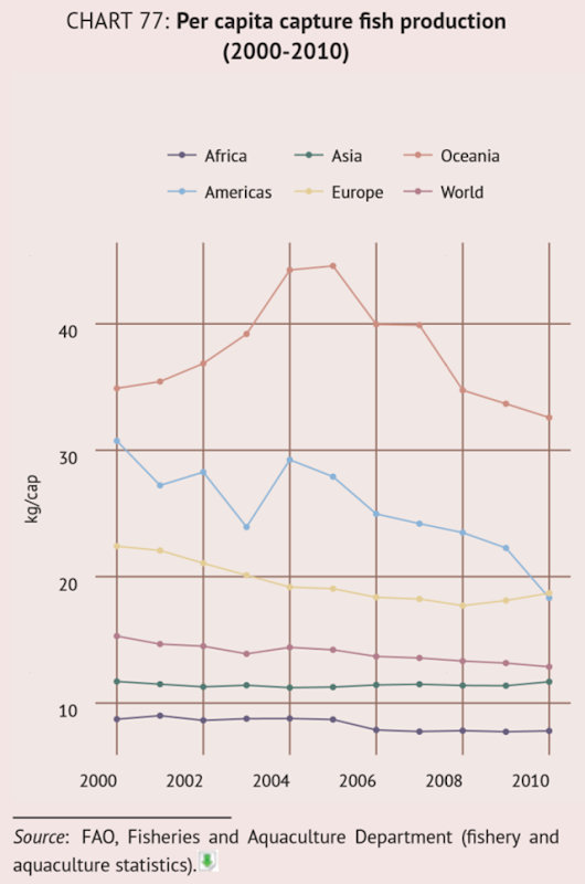
(FAO) – In 2010, capture fisheries and aquaculture supplied the world with 148 million tonnes of fish, crustaceans and molluscs. Of this, 128 million tonnes was used as human food, providing an estimated per capita food supply of about 19 kg (live weight equivalent). Globally, fish provides about 17 percent of the population’s average per capita intake of animal protein. Most of the fish landed and not used for direct human consumption is processed into fishmeal and oil for use as animal feed, mainly for carnivorous aquatic species (such as shrimp, salmon, trout, eels, sea bass and sea bream), but also for pigs, chickens, household pets, cattle, etc. Worldwide, capture fisheries and aquaculture provide a source of income and livelihood for 55 million people through direct employment; overall there are more than 220 million jobs in the global fish industry.
Graph of the Day: Global per capita capture fish production, 2000-2010 — Legal and illegal logging in the Brazilian state of Pará, 2010-2012 
23 October 2013 (mongabay.com) – Illegal logging remains pervasive in the Brazilian state of Pará, finds an assessment released by Imazon. Analyzing satellite data and records from Pará’s environmental agency Sema, the Brazil-based NGO found that 78 percent of logging documented via satellite between August 2011 and July 2012 was illegal. Some 122,337 hectares of rainforest was logged during the period, a 151 percent rise over a year earlier, when 48,802 ha were illegally harvested. Illegal logging far outpaced legal logging in the state: the area illegally cut was three-and-a-half times larger than the 34,902 ha where sanctioned logging took place.
Illegal logging remains rampant in Brazil — Ecuador’s Yasuní National Park and land leased for oil development 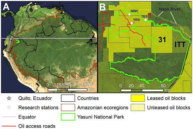
3 October 2013 (mongabay.com) – Over 100 scientists have issued a statement to the Ecuadorian Congress warning that proposed oil development and accompanying roads in Yasuní National Park will degrade its “extraordinary biodiversity.” The statement by a group dubbed the Scientists Concerned for Yasuní outlines in detail how the park is not only likely the most biodiverse ecosystems in the western hemisphere, but in the entire world. Despite this, the Ecuadorian government has recently given the go-ahead to plans to drill for oil in Yasuni’s Ishpingo-Tambococha-Tiputini (ITT) blocs, one of most remote areas in the Amazon rainforest.
More than 100 scientists warn Ecuador Congress against oil development in Yasuní National Park – ‘They are not nibbling around the edges of the park anymore, but going deep into the core’ — Trends in forest canopy green cover over the eastern United States, 2000-2010 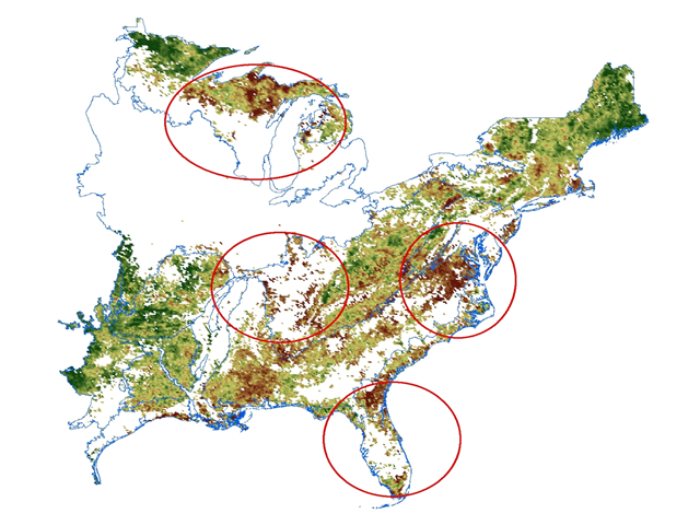
25 February 2013 (NASA) – NASA scientists report that warmer temperatures and changes in precipitation locally and regionally have altered the growth of large forest areas in the eastern United States over the past 10 years. Using NASA’s Terra satellite, scientists examined the relationship between natural plant growth trends, as monitored by NASA satellite images, and variations in climate over the eastern United States from 2000 to 2010. Monthly satellite images from the MODerate resolution Imaging Spectroradiometer (MODIS) Enhanced Vegetation Index (EVI) showed declining density of the green forest cover during summer in four sub-regions, the Upper Great Lakes, southern Appalachian, mid-Atlantic, and southeastern Coastal Plain. More than 20 percent of the non-agricultural area in the four sub-regions that showed decline during the growing season, were covered by forests. Nearly 40 percent of the forested area within the mid-Atlantic sub-region alone showed a significant decline in forest canopy cover.
Graph of the Day: Trends in forest canopy green cover over the eastern United States, 2000-2010 — Forest fires near Yakutsk, Russia, 2000-2012 
14 November 2013 (Washington Post) – From a new study in the journal Science: the first effort to quantify in detail how forests are changing and disappearing over the past decade. The research team, led by the University of Maryland, used Landsat satellite images and Google’s Earth Engine to assemble detailed new maps.
Graph of the Day: Forest fires near Yakutsk, Russia, 2000-2012 — Alaska temperature anomaly with respect to a normal forecast for 21 June 2013 
19 June 2013 (wunderground.com) – Alaska is a land of extremes, but the weather of the past month has been truly exceptional. An intense ridge of high pressure, part of an extreme jet stream pattern that has become “stuck” in place for many days, is creating the state’s hottest heat wave in 44 years this week. Numerous cities in Alaska have recorded their all-time hottest temperatures on record, and according to wunderground’s weather historian, Christopher C. Burt, the unofficial 98° measured at Bentalit Lodge on Monday, June 17, ties the record for the hottest reliably measured temperature in state history.
Alaska continues to fry, as wildfires flare up — November 2013 global land and ocean temperature anomalies  with a global temperature above the 20th century average. The last below-average November global temperature was November 1976 and the last below-average global temperature for any month was February 1985. Graphic: NOAA")
17 December 2013 (NCDC) – According to NOAA scientists, the globally averaged temperature over land and ocean surfaces for November 2013 was the highest for November since record keeping began in 1880. It also marked the 37th consecutive November and 345th consecutive month (more than 28 years) with a global temperature above the 20th century average. The last below-average November global temperature was November 1976 and the last below-average global temperature for any month was February 1985.
Graph of the Day: November 2013 global land and ocean temperature anomalies — The Angry Summer: In 90 days, 123 weather records were broken throughout Australia 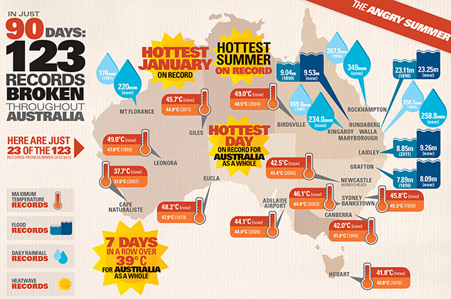
SYDNEY, Australia, 4 March 2013 (The New York Times) – Climate change was a major driving force behind a string of extreme weather events that alternately scorched and soaked large sections of Australia in recent months, according to a report [pdf] issued Monday by the government’s Climate Commission. A four-month heat wave during the Australian summer culminated in January in bush fires that tore through the eastern and southeastern coasts of the country, where most Australians live. Those record-setting temperatures were followed by torrential rains and flooding in the more densely populated states of New South Wales and Queensland that left at least six people dead and caused roughly $2.43 billion in damage along the eastern seaboard.
The Angry Summer: Government report blames climate change for weather extremes in Australia — Australia Bureau of Meteorology forecast for 14 January 2013 
9 January 2013 (Sydney Morning Herald) – Australia’s “dome of heat” has become so intense that the temperatures are rising off the charts – literally. The Bureau of Meteorology’s interactive weather forecasting chart has added new colours – deep purple and pink – to extend its previous temperature range that had been capped at 50 degrees.
Temperatures off the charts in Australia – Bureau of Meteorology adds new colors to represent record temperatures above 50°C (122°F) — Record rainfall deficiencies over South Australia, April 2012 – January 2013 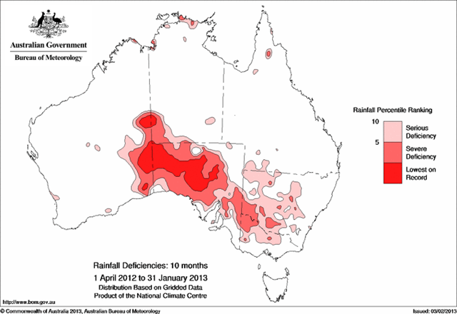
5 February 2013 (National Climate Centre) – Severe rainfall deficiencies for the 6 month (August 2012 to January 2013) period have expanded in central Australia and in large parts of the inland southeast of Australia following below average January rainfall. Severe deficiencies now cover most of South Australia (where August to January rainfall was the lowest on record), large areas of western New South Wales and Victoria, and the southwest corner of the Northern Territory.
Graph of the Day: Australia rainfall deficiencies, 1 April 2012 – 31 January 2013 — Hourly temperature in Sydney, Australia, 18 January 2013 
19 January 2013 (SMH) – Sydney endured its hottest ever day on Friday, with records smashed across the city and thousands of people suffering from the heat. The mercury topped 45.8 at Sydney’s Observatory Hill at 2.55pm, breaking the previous record set in 1939 by half a degree. The city’s highest temperature was a scorching 46.5 degrees, recorded in Penrith at 2.15pm, while Camden, Richmond and Sydney Airport all reached 46.4 degrees.
Sydney endures hottest day ever recorded – Emergency services council warns government of worse to come — Highest-recorded temperatures in Mainland China, July 2013 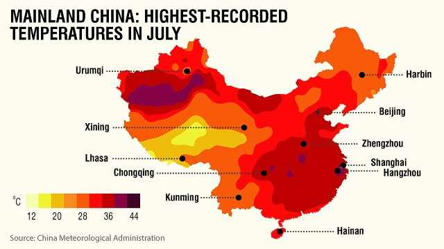
Hong Kong, 1 August 2013 (CNN) – Record-breaking temperatures have been searing large swaths of China, resulting in dozens of heat-related deaths and prompting authorities to issue a national alert. People are packing into swimming pools or taking refuge in caves in their attempts to escape the fierce temperatures. Local governments are resorting to cloud-seeding technology to try to bring rain to millions of acres of parched farmland. The worst of the smoldering heat wave has been concentrated in the south and east of the country, with the commercial metropolis of Shanghai experiencing its hottest July in at least 140 years, according to state media.
Heat wave kills people, crops, fish, and hopes in China — Summertime maximum and minimum temperatures in each of California’s six climate regions, 1950-2010 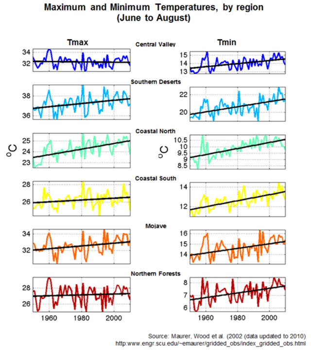
8 August 2013 (CalEPA) – Summertime (June-August) maximum (Tmax) and minimum (Tmin) temperatures have increased between 1950 and 2010 for each of the six climate regions. The map of California climate regions is based on a space-time analysis of temperature extremes (see Richman and Lamb, 1985; Comrie and Glenn, 1998; Guirguis and Avissar, 2008 for methodology). Tmax reflects the hottest daytime temperatures, while Tmin reflects the coolest nighttime temperatures.
Graph of the Day: Maximum and minimum temperatures in California, by region, 1950-2010 — Temperature reconstruction of global temperatures throughout the Holocene epoch 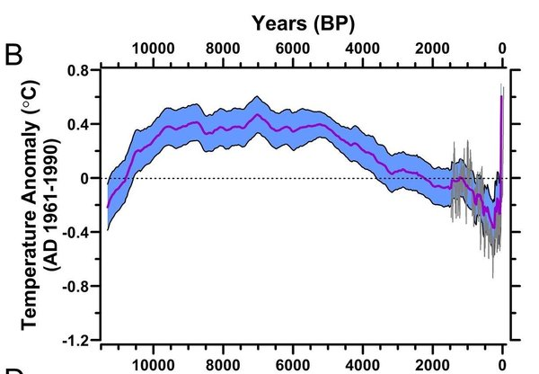
WASHINGTON, 8 March 2013 (AP) – A new study looking at 11,000 years of climate temperatures shows the world in the middle of a dramatic U-turn, lurching from near-record cooling to a heat spike. Research released Thursday in the journal Science uses fossils of tiny marine organisms to reconstruct global temperatures back to the end of the last ice age. It shows how the globe for several thousands of years was cooling until an unprecedented reversal in the 20th century. Scientists say it is further evidence that modern-day global warming isn’t natural, but the result of rising carbon dioxide emissions that have rapidly grown since the Industrial Revolution began roughly 250 years ago.
Recent global heat spike unlike anything in 11,000 years – ‘We’ve never seen something this rapid. Even in the ice age the global temperature never changed this quickly.’ — Global average temperature since the last ice age (20,000 BC) to the not-too distant future (2100) under a middle-of-the-road CO2 emission scenario 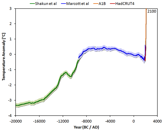
19 March 2013 (Our Changing Climate) – The big picture (or as some call it: the Wheelchair): Global average temperature since the last ice age (20,000 BC) up to the not-too distant future (2100) under a middle-of-the-road emission scenario. Earlier this month an article was published in Science about a temperature reconstruction regarding the past 11,000 years. The lead author is Shaun Marcott from Oregon State University and the second author Jeremy Shakun, who may be familiar from the interesting study that was published last year on the relationship between CO2 and temperature during the last deglaciation. The temperature reconstruction of Marcott is the first one that covers the entire period of the Holocene. Naturally this reconstruction is not perfect, and some details will probably change in the future. A normal part of the scientific process.
Graph of the Day: Global average surface temperature, 20,000 BC-present, with projection to 2100 — Climate departure years for cities around the world 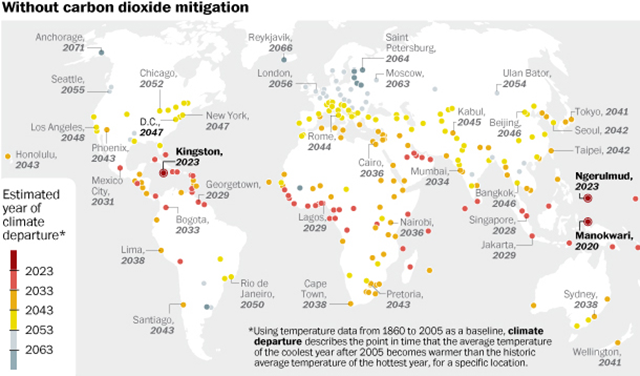
9 October 2013 (Washington Post) – Climate scientists sometimes talk about something called “climate departure” as a way of measuring when climate change has really changed things. It’s the moment when average temperatures, either in a specific location or worldwide, become so impacted by climate change that the old climate is left behind. It’s a sort of tipping point. And a lot of cities are scheduled to hit one very soon. A city hits “climate departure” when the average temperature of its coolest year from then on is projected to be warmer than the average temperature of its hottest year between 1960 and 2005. For example, let’s say the climate departure point for D.C. is 2047 (which it is). After 2047, even D.C.’s coldest year will still be hotter than any year from before 2005. Put another way, every single year after 2047 will be hotter than D.C.’s hottest year on record from 1860 to 2005. It’s the moment when the old “normal” is really gone.
Map: These are the cities that climate change will hit first – ‘The boundary of passing from the climate of the past to the climate of the future happens surprisingly soon’ — Projected global average surface temperatures over the lifetime of a person born in 1965 and beyond, to the year 2200 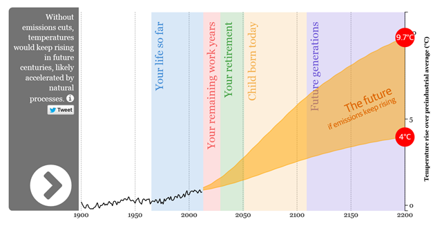
27 September 2013 (theguardian.com) – The UN is to publish the most exhaustive examination of climate change science to date, predicting dangerous temperature rises. How hot will it get in your lifetime? Find out with our interactive guide, which shows projections based on the report.
Climate change: How hot will it get in my lifetime? — Global surface temperature, 1979-2012, corrected for missing Arctic data  are shown in the graph compared to the uncorrected ones (thin lines). The temperatures of the last three years have become a little warmer, the year 1998 a little cooler. Graphic: Cowtan and Way, 2013")
13 November 2013 (RealClimate) – A new study by British and Canadian researchers shows that the global temperature rise of the past 15 years has been greatly underestimated. The reason is the data gaps in the weather station network, especially in the Arctic. If you fill these data gaps using satellite measurements, the warming trend is more than doubled in the widely used HadCRUT4 data, and the much-discussed “warming pause” has virtually disappeared.
Global warming since 1997 underestimated by half — September Arctic sea ice extent based on 89 ensemble members from 36 CMIP5 models under the RCP8.5 (high) emissions scenario 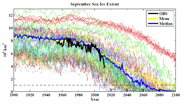
21 May 2013 (GRL) – The observed rapid loss of thick, multi-year sea ice over the last seven years and September 2012 Arctic sea ice extent reduction of 49% relative to the 1979-2000 climatology are inconsistent with projections of a nearly sea ice free summer Arctic from model estimates of 2070 and beyond made just a few years ago.
Graph of the Day: Observed and modeled September Arctic sea ice extent, 1900-2100 — Antarctic ice melt relative to 600-year mean 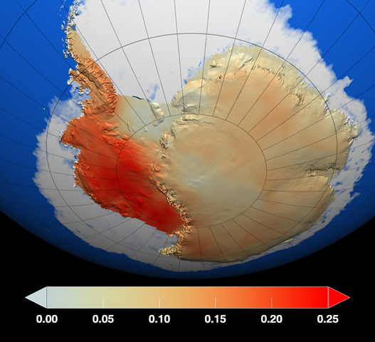
CANBERRA, 15 April 2013 (Reuters) – The summer ice melt in parts of Antarctica is at its highest level in 1,000 years, Australian and British researchers reported on Monday, adding new evidence of the impact of global warming on sensitive Antarctic glaciers and ice shelves. Researchers from the Australian National University and the British Antarctic Survey found data taken from an ice core also shows the summer ice melt has been 10 times more intense over the past 50 years compared with 600 years ago.
Scientists find Antarctic ice is melting faster – Summer ice melt has been 10 times more intense over the past 50 years compared with 600 years ago — Computer simulations showing open-water vessels crossing the Northwest Passage and North Sea Route in the summer by 2050 without icebreakers 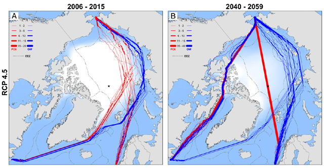
OSLO, 12 March 2013 (Reuters) – A Chinese shipping firm is planning the country’s first commercial voyage through a shortcut across the Arctic Ocean to the United States and Europe in 2013, a leading Chinese scientist said on Tuesday.
China plans first commercial trip through Arctic shortcut in 2013 — Observed areas of methane hotspots from submarine permafrost on the East Siberian Arctic Shelf 
FAIRBANKS, Alaska, 29 November 2013 (Fairbanks Daily News-Miner) – Ounce for ounce, methane has an effect on global warming more than 30 times more potent than carbon dioxide, and it’s leaking from the Arctic Ocean at an alarming rate, according to new research by scientists at the University of Alaska Fairbanks. Their article, which appeared Sunday in the peer-reviewed journal Nature Geoscience, states that the Arctic Ocean is releasing methane at a rate more than twice what scientific models had previously anticipated. Natalia Shakhova and Igor Semiletov at the university’s International Arctic Research Center have spent more than a decade researching the Arctic’s greenhouse-gas emissions, along with scientists from Russia, Europe and the Lower 48. Shakhova, the lead author of the most recent report, said the methane release rate likely is even greater than their paper describes. “We decided to be as conservative as possible,” Shakhova said. “We’re actually talking the top of the iceberg.”
Arctic Ocean leaking methane at alarming rate –‘What we’re observing right now is much faster than what we anticipated and much faster than what was modeled’ — Sacramento River runoff, 1906-2011 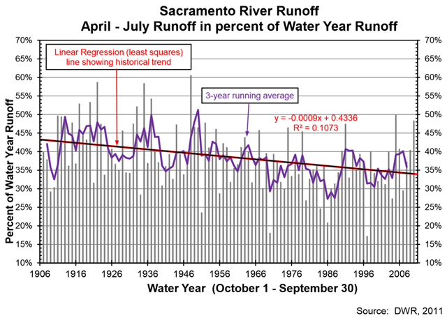
8 August 2013 (CalEPA) – Since 1906, the fraction of annual unimpaired runoff into the Sacramento River that occurs from April through July (represented as a percentage of total water year runoff) from the accumulated winter precipitation in the Sierra Nevada, has decreased by about 9 percent.
Graph of the Day: Sacramento River runoff, 1906-2011 — Decrease in water levels of the High Plains Aquifer, from predevelopment to 2011 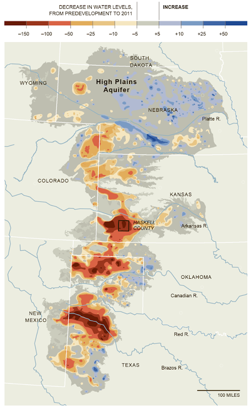
19 May 2013 (The New York Times) – Portions of the High Plains Aquifer are rapidly being depleted by farmers who are pumping too much water to irrigate their crops, particularly in the southern half in Kansas, Oklahoma and Texas. Levels have declined up to 242 feet in some areas, from predevelopment — before substantial groundwater irrigation began — to 2011.
Graph of the Day: Decrease in High Plains Aquifer water levels, predevelopment to 2011 — Map of the United States (excluding Alaska) showing cumulative groundwater depletion in 40 assessed aquifer systems or subareas, 1900-2008 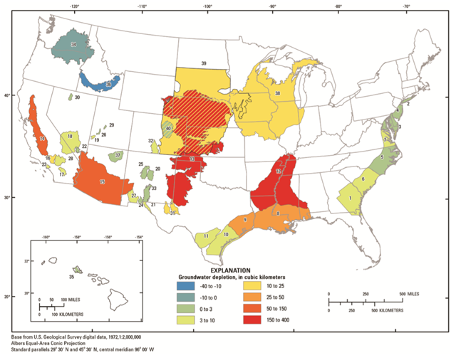
(USGS) – Estimated groundwater depletion in the United States during 1900–2008 totals approximately 1,000 cubic kilometers (km3). Furthermore, the rate of groundwater depletion has increased markedly since about 1950, with maximum rates occurring during the most recent period (2000–2008) when the depletion rate averaged almost 25 km3 per year (compared to 9.2 km3 per year averaged over the 1900–2008 timeframe).
Graph of the Day: Cumulative U.S. groundwater depletion, 1900-2008 — Slow recovery of Amazon rainforest from 2005 megadrought 
17 January 2013 (Jet Propulsion Laboratory) – An area of the Amazon rainforest twice the size of California continues to suffer from the effects of a megadrought that began in 2005, finds a new NASA-led study. These results, together with observed recurrences of droughts every few years and associated damage to the forests in southern and western Amazonia in the past decade, suggest these rainforests may be showing the first signs of potential large-scale degradation due to climate change. In the image above, at left, the extent of the 2005 megadrought in the western Amazon rainforests during the summer months of June, July, and August as measured by NASA satellites. The most impacted areas are shown in shades of red and yellow. The circled area in the right panel shows the extent of the forests that experienced slow recovery from the 2005 drought, with areas in red and yellow shades experiencing the slowest recovery. Graphic: NASA / JPL-Caltech / GSFC
Study finds megadrought jeopardizing Amazon rainforest — Global sea surface pH change, historical and projected to the year 2100 
13 November 2013 (BBC News) – The world’s oceans are becoming acidic at an “unprecedented rate” and may be souring more rapidly than at any time in the past 300 million years. In their strongest statement yet on this issue, scientists say acidification could increase by 170% by 2100. They say that some 30% of ocean species are unlikely to survive in these conditions.
World’s oceans acidifying more rapidly than at any time in the past 300 million years — Zooplankton abundance in the Gulf of Maine, 1977-2013 
WOODS HOLE, Massachusetts, 25 November 2013 (Cape Cod Times) – A marine ecosystem expert is warning that the effect of changes in water temperature and plankton blooms may have ripple effects up the food chain. “We believe that the changes in the timing of warming events have affected plant and animal reproduction,” wrote oceanographer Kevin Friedland of the Northeast Fisheries Science Center in Woods Hole in an ecosystem advisory released last week.
Scientists observe lowest-ever spring plankton bloom in Northeast Shelf Large Marine Ecosystem — Atmospheric CO2 concentration, from 800,000 years ago to present 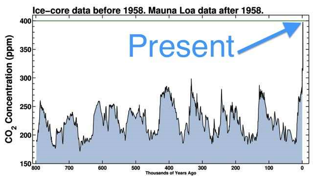
3 May 2013 (Climate Central) – The last time there was this much carbon dioxide (CO2) in the Earth’s atmosphere, modern humans didn’t exist. Megatoothed sharks prowled the oceans, the world’s seas were up to 100 feet higher than they are today, and the global average surface temperature was up to 11°F warmer than it is now.
The last time CO2 was this high, humans didn’t exist – ‘There is the possibility that we’ve already breached the threshold of truly dangerous human influence on our climate and planet’ — Global mineral fertilizer consumption for nitrogen and phosphorus and projected possible futures, 1960-2050 
18 February 2013 (The Independent) – The world is facing a fertiliser crisis, with far too little in some places, and far too much in others, a new report from the United Nations says today. The mass application of nitrogen, phosphorus, and other nutrients needed for plant growth has had huge benefits for world food and energy production, but it has also caused a web of water and air pollution that is damaging human health, causing toxic algal blooms, killing fish, threatening sensitive ecosystems, and contributing to climate change, says the report, Our Nutrient World [pdf].
UN says fertiliser crisis is damaging the biosphere – Mass application of nutrients causes pollution in some areas while under-use hampers food production in others — Environmental stressors to Great Lakes 
Ann Arbor, Michigan, 20 December 2012 (SPX) – A comprehensive map three years in the making is telling the story of humans’ impact on the Great Lakes, identifying how “environmental stressors” stretching from Minnesota to Ontario are shaping the future of an ecosystem that contains 20 percent of the world’s fresh water. This map merges data for all major categories of environmental stressors to the Great Lakes, ranging from climate change to pollution to invasive species.
Environmental threat map highlights Great Lakes restoration challenges – ‘The Great Lakes continue to be degraded by numerous environmental stressors’ — Biological condition in rivers and streams across the nine U.S. ecoregions 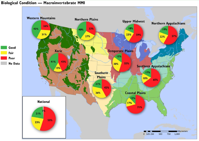
28 February 2013 (EPA) – The proportion of rivers and streams in poor biological condition, based on the Macroinvertebrate MMI, ranges from 26% in the Western Mountains ecoregion to 71% in the Coastal Plains ecoregion. The three most widespread stressors to rivers and streams — phosphorus, nitrogen, and riparian vegetative cover are depicted by ecoregion. A clear pattern is evident: the easternmost ecoregions (generally east of the Mississippi River) have a higher proportion of rivers and streams scoring in poor biological condition than those in the western U.S. In the east, the percent of river and stream miles in poor biological condition ranges from 55% to 71%. In the western ecoregions, the percent in poor biological condition ranges from 26% to 43%.
Graph of the Day: Biological condition in rivers and streams across nine U.S. ecoregions — Map of the U.S. Plains showing the percentage of grasslands that were converted into corn or soybean fields between 2006 and 2011 
20 February 2013 (Washington Post) – America’s prairies are shrinking. Spurred on by the rush for biofuels, farmers are digging up grasslands in the northern Plains to plant crops at the quickest pace since the 1930s. While that’s been a boon for farmers, the upheaval could create unexpected problems.
A new study by Christopher Wright and Michael Wimberly of South Dakota State University finds that U.S. farmers converted more than 1.3 million acres of grassland into corn and soybean fields between 2006 and 2011, driven by high crop prices and biofuel mandates. In states like Iowa and South Dakota, some 5 percent of pasture is turning into cropland each year.
Biofuel rush wiping out America’s grasslands at fastest pace since the 1930s Dust Bowl – Rates of grassland loss are ‘comparable to deforestation rates in Brazil, Malaysia, and Indonesia’ — Philippines disaster-induced displacement, 2009-2013 
28 December 2013 (Desdemona Despair) – Desdemona updated the IDMC graph from here with the number of Filipinos displaced by Typhoon Haiyan in November 2013: 4 million people. Between Typhoons Bopha and Haiyan, 6 million Filipinos were displaced in 2013. Des also added a parabolic curve (red) with a pretty good fit (R2 = 0.89).
Graph of the Day: Philippines disaster-induced displacement, 2009-2013 — Rainfall totals for Boulder, Colorado, 10-12 September 2013 
13 September 2013 (Climate Central) – The Boulder, Colo. area is reeling after being inundated by record rainfall, with more than half a year’s worth of rain falling over the past three days. During those three days, 24-hour rainfall totals of between 8 and 10 inches across much of the Boulder area were enough to qualify this storm as a 1 in 1,000 year event, meaning that it has a 0.1 percent chance of occurring in a given year.
Colorado’s ‘Biblical’ flood in line with climate trends – Over 1200 people missing – ‘This is clearly going to be a historic event. The true magnitude is really just becoming obvious now.’ — Large floods in Europe, with severity 2 and magnitude ≥ 5, 1985-2009 
27 October 2013 (Norwegian Meteorological Institute) – Globally, over the past 50 years, heavy precipitation events have been on the rise for most extra-tropical regions, corresponding to a warmer Earth surface and lower troposphere. This includes widespread increases in the contribution to total annual precipitation from very wet days, days on which precipitation amounts exceed the 95th percentile value, in many land regions. A similar trend is seen in Europe; according to observations, heavy precipitation has been on the rise in a warming climate over much of the region. However, intense precipitation in Europe exhibits complex variability and a lack of a robust spatial pattern. The principal seasonal effect is the increase in extreme precipitation in winter with heavy precipitation events becoming more frequent, even in regions with decreasing total precipitation amounts.
Graph of the Day: Large floods in Europe, 1985-2009 — West and central Africa flood displacement, June-October 2012 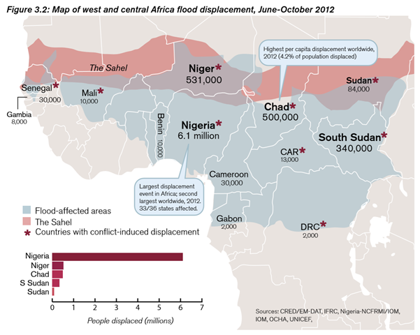
13 May 2013 (IDMC) – Unusually heavy and prolonged rainfall from June to November 2012 resulted in widespread flooding across 18 countries. Displacement was reported in 13: Benin, Cameroon, Central African Republic, Chad, the Democratic Republic of Congo, Gabon, the Gambia, Mali, Niger, Nigeria, Senegal, Sudan and South Sudan (see Figure 3.2). Over 7.6 million people were displaced from their homes. The IFRC and national Red Cross and Red Crescent societies in a number of these countries highlighted the importance of having a regional overview when planning international interventions in states with inter-linked flood disasters.
Graph of the Day: West and Central Africa flood displacement, June-October 2012 — Hours per year of flooding in Norfolk, Virginia’s Hague neighborhood, 1929-2012 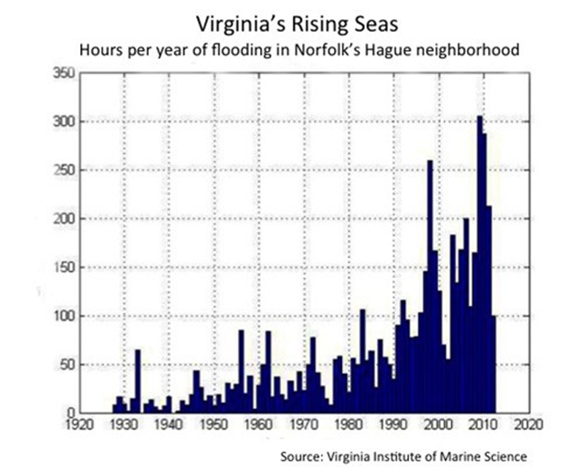
WILLIAMSBURG, Virginia, 16 September 2013 (The Daily Climate) – Weary of debating the causes of climate change, mayors and other elected officials from Virginia’s battered coastal regions gathered here last week and agreed that local impacts have become serious enough to present a case for state action.
Virginia mayors: Time to respond to climate change – ‘There are more 100-year storms in the last 15 years than we’ve ever seen’ — Total foundation funding distribution to U.S. climate change countermovement organizations, 2003-2010 
20 December 2013 (PhysOrg) – A new study conducted by Drexel University’s environmental sociologist Robert J. Brulle, PhD, exposes the organizational underpinnings and funding behind the powerful climate change countermovement. This study marks the first peer-reviewed, comprehensive analysis ever conducted of the sources of funding that maintain the denial effort. An examination of these data shows that these 91 CCCM organizations have an annual income of just over $900 million, with an annual average of $64 million in identifiable foundation support. The overwhelming majority of the philanthropic support comes from conservative foundations. Additionally, there is evidence of a trend toward concealing the sources of CCCM funding through the use of donor directed philanthropies.
Graph of the Day: Total foundation funding distribution to U.S. climate change countermovement organizations, 2003-2010 — World energy consumption by source, 1820-2010 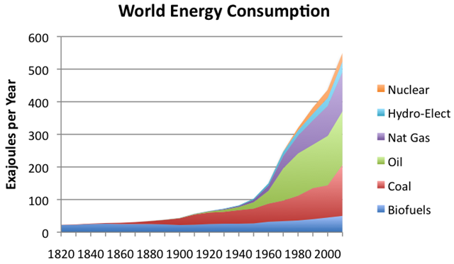
11 January 2013 (The Oil Drum) – World energy consumption by source, 1820-2010, based on Vaclav Smil’s estimates from Energy Transitions: History, Requirements, and Prospects and BP Statistical Data on 1965 and subsequent.
Graph of the Day: World Energy Consumption by Source, 1820-2010
Desdemona D.:
spectacular accumulation of facts – great job!
Tom
No way. See all those "hockey sticks"?
This means these graphs are totally faked, just like that other famous "hockey stick" we all heard about.
Everyone can safely ignore these images. They don't mean nuthin'.
Crack another beer, change the channel and go right back to sleep…
What might have been a planetary emergency is just another bunch of photoshopped fabricated "data" from a bunch of egghead scientists who don't know nuthin' 'bout anything at all.
There's still beer in the fridge, gas in the car and football on t.v., so all is right as rain in the world.
Des – what you need is a graph depicting the growing levels of stupidity and widespread ignorance and this relationship to escalating global disaster.
Print it all off on a glossy 8×10 high resolution image, then tack in to their foreheads with a high-impact nailgun as a 'gentle reminder' that all is NOT right in the world, not even close.
It is so stupendously obvious that we are so totally screwed that any "denial" needs to be criminalized.
But that would leave us without any politicians and corporations…
Which come to think of it, would be a damned good thing for everyone.
The population would be reduced by at least 90% too, another giant "plus". ~SA~