August 6, 2011
Graph of the Day: Mean Duration of U.S. Unemployment, 1948-2011
By Joe Weisenthal
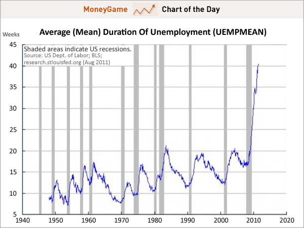
5 August 2011 We used to say that the chart showing the pace of this jobs “recovery” vs. all other jobs recoveries was the scariest jobs chart ever (see here for example). But we’ve since changed our mind. It’s the average duration of unemployment — which surges without any sign of slowing down — that’s really scary right now. Not only is this number taking off like a rocket, but it potentially represents people permanently and structurally kept out of the jobs market. Be afraid.