50 Doomiest Graphs of 2010
The Graph of the Day feature comprises Desdemona’s assault on the left hemisphere of the brain, in the quixotic quest against delusional hope. This post complements the media barrage on the right hemisphere, 50 Doomiest Photos of 2010. 2010 yielded a torrent of new scientific data that documents the accelerating destruction of the biosphere, and Desdemona managed to capture a few graphs from the flood. Here are the most doom-laden graphs of 2010, chosen by scope, length of observational period, and sleekness of presentation. Open up your left hemisphere and drink in the data.
- 2013 doomiest graphs, images, and stories
- 2012 doomiest graphs, images, and stories
- 2011 doomiest graphs, images, and stories
- 2010 doomiest graphs, images, and stories
— Americans’ Beliefs about the Evidence for Global Warming 
Americans’ Beliefs about the Evidence for Global Warming, by Departure of Local Weather from Normal Temperature in Week Prior to Survey. Egan and Mullin, 2009 Local weather’s effect on beliefs that Earth is getting warmer. Figure 3 displays the simple bivariate relationship between temperature and beliefs about the evidence for global warming. To summarize the relationship, the figure displays the best linear fit for the data along with a nonparametric smoother drawn with the lowess technique (Cleveland 1993). The figure shows a clear and substantial relationship between the two variables: as local temperatures rise above normal, so does the percentage of Americans believing that global warming is a reality. The smoother consistently traces the regression line, indicating that the relationship between the two variables is close to linear.
Graph of the Day: Americans’ Beliefs about Global Warming, by Departure of Local Weather from Normal Temperature — 800,000-Year Record of Atmospheric Carbon Dioxide Concentration 
Analysis of air bubbles trapped in an Antarctic ice core extending back 800,000 years documents the Earth’s changing carbon dioxide concentration. Over this long period, natural factors have caused the atmospheric carbon dioxide concentration to vary within a range of about 170 to 300 parts per million (ppm). Temperature-related data make clear that these variations have played a central role in determining the global climate. As a result of human activities, the present carbon dioxide concentration of about 385 ppm is about 30 percent above its highest level over at least the last 800,000 years. In the absence of strong control measures, emissions projected for this century would result in the carbon dioxide concentration increasing to a level that is roughly 2 to 3 times the highest level occurring over the glacial-interglacial era that spans the last 800,000 or more years.
Graph of the Day: 800,000-Year Record of Atmospheric Carbon Dioxide Concentration — Atmospheric Carbon Dioxide Concentration, 10,000 BC – 2009 AD

Global atmospheric concentrations of carbon dioxide, methane, nitrous oxide, and certain manufactured greenhouse gases have all risen substantially in recent years.
- Before the industrial era began around 1780, carbon dioxide concentrations measured approximately 270–290 ppm. Concentrations have risen steadily since then, reaching 387 ppm in 2009—a 38 percent increase. Almost all of this increase is due to human activities.
- Since 1905, the concentration of methane in the atmosphere has roughly doubled. It is very likely that this increase is predominantly due to agriculture and fossil fuel use.
- Historical measurements show that the current global atmospheric concentrations of carbon dioxide and methane are unprecedented over the past 650,000 years, even after accounting for natural fluctuations.
Graph of the Day: Atmospheric Carbon Dioxide Concentration, 10,000 BC – 2009 AD —
Thermal Stress on Caribbean Corals, 1985–2006 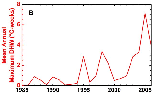
Average of annual maximum thermal stress, measured in Degree Heating Weeks (DHW), during 1985–2006. Significant coral bleaching was reported during periods with average thermal stress above 0.5°C-weeks, and was especially widespread in 1995, 1998, and 2005.
Graph of the Day: Thermal Stress on Caribbean Corals, 1985–2006 — Ocean Heat Content Anomaly, 1955-2007
 for the 0–700 m layer. Differences among the time series arise from: input data; quality control procedure; gridding and infilling methodology (what assumptions are made in areas of missing data); bias correction methodology; and choice of reference climatology. Anomalies are computed relative to the 1955–2002 average. Figure reproduced from Palmer et al. (2010). NOAA State of the Climate in 2009")
XBT corrected estimates of annual ocean heat content anomaly (1022 J) for the 0–700 m layer. Differences among the time series arise from: input data; quality control procedure; gridding and infilling methodology (what assumptions are made in areas of missing data); bias correction methodology; and choice of reference climatology. Anomalies are computed relative to the 1955–2002 average. Figure reproduced from Palmer et al. (2010).
Graph of the Day: Ocean Heat Content Anomaly, 1955-2007 — Record Hot Days in Australia, 1960-2009

- The number of days in Australia with record hot temperatures has increased each decade over the past 50 years.
- There have been fewer record cold days each decade.
- 2000 to 2009 was Australia’s warmest decade on record.
Graph of the Day: Record Hot and Cold Days in Australia, 1960-2009 — Eurasian Arctic River Discharge to the Arctic Ocean, 1936-2008

Total annual river discharge to the Arctic Ocean from the six largest rivers in the Eurasian Arctic for the observational period 1936–2008 (updated from Peterson et al. 2002) (red line) and from the four large North American pan-Arctic rivers over 1970–2008 (blue line). Annual river discharge to the Arctic Ocean from the major Eurasian rivers in 2008 was 2078 km3. In general, river discharge shows an increasing trend over 1936–2008 with an average rate of annual change of 2.9 ± 0.4 km3 yr-1. An especially intensive increase in river discharge to the ocean was observed during the last 20 years when the sea ice extent in the Arctic Ocean began decreasing.
Graph of the Day: Eurasian Arctic River Discharge to the Arctic Ocean, 1936-2008 —
Ten observations that are consistent with a warming world
. metoffice.gov.uk")
Scientific evidence that our world is warming is unmistakable has been released today in the 2009 State of the Climate report, issued by US National Oceanic and Atmospheric Administration (NOAA). The report draws on data from 10 key climate indicators that all point to that same finding — the world is warming. The 10 indicators of temperature have been compiled by the Met Office Hadley Centre, drawing on the work of more than 100 scientists from more than 20 institutions. They provide, in a one place, a snapshot of our world and spell out a single conclusion that the climate is unequivocally warming.
Ten observations that are consistent with a warming world — Amazon rainforest drought, through 16 October 2010
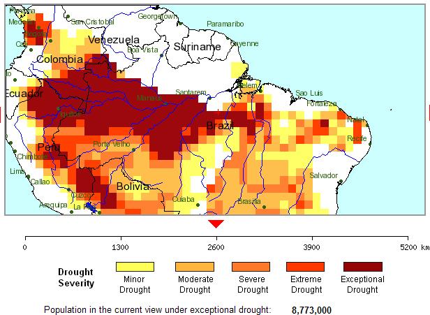
We know from simple on-the-ground knowledge that the 2010 drought was extreme, leading to record lows on some major rivers in the Amazon region and an upsurge in the number of forest fires. Preliminary analyses suggest that the 2010 drought was more widespread and severe than the 2005 event. The 2005 drought was identified as a 1-in-100 year type event.
Another extreme drought hits the Amazon, raising climate change concerns — Carbon monoxide over western Russia, August 2010  sensor flying on NASA’s Terra satellite, shows carbon monoxide over western Russia between August 1 and August 8, 2010. The highest levels of carbon monoxide are shown in red, while lower levels are yellow and orange. NASA Earth Observatory image created by Jesse Allen, using data provided by Gabriele Pfister, the National Center for Atmospheric Research (NCAR) and the University of Toronto MOPITT Teams.")
Two NASA satellites registered a total of 368 hotspots from fires across Russia on Saturday, with the central part of the country being the worst affected, a spokeswoman for the ScanEx company said. “Wildfires raging on vast areas and smoke blankets can be clearly seen even on satellite photos of medium definition,” Nadezhda Pupysheva said. Central Russia’s Moscow, Ryazan and Nizhny Novgorod regions are the worst affected, she said. A scorching heat wave has gripped much of European Russia since mid-June, which coupled with the worst drought since the 1970s has made the countryside particularly susceptible to wildfires.
NASA satellites register 368 wildfires in Russia — Temperature Anomalies for the Russian Federation, 20-27 July 2010
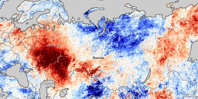
This map shows temperature anomalies for the Russian Federation from July 20–27, 2010, compared to temperatures for the same dates from 2000 to 2008. Areas of atypical warmth predominate in the east and west. Orange- and red-tinged areas extend from eastern Siberia toward the southwest, but the most obvious area of unusual warmth occurs north and northwest of the Caspian Sea. These warm areas in eastern and western Russia continue a pattern noticeable earlier in July, and correspond to areas of intense drought and wildfire activity.
Graph of the Day: Temperature Anomalies for the Russian Federation, 20-27 July 2010 — 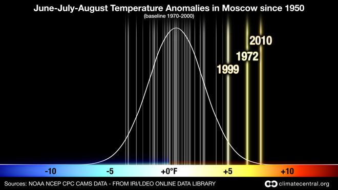
We have summarized the behavior of a typical summer in Moscow by a normal (bell) curve with mean and standard deviation derived from the summer temperature anomalies during the period 1970-2000 (the typical choice for current climatology). Compared to that distribution, the values experienced this summer are so unexpected as to be beyond three standard deviations for June, July and August means and four standard deviations for July means from the center of that distribution.
Graph of the Day: Summer Temperature Anomalies in Moscow, 1950-2010 —
Tennessee Extreme Event of May 1-2, 2010
 for 48-Hour Duration. National Weather Service")
I didn’t understand just how unprecedented this superstorm was until I saw the above map from the Office of Hydrological Development at NOAA/NWS. I have never seen a map like this before, but then that may be because there simply aren’t many events to rival this one. Look at the red streak, which is the area hit by a greater than 1000-year deluge. And look at how much of western Tennessee was slammed with a greater than 500 year downpour. This is the “high water” of Hell and High Water.
Tennessee’s 1000-year flood: Rainfall at 15 sites exceeded Hurricane Katrina maxima —
Arctic Sea Ice Extent Partitioned by Age of Ice, 1985-2010

This figure supports thinning of the icepack over the last couple of decades since older ice tends to be thicker than younger ice. You can see in this figure how little of the really old, and thick ice there is left in the Arctic Basin.
In fact, the figure shows ice 5 years or older dropping from 800,000 sq-km in 2008 to 400,000 in 2009 to only 320,000 sq-km. Spring 2010 also saw a record low in the amount of ice 4 years or older.
Graph of the Day: Arctic Sea Ice Extent Partitioned by Age of Ice, 1985-2010 — Ice-shelf Retreat in the Southern Antarctic Peninsula, 1947-2009

This image shows ice-front retreat in part of the southern Antarctic Peninsula from 1947 to 2009. USGS scientists are studying coastal and glacier change along the entire Antarctic coastline. The southern portion of the Antarctic Peninsula is one area studied as part of this project, and is summarized in the USGS report, Coastal-Change and Glaciological Map of the Palmer Land Area, Antarctica: 1947—2009 (map I—2600—C).
Graph of the Day: Ice-shelf Retreat in the Southern Antarctic Peninsula, 1947-2009 — All Published Himalaya Glacier Mass Balance Measurements, 1960s – 2000s
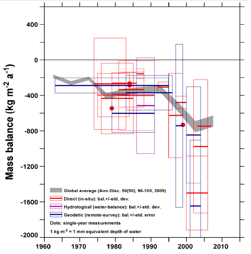
The graph shows all published Himalaya-Karakoram (HK) measurements; they are more negative after 1995 than before. The map shows where the measurement sites are. Mass balance varies greatly year to year; these are series averages. Boxes suggest estimated uncertainty. The apparent trend is less uncertain than any one measurement. The data indicate either accelerating loss or stepwise increase in mass loss rate. This need not be true of every part of the region. For example there are suggestions of recent mass gain in the Karakoram. Mass loss rate here is consistent with the global average. The mass-balance rate required to remove all H-K ice during 2000-2035 would be about -11,000 kg m-2a-1.
Graph of the Day: All Published Himalaya Glacier Mass Balance Measurements, 1960s – 2000s —
Cumulative frequency of glacier lake outburst floods (GLOFs) in Nepal, Bhutan, and Tibet
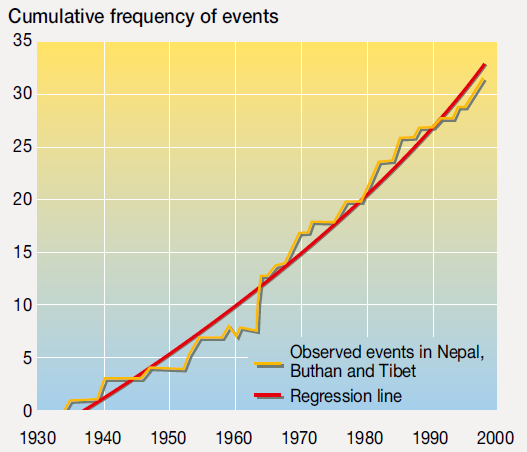
The High Mountain Glaciers and Climate Change report [pdf], by the United Nations Environment Program (UNEP), found that many people in vulnerable mountainside homes are already living with the growing risks of global warming and need more support to help them adapt to a changing landscape. The melting of glaciers was triggering more frequent “glacial lake outburst floods,” when masses of melted water burst through brittle rock barriers and inundating valleys below, said the report. “People in the Himalayas must prepare for a tough and unpredictable future,” said Erik Solheim, Norway’s environment minister, in a statement accompanying the report.
Melting glaciers threaten floods in Himalayas, Andes —
Mean Cumulative Mass Balance of Glaciers, 1980-2008

Preliminary mass balance values for the observation period 2007/08 have been reported now from more than 90 glaciers worldwide. The mass balance statistics are calculated based on all reported values as well as on the data from the 30 reference glaciers in 9 mountain ranges with continuous observation series back to 1980. The average mass balance of the glaciers with available long-term observation series around the world continues to decrease, with tentative figures indicating a further thickness reduction of 0.5 metres water equivalent (m w.e.) during the hydrological year 2007/08. The new data continues the global trend in strong ice loss over the past few decades and brings the cumulative average thickness loss of the reference glaciers since 1980 at about 12 m w.e.
Graph of the Day: Mean Cumulative Mass Balance of Glaciers, 1980-2008 — Status of Polar Bear Populations, March 2010

A status table was first discussed and published at the 11th meeting of the Polar Bear Specialist Group (PBSG) in Copenhagen in 1993. The present table was discussed and concluded upon in Copenhagen in 2009, and some small updates on the comments was done in March 2010.
Graph of the Day: Status of Polar Bear Populations, March 2010 — Ice loss from the Greenland ice sheet
Ice loss from the Greenland ice sheet, which has been increasing during the past decade over its southern region, is now moving up its northwest coast, according to a new international study. The research indicates the ice-loss acceleration began moving up the northwest coast of Greenland staring in late 2005. The team drew their conclusions by comparing data from NASA’s Gravity and Recovery Climate Experiment satellite system, or GRACE, with continuous GPS measurements made from long-term sites on bedrock on the edges of the ice sheet.
Ice loss from Greenland ice sheet spreading to northwest coast — Weekly Ice Coverage in Western Hudson Bay for the 2010 Season 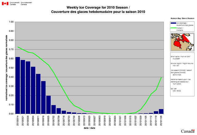
The polar bears of Western Hudson Bay went without eating this year for approximately 3 weeks longer than usual. According to the National Wildlife Federation, the combined early summer break-up of sea ice and delayed winter freeze-up foreshadows what is likely to be a fast-approaching and grim future for these polar bears. “The facts are impossible to ignore,” said Dr. Sterling Miller, senior biologist with the National Wildlife Federation. “These bears are spending longer periods off the ice, their body mass and reproductive rates have been steadily declining, and their numbers are dropping.”
Dramatic decline in sea ice imperils Western Hudson Bay polar bears – Bears went without eating this year for 3 weeks longer than usual —
Temperatures Worldwide, 1901–2009

This figure shows how average temperatures worldwide have changed since 1901. Surface global data come from a combined set of land-based weather stations and sea surface temperature measurements, while satellite measurements cover the lower troposphere, which is the lowest level of the Earth’s atmosphere (see diagram on p. 20). “UAH” and “RSS” represent two different methods of analyzing the original satellite measurements. This graph uses the 1901 to 2000 average as a baseline for depicting change. Choosing a different baseline period would not change the shape of the trend.
Graph of the Day: Temperatures Worldwide, 1901–2009 — Trends in April Snowpack in the Western US and Canada, 1950–2000

This map shows trends in snow water equivalent in the western United States and part of Canada. Negative trends are shown by red circles and positive trends by blue. • From 1950 to 2000, April snow water equivalent declined at most of the measurement sites, with some relative losses exceeding 75 percent. • In general, the largest decreases were observed in western Washington, western Oregon, and northern California. April snowpack decreased to a lesser extent in the northern Rockies. • A few areas have seen increases in snowpack, primarily in the southern Sierra Nevada of California and in the Southwest.
Graph of the Day: Trends in April Snowpack in the Western US and Canada, 1950–2000
— Onset Date of Spring Runoff Pulse in the US West 
This graph shows trends in yearly dates of spring snowmelt onset in rivers throughout US West, based on U.S. Geological Survey streamgages. Reddish-brown circles indicate significant trends toward onsets more than 20 days earlier. Lighter circles indicate less advance of the onset. Blue circles indicate later onset. The changes depend on a number of factors in addition to temperature, including altitude and timing of snowfall.
Graph of the Day: Onset Date of Spring Runoff Pulse in the US West — Northern Hemisphere Snow Cover Anomalies, April 1966 – April 2010

National Oceanic and Atmospheric Administration (NOAA) meteorologists began production of satellite-derived maps of Northern Hemisphere snow cover extent (SCE) in late 1966.
Graph of the Day: Northern Hemisphere Snow Cover Anomalies, April 1966 – April 2010 —
Annual inflow to Perth dams, 1911-2010
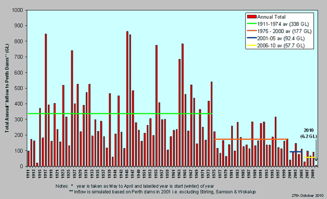
The equivalent of an extra 17,600 Olympic-sized swimming pools of water will be taken from Perth’s aquifers this year, as a prolonged dry spell bites hard on supplies. The Department of Water has approved the Water Corporation’s application to take 165 gigalitres from the Gnangara and Jandakot aquifers. That is 44 gigalitres, or 44 billion litres, more than last year, though about four gigalitres less than in 2006-07, the last prolonged dry period. The majority of the drawdown, 151.71 gigalitres, will be from the fragile Gnangara aquifer.
Long-term drought trend causes Perth to drain aquifers —
Annual Flows of the Colorado River, 1905-2005
 of the Colorado River into the delta from 1905 to 2005 at the Southern International Border station. Note that, in most years after 1960, flows to the delta fell to zero as total withdrawals equaled total (or peak) renewable supply. Gleick and Palaniappan, 2010")
Annual flows (in million cubic meters) of the Colorado River into the delta from 1905 to 2005 at the Southern International Border station. Note that, in most years after 1960, flows to the delta fell to zero as total withdrawals equaled total (or peak) renewable supply.
Graph of the Day: Annual Flows of the Colorado River, 1905-2005 — Prevailing Patterns of Threat to Human Water Security and Biodiversity in 2010

Adjusted human water security threat is contrasted against incident biodiversity threat. Much of the developed world faces the challenge of reducing biodiversity threat and protecting biodiversity, while maintaining established water services. The developing world shows tandem threats to human water security and biodiversity, posing an arguably more significant challenge.
Graph of the Day: Prevailing Patterns of Threat to Human Water Security and Biodiversity in 2010 —
World Groundwater Depletion Rates, 2010

In recent decades, the rate at which humans worldwide are pumping dry the vast underground stores of water that billions depend on has more than doubled, say scientists who have conducted an unusual, global assessment of groundwater use. These fast-shrinking subterranean reservoirs are essential to daily life and agriculture in many regions, while also sustaining streams, wetlands, and ecosystems and resisting land subsidence and salt water intrusion into fresh water supplies. Today, people are drawing so much water from below that they are adding enough of it to the oceans (mainly by evaporation, then precipitation) to account for about 25 percent of the annual sea level rise across the planet, the researchers find.
Graph of the Day: World Groundwater Depletion Rates, 2010
— Groundwater Storage Loss in the Sacramento-San Joaquin River Basins, October 2003 – March 2009

In the 66-month period analyzed, the water stored in the combined Sacramento and San Joaquin Basin decreased by more than 31 cubic kilometers, or nearly the volume of Lake Mead. Nearly two-thirds of this came from changes in groundwater storage, primarily from the Central Valley.
Graph of the Day: Groundwater Storage Loss in the Sacramento-San Joaquin River Basins, October 2003 – March 2009 — Observed Change in US Annual Average Precipitation, 1958-2008

US precipitation has increased an average of about 5 percent over the past 50 years. Projections of future precipitation generally indicate that northern areas will become wetter, and southern areas, particularly in the West, will become drier. While precipitation over the United States as a whole has increased, there have been important regional and seasonal differences. Increasing trends throughout much of the year have been predominant in the Northeast and large parts of the Plains and Midwest. Decreases occurred in much of the Southeast in all but the fall season and in the Northwest in all seasons except spring. Precipitation also generally decreased during the summer and fall in the Southwest, while winter and spring, which are the wettest seasons in states such as California and Nevada, have had increases in precipitation.
Graph of the Day: Observed Change in US Annual Average Precipitation, 1958-2008 — Potential US Water Supply Conflicts by 2025

Many locations in the United States are already undergoing water stress. The Great Lakes states are establishing an interstate compact to protect against reductions in lake levels and potential water exports. Georgia, Alabama, and Florida are in a dispute over water for drinking, recreation, farming, environmental purposes, and hydropower in the Apalachicola–Chattahoochee–Flint River system.
Graph of the Day: Potential US Water Supply Conflicts by 2025 — Net primary production and the carbon cycle
Global plant productivity that once was on the rise with warming temperatures and a lengthened growing season is now on the decline because of regional drought according to a new study of NASA satellite data.
Drought drives decade-long decline in plant growth — Ocean Carbon Dioxide Levels and Acidity, 1983–2005

This figure shows changes in ocean carbon dioxide levels (measured as a partial pressure) and acidity (measured as pH). The data come from two observation stations in the North Atlantic Ocean (Canary Islands and Bermuda) and one in the Pacific (Hawaii). Dots represent individual measurements, while the lines represent smoothed trends. Measurements made over the last few decades have demonstrated that ocean carbon dioxide levels have risen, accompanied by an increase in acidity (that is, a decrease in pH).
Graph of the Day: Ocean Carbon Dioxide Levels and Acidity, 1983–2005 — Abundance of Australia Waterbirds, 1983-2004

Ten aerial survey bands (each 30 km in width), every two degrees of latitude, crossing eastern Australia and providing estimates for up to 50 species of waterbirds in October each year (1983-2004). Letters identify seven particular wetlands: Styx River wetlands (A), Lake Hope (B), Paroo River overflow lakes (C), and Macquarie Marshes (D).
Graph of the Day: Abundance of Australia Waterbirds, 1983-2004 — Returns and Forecasts of Canada Sockeye Salmon, 1970-2009 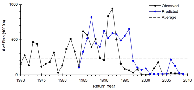
Historically, the Rivers and Smith Inlet sockeye salmon stock formed one of the most valuable salmon fisheries in British Columbia, however it declined precipitously in the early 1990s. This decline is the result of poor marine survival during the migration through this ecozone and into the Gulf of Alaska; however the specific cause and location of this mortality is unknown.
Graph of the Day: Returns and Forecasts of Canada Sockeye Salmon, 1970-2009 — Length of Four Fish Species on the Scotian Shelf, 1970-2002
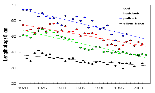
There has been a decline in the size and condition in a number of groundfish species. There has been a reduction in the size of some groundfish species (e.g., haddock, cod, pollock, and silver hake) since the start of the time series in 1970. This decrease in size has been observed both on the Eastern Scotian Shelf, where decreasing water temperature may have had an influence on growth in the late 1980s through early 1990s, but also on the Western Scotian Shelf, where temperatures remained relatively stable over this same period. A change in the average size of exploited species can be related to long-term fishing pressure if larger individuals are removed selectively from the population.
Graph of the Day: Length of Four Fish Species on the Scotian Shelf, 1970-2002 — Change in Latitude of Bird Center of Abundance, 1966–2005

This figure shows annual change in latitude of bird center of abundance for 305 widespread bird species in North America from 1966 to 2005. Each winter is represented by the year in which it began (for example, winter 2005–2006 is shown as 2005). The shaded band shows the likely range of values, based on the number of measurements collected and the precision of the methods used. • Among 305 widespread North American bird species, the average mid-December to early January center of abundance moved northward between 1966 and 2005. The average species shifted northward by 35 miles during this period. Trends in center of abundance are closely related to winter temperatures. • On average, bird species have also moved their wintering grounds farther from the coast since the 1960s. • Some species have moved farther than others. Of the 305 species studied, 177 (58 percent) have shifted their wintering grounds significantly to the north since the 1960s, but some others have not moved at all. A few species have moved northward by as much as 200 to 400 miles.
Graph of the Day: Change in Latitude of Bird Center of Abundance, 1966–2005 — Tracking the Gulf Oil Spill

The map sequence shows how the oil spill has been spreading in the Gulf of Mexico. Each day’s outline reflects the most current estimate by the National Oceanic and Atmospheric Administration for the extent of the spill on that day.
[Click the image to get to the New York Times animation, which has been updated to show the entire event, from beginning to end.]
Graph of the Day: Daily Oil Spill Extent — Change in annual mean sea surface pH between the pre-industrial period (1700s) and the present day (1990s)
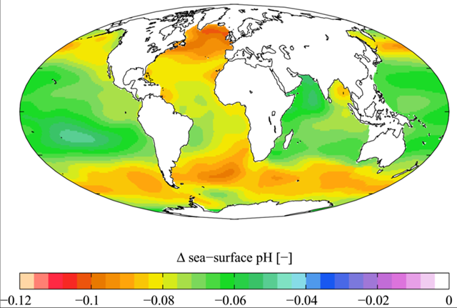
Estimated change in annual mean sea surface pH between the pre-industrial period (1700s) and the present day (1990s). ΔpH here is in standard pH units. Carbon dioxide emissions that contribute to global warming are also turning the oceans more acidic at the fastest pace in hundreds of thousands of years, the National Research Council reported Thursday. “The chemistry of the ocean is changing at an unprecedented rate and magnitude due to anthropogenic carbon dioxide emissions,” the council said. “The rate of change exceeds any known to have occurred for at least the past hundreds of thousands of years.”
Ocean chemistry changing at ‘unprecedented rate’ — Methane Fluxes Venting to the Atmosphere from the East Siberian Arctic Shelf

Summertime observations of dissolved CH4 in the East Siberian Arctic Shelf (ESAS) (21). (D) Fluxes of CH4 venting to the atmosphere over the ESAS.
Remobilization to the atmosphere of only a small fraction of the methane held in East Siberian Arctic Shelf (ESAS) sediments could trigger abrupt climate warming, yet it is believed that sub-sea permafrost acts as a lid to keep this shallow methane reservoir in place. Here, we show that more than 5000 at-sea observations of dissolved methane demonstrates that greater than 80% of ESAS bottom waters and greater than 50% of surface waters are supersaturated with methane regarding to the atmosphere.
Graph of the Day: Methane Fluxes Venting to the Atmosphere from the East Siberian Arctic Shelf —
Coastal Ocean Hypoxia Events, 1969-2009

Global pattern in the development of coastal hypoxia. Each red dot represents a documented case related to human activities. Number of hypoxic sites is cumulative through time. Black lines represent continental shelf areas threatened with hypoxia from expansion of OMZ and upwelling. Modified from Díaz and Rosenberg (2008) and Levin et al. (2009a). Over the past five to ten years, changes in the ocean’s dissolved oxygen content have become a focal point of oceanic research. The oxygen content in the open ocean appears to have decreased in most (but not all) areas (Gilbert et al., 2009). At the same time, low oxygen areas, also known as “dead zones”, have spread in the coastal oceans during the last five decades.
Graph of the Day: Coastal Ocean Hypoxia Events, 1969-2009 — Aquatic Dead Zones, January 2008
; the GSFC Ocean Color team (particulate organic carbon); and the Socioeconomic Data and Applications Center (SEDAC) (population density) via earthobservatory.nasa.gov")
The size and number of marine dead zones—areas where the deep water is so low in dissolved oxygen that sea creatures can’t survive—have grown explosively in the past half-century. Red circles on this map show the location and size of many of our planet’s dead zones. Black dots show where dead zones have been observed, but their size is unknown.
Graph of the Day: Aquatic Dead Zones, January 2008 — Total Land Area Affected by Mountain Pine Beetle in BC, 1981-2005

The area of BC forest affected by the Mountain Pine Beetle (MPB) has more than doubled, from 4 million hectares in 2003 to 8.7 million hectares in 2006, with much of this in the Fraser Basin. The MPB reduces trees’ nutrient and water uptake, resulting in defoliation and tree mortality. In the absence of extreme cold periods that historically have controlled MPB populations, it has been projected that, by 2013, 80% of BC’s central and southern interior mature pine forest could be killed by MPB.
Graph of the Day: Total Land Area Affected by Mountain Pine Beetle in BC, 1981-2005 — World Irrigated Area Per Thousand People, 1950-2007
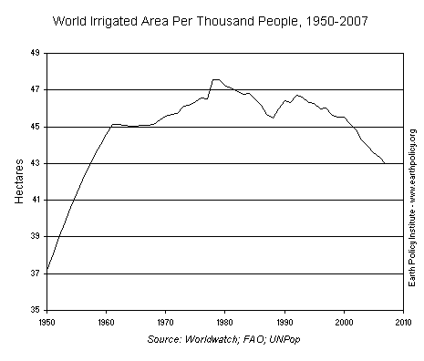
World food production continues to increase, yet the rate at which it is increasing has slowed. From 1970 to 1990, world grain production grew by 64 percent. From 1990 to 2009, it increased by only 24 percent. Past growth in agricultural production was fueled in part by expanding irrigation: world irrigated area tripled from 1950 to 2000. However, expansion of irrigated area has since slowed significantly as land and water availability has declined, showing almost no growth in the past decade. When growing global population is taken into account, this trend becomes even more concerning. The world irrigated area per thousand people has declined from a high of over 47 hectares (116 acres) in the late 1970s to only 43 hectares (106 acres) per thousand people in 2007.
Graph of the Day: World Irrigated Area Per Thousand People, 1950-2007 — Total Arable Land, 1961-2007

Arable land expansion has slowed down substantially in the last 50 years. This implies that much of the best arable land is already in use.
Graph of the Day: Total Arable Land, 1961-2007 — 30 year mortgage rates, 1971-2010

This graph shows the 30 year fixed rate mortgage interest rate from the Freddie Mac Primary Mortgage Market Survey®. The red line is a quarterly estimate from the BEA of the effective rate of interest on all outstanding mortgages (Owner- and Tenant-occupied residential housing). The effective rate on outstanding mortgages is at a series low of just under 6%, but the rate is moving down slowly since so many borrowers can’t refinance because they do not qualify (either because the property value is too low or their incomes are insufficient).
30-year mortgage rates fall to record low —
U.S. Real Consumption and Income Growth, 1933-2009

Looking at real GDP growth over these periods, the 2002–09 era looks very weak, with only 1946–49 having a lower average annual rate of growth (in these years, GDP averaged an annual decline of 2.01 percent). Average annual real GDP growth was 1.72 percent for the 2002–09 period, much lower than the average of 3.97 percent for the previous 10 trough-to-trough periods.
Graph of the Day: U.S. Real Consumption and Income Growth, 1933-2009 — U.S. Unemployment Rate Including Long-term Discouraged Workers, 1994-2010
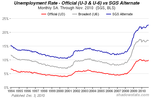
The seasonally-adjusted SGS Alternate Unemployment Rate reflects current unemployment reporting methodology adjusted for SGS-estimated long-term discouraged workers, who were defined out of official existence in 1994. That estimate is added to the BLS estimate of U-6 unemployment, which includes short-term discouraged workers.
Graph of the Day: US Unemployment Rate Including Long-term Discouraged Workers, 1994-2010 — Living Planet Index, 1970-2006
")
Natural systems that support economies, lives and livelihoods across the planet are at risk of rapid degradation and collapse unless there is swift, radical and creative action to conserve and sustainably use the variety of life on Earth. This is one principal conclusion of a major new assessment of the current state of biodiversity and the implications of its continued loss for human well-being. The third edition of Global Biodiversity Outlook (GBO-3) [pdf], produced by the Convention on Biological Diversity (CBD), confirms that the world has failed to meet its target to achieve a significant reduction in the rate of biodiversity loss by 2010.
New vision required to stave off dramatic biodiversity loss, says UN report
A stunning collection — so glad for your explanations and highlighting. Thanks.
Thank you for putting all these together. A very useful resource.