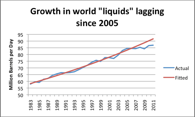
Graph of the Day: Growth in World Oil Supplies, 1983-2011
By Gail the Actuary
12 April 2012 The US Energy Information Administration (EIA) recently released full-year 2011 world oil production data. In this post, I would like show some graphs of recent data, and provide some views as to where this leads with respect to future production. The fitted line in Figure 1 suggests a “normal” growth in oil supplies (including substitutes) of 1.6% a year, based on the 1983 to 2005 pattern, or total growth of 10.2% between 2005 and 20011. Instead of 10.2%, actual growth between 2005 and 2010 amounted to only 3.0% including crude oil and substitutes. The shortfall in oil production relative to what would have been expected based on the 1983-2005 growth pattern amounted to 4.7 million barrels in 2011. This is far more than any country claims as spare capacity. This is no doubt one of the reasons why oil prices are as high they are now. These high oil prices tend to interfere with economic growth of oil importing nations. […]

No surprise here…peak oil ..2005 been reported before.
we're talking real oil liquid oil…not tar sands, ethanol ,Ha!! etc.
The question is when it starts falling off the plateau.