50 doomiest graphs of 2017
23 December 2017 (Desdemona Despair) – In 1992, the Union of Concerned Scientists issued a dire “warning to humanity”:
Human beings and the natural world are on a collision course. Human activities inflict harsh and often irreversible damage on the environment and on critical resources. If not checked, many of our current practices put at serious risk the future that we wish for human society and the plant and animal kingdoms, and may so alter the living world that it will be unable to sustain life in the manner that we know. Fundamental changes are urgent if we are to avoid the collision our present course will bring about.
In 2017, twenty-five years later, UCS issued another warning, in a paper published in the journal BioScience:
Since 1992, with the exception of stabilizing the stratospheric ozone layer, humanity has failed to make sufficient progress in generally solving these foreseen environmental challenges, and alarmingly, most of them are getting far worse. Especially troubling is the current trajectory of potentially catastrophic climate change due to rising GHGs from burning fossil fuels (Hansen, et al., 2013), deforestation (Keenan, et al., 2015), and agricultural production—particularly from farming ruminants for meat consumption (Ripple, et al., 2014). Moreover, we have unleashed a mass extinction event, the sixth in roughly 540 million years, wherein many current life forms could be annihilated or at least committed to extinction by the end of this century.
They include a collection of graphs in the BioScience paper that illustrates the point:
Trends over time for environmental issues identified in the 1992 scientists’ warning to humanity. The years before and after the 1992 scientists’ warning are shown as gray and black lines, respectively. Panel (a) shows emissions of halogen source gases, which deplete stratospheric ozone, assuming a constant natural emission rate of 0.11 Mt CFC-11-equivalent per year. In panel (c), marine catch has been going down since the mid-1990s, but at the same time, fishing effort has been going up. The vertebrate abundance index in panel (f) has been adjusted for taxonomic and geographic bias but incorporates relatively little data from developing countries, where there are the fewest studies; between 1970 and 2012, vertebrates declined by 58 percent, with freshwater, marine, and terrestrial populations declining by 81, 36, and 35 percent, respectively. Five-year means are shown in panel (h). In panel (i), ruminant livestock consist of domestic cattle, sheep, goats, and buffaloes. Note that y-axes do not start at zero, and it is important to inspect the data range when interpreting each graph. Percentage change, since 1992, for the variables in each panel are as follows: (a) –68.1%; (b) –26.1%; (c) –6.4%; (d) +75.3%; (e) –2.8%; (f) –28.9%; (g) +62.1%; (h) +167.6%; and (i) humans: +35.5%, ruminant livestock: +20.5%. Graphic: Ripple. et al., 2017 / BioScience
In seven of the nine graphs, the trends before and after the 1992 warning proceed as if nothing had happened. In the other two graphs, one (ozone depletion chemicals) shows humans successfully averting a disaster (stratospheric ozone loss), but the other (marine catch) shows a clear resource depletion curve, as humans continue to overfish the oceans. In every other instance, human civilization has ignored the warning completely and proceeds on its path to extinction.The year 1992 was when a young Desdemona became acutely aware of these issues, and after reading the first IPCC report on climate change, Des was nearly paralyzed with fear. Surely, with the end of the Cold War, humans would get our act together and curtail our most destructive practices. Alas, now we know better: industrial civilization is inimical to the natural world and can’t be made “sustainable”. In 1992, the human population was a mere 5.4 billion, and in 2017, it has swollen to nearly 7.6 billion, with no peak in sight. Driven by the efflorescence of human biomass, extractive industries continue to mine, deforest, and pollute the natural world, on which global climate and human agriculture depend. The few people who organize to defend the natural world are swept out of the way by increasingly authoritarian governments, or they’re simply murdered with impunity.Killings of land and environmental defenders by country in 2016. Graphic: Global WitnessGiven what we’ve seen over the last generation, we can predict from these graphs that humans will ignore this latest warning from scientists as well, and the future of the natural world remains as grim as the most pessimistic projections of 1992.Will UCS issue another warning twenty-five years from now, in 2042? Will there be anything left to defend?
- 2017 doomiest images and stories
- 2016 doomiest graphs, images, and stories
- 2015 doomiest graphs, images, and stories
- 2014 doomiest graphs, images, and stories
- 2013 doomiest graphs, images, and stories
- 2012 doomiest graphs, images, and stories
- 2011 doomiest graphs, images, and stories
- 2010 doomiest graphs, images, and stories
—
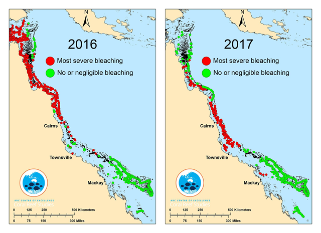
Great Barrier Reef bleaching in 2016 and 2017
10 April 2017 (ARC Centre of Excellence for Coral Reef Studies) – For the second time in just 12 months, scientists have recorded severe coral bleaching across huge tracts of the Great Barrier Reef after completing aerial surveys along its entire length. In 2016, bleaching was most severe in the northern third of the Reef, while one year on, the middle third has experienced the most intense coral bleaching.“The combined impact of this back-to-back bleaching stretches for 1,500 km (900 miles), leaving only the southern third unscathed,” says Prof. Terry Hughes, Director of the ARC Centre of Excellence for Coral Reef Studies, who undertook the aerial surveys in both 2016 and 2017.“The bleaching is caused by record-breaking temperatures driven by global warming. This year, 2017, we are seeing mass bleaching, even without the assistance of El Niño conditions.”
Insect mass collected in Germany’s Orbroicher Bruch nature reserve, 1989 and 2013
10 May 2017 (Science) – Entomologists call it the windshield phenomenon. “If you talk to people, they have a gut feeling. They remember how insects used to smash on your windscreen,” says Wolfgang Wägele, director of the Leibniz Institute for Animal Biodiversity in Bonn, Germany. Today, drivers spend less time scraping and scrubbing. “I’m a very data-driven person,” says Scott Black, executive director of the Xerces Society for Invertebrate Conservation in Portland, Oregon. “But it is a visceral reaction when you realize you don’t see that mess anymore.”
Insect biomass in 63 nature protection areas in Germany, 1989-2016
18 October 2017 (IWWR) – Since 1989, in 63 nature reserves in Germany the total biomass of flying insects has decreased by more than 75 percent. This decrease has long been suspected but has turned out to be more severe than previously thought. Ecologists from Radboud University together with German and English colleagues published these findings in the scientific journal PLOS ONE on 18 October 2017.In recent years, it became clear that the numbers of many types of insects such as butterflies and bees were declining in Western Europe and North America. “However, the fact that flying insects are decreasing at such a high rate in such a large area is an even more alarming discovery,” states Hans de Kroon, project leader at Radboud University.
Reduction in bird populations in Germany, 1998 and 2009
27 October 2017 (Mongabay) – A new study in PLOS ONE reveals a 76 percent reduction in Germany’s flying insect biomass over the past 27 years while another reports the country’s bird abundance has declined 15 percent in just over a decade.While the causes behind the insect decline haven’t yet been conclusively studied, the PLOS ONE study suggests agricultural intensification like increased pesticide use may be contributing to the decline.Neonicotinoid pesticides have been blamed for bee declines, and studies also link them to declines in aquatic insect communities. Many flying insects have aquatic life stages.
“Decimated”: Germany’s birds disappear as insect abundance plummets 76 percent—
Distribution of extinction threat values for 340 primate species
24 January 2017 (mongabay.com) – The Year of the Monkey has just ended, and won’t come around again for another 12 years. In the meantime, what is happening with our closest living relatives, the nonhuman primates? A recent paper in Science Advances by 31 of us indicates that we are facing an impending extinction episode if we don’t ramp up our actions in a major way over the remainder of this decade and before the next Year of the Monkey comes around again.Our paper, led by Alejandro Estrada of the National Autonomous University of Mexico and Paul Garber from the University of Illinois, Urbana, and including the two of us as coauthors, highlights the fact that nonhuman primates are on the decline almost everywhere.
Global tree cover loss, 2011-2016
OSLO, 23 October 2017 (Reuters) – Forest fires in Brazil and Indonesia contributed to a record loss in global tree cover in 2016, equivalent to the size of New Zealand, that could accelerate deforestation blamed for climate change, an independent forest monitoring network said on Monday.Man-made global warming increased the risks of wildfires by adding to extreme heat and droughts in some regions, according to Global Forest Watch (GFW). This year, California and Portugal have been among places suffering deadly blazes.
Annual global tree cover loss, with loss greater than 30 percent canopy density
17 July 2017 (World Resources Institute) – Global Forest Watch released new satellite-based data showing how forests around the world changed in the year 2015. The data, produced through the analysis of roughly a million satellite images by the University of Maryland and Google, measures the death or removal of trees at least 5 meters tall within 30×30 meter areas. This can capture any number of sustainable or unsustainable activities, from the clearing of natural forests to the harvest of tree plantations, but when analyzed appropriately with other contextual data and information can serve as a proxy for deforestation (typically defined as the permanent conversion of forest land for another use).For 2015, the data reveal both positive stories—such as a possible slowing of tree cover loss in Colombia—and more worrisome trends, including rising rates of tree cover loss in Papua New Guinea, West Africa, and the Mekong Region. We explore those stories below, as well as what the data can tell us about global state of forests.
Hectares burnt by forest fires in the EU, 2017 vs. 2008-2016
27 July 2017 (Euronews) – The number of forest fires in the EU has trebled so far this year, according to figures obtained by Euronews, affecting an area nearly the size of Luxembourg.There have been 677 blazes in 2017 – a huge increase on the 215 the bloc saw annually on average over the previous eight years.Experts have blamed climate change for the rise, saying it has extended the traditional wildfire season and increased the frequency of blazes.
Global warming blamed as EU forest fires treble in 2017 —
Active wildfires over Greenland, 2002-2017
11 August 2017 (Eos) – In a real clash of fire and ice, a massive wildfire in southern Greenland has captured the world’s attention.At the end of July, a couple of NASA satellites detected hot spots in Greenland that indicated fire, said Mark Ruminski, a team leader for a hazard mapping system of the National Oceanic and Atmospheric Administration. But fires are unexpected in Greenland, so he and his team thought it might be an error in the data.Then a civilian pilot snapped pictures of a wildfire near Sisimiut, the second-largest city in Greenland. When clouds cleared a few days later, NASA’s Landsat 8 satellite and the European Space Agency’s Sentinel-2 satellites captured photos of the largest of the fires from high above.Although ice covers nearly all of Greenland, fires do occasionally break out on the ice sheet’s margins. Hearing of the new sightings, Stef Lhermitte, a geoscientist who specializes in remote sensing at Delft University of Technology in the Netherlands, reviewed the past 17 years of data from NASA’s Moderate Resolution Imaging Spectroradiometer (MODIS) satellite and threw together a quick analysis on Twitter to help give context to the situation.
Mark Parrington, an atmospheric chemist who works with the European Union’s Copernicus Earth observation program, also tweeted an analysis of carbon dioxide emissions that indicates spikes of fire activity in 2015, 2016, and 2017.Although the current fire’s cause remains a mystery, peat from thawed permafrost could be its fuel, said Jessica McCarty, a geographer at Miami University in Oxford, Ohio, who specializes in geospatial analysis of wildfires.Permafrost, or permanently frozen soil, lies under multiple meters of an “active” soil layer that thaws seasonally. But in certain areas, when ice within the thawing permafrost layer melts, it can expose peat, a material that forms after decomposing plants get smashed down for centuries.The peat is made up of organic matter, most notably carbon, McCarty said. Given how readily it burns, she added, it’s almost like one giant charcoal briquette.McCarty suspects the fire’s fuel is peat for several reasons. First, the fire isn’t moving, like it would in a forest (not that there are any trees to speak of in this region of Greenland, she noted). In addition, the fire’s smoke is white, indicating damp fuel, like freshly thawed permafrost.If the fire is being fueled by thawed permafrost, there may be underlying climate change implications, McCarty continued. “The climate change [connection] is that there would be no fires here in Greenland if there were no fuel, and the only way that there’s fuel is if the permafrost is [thawed].”“Personally, this is very disturbing to me,” McCarty said, because the fire indicates significant permafrost degradation “sooner than [scientists] thought it would happen.” Researchers project significant permafrost loss in Greenland by the end of the century. Not 2017, she said.
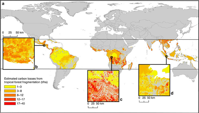
Worldwide carbon emissions due to fragmentation of tropical forests
31 March 2017 (Mongabay) – The earth’s forests have been broken into around 50 million fragments, the edges of which add up to a length that would make it a third of the way to the sun and which increase annual tropical deforestation carbon emissions by 31 percent. This, according to a new study published recently in Nature Communications that reveals forest fragmentation may be much more destructive than previously thought. A few hundred years ago, most large tropical forests stood vast and largely undisturbed. But since then, agriculture and extractive industries have moved in, whittling away forests to make room for cattle pasture and soy fields, palm oil plantations and acacia concessions. Today, owing primarily to human pressures, many of the world’s tropical forests exist as a collection of remnants. The Atlantic Forest is one of these. Once covering a huge swath of the eastern coast of Brazil and into Paraguay, Uruguay, and Argentina, the Atlantic Forest (called Mata Atlântica in Portuguese) has largely disappeared, and some researchers estimate just 3.5 percent may still remain – mostly as fragments interspersed in an expanse of pasture and cropland. Research has shown that forest fragmentation can have dire effects on wildlife, leading to higher extinction rates than if a forest is simply reduced in size while remaining in one piece. But how fragmentation affects carbon emissions is something that scientists haven’t been able to grasp – until now.
Forest fragmentation may be releasing much more carbon than we think—
Gulf of Mexico dead zone in July 2017
2 August 2017 (NOAA) – Scientists have determined this year’s Gulf of Mexico “dead zone,” an area of low oxygen that can kill fish and marine life, is 8,776 square miles, an area about the size of New Jersey. It is the largest measured since dead zone mapping began there in 1985.The measured size is close to the 8,185 square miles forecast by NOAA in June. The annual forecast, generated from a suite of NOAA-sponsored models, is based on nutrient runoff data from the U.S. Geological Survey. Both NOAA’s June forecast and the actual size show the role of Mississippi River nutrient runoff in determining the size of the dead zone.This large dead zone size shows that nutrient pollution, primarily from agriculture and developed land runoff in the Mississippi River watershed is continuing to affect the nation’s coastal resources and habitats in the Gulf.These nutrients stimulate massive algal growth that eventually decomposes, which uses up the oxygen needed to support life in the Gulf. This loss of oxygen can cause the loss of fish habitat or force them to move to other areas to survive, decreased reproductive capabilities in fish species and a reduction in the average size of shrimp caught.
Gulf of Mexico dead zone is the largest ever measured —
Global map of linear trend of dissolved oxygen in the ocean at a depth of 100 meters
ATLANTA, Georgia, 3 May 2017 (Georgia Tech) – A new analysis of decades of data on oceans across the globe has revealed that the amount of dissolved oxygen contained in the water – an important measure of ocean health – has been declining for more than 20 years.Researchers at Georgia Institute of Technology looked at a historic dataset of ocean information stretching back more than 50 years and searched for long term trends and patterns. They found that oxygen levels started dropping in the 1980s as ocean temperatures began to climb.“The oxygen in oceans has dynamic properties, and its concentration can change with natural climate variability,” said Taka Ito, an associate professor in Georgia Tech’s School of Earth and Atmospheric Sciences who led the research. “The important aspect of our result is that the rate of global oxygen loss appears to be exceeding the level of nature’s random variability.”
Decades of data on world’s oceans reveal a troubling oxygen decline —
Regime shifts between oxic and anoxic states of lake and ocean waters
6 October 2017 (UvA News) – Gradual environmental changes due to eutrophication and global warming can cause a rapid depletion of oxygen levels in lakes and coastal waters. A new study led by professors Jef Huisman and Gerard Muyzer of the University of Amsterdam (UvA) shows that microorganisms play a key role in these disastrous regime shifts. The researchers’ findings were published in the journal Nature Communications on 6 October 2017.Regime shifts are abrupt, large and persistent changes in the structure and function of ecosystems triggered by gradual changes in environmental conditions. Regime shifts have been described for a large variety of ecosystems. One type of regime shift may occur in lakes and coastal waters when a rapid depletion of the dissolved oxygen concentration leads to a lack of oxygen, which is detrimental to most aquatic organisms. Although this phenomenon is well known, the underlying mechanisms causing the transition from oxic to anoxic conditions are not fully understood.
Global carbon dioxide emissions from fossil fuels, 1990-2017
13 November 2017 (The Conversation) – Global greenhouse emissions from fossil fuels and industry are on track to grow by 2% in 2017, reaching a new record high of 37 billion tonnes of carbon dioxide, according to the 2017 Global Carbon Budget, released today.The rise follows a remarkable three-year period during which global CO₂ emissions barely grew, despite strong global economic growth.But this year’s figures suggest that the keenly anticipated global peak in emissions – after which greenhouse emissions would ultimately begin to decline – has yet to arrive.
Fossil fuel emissions hit record high after unexpected growth in 2017—
Geographic distribution of industry-reported venting volumes of methane in Alberta in 2016
TORONTO, 17 October 2017 (The Guardian) – Alberta’s oil and gas industry – Canada’s largest producer of fossil fuel resources – could be emitting 25 to 50% more methane than previously believed, new research has suggested.The pioneering peer reviewed study, published in Environmental Science & Technology on Tuesday, used airplane surveys to measure methane emissions from oil and gas infrastructure in two regions in Alberta. The results were then compared with industry-reported emissions and estimates of unreported sources of the powerful greenhouse gas, which warm the planet more than 20 times as much as similar volumes of carbon dioxide.“Our first reaction was ‘Oh my goodness, this is a really big deal,” said Matthew Johnson, a professor at Carleton University in Ottawa and one of the study’s authors. “If we thought it was bad, it’s worse.”
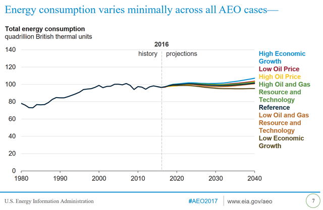
Energy-related carbon emissions from the U.S., 1980-2016, and projected to 2040
5 January 2017 (Climate Central) – The amount of energy Americans use and the pollution they emit from using coal, oil, and natural gas are not likely to change radically over the next 30 years, even as the U.S. becomes a major energy exporter, according to the U.S. Energy Information Administration’s Annual Energy Outlook, published Thursday.The outlook, which does not factor in any policies from the incoming fossil fuel-friendly Trump administration, shows that the U.S. is unlikely to make significant gains in reducing greenhouse gas emissions to meet its obligations under the Paris Climate Agreement, even though zero-carbon renewables are expected to grow faster than any other energy source over the next three decades. Electricity generation is expected to remain the largest single use of energy in the U.S., but crude oil use for transportation is expected to be largest source of energy-related carbon emissions. Carbon emissions from transportation surpassed those from electric power generation for the first time in U.S history in 2016. The U.S. is likely to become a major exporter of energy because it is expected to produce about 20 percent more energy than it does today through 2040 while using only about 5 percent more energy, said EIA administrator Adam Sieminsky.
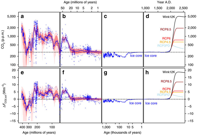
Projected atmospheric carbon dioxide levels compared with ancient levels
WASHINGTON, 5 April 2017 (The Washington Post) – Continuing to burn fossil fuels at the current rate could bring atmospheric carbon dioxide to its highest concentration in 50 million years, jumping from about 400 parts per million now to more than 900 parts per million by the end of this century, a new study warns.And if greenhouse gas emissions continue unabated beyond that point, the climate could reach a warming state that hasn’t been seen in the past 420 million years. Some research suggests that, if humans burned through all fossil fuels on Earth, atmospheric carbon dioxide concentrations could hit 5,000 parts per million by the year 2400. The new study speaks to the power of human influence over the climate. It suggests that after millions of years of relative stability in the absence of human activity, just a few hundred years of anthropogenic greenhouse gas emissions are on track to cause unprecedented warming.
Carbon dioxide levels could reach their highest point in 50 million years by the end of the century—
Global mean surface ocean pH values across the PETM, with modern era comparison
RIVERSIDE, California, 30 August 2017 (UCR Today) – A natural global warming event that took place 56 million years ago was triggered almost entirely by volcanic eruptions that occurred as Greenland separated from Europe during the opening of the North Atlantic Ocean, according to an international team of researchers that includes Andy Ridgwell, a University of California, Riverside professor of earth sciences.
Volcanic eruptions drove ancient global warming event—
Geography of carbon density change, 2003-2014
28 September 2017 (WHRC) – A revolutionary new approach to measuring changes in forest carbon density has helped WHRC scientists determine that the tropics now emit more carbon than they capture, countering their role as a net carbon “sink.”The shift from carbon sink to carbon “source” was caused by widespread deforestation, degradation and disturbance, according to a new study by a team of WHRC and Boston University scientists. The landmark paper was published online in the journal Science. […]“These findings provide the world with a wakeup call on forests,” said WHRC scientist Alessandro Baccini, the report’s lead author. “If we’re to keep global temperatures from rising to dangerous levels, we need to drastically reduce emissions and greatly increase forests’ ability to absorb and store carbon. Forests are the only carbon capture and storage ‘technology’ we have in our grasp that is safe, proven, inexpensive, immediately available at scale, and capable of providing beneficial ripple effects—from regulating rainfall patterns to providing livelihoods to indigenous communities.”
New approach to measuring forest carbon density shows tropics now emit more carbon than they capture—
Annual probability of occurrence of a heat waves with apparent temperature peaks greater than 40°C and 55°C
8 August 2017 (JRC) – Heatwaves amplified by high humidity can reach above 40°C and may occur as often as every two years, leading to serious risks for human health. If global temperatures rise with 4°C, a new super heatwave of 55°C can hit regularly many parts of the world, including Europe.A recently published study by the Joint Research Centre (JRC) – the European Commission’s science and knowledge service – analyses the interaction between humidity and heat. The novelty of this study is that it looks not only at temperature but also relative humidity to estimate the magnitude and impact of heat waves.It finds out that the combinations of the two, and the resulting heatwaves, leave ever more people exposed to significant health risks, especially in East Asia and America’s East Coast.Warm air combined with high humidity can be very dangerous as it prevents the human body from cooling down through sweating, leading to hyperthermia. As a result, if global warming trends continue, many more people are expected to suffer sun strokes, especially in densely populated areas of India, China, and the US.
Temperature and heat wave increases in India, 1960–2009
IRVINE, California, 7 June 2017 (UCI) – An increase in mean temperature of 0.5 degrees Celsius over half a century may not seem all that serious, but it’s enough to have more than doubled the probability of a heat wave killing in excess of 100 people in India, according to researchers at the University of California, Irvine and other institutions.This could have grim implications for the future, because mean temperatures are projected to rise by 2.2 to 5.5 degrees Celsius by the end of this century in the low- and mid-latitude countries of the Asian subcontinent, the Middle East, Africa and South America.“The impact of global climate change is not a specter on the horizon. It’s real, and it’s being felt now all over the planet,” said Amir AghaKouchak, UCI associate professor of civil & environmental engineering and co-author of the study, published today in Science Advances. “It’s particularly alarming that the adverse effects are pummeling the world’s most vulnerable populations.”
Histograms of daily maximum wet-bulb temperature, TWmax (°C), and maps of the ensemble averaged 30-year TWmax in India
2 August 2017 (The Guardian) – Extreme heatwaves that kill even healthy people within hours will strike parts of the Indian subcontinent unless global carbon emissions are cut sharply and soon, according to new research.Even outside of these hotspots, three-quarters of the 1.7bn population – particularly those farming in the Ganges and Indus valleys – will be exposed to a level of humid heat classed as posing “extreme danger” towards the end of the century.The new analysis assesses the impact of climate change on the deadly combination of heat and humidity, measured as the “wet bulb” temperature (WBT). Once this reaches 35C, the human body cannot cool itself by sweating and even fit people sitting in the shade will die within six hours.
Climate change to cause humid heatwaves that will kill even healthy people—
Forage Index map for Kenya, 2000-2016
16 October 2017 (IRIN) – Even at the best of times, the people of Turkana live on the edge. Almost all of the 1.3 million inhabitants of this arid county in northwest Kenya endure extreme poverty.By August the number of food insecure Kenyans, those lacking access to food sufficient to live a healthy life, had risen to 3.4 million. According to a flash appeal published in early September by OCHA, the UNs humanitarian aid coordination body, half a million Kenyans fall into the category of emergency food insecurity.In Turkana, very critical rates of global acute malnutrition (one of the key indicators of humanitarian crises) of up to 37% or above have been recorded in some areas more than double the emergency threshold of 15%. This is largely a result of higher food prices and a reduction in milk and food supplies.Turkana is the epicentre of the drought, Chris Ajele, director of the countys ministry of pastoral economy, told IRIN in late September in Lodwar, the county capital.“Drought is a part of life for pastoralists, but whereas they used to happen every 10 years, now, because of climate change, the gap is narrowing and they are becoming unpredictable”, said Josephat Lotwel, who works on drought response in Turkana for the National Disaster Management Authority. The forecast is that this drought will continue, malnutrition will increase, and more animals will die.
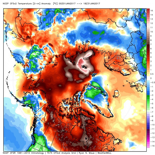
Arctic temperature difference from normal during January 2017
1 February 2017 (The Washington Post) – The Arctic is so warm and has been this warm for so long that scientists are struggling to explain it and are in disbelief. The climate of the Arctic is known to oscillate wildly, but scientists say this warmth is so extreme that humans surely have their hands in it and may well be changing how it operates.Temperatures are far warmer than ever observed in modern records, and sea ice extent keeps setting record lows.2016 was the warmest year on record in the Arctic, and 2017 has picked up right where it left off. “Arctic extreme (relative) warmth continues,” Ryan Maue, a meteorologist with WeatherBell Analytics, tweeted on Wednesday, referring to January’s temperatures. Veteran Arctic climate scientists are stunned. “[A]fter studying the Arctic and its climate for three and a half decades, I have concluded that what has happened over the last year goes beyond even the extreme,” wrote Mark Serreze, director of the National Snow and Ice Data Center in Boulder, Colorado, in an essay for Earth magazine.
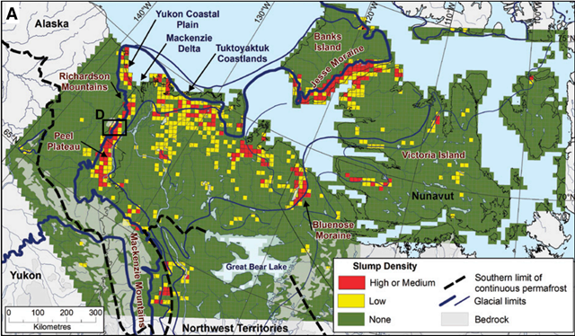
Permafrost thaw slump distribution and glaciated terrain in northwest Canada
28 February 2017 (InsideClimate News) – Huge slabs of Arctic permafrost in northwest Canada are slumping and disintegrating, sending large amounts of carbon-rich mud and silt into streams and rivers. A new study that analyzed nearly a half-million square miles in northwest Canada found that this permafrost decay is affecting 52,000 square miles of that vast stretch of earth—an expanse the size of Alabama.According to researchers with the Northwest Territories Geological Survey, the permafrost collapse is intensifying and causing landslides into rivers and lakes that can choke off life downstream, all the way to where the rivers discharge into the Arctic Ocean. Similar large-scale landscape changes are evident across the Arctic including in Alaska, Siberia and Scandinavia, the researchers wrote in a paper published in the journal Geology in early February. The study didn’t address the issue of greenhouse gas releases from thawing permafrost. But its findings could help quantify the immense global scale of the thawing, which will contribute to more accurate estimates of carbon emissions.
Massive permafrost thaw documented in Canada, portending huge carbon release—
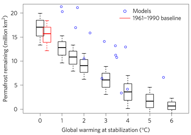
Relationship between global warming stabilization scenarios and remaining permafrost area
10 April 2017 (University of Leeds) – A new international research study, including climate change experts from the University of Leeds, University of Exeter and the Met Office, reveals that permafrost is more sensitive to the effects of global warming than previously thought.The study, published today in Nature Climate Change, suggests that nearly four million square kilometres of frozen soil – an area larger than India – could be lost for every additional degree of global warming experienced.
Methane craters on the floor of the Barents Sea
1 June 2017 (The Atlantic) – When Karin Andreassen set out for the Barents Sea, she knew she would find a lot of methane. The cold, shallow body of water just north of Norway meets Russia is home to oil and gas fields, and methane—the main component of natural gas—naturally seeps out of the seafloor here. Andreassen, a marine geologist at UiT The Arctic University of Norway, also knew from surveys in the 90s that she’d find some underwater craters.But she did not expect to find so many craters (hundreds!) and so many huge ones (half a mile wide).“They were giant,” she says, “And they were next to these huge mounds.” The mounds ended up being a clue to the craters’ origins. In a new study, Andreassen and her colleagues lay out a unified theory for how the craters and mounds formed as the Barents Sea itself changed over thousands of years. It all goes back to methane.
Hundreds of huge craters discovered in floor of the Arctic Ocean —
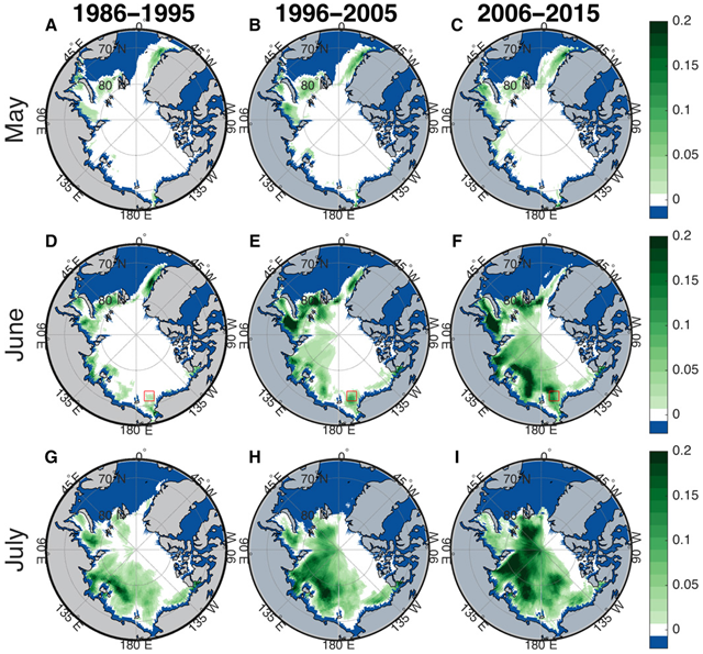
Map of average number of days of sufficient light in the Arctic Ocean for sub-ice phytoplankton blooms, 1986-2015
29 March 2017 (Harvard Gazette) – In 2011, researchers observed something that should be impossible — a massive bloom of phytoplankton growing under Arctic sea ice in conditions that should have been far too dark for anything requiring photosynthesis to survive. So, how was this bloom possible?Using mathematical modeling, researchers from the Harvard John A. Paulson School of Engineering and Applied Sciences (SEAS) found that thinning Arctic sea ice may be responsible for these and more blooms in the future, and could potentially cause significant disruption in the Arctic food chain. Phytoplankton shouldn’t be able to grow under the ice because ice reflects most sunlight back into space, stopping it from reaching the water below. But over the past decades, Arctic ice has gotten darker and thinner due to warming temperatures, allowing more and more sunlight to penetrate to the water beneath. Large, dark pools of water on the surface of the ice, known as melt ponds, have increased, lowering the reflectivity of the ice. The ice that remains today is thin and getting thinner.Twenty years ago, only about 3 to 4 percent of Arctic sea ice was thin enough to allow large colonies of plankton to bloom underneath. Today, the researchers found that nearly 30 percent of the ice-covered Arctic Ocean permits sub-ice blooms in summer months.
Number of days when Antarctica surface melt was detected from passive microwave satellite observations
COLUMBUS, Ohio, 15 June 2017 (OSU) – An area of West Antarctica more than twice the size of California partially melted in 2016 when warm winds forced by an especially strong El Niño blew over the continent, an international group of researchers has determined.In the June 15 issue of the journal Nature Communications, they report that the warm spell persisted for more than two weeks in January 2016. Satellite data revealed a mix of melted snow and ice over most of the Ross Ice Shelf—a thick platform of floating ice that channels about a third of the ice flowing from the West Antarctic Ice Sheet into the ocean.While researchers have been gathering evidence for years that warm ocean water is melting West Antarctic ice shelves from beneath, this is one of the first times they’ve been able to document how warm air could also cause widespread melting from above.“We were extraordinarily fortunate to be able to deploy state-of-the art equipment to West Antarctica just before this large melt event occurred,” said Dan Lubin, principal investigator of the Atmospheric Radiation Measurement (ARM) West Antarctic Radiation Experiment (AWARE). Lubin is a research physicist at the Scripps Institution of Oceanography in La Jolla, California and a coauthor of the Nature Communications study.
Subsidence map for coastal Louisiana over the past 6–10 years
15 June 2017 (The Washington Post) – It’s common knowledge that the coast of Louisiana is quietly sinking into the balmy Gulf waters. But new research suggests we may have been underestimating how quickly it’s happening.A new paper, published Wednesday in the Geological Society of America’s bulletin GSA Today, includes an updated map of the Louisiana coastline and the rate at which it’s sinking into the sea, a process scientists call “subsidence,” which occurs in addition to the climate change-caused process of sea-level rise. The new map suggests that, on average, the Louisiana coast is sinking at a rate of about 9 millimeters, or just over a third of an inch, per year — a faster rate than previous studies have suggested, according to the authors.“I think it’s a point worth making that we are finding here that what people recently have considered worst case scenarios are actually conditions that we already see right now,” said Torbjörn Törnqvist, a geologist at Tulane University and a co-author on the new paper.
Scientists say the rapid sinking of Louisiana’s coast already counts as a “worst case scenario” —
NOAA’s Annual Greenhouse Gas Index, 1990-2016
11 July 2017 (NOAA) – NOAA’s Annual Greenhouse Gas Index, which tracks the warming influence of long-lived greenhouse gases, has increased by 40 percent from 1990 to 2016 — with most of that attributable to rising carbon dioxide levels, according to NOAA climate scientists.The role of greenhouse gases on influencing global temperatures is well understood by scientists, but it’s a complicated topic that can be difficult to communicate. In 2006, NOAA scientists introduced the Annual Greenhouse Gas Index as a way to help policymakers, educators and the public understand changes in the direct climate warming influence exerted by greenhouse gas levels over time.“The greenhouse gas index is based on atmospheric data, so it’s telling us what is happening to Earth’s climate right now.” said James Butler, director of NOAA’s Global Monitoring Division.
NOAA’s greenhouse gas index up 40 percent since 1990 – Carbon dioxide increase is accelerating —
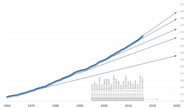
Atmospheric CO2 with decade trendlines and climate conferences, 1960-2017
10 April 2017 (National Observer) – The primary driver of global warming, disruptive climate changes and ocean acidification is the ever-increasing amount of carbon dioxide in our atmosphere.Despite decades of global efforts towards climate policies, clean energy and efficiency, CO2 levels continue to rise and are actually accelerating upward. For those of us hoping for signs of climate progress, this most critical and basic climate data is bitter news indeed. It shows humanity racing ever more rapidly into a full-blown crisis for both our climate and our oceans.That’s the story told by the newest CO2 data released by the United States National Oceanic and Atmospheric Administration (NOAA). Our foot-dragging at reducing climate pollution has left us in a dangerous situation with little time left to act. We’ve spent decades accelerating CO2 emissions to unprecedented extremes. We’ve blown our chance to deal gracefully with the climate and ocean crisis.
Atmospheric CO2 levels accelerate upward, smashing records—
Global Warming Index, 1950-2017
13 November 2017 (University of Oxford) – A new index of warming due to human influence on climate is released today in the journal Nature Scientific Reports. It exceeded 1°C above mid-19th-century levels in 2017 and is rising faster than ever before, leaving little time to achieve the goals of the Paris Climate Agreement.”Global temperatures may be pushed up temporarily by El Niño events or down by volcanic eruptions. We combine temperature observations with measurements of drivers of climate change to provide an up-to-date estimate of the contribution of human influence to global warming”, explains Karsten Haustein, who led the study.”This ‘Global Warming Index’ has been increasing continuously since the 19th century, with no pause in recent decades”, Haustein continues. “It has risen at a rate of 0.16°C per decade over the past 20 years, and is expected to average 0.96°C above 1850-79 for the decade 2010-2019. Worryingly, it appears to be accelerating, despite the recent slow-down in carbon dioxide emissions, because of trends in other climate pollutants, notably methane.”
New index of human influence on global temperature is rising faster than ever—
Temperature Anomalies over land and over ocean, 1950-2017
22 August 2017 (ThinkProgress) – Global temperatures are rising faster on the land, where we live, than the oceans, where we don’t, NASA charts reveal. Since scientists have long predicted this trend and say it will continue, it’s worth a closer look.The warming is also speeding up. Over the last 45 years, surface temperature has been rising at an average rate of around 0.3° F per decade — more than double the rate over the whole 135-year period. This speed up was also predicted. After all, emissions of CO2, the most important heat-trapping greenhouse gas, have increased by a factor of six since 1950 — and the rise of overall CO2 levels has sped up.The disparity between the rate of land and ocean warming has also gotten bigger. NASA Goddard Institute for Space Studies (GISS) recently posted some charts that show just how much faster it has been warming in recent decades — and how much the disparity has grown.
Stunning NASA chart shows how fast the ground beneath our feet is heating up—
Histogram of the predictive distribution of the global mean temperature increase relative to 1861–1880
31 July 2017 (UW News) – Warming of the planet by 2 degrees Celsius is often seen as a “tipping point” that people should try to avoid by limiting greenhouse gas emissions.But the Earth is very likely to exceed that change, according to new University of Washington research. A study using statistical tools shows only a 5 percent chance that Earth will warm 2 degrees or less by the end of this century. It shows a mere 1 percent chance that warming could be at or below 1.5 degrees, the target set by the 2016 Paris Agreement.“Our analysis shows that the goal of 2 degrees is very much a best-case scenario,” said lead author Adrian Raftery, a UW professor of statistics and sociology. “It is achievable, but only with major, sustained effort on all fronts over the next 80 years.”The new, statistically-based projections, published July 31 in Nature Climate Change, show a 90 percent chance that temperatures will increase this century by 2.0 to 4.9 C.“Our analysis is compatible with previous estimates, but it finds that the most optimistic projections are unlikely to happen,” Raftery said. “We’re closer to the margin than we think.”
Effect of 1°C temperature increase on real per-capita output across the globe
18 October 2017 (The Irish Times) – “Right, as the world goes, is only in question between equals in power, while the strong do what they can and the weak suffer what they must.”This sentence from the History of the Peloponnesian War by Thucydides is the philosophy of Donald Trump’s administration. Thus, two of his advisers, HR McMaster and Gary Cohn, wrote in May that: “The world is not a ‘global community’ but an arena where nations, non-governmental actors, and businesses engage and compete for advantage.”This amoral perspective has serious implications. In no area are global spillovers more significant and co-operation more vital than climate. The failure to act ensures that the poor would indeed suffer.This is the conclusion of a chapter on the economic impact of weather shocks, in the International Monetary Fund’s latest World Economic Outlook. The largest negative impacts of the shocks being made more frequent by global warming are on tropical countries.Nearly all low-income countries are tropical. Yet these countries are the least able to protect themselves. Thus they are innocent victims of changes for which they bear no responsibility.
Poorest countries suffer most from global warming—
Estimated protein concentration (a) and carbon-to-nitrogen ratio (b) for historical samples from floral (anthers and pollen) tissue for S. canadensis ![Average and variation (±s.e.) with time (1842–1998) in estimated protein concentration (a) and carbon to nitrogen ratio (b) for historical samples from floral (anthers and pollen) tissue for S. canadensis from the Smithsonian Natural History Museum. Atmospheric CO2 (Ca) for a given set of sample dates were obtained prior to 1960 from [49]; after 1960 using http://www.esrl.noaa.gov/gmd/ccgg/trends/. Each point is the average of approximately 6–40 samples by year from different biogeographic regions within North America. Graphic: Ziska, et al., 2016 / Proceedings of the Royal Society B Average and variation (±s.e.) with time (1842–1998) in estimated protein concentration (a) and carbon to nitrogen ratio (b) for historical samples from floral (anthers and pollen) tissue for S. canadensis from the Smithsonian Natural History Museum. Atmospheric CO2 (Ca) for a given set of sample dates were obtained prior to 1960 from [49]; after 1960 using http://www.esrl.noaa.gov/gmd/ccgg/trends/. Each point is the average of approximately 6–40 samples by year from different biogeographic regions within North America. Graphic: Ziska, et al., 2016 / Proceedings of the Royal Society B](https://lh3.googleusercontent.com/-t4xMzknKhB8/Wb6XUcFf9RI/AAAAAAAAlNA/YrCBpjXAK0gDic0gMbvYDdMzlPouWETHACHMYCw/image%255B6%255D?imgmax=800)
13 September 2017 (Politico) – Irakli Loladze is a mathematician by training, but he was in a biology lab when he encountered the puzzle that would change his life. It was in 1998, and Loladze was studying for his Ph.D. at Arizona State University. Against a backdrop of glass containers glowing with bright green algae, a biologist told Loladze and a half-dozen other graduate students that scientists had discovered something mysterious about zooplankton.Zooplankton are microscopic animals that float in the world’s oceans and lakes, and for food they rely on algae, which are essentially tiny plants. Scientists found that they could make algae grow faster by shining more light onto them—increasing the food supply for the zooplankton, which should have flourished. But it didn’t work out that way. When the researchers shined more light on the algae, the algae grew faster, and the tiny animals had lots and lots to eat—but at a certain point they started struggling to survive. This was a paradox. More food should lead to more growth. How could more algae be a problem?Loladze was technically in the math department, but he loved biology and couldn’t stop thinking about this. The biologists had an idea of what was going on: The increased light was making the algae grow faster, but they ended up containing fewer of the nutrients the zooplankton needed to thrive. By speeding up their growth, the researchers had essentially turned the algae into junk food. The zooplankton had plenty to eat, but their food was less nutritious, and so they were starving.
Modelled global increase in nitrate stored in the vadose zone, 1900-2000
10 November 2017 (BBC News) – Huge quantities of nitrate chemicals from farm fertilisers are polluting the rocks beneath our feet, a study says.Researchers at the British Geological Survey say it could have severe global-scale consequences for rivers, water supplies, human health and the economy.They say the nitrate will be released from the rocks into rivers via springs.That will cause toxic algal blooms and fish deaths, and will cost industry and consumers billions of pounds a year in extra water treatment.
Study reveals scale of “nitrate timebomb”—
China’s use of agricultural plastic mulch films, projected to 2024
5 September 2017 (Bloomberg News) – China will expand its agricultural use of environment-damaging plastic film to boost crop production even as authorities try to curb soil pollution, a government scientist said.Some 1.45 million metric tons of polyethylene are spread in razor-thin sheets across 20 million hectares (49 million acres) — an area about half the size of California — of farmland in China. Use of the translucent material may exceed 2 million tons by 2024 and cover 22 million hectares, according to Yan Changrong, a researcher with the Chinese Academy of Agricultural Sciences in Beijing.The plastic sheets, used as mulch over 12 percent of China’s farmland, are growing in popularity because they trap moisture and heat, and prevent weeds and pests. Those features can bolster cotton, maize, and wheat yields, while enabling crops to be grown across a wider area.“The technology can boost yields by 30 percent, so you can image how much extra production we can get — it can solve the problems of producing sufficient food and fiber,” Yan said in an interview at his office at the academy’s Institute of Environment and Sustainable Development in Agriculture.The downside is that polypropylene film isn’t biodegradable and often not recycled. Potentially cancer-causing toxins can be released into the soil from the plastic residue, known locally as “white pollution,” which is present at levels of 60-to-300 kilograms (132-to-661 pounds) per hectare in some provinces.
Plastic film covering 12 percent of China farmland pollutes soil—
Worldwide contamination of honey by neonicotinoid pesticides
5 October 2017 (Science News) – Neonicotinoid pesticides are turning up in honey on every continent with honeybees.The first global honey survey testing for these controversial nicotine-derived pesticides shows just how widely honeybees are exposed to the chemicals, which have been shown to affect the health of bees and other insects. Three out of four honey samples tested contained measurable levels of at least one of five common neonicotinoids, researchers report in the Oct. 6 Science.“On the global scale, the contamination is really striking,” says study coauthor Edward Mitchell, a soil biologist at the University of Neuchâtel in Switzerland. The pesticides are used on many kinds of crops grown in different climates, but traces of the chemicals showed up even in honey from remote islands with very little agriculture.“I used to think of neonicotinoids as being a [localized] problem next to a small set of crops,” says Amro Zayed, who studies bees at York University in Toronto and wasn’t involved in the research. These pesticides “are much more prevalent than I previously thought.”
Difference in obesity prevalence in Europe between 2002 and 2014, for girls and boys
17 May 2017 (United Nations) – Citing eating habits, physical activity, and sedentary behaviours, the United Nations health agency launched a new publication today at the European Congress on Obesity in Portugal which revealed a rising number of obese adolescents in many countries across Europe.“Despite sustained efforts to tackle childhood obesity, one in three adolescents is still estimated to be overweight or obese in Europe, with the highest rates found in southern European and Mediterranean countries,” said Dr. Zsuzsanna Jakab, Regional Director for Europe of the World Health Organization (WHO).
Amid ‘alarming rise’ in obesity, UN study finds one in three European adolescents overweight —
Trends in the number of children and adolescents with obesity and with moderate and severe underweight, 1975-2016
LONDON, 11 October 2017 (WHO) – The number of obese children and adolescents (aged five to 19 years) worldwide has risen tenfold in the past four decades. If current trends continue, more children and adolescents will be obese than moderately or severely underweight by 2022, according to a new study led by Imperial College London and WHO.The study was published in The Lancet ahead of World Obesity Day (11 October). It analysed weight and height measurements from nearly 130 million people aged over five years (31.5 million people aged five to 19, and 97.4 million aged 20 and older), making it the largest ever number of participants involved in an epidemiological study. More than 1000 contributors participated in the study, which looked at body mass index (BMI) and how obesity has changed worldwide from 1975 to 2016.Obesity rates in the world’s children and adolescents increased from less than 1% (equivalent to five million girls and six million boys) in 1975 to nearly 6% in girls (50 million) and nearly 8% in boys (74 million) in 2016. Combined, the number of obese five to 19 year olds rose more than tenfold globally, from 11 million in 1975 to 124 million in 2016. An additional 213 million were overweight in 2016 but fell below the threshold for obesity.
U.S. income growth 1980 and 2014
7 August 2017 (The New York Times) – Many Americans can’t remember anything other than an economy with skyrocketing inequality, in which living standards for most Americans are stagnating and the rich are pulling away. It feels inevitable.But it’s not.A well-known team of inequality researchers — Thomas Piketty, Emmanuel Saez, and Gabriel Zucman — has been getting some attention recently for a chart it produced. It shows the change in income between 1980 and 2014 for every point on the distribution, and it neatly summarizes the recent soaring of inequality.The line on the chart (which we have recreated as the red line above) resembles a classic hockey-stick graph. It’s mostly flat and close to zero, before spiking upward at the end. That spike shows that the very affluent, and only the very affluent, have received significant raises in recent decades.
The broken U.S. economy, in one simple chart —
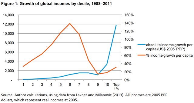
Growth of global incomes by decile, 1988–2011
15 January 2017 (Oxfam) – The gap between rich and poor is far greater than had previously been estimated, with big business and the super-rich fueling the inequality crisis by dodging taxes, driving down wages, and using their power to influence politics.According to Oxfam’s new report [pdf] ahead of the annual meeting of political and business leaders in Davos, Switzerland, eight men own the same wealth as the 3.6 billion people who make up the poorest half of humanity. It is time for a fundamental change in the way we manage our economies so that they work for all people, and not just a fortunate few.
Global map of the World Press Freedom Index for 2017
4 May 2017 (RSF) – The 2017 World Press Freedom Index compiled by Reporters Without Borders (RSF) reflects a world in which attacks on the media have become commonplace and strongmen are on the rise. We have reached the age of post-truth, propaganda, and suppression of freedoms – especially in democracies.RSF’s latest World Press Freedom Index highlights the danger of a tipping point in the state of media freedom, especially in leading democratic countries. (Read our analysis entitled Journalism weakened by democracy’s erosion.) Democracies began falling in the Index in preceding years and now, more than ever, nothing seems to be checking that fall.The obsession with surveillance and violations of the right to the confidentiality of sources have contributed to the continuing decline of many countries previously regarded as virtuous. This includes the United States (down 2 places at 43rd), the United Kingdom (down 2 at 40th), Chile (down 2 at 33rd), and New Zealand (down 8 at 13th).Donald Trump’s rise to power in the United States and the Brexit campaign in the United Kingdom were marked by high-profile media bashing, a highly toxic anti-media discourse that drove the world into a new era of post-truth, disinformation, and fake news.
Prevalence of undernourishment and number of people undernourished, 2000-2016
17 October 2017 (The Conversation) – Around the globe, about 815 million people – 11 percent of the world’s population – went hungry in 2016, according to the latest data from the United Nations. This was the first increase in more than 15 years.Between 1990 and 2015, due largely to a set of sweeping initiatives by the global community, the proportion of undernourished people in the world was cut in half. In 2015, U.N. member countries adopted the Sustainable Development Goals, which doubled down on this success by setting out to end hunger entirely by 2030. But a recent U.N. report shows that, after years of decline, hunger is on the rise again.As evidenced by nonstop news coverage of floods, fires, refugees and violence, our planet has become a more unstable and less predictable place over the past few years. As these disasters compete for our attention, they make it harder for people in poor, marginalized and war-torn regions to access adequate food.
World hunger is increasing thanks to wars and global warming—
International migration trend by region (in millions), 2000-2015
5 May 2017 (UN) – Highlighting the complex link between food insecurity and migration – where increase in one forces the other to rise and then spirals back to push the former even higher – the United Nations food relief agency has urged greater investments in food security and livelihoods at places of origin to prevent displacement and reduce forced onward migration.In its new report, At the Root of Exodus: Food security, conflict and international migration, the UN World Food Programme (WFP) found that each 1 per cent increase in food insecurity pushed 1.9 per cent more people towards migration. However, the act of migration itself can cause food insecurity, given the costs, lack of opportunities and often hazardous conditions along the journey, and force people to continue to move.“With millions of our brothers and sisters having fled their homes and facing so much hardship, it is our duty to shed light on their tragic situation,” David Beasley, the Executive Director of WFP, said in a news release announcing the report.
Worsening food insecurity forcing more people to migrate, finds new UN report —
Overdose deaths in U.S. involving opioids, 1999-2015
6 November 2017 (Quartz) – Drug overdose deaths, once rare, are now the leading cause of accidental death in the US, surpassing peak annual deaths caused by motor vehicle accidents, guns, and HIV infection.As a former public health official, clinician, and researcher, I’ve been engaged in efforts to control the opioid addiction epidemic for the past 15 years.The data shows that the situation is dire and getting worse. Until opioids are prescribed more cautiously and until effective opioid addiction treatment becomes easier to access, overdose deaths will likely remain at record high levels.
Rate of opioid prescription in the U.S. by county in 2016
18 August 2017 (NCMI) – It is well known that the US currently faces an opioid epidemic and according to the Department of Health and Human Services (HHS) since 1999 the rate of overdose death related to opioid, including both heroin and prescription drugs, has quadrupled. According to the National Institute on Drug Abuse (NIDA) prescription opioid use is a risk factor for heroin use in which the incidence of heroin abuse was 19 times higher among individual who reported prior use of non-medical pain reliever use compared to those who did not. In addition to the negative health effects the epidemic has also had economic impacts on the health care system with nearly 55 billion dollars being spent a year on health and social cost related to prescription opioid abuse [1]. For these reasons many states have cracked down on prescribing opioids and one might see the importance in using geographic information system (GIS) to map out hotspots of opioid prescription rates so they can possibly be reduced.Today’s map of the day shows the rate of opioid prescription by county for the year of 2016. From the map we can see many counties within various southern states have higher rates indicated by the dark brown shading.
Graph of the Day: Opioid prescription rate for the U.S. in 2016—
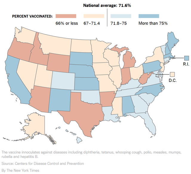
Vaccine coverage in the United States
HOUSTON, 8 February 2017 (The New York Times) – It’s looking as if 2017 could become the year when the anti-vaccination movement gains ascendancy in the United States and we begin to see a reversal of several decades in steady public health gains. The first blow will be measles outbreaks in America.Measles is one of the most contagious and most lethal of all human diseases. A single person infected with the virus can infect more than a dozen unvaccinated people, typically infants too young to have received their first measles shot. Such high levels of transmissibility mean that when the percentage of children in a community who have received the measles vaccine falls below 90 percent to 95 percent, we can start to see major outbreaks, as in the 1950s when four million Americans a year were infected and 450 died. Worldwide, measles still kills around 100,000 children each year.The myth that vaccines like the one that prevents measles are connected to autism has persisted despite rock-solid proof to the contrary. Donald Trump has given credence to such views in tweets and during a Republican debate, but as president he has said nothing to support vaccination opponents, so there is reason to hope that his views are changing.However, a leading proponent of the link between vaccines and autism said he recently met with the president to discuss the creation of a presidential commission to investigate vaccine safety. Such a commission would be a throwback to the 2000s, when Representative Dan Burton of Indiana held fruitless hearings and conducted investigations on this topic. And a documentary alleging a conspiracy at the Centers for Disease Control and Prevention, Vaxxed: From Cover-Up to Catastrophe, has recently been shown around the country.
Measles outbreaks across Europe, 2016-2017
11 July 2017 (BBC News) – Thirty-five people have died in the past year from measles outbreaks across Europe, the World Health Organization has warned.It described the deaths – which can be prevented with vaccination – as an “unacceptable tragedy”.A six-year-old boy in Italy was the latest to die from the infection. More than 3,300 measles cases have been recorded in the country.The most fatalities – 31 – have been in Romania.But there have also been deaths in Germany and Portugal since June 2016.Dr Zsuzsanna Jakab, the WHO regional director for Europe, said: “Every death or disability caused by this vaccine-preventable disease is an unacceptable tragedy. […]Prime Minister Paolo Gentiloni blamed a decrease in vaccinations in part on a “spread of anti-scientific theories“.A lingering false belief that the measles, mumps and rubella (MMR) jab causes autism is largely to blame, despite the claims being disproven and the doctor who made them being struck off.
Ecological Footprint per person and HDI by country indicate how close each country is to basic global sustainable development criteria
1 September 2017 (Global Footprint Network) – This month, the UN General Assembly (UNGA 72) will convene in New York City for its 72nd Regular Session. The summit’s theme is “Focusing on People: Striving for Peace and a Decent Life for All on a Sustainable Planet.” The phrase closely echoes Global Footprint Network’s vision “that all people can live thrive within the means of our planet.”Which prompts us to raise the question, why won’t the significance of resource security, planetary boundaries, environmental resilience, or any of these themes be included in the topics of discussion at UNGA 72?This blind spot is nothing new. In a recent article published by Frontiers in Energy Research, Global Footprint Network highlighted how the UN Sustainable Development Goals (SDGs) adopted two years ago this month are vastly underemphasizing sustainability. The authors of “Making the Sustainable Development Goals Consistent with Sustainability””—Footprint Network CEO and Co-founder Mathis Wackernagel, Program Director Laurel Hanscom, and Director of Research David Lin—found that countries scoring high on a recently developed SDG index also had, without exception, high Ecological Footprints per person. Using the Bertelsmann and Sustainable Development Solutions Network (SDSN)’s SDG index to quantify SDGs, the article reveals that the sustainable development goals are largely (short-term) development goals, vastly underperforming on sustainability.
Making the U.N. Sustainable Development Goals consistent with sustainability—
Mean sperm concentration by fertility and geographic groups, adjusted for potential confounders
25 July 2017 (Financial Times) – The sperm count of men in the western world has fallen by more than half over a period of 40 years, according to an international study described by its authors as “an urgent wake-up call” about declining male health.“Decreasing sperm count has been of great concern since it was first reported 25 years ago,” said senior author Shanna Swan of Icahn School of Medicine at Mount Sinai, New York. “This definitive study shows … that the decline is strong and continuing.”
“Urgent wake-up call” for male health as sperm counts plummet globally
![Phylogenetic signal as a predictor of extinction risk in the world’s primates. Distribution of threat values (IUCN Red List categories) for 340 primate species. Representative genera labeled. After taxonomic updates, our working phylogeny included 350 of the 367 species considered in the molecular supertree (73), of which 340 are not Data Deficient. Closely related species are more likely to have the same threat status than species taken randomly from the phylogeny [D = 0.31; P (D < 1) < 0.001], supporting a strong phylogenetic signal (see Supplementary Text for details of methodology). Data for Africa include Madagascar. IUCN Red List Categories: CR (Critically Endangered), EN (Endangered), VU (Vulnerable), NT (Near Threatened), and LC (Least Concern). Graphic: Estrada, et al., 2017 / Science Advances Phylogenetic signal as a predictor of extinction risk in the world’s primates. Distribution of threat values (IUCN Red List categories) for 340 primate species. Representative genera labeled. After taxonomic updates, our working phylogeny included 350 of the 367 species considered in the molecular supertree (73), of which 340 are not Data Deficient. Closely related species are more likely to have the same threat status than species taken randomly from the phylogeny [D = 0.31; P (D < 1) < 0.001], supporting a strong phylogenetic signal (see Supplementary Text for details of methodology). Data for Africa include Madagascar. IUCN Red List Categories: CR (Critically Endangered), EN (Endangered), VU (Vulnerable), NT (Near Threatened), and LC (Least Concern). Graphic: Estrada, et al., 2017 / Science Advances](https://lh3.googleusercontent.com/-PKQSBauCTF8/WJJn8GoYnFI/AAAAAAAAiig/6GQ_ze3-dNo/image%25255B12%25255D.png?imgmax=800)
