50 doomiest graphs of 2016
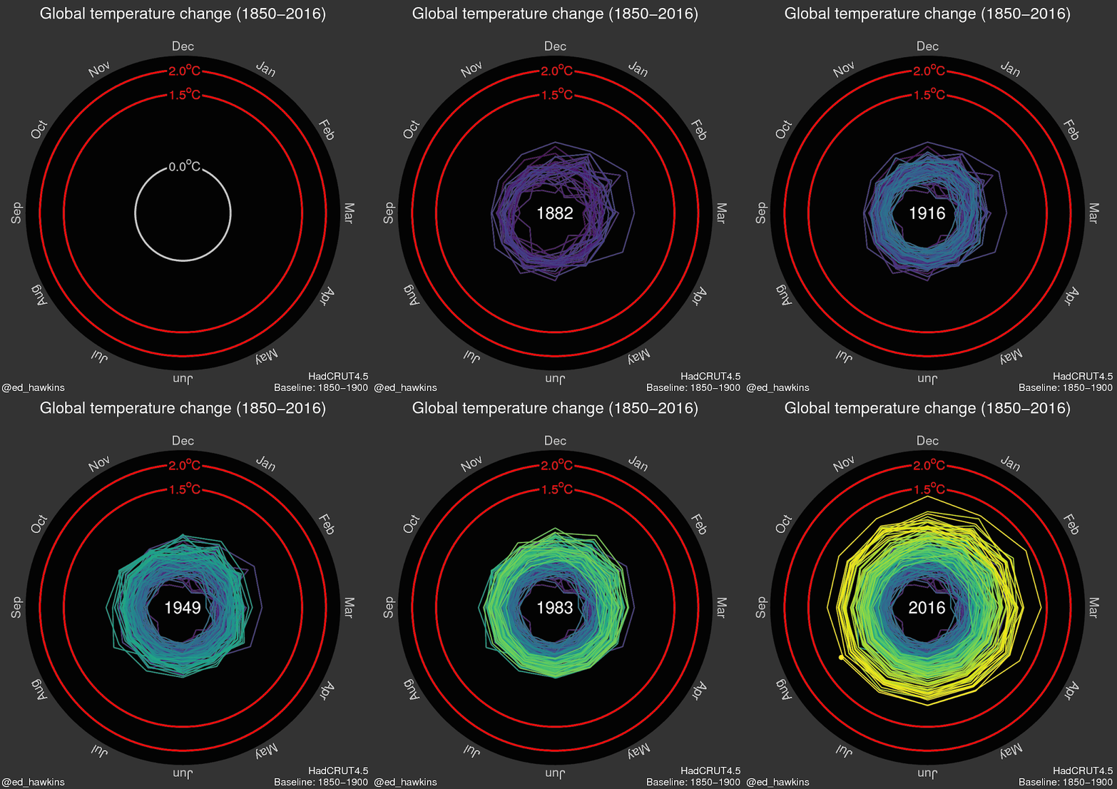 31 December 2016 (Desdemona Despair) – The data don’t lie. Unfortunately, the antiscience forces of the incoming Trump administration clearly intend to defund vital government data collection programs for climate science and Earth observation. In the extreme case, they could wage a war on scientific expertise, by stripping empiricism out of America’s regulatory systems altogether. As 2016 showed, the need for the Earth sciences has never been greater. The global warming risks to island nations became clearer, with 73 percent of islands expected to become more arid. El Niño, amplified by global warming, caused ”gruesome” coral deaths globally and brought record drought and wildfires to the Amazon rainforest, while stalling tree growth and shutting down the Amazon carbon sink. None of this stopped humans from chopping down the Amazon, with deforestation rising to rates not seen since 2009. Fortunately, U.S. scientists recall the libricide committed by the Harper government against Canada’s fisheries science data in 2013. They’ve organized a “guerrilla archiving” effort to copy vital climate and other environmental data to servers outside of U.S. territory, before the wrecking crew arrives to demolish America’s scientific capabilities.
- 2016 doomiest images and stories
- 2015 doomiest graphs, images, and stories
- 2014 doomiest graphs, images, and stories
- 2013 doomiest graphs, images, and stories
- 2012 doomiest graphs, images, and stories
- 2011 doomiest graphs, images, and stories
- 2010 doomiest graphs, images, and stories
—
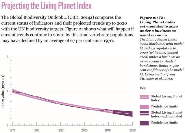
Living Planet Index, projected to 2020
The Living Planet Index (solid black line) with model fit and extrapolation to 2020 (white line, shaded area) under a business-as-usual scenario, shaded band shows limits 95 per cent confidence of the model fit. Using the method from Tittensor, et al., 2014. Graphic: WWF International
Global wildlife populations could drop two-thirds by 2020 as human demand continues to exceed Earth’s capacity; Report revels 56 percent of UK species have declined since 1970 and 1,199 species are threatened with extinction —
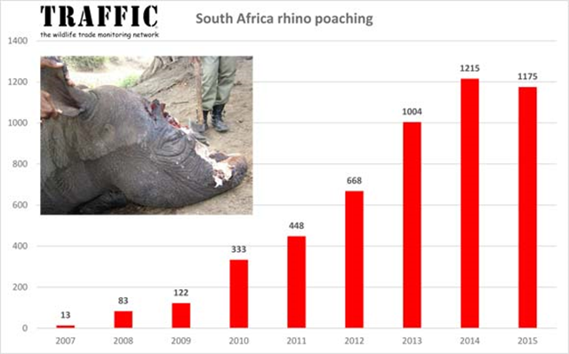
Number of poached rhinos in South Africa, 2007-2015
South Africa announced the official number of rhinos illegally killed in the country during 2015. The figure of 1,175 represented a slight drop on the 1,215 record total in 2014, but overall rhino poaching figures for Africa totaled a record high for the continent.
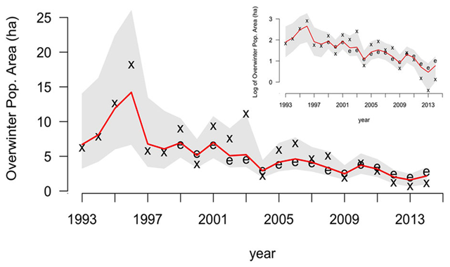
Population of migratory monarch butterflies, 1993-2014
Model estimated annual over wintering population size for the Eastern, migratory population of monarch butterflies (Danaus plexippus), 1993-2014. The red line is the median of posterior estimates, and the gray shaded area shows 95 percent credible intervals. The x symbols define overwintering habitat area data from Mexico, and the e symbols represent observations of annual egg production in the Midwest scaled to match the magnitude of the overwintering data. The inset depicts the data and model results on a log-scale. Graphic: Semmens, et al., 2016 / Nature Scientific Reports
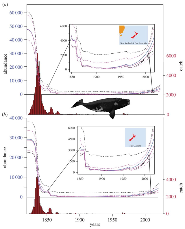
Catches of New Zealand southern right whales, 1829-2020
Population trajectories and catches of New Zealand southern right whales from 1829 to 2020. Panels show the population trajectories when (a) ‘high case’ catches from the southwest Pacific are allocated, and (b) New Zealand catches only, using the low-case catch allocation. Median estimates are solid lines while dashed lines denote 95 percent probability intervals. Blue lines show the population trajectory when female recaptures are fitted. Pink lines show the trajectory fitted to relative abundance indices described in Carroll, et al., 2013. Graphic: Jackson, et al., 2016 / Royal Society Open Science
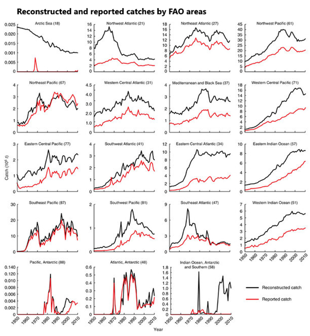
Peak Fish: Revised fisheries catch data show strong resource depletion effect
Fisheries data assembled by the Food and Agriculture Organization (FAO) suggest that global marine fisheries catches increased to 86 million tonnes in 1996, then slightly declined. Here, using a decade-long multinational “catch reconstruction” project covering the Exclusive Economic Zones of the world’s maritime countries and the High Seas from 1950 to 2010, and accounting for all fisheries, we identify catch trajectories differing considerably from the national data submitted to the FAO. We suggest that catch actually peaked at 130 million tonnes, and has been declining much more strongly since.
Why we’ve been hugely underestimating the overfishing of the oceans —
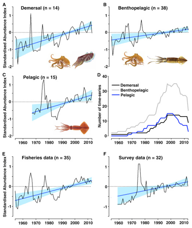
Trends in squid populations, 1953-2013
Trends in abundance from 1953 to 2013 for demersal (A), benthopelagic (B) and pelagic (C) cephalopods (all edf = 1, all p values ≤ 0.01), with number of time-series by life-history group (D; total n = 67). Illustrations depict key taxa associated with each group. Trends in abundance for time-series derived from fisheries data (E) and survey data (F) (all edf = 1, all p values < 0.05). For all abundance plots, dark blue lines represent fitted values derived from generalised additive mixed models (± 95% CI) and black lines represent mean standardized time-series (z-scores). Graphic: Doubleday, et al., 2016 / Current Biology
Squids populations on the rise as oceans warm —
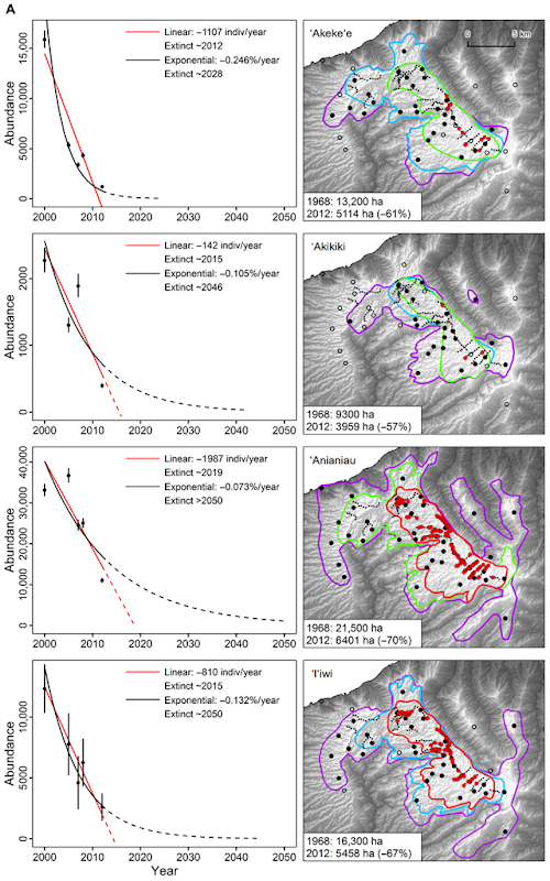
Rapid decline of last native bird species in Kauai, Hawai’i, 2000-2012
Population estimates (left panels) are from surveys conducted in 2000, 2005, 2007, 2008, and 2012 across both the interior and exterior portions of the Alaka‘i Plateau (with error bars representing the 95% CI of each estimate). Linear and exponential population change models fitted to the 2000–2012 data are projected from 2013 to 2050 or estimated year of extinction (when abundance is less than 30 individuals, which is a quasi-extinction level). Graphic: Paxton, et al., 2016 / Science Advances The few remaining species of native forest birds left on the Hawaiian island of Kauai have suffered population declines so severe – 98 percent in one case – that some are near extinction. The cause of the collapse, according to a recent study in the journal Science Advances, is not alien plants or predators, but rather warming temperatures that have enabled non-native mosquitoes carrying deadly avian malaria to invade the birds’ high-elevation strongholds.
Global warming is killing the last native bird species in the mountain forests of Kauai —
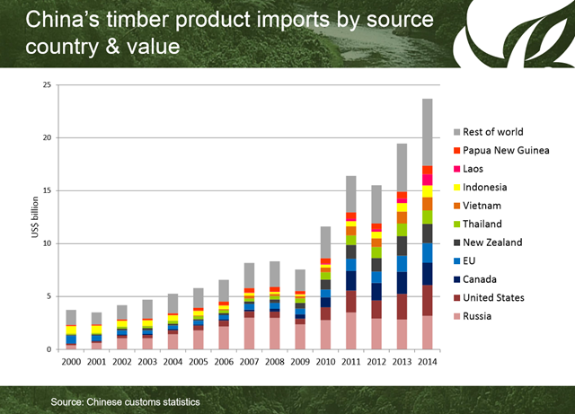
China timber product imports by source country and value, 2000-2014
EU member states are failing to enforce laws designed to protect the world’s forests from illegal logging. Illegal wood products are imported to the EU primarily from China, in the form of furniture, plywood and flooring, and as timber logged in Russia and in the world’s tropical rainforests – a trade that drives deforestation and corruption. Interpol claims that tackling illegal logging would be the “fastest, most effective” way to reduce global greenhouse gas emissions. Graphic: James Hewitt
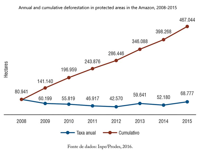
Deforestation in protected areas in the Amazon, 2008-2015
Between 2008 and 2015, 467,000 hectares [1,153,982 acres] were deforested in protected areas of the region, destroying about 233 million trees and causing the death or displacement of about 8.3 million birds and 271,000 monkeys. We estimate that the burning of vegetation in deforested area in the Amazon protected areas has resulted in the issuance of 29 million tons of carbon dioxide equivalent per year between 2008 and 2015, comparable to the emission of this gas by 10 million cars per year (i.e., the equivalent to the emissions of 20% of the car fleet in Brazil).
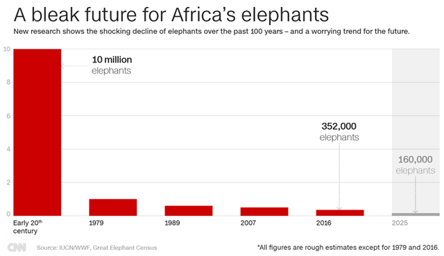
Population of Africa elephants, from the early 20th century to 2016
Before the Great Elephant Census (GEC), total elephant numbers were largely guesswork. But over the past two years, 90 scientists and 286 crew have taken to the air above 18 African countries, flying the equivalent of the distance to the moon — and a quarter of the way back — in almost 10,000 hours. Prior to European colonization, scientists believe that Africa may have held as many as 20 million elephants; by 1979 only 1.3 million remained — and the census reveals that things have gotten far worse. Graphic: CNN
Catastrophic decline of Africa elephant population revealed by most comprehensive survey ever —
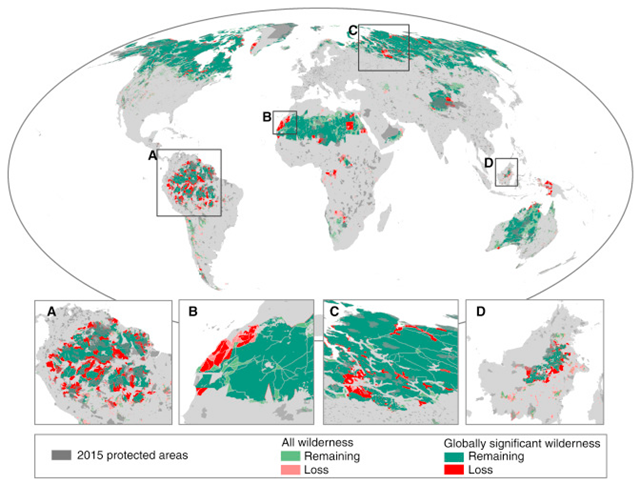
Change in the global distribution of wilderness areas since the early 1990s
Globally significant wilderness areas are defined as wilderness areas >10,000 km2. The insets are focused on the Amazon (A), the western Sahara (B), the West Siberian taiga (C), and Borneo (D). Graphic: Watson, et al., 2016 / Current Biology
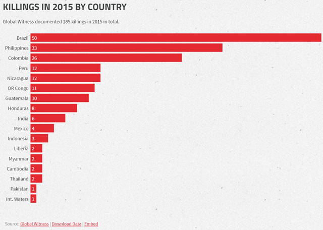
Murders of environmental and indigenous defenders in 2015
More than three people were killed a week in 2015 defending their land, forests, and rivers against destructive industries. Graphic: Global Witness
2015 was the worst year on record for murders of land and environmental defenders – ‘We get threatened, vilified, and killed for standing up to the mining companies on our land and the paramilitaries that protect them’; Graph of the Day: Global killings of land and environmental defenders, 2002-2014 —
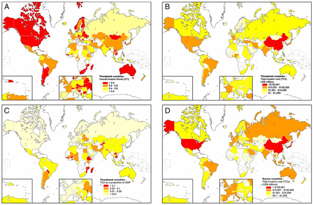
World map of threat to agriculture from invasive species
(A) The overall invasion threat (OTt) to each threatened country, t; (B) the total invasion cost (TICt) (in millions of US dollars) to threatened countries; (C) the total invasion cost (TICt) (in millions of US dollars) to threatened countries, as a proportion of GDP; and (D) the total invasion cost (TICs) (in millions of US dollars) from source countries, s. Graphic: Paini, et al., 2016 / PNAS
Global threat to agriculture from invasive species —
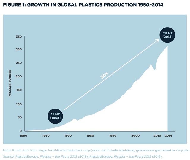
Growth in global plastics production, 1950-2014
Plastic rubbish will outweigh fish in the oceans by 2050 unless the world takes drastic action to recycle the material. Graphic: Ellen MacArthur Foundation
Plastic to outweigh fish in oceans by 2050, study warns
—
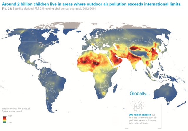
Global distribution of air pollution during 2012-2014
Satellite derived PM 2.5 level (global annual average), 2012-2014. Around 2 billion children live in areas where outdoor air pollution exceeds international limits. Graphic: van Donkelaar, et al., 2016 / Environ. Sci. Technol / UNICEF
UNICEF: Almost one in seven children breathing heavily toxic air –‘Air pollution will become the leading cause of environment-related child death by 2050’, 92 percent of world population lives where air quality levels exceed safety limits: World Health Organization —
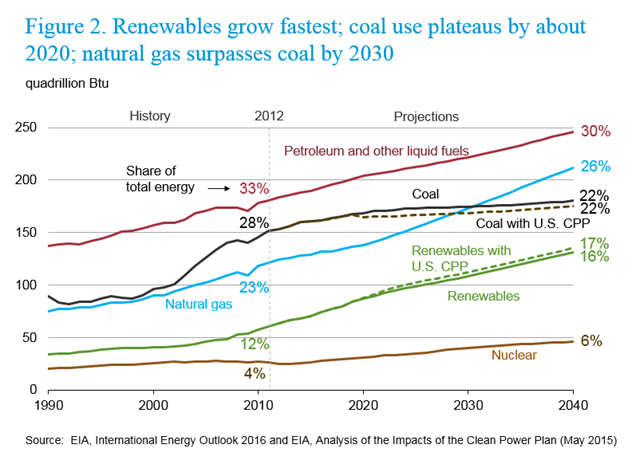
World energy mix, projected to 2040
World energy mix, projected to 2040. Renewables grow fastest; coal use plateaus by about 2020; natural gas surpasses coal by 2030. Based on its latest projections, EIA said global carbon dioxide emissions from energy activities will rise from 36 billion metric tons in 2012, the baseline year used for the 2016 outlook, to 43 billion metric tons in 2040. Graphic: EIA
Use of fossil fuels may not decline in the foreseeable future – World energy consumption projected to increase by 48 percent over the next three decades; Hooked! The unyielding grip of fossil fuels on global life – ‘In 2040, fossil fuels will still have a grip on a staggering 78 percent of the world energy market’ —
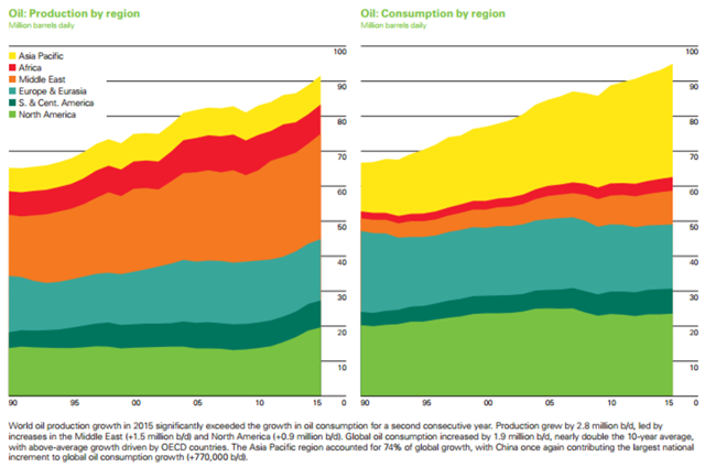
World oil production and consumption by region for 2015
World oil production growth in 2015 significantly exceeded the growth in oil consumption for a second consecutive year. Production grew by 2.8 million b/d, led by increases in the Middle East (+1.5 million b/d) and North America (+0.9 million b/d). Global oil consumption increased by 1.9 million b/d, nearly double the 10-year average, with above-average growth driven by OECD countries. The Asia Pacific region accounted for 74 percent of global growth, with China once again contributing the largest national increment to global oil consumption growth (+770,000 b/d). Graphic: BP
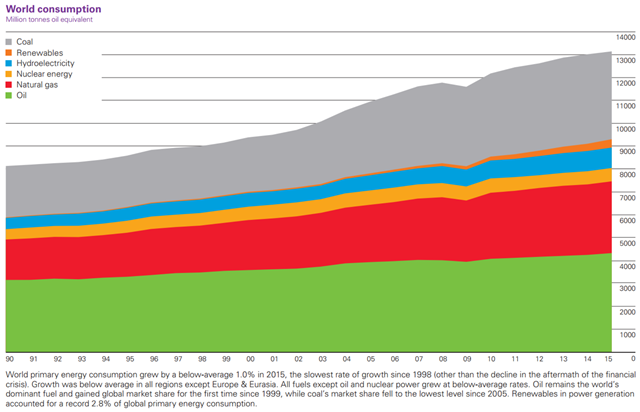
World primary energy consumption by source, 1990-2015
World primary energy consumption (million tons oil equivalent), 1990-2015. Graphic: BP
Graph of the Day: World primary energy consumption, 1990-2015 —
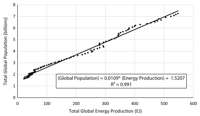
Correlation of historical energy production and world population, 1900–2014
Correlation of historical energy production and world population, 1900–2014. Data from (ASPO, 2006, BP, 2015, Gerland et al., 2014, Laherrere, 2004, McEvedy and Jones, 1978 and Rutledge, 2011). Global energy does not include the solid fuel renewable energy sources (RES), i.e., wood and peat. Graphic: Jones and Warner, 2016 / Energy Policy
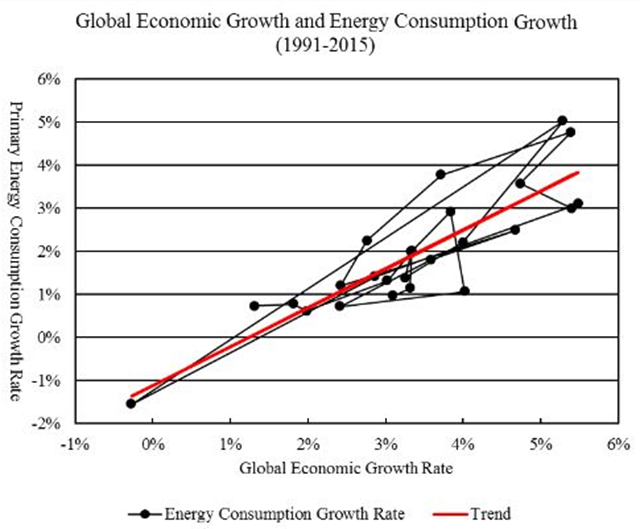
Global economic growth and energy consumption growth, 1991-2015
This graph compares the historical world economic growth rates and the primary energy consumption growth rates from 1991 to 2015. The primary energy consumption growth rate has an intercept of -0.011 at zero economic growth rate and a slope of 0.904. That is, primary energy consumption has an ‘autonomous’ tendency to fall by 1.1 percent a year when economic growth rate is zero. When economic growth rate rises above zero, an increase in economic growth rate by one percentage point is associated with an increase in primary energy consumption by 0.9 percent. R-square for the linear trend is 0.751. Source: Gross world product in constant 2011 international dollars is from World Bank (2016); world primary energy consumption is from BP (2016). Graphic: Political Economist / Ron Patterson / Peak Oil Barrel
Graph of the Day: Global economic growth and energy consumption growth, 1991-2015 —
Annual greenhouse gas index, 1700-2015
The level of carbon dioxide in the atmosphere is not just rising, it’s accelerating, and another potent greenhouse gas, methane showed a big spike last year, according to the latest annual greenhouse gas index released by the National Oceanic and Atmospheric Administration. The NOAA annual greenhouse gas index (AGGI) is a measure of the warming influence of long-lived trace gases and how that influence is changing each year. The index was designed to enhance the connection between scientists and society by providing a normalized standard that can be easily understood and followed. The warming influence of long-lived greenhouse gases is well understood by scientists and has been reported by NOAA through a range of national and international assessments.
Graph of the Day: NOAA annual greenhouse gas index (AGGI), 1700-2015 —
Canada carbon emissions projected to 2020 and 2030
Canadian government numbers show that years of environmental efforts in Canada essentially had no impact on reducing carbon emissions. The projection, released by Environment and Climate Change Canada, shows that Canada is expected to pump out the equivalent of 768 megatons of CO2 by 2020, and 815 megatons by 2030. Those projections also do not include emissions from the forestry sector.
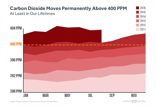
Global atmospheric CO2 concentration, 2011 to September 2016
Global atmospheric CO2 concentration, 2011-2016. The lower value of CO2 concentration passed 400 ppm in September 2016, and won’t fall below 400 ppm ‘ever again for the indefinite future.’ Graphic: Climate Central / Scripps Institute of Oceanography / Mauna Loa Observatory
Global atmospheric CO2 concentration passes 400 ppm threshold ‘for the indefinite future’ —
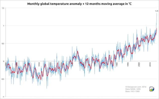
Global surface temperatures, 1880 to February 2016
Monthly global surface temperatures (land and ocean) from NASA for the period 1880 to February 2016, expressed in departures from the 1951-1980 average. The red line shows the 12-month running average. February 2016 soared past all rivals as the warmest seasonally adjusted month in more than a century of global recordkeeping. Graphic: Stephan Okhuijsen / datagraver.com
February smashes Earth’s all-time global heat record by a jaw-dropping margin —
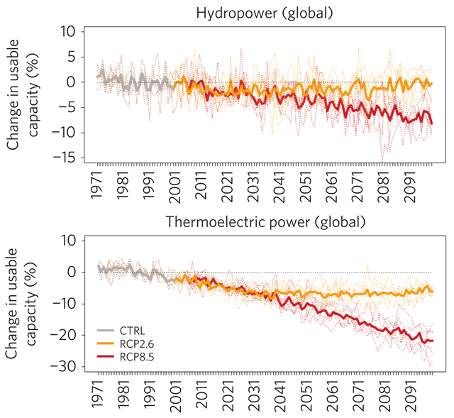
Projected impacts of climate change on usable capacity of current hydropower and thermoelectric power plants
Projected impacts of climate and water resources on annual mean usable capacity of current hydropower and thermoelectric power plants, for the two global warming scenarios, RCP2.6 and RCP8.5. Graphic: van Vliet, et al., 2016 / Nature Climate Change
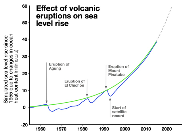
Acceleration in rate of sea level rise due to global warming, projected to 2020
The graph shows how sea level rises and falls as ocean heat content fluctuates. After volcanic eruptions, the Earth cools and, in turn, the heat content in the ocean drops, ultimately lowering sea level. The solid blue line is the average sea level rise of climate model simulations that include volcanic eruptions. The green line is the average from model simulations with the effect of volcanic eruptions removed, and it shows a smooth acceleration in the rate of sea level rise due to climate change. Graphic: UCAR
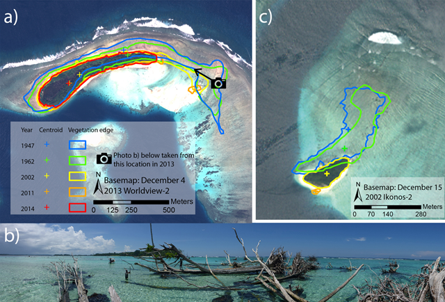
Coastal recession of Solomon Islands, 1947-2014
Coastal recession of Sogomou and Kale. (a) Coastline recession on Sogomou Island between 1947 and 2014, (b) view from the eroding eastern end of Sogomou looking back towards the remainder of the island, (c) coastline recession on Kale Island between 1947 and 2014. Note: Kale Island was completely displaced by 2014. Graphic: Albert, et al., 2016 / Environmental Research Letters
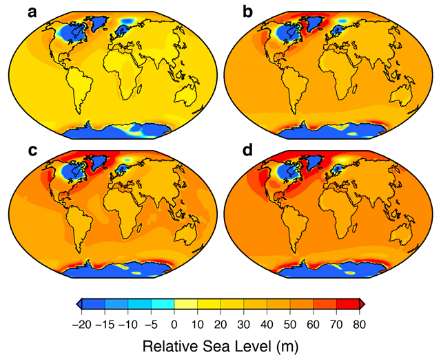
Projected relative sea-level changes at 10,000 years for four emission scenarios
Maps showing projected patterns of relative sea-level change at 10,000 years for four emission scenarios from version 2.8 of the UVic model: (a) 1280 PgC, (b) 2560 PgC, (c) 3840 PgC and (d) 5120 PgC. Each map includes the contributions from future ice melting and the on-going isostatic response of the Earth to the most recent deglaciation. For each scenario, the global mean sea-level (GMSL) values are approximately: (a) 21 m, (b) 33 m, (c) 39 m, and (d) 44 m (these values include a contribution from isostatic processes. The global mean contributions from ocean warming and glacier melting are not included (they are less than 5 percent of the GMSL values given above for all emission scenarios). Graphic: Clark, et al., 2016 / Nature Climate Change
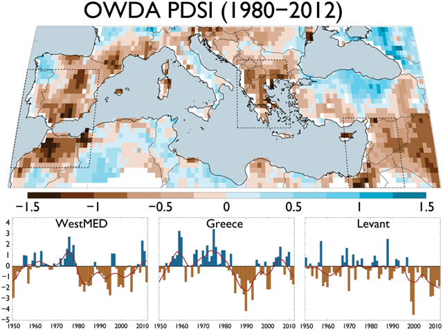
Drought Severity Index in the Mediterranean, 1980–2012
(top) Multiyear average Palmer Drought Severity Index (scPDSI) for 1980–2012 with regions of recent and persistent drought outlined in dashed black lines: WestMED (32°N–42°N, 10°W–0°), Greece (36°N–43°N, 19°E–26°), and the Levant (30°N–37°N, 33°E–40°E). (bottom) Also shown are the regional average scPDSI time series from these regions for 1950–2012 (red line is a 10 year loess smoother). Graphic: Cook, et al., 2016 / Journal of Geophysical Research: Atmospheres
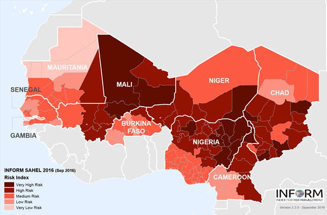
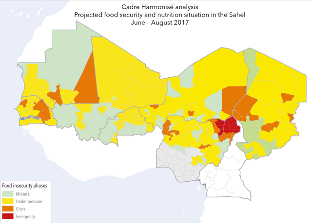
Projected food security and nutrition situation in the Sahel for June–August 2017
INFORM risk index for African nations in the Sahel region, September 2016. INFORM is a composite index for risk management that identifies countries at a high risk of humanitarian crisis which are more likely to require international assistance. The index envisages three dimensions of risk: hazards & exposure, vulnerability and lack of coping capacity dimensions. Graphic: UN
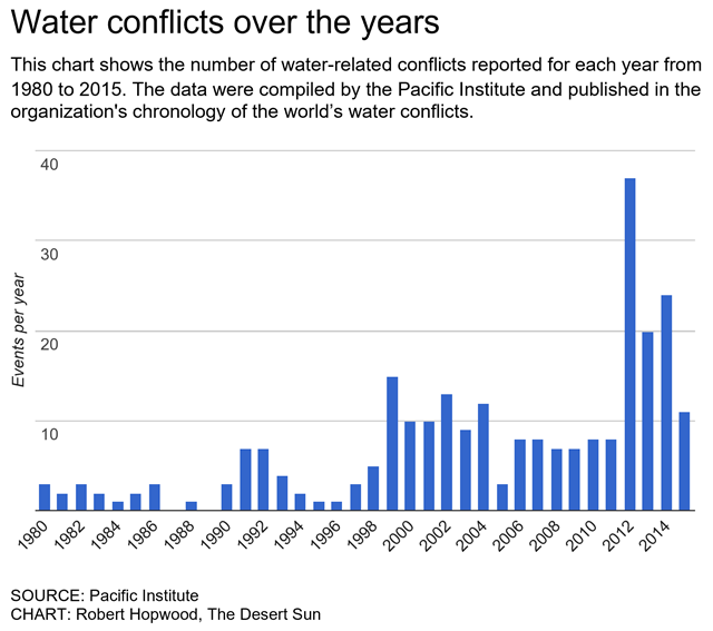
Water-related conflicts, 1980-2014
This chart shows the number of water-related conflicts reported for each year from 1980 to 2015. The data were compiled by the Pacific Institute and published in the organization’s chronology of the world’s water conflicts. Graphic: Robert Hopwood / The Desert Sun
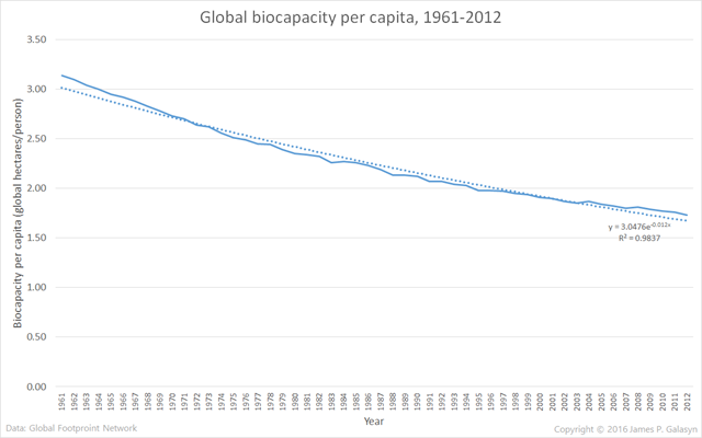
Global biocapacity per capita, 1961-2012
Over the period from 1961 to 2012, humanity’s ecological footprint has nearly tripled. During this time, Earth’s biocapacity declined at a steady rate of about 55 million global hectares per year. Biocapacity per capita is declining at an exponential rate. Extrapolating the curve fit shows that it will fall to half of its 1961 value by around the year 2020. By the year 2100, biocapacity per capita will fall to about one-sixth of its 1961 value, which means that each human will be supported by about 17 percent of the ecosystem services that each human was supported by in 1961.
Graph of the Day: Global biocapacity per capita, 1961-2012 —
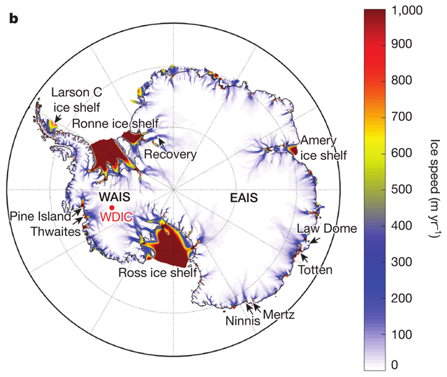
Speed of ice movement in Antarctica
Model surface ice speeds and grounding lines (black lines) show the location of major ice streams, outlet glaciers, and buttressing ice shelves (seaward of grounding lines) relative to the underlying topography in Antarctica. Features and place names mentioned in the text are also shown. AS, Amundsen Sea; BS, Bellingshausen Sea; WDIC, WAIS Divide Ice Core. The locations of the Pine Island, Thwaites, Ninnis, Mertz, Totten, and Recovery glaciers are shown. Model ice speeds (b) are shown after equilibration with a modern atmospheric and ocean climatology. Graphic: DeConto and Pollard, 2016 / Nature
Sea levels set to ‘rise far more rapidly than expected’ —
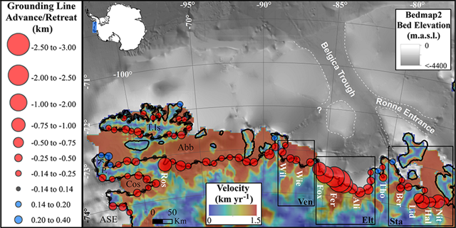
Ice retreat along coastline of West Antarctica, 1990-2015
Net grounding line (GL) change along Bellingshausen Sea coastline of West Antarctica between 1990 and 2015 derived from Landsat mapping. Circle radii denote the magnitude and direction of change (red: retreat, blue: advance) for every 30 km segment of the BSS GL. Graphic: Christie, et al., 2016 / GRL
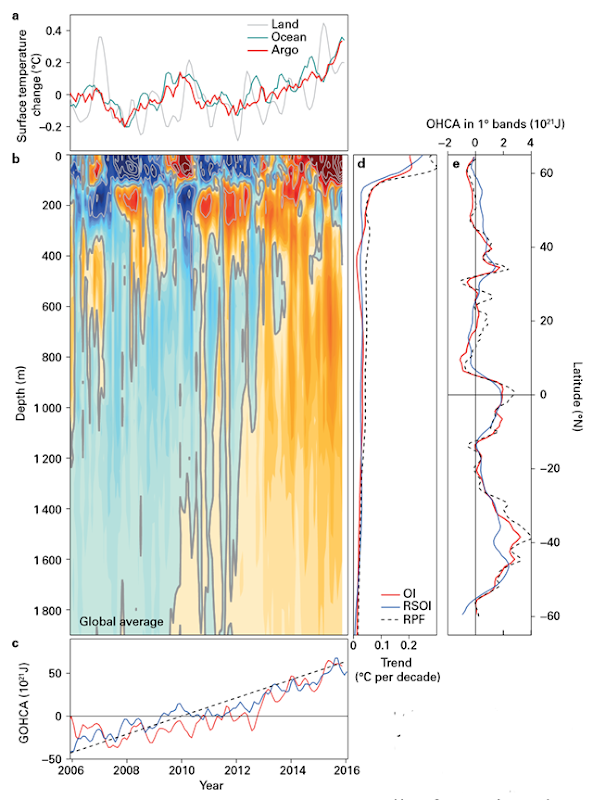
Globally averaged ocean surface temperature change, 2006-2015
Globally averaged ocean surface temperature change (°C), from Argo (red), the National Oceanic and Atmospheric Administration (NOAA, turquoise) and a six-month running mean of NOAA globally averaged land temperature change (grey); (b) Global average ocean temperature changes from Argo (contour interval is 0.01 °C for colours, 0.05 °C in grey); (c) Global ocean 0–2 000 m heat content change over time; (d) Global average 2006–November 2015 potential temperature trend (°C per decade) plotted against depth; and (e) Heat content trends plotted against latitude. Graphic: Wijffels, et al., 2016
Graph of the Day: Change in ocean temperature and heat content, 2006-2015, Ocean warming doubles in recent decades – ‘With time the warming signal is reaching deeper into the ocean’ —
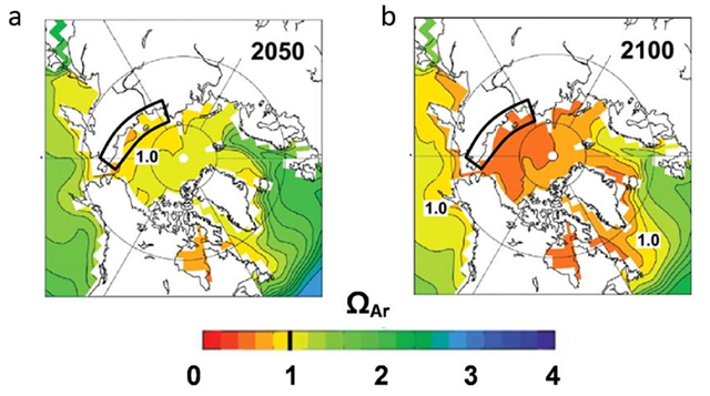
Acidification of the Arctic Ocean by permafrost melt, projected to 2050 and 2100
Predicted levels of aragonite saturation (ΩAr) in different areas of the Arctic Ocean. a) In 2050; b) in 2100 (S3). The area of the East Siberian Arctic Shelf (ESAS) is marked by a black rectangle. Graphic: Semiletov, et al., 2016 / Nature Geoscience
Severe Arctic Ocean acidification via permafrost thawing and river runoff —
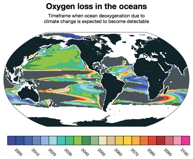
Estimated deoxgenation of oceans due to global warming, projected to 2100
Deoxgenation due to climate change is already detectable in some parts of the ocean. New research from NCAR finds that it will likely become widespread between 2030 and 2040. Other parts of the ocean, shown in gray, will not have detectable loss of oxygen due to climate change even by 2100. Graphic: Matthew Long / NCAR
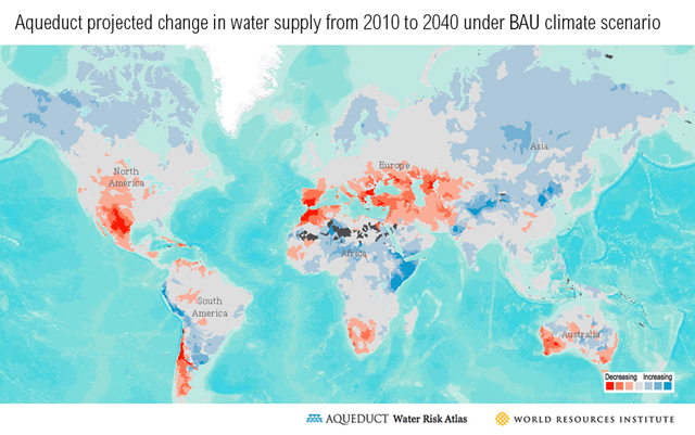
Projected change in global water supply from 2010 to 2040, under business-as-usual climate scenario
A changing climate means less rain and lower water supplies in regions where many people live and much of the planet’s food is produced: the mid-latitudes of the Northern and Southern hemispheres, including the U.S. Southwest, southern Europe and parts of the Middle East, southern Africa, Australia and Chile. As WRI-Aqueduct’s future scenarios for water supply show, diminished water supplies will be apparent in these areas by 2020 – less than four years away — and are expected to grow worse by 2030 and 2040. Now a new study in the journal Nature provides some of the first evidence that this widely-predicted phenomenon – the movement of clouds and rainfall from the mid-latitudes towards the North and South poles — is already taking place. Just like the retreat of glaciers and polar sea ice, now clouds and rain are retreating poleward.
Clouds study alarms scientists – ‘The data shows major reorganization of the cloud system’, World Resources Institute: As clouds head for the poles, time to prepare for food and water shocks —
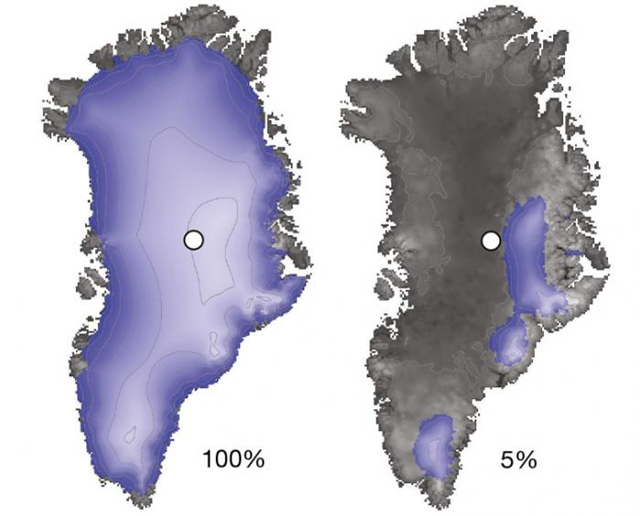
Estimated Greenland ice sheet retreat during the Pleistocene epoch
Scientists drilled nearly two miles down through the summit of the Greenland ice sheet (white dot, left), to reach bedrock. Isotopes found in the rock indicate that this site and most of Greenland were nearly ice free (right) during the recent geologic past. Graphic: Schaefer, et al., 2016 / Nature
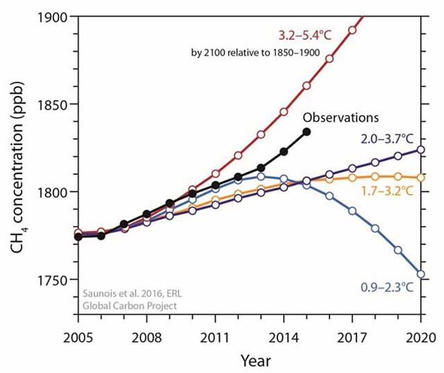
Atmospheric methane concentrations, observed and projected to 2020
Projections of atmospheric methane concentrations (ppb) for the four Representative Concentration Pathway (RCP) scenarios and observed globally averaged atmospheric abundance at marine boundary layer sites from the NOAA network (black, Dlugockenky 2016). Tropospheric concentrations from RCP models have been scaled to fit surface observations. Graphic: Saunois, et al., 2016 / Environmental Research Letters
Methane emissions spiking globally, now approaching the most greenhouse gas-intensive scenarios —
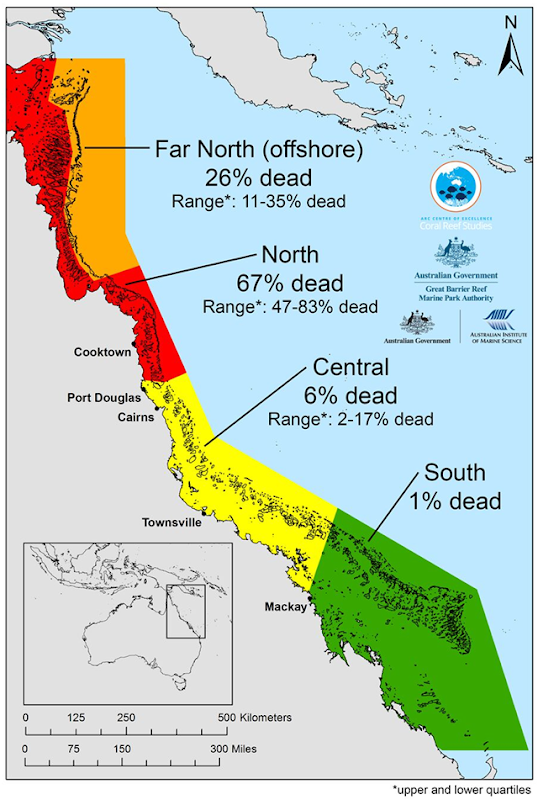
Mortality map of Great Barrier Reef bleaching in 2016
A mass bleaching event on the Great Barrier Reef in 2016 killed more corals than ever before. This map, detailing coral loss on the GBR, shows how mortality varied from north to south. Graphic: ARC Centre of Excellence for Coral Reef Studies
Largest die-off of corals ever recorded on Great Barrier Reef in 2016 —
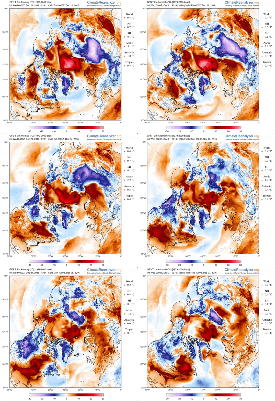
Abnormally high Arctic temperatures, 21 December 2016
Abnormally warm air, about 50°F above normal, invaded the Arctic and persisted, from 21 December 2016 through 27 December 2016. Credit: Climate Reanalyzer
North Pole temperatures may soar to 50°F above normal – Freakishly warm pole weather likely to peak on Christmas Eve; Weather buoy near North Pole hits melting point – Large area of Arctic 20°C higher than normal on Christmas Eve 2016 —
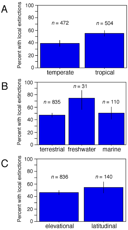
Frequency of local species extinctions related to global warming across different climatic regions, habitats, and gradients
(A) Species are categorized as temperate or tropical (based on the location of the study), and the percentage of species with one or more local extinctions is shown, along with the sample sizes of species in each region. (B) Species are categorized as terrestrial, freshwater, or marine, and the frequency of species with local extinctions is shown (along with total species per habitat). (C) Species are categorized based on whether they were surveyed along elevational or latitudinal transects. Vertical lines indicate 95% confidence intervals on the estimated frequency of species with local extinctions. Graphic: John J. Wiens, 2016 / PLOS
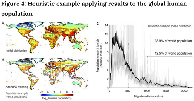
Temperature-preserving migration applied to the global distribution of humans, under 2°C global warming
Temperature-preserving displacements are applied to the global distribution of people as an illustrative thought experiment, since this is one species distribution that is familiar and well documented. Actual human migrations will certainly differ and likely will be less extreme, as people can adapt and access technologies that may allow them to avoid displacement, behaviors that are abstracted away in this analysis. (A) Logarithm of the current distribution of humans. (B) The distribution of this population if all individuals undertake the displacement in Fig. 3. (C) Histogram with 1 km bins (grey, smoothed is black) for the minimum distance traveled by each person currently on Earth. Graphic: Hsiang and Sobel, 2016 / Scientific Reports
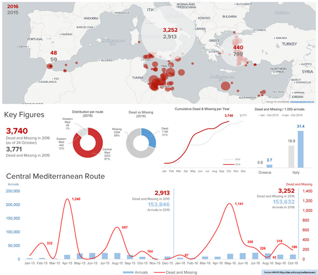
Refugee crossings and deaths in the Mediterranean in October 2016, compared with 2015
With two months still to go in 2016, deaths of refugees and migrants crossing the Mediterranean hit a record high. Expressing alarm at the situation, UNHCR reported that 3,740 lives had been lost so far in 2016, just short of the 3,771 reported for the whole of 2015. Graphic: UNHCR
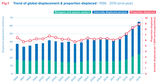
Global displacement and proportion displaced, 1996-2015
The global population of forcibly displaced people today is larger than the entire population of the United Kingdom. If they were a country, the forcibly displaced would be the 21st largest in the world. Graphic: UNHCR
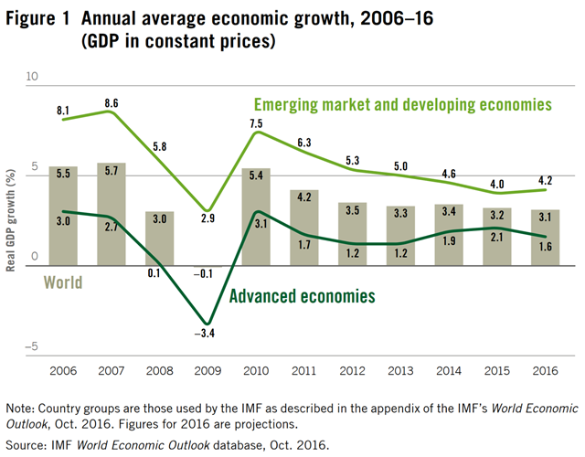
Annual average global economic growth, 2006–2016
Wage growth around the world has decelerated since 2012, falling from 2.5 per cent to 1.7 per cent in 2015, its lowest level in four years. If China, where wage growth was faster than elsewhere, is not included, growth in global wages dropped from 1.6 per cent to 0.9 per cent. Graphic: ILO
Global wage growth falls to its lowest level in four years —
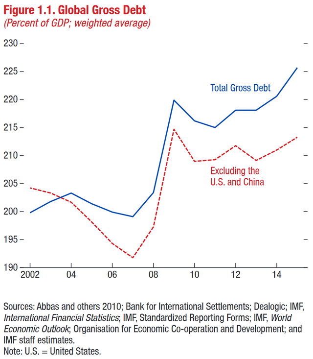
Global gross debt, 2002-2015
Global debt, both public and private, reached 225 percent of global economic output in 2015, up from about 200 percent in 2002, the IMF said in its new Fiscal Monitor report. The IMF said about two thirds of the 2015 total, or about $100 billion, is owed by private sector borrowers, and noted that rapid increases in private debt often lead to financial crises. Graphic: IMF
IMF says global debt tops all-time high at $152 trillion; Caught in “poverty trap”, least developed countries being left behind – UN report —
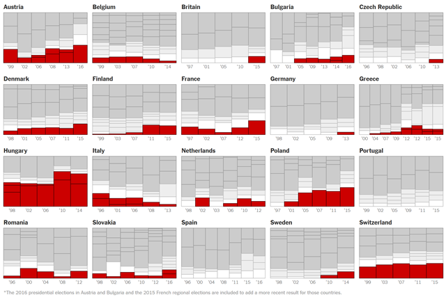
Election results in Europe, highlighting right-wing populist and far-right parties
These charts show election results in 20 European countries, updated 5 December 2016, with right-wing populist and far-right parties highlighted in red. Graphic: The New York Times
How far is Europe swinging to the far right? Election results in December 2016 —
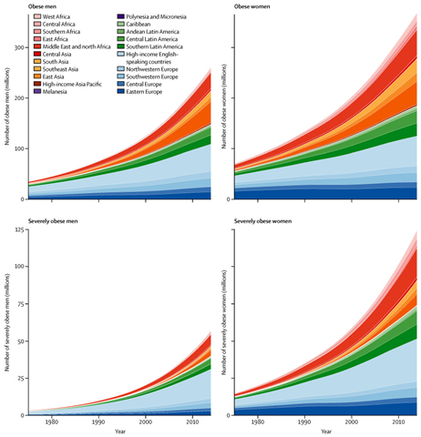
Global obesity trends by region, 1975-2014
Trends in the number of obese and severely obese people by region, 1975-2014. A person is obese if they have a body-mass index (BMI) of 30 kg/m2 or higher, or is severely obese if they have a BMI of 35 kg/m2 or higher. Graphic: NCD Risk Factor Collaboration, 2016 / The Lancet
![Pre-1978 changes in the CO2-equivalent concentration and the NOAA annual greenhouse gas index (AGGI) based on the ongoing measurements of all greenhouse gases reported here, measurements of CO2 going back to the 1950s from C.D. Keeling [Keeling et al., 1958], and atmospheric changes derived from air trapped in ice and snow above glaciers [Machida et al., 1995, Battle et al., 1996, Etheridge, et al., 1996; Butler, et al., 1999]. Equivalent CO2 atmospheric amounts (in ppm) are derived with the relationship (Table 1) between CO2 concentrations and radiative forcing from all long-lived greenhouse gases. Graphic: NOAA Pre-1978 changes in the CO2-equivalent concentration and the NOAA annual greenhouse gas index (AGGI) based on the ongoing measurements of all greenhouse gases reported here, measurements of CO2 going back to the 1950s from C.D. Keeling [Keeling et al., 1958], and atmospheric changes derived from air trapped in ice and snow above glaciers [Machida et al., 1995, Battle et al., 1996, Etheridge, et al., 1996; Butler, et al., 1999]. Equivalent CO2 atmospheric amounts (in ppm) are derived with the relationship (Table 1) between CO2 concentrations and radiative forcing from all long-lived greenhouse gases. Graphic: NOAA](https://lh3.googleusercontent.com/-P-E__J24ZGI/WDYRjkWztYI/AAAAAAAAhxo/SGszqEa6N7w/image_thumb%25255B2%25255D.png?imgmax=800)

