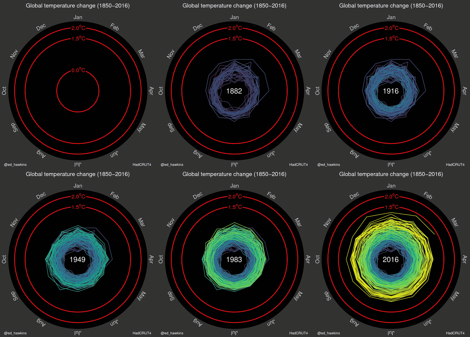
Graph of the Day: Global average surface temperature spirals toward 2°C increase
By Andrea Thompson
9 May 2016 (Climate Central) – The steady rise of Earth’s temperature as greenhouse gases accumulate in the atmosphere and trap more and more heat is sending the planet spiraling closer to the point where warming’s catastrophic consequences may be all but assured. That metaphoric spiral has become a literal one in a new graphic drawn up by Ed Hawkins, a climate scientist at the University of Reading in the United Kingdom. The animated graphic features a rainbow-colored record of global temperatures spinning outward from the late 19th century to the present as the Earth heats up. “The pace of change is immediately obvious, especially over the past few decades,” Hawkins, who has previously worked with Climate Central’s extreme weather attribution team, wrote in an email. The graphic is part of Hawkins’s effort to explore new ways to present global temperature data in a way that clearly telegraphs the warming trend. Another climate scientist, Jan Fuglestvedt of the Center for International Climate and Environmental Research – Oslo, suggested the spiral presentation. The graphic displays monthly global temperature data from the U.K. Met Office and charts how each month compares to the average for the same period from 1850-1900, the same baselines used in the most recent report from the Intergovernmental Panel on Climate Change. At first, the years vacillate inward and outward, showing that a clear warming signal had yet to emerge from the natural fluctuations that happen from year to year. But clear warming trends are present in the early and late 20th century. […] Just how much temperatures have risen is clear in the first few months of data from 2016, it’s line clearly separated from 2015 — which was the hottest year on record — and edging in on the 1.5°C mark. Every month of 2016 so far has been the warmest such month on record; in fact, the past 11 months have all set records, the longest such streak in the temperature data kept by the National Oceanic and Atmospheric Administration. (Each agency that keeps such a temperature record handles the data slightly differently, which can lead to small differences in monthly and yearly values, though the overall trend is in broad agreement for all such agencies.) [more]
See Earth’s Temperature Spiral Toward 2°C

Two degrees is completely blown is it not? Firstly aerosol masking from all the pollution is hiding, by a significant margin, the full effect of the CO2 already in the system. The majority of those aerosols would wash out within twelve months of polluting ceasing. Secondly feedback s such as the loss of Arctic ice will continue and melting permafrost will continue, without further pollution.
It would seem we are looking at the deepest la Nina equaling today's temperatures in a little over a decade. The next super El Nino after that will see the two degrees. Then within a decade of that, 2 degrees above preindustrial will be the coolest we ever get.