50 doomiest graphs of 2015
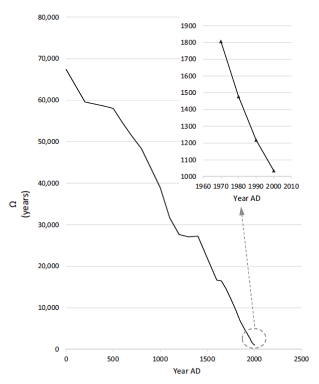 Number of years of phytomass food potentially available to feed the global human population. Graphic: Schramski, et al., 2015 / PNAS Each year, picking the doomiest graphs gets progressively more difficult as the count approaches 50 – so much doom data, so little space. Usually, picking the doomiest graph taxes Desdemona’s brain too much, but this year, one graph stood out, from a paper titled, “Human domination of the biosphere: Rapid discharge of the earth-space battery foretells the future of humankind” “You can think of the Earth like a battery that has been charged very slowly over billions of years. The sun’s energy is stored in plants and fossil fuels, but humans are draining energy much faster than it can be replenished,” said the study’s lead author, John Schramski. The abstract concludes:
The earth is only temporarily poised a quantifiable distance from the thermodynamic equilibrium of outer space. … With the rapid depletion of this chemical energy, the earth is shifting back toward the inhospitable equilibrium of outer space with fundamental ramifications for the biosphere and humanity.
This delightfully captures the precariousness of the continued existence of the biosphere. Scroll down for more of the year’s doomiest data, and check out Desdemona’s doomiest posts of previous years:
- 2016 doomiest graphs, images, and stories
- 2015 doomiest images and stories
- 2014 doomiest graphs, images, and stories
- 2013 doomiest graphs, images, and stories
- 2012 doomiest graphs, images, and stories
- 2011 doomiest graphs, images, and stories
- 2010 doomiest graphs, images, and stories
—
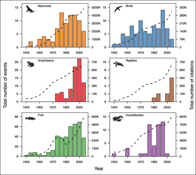
Recorded animal mass mortality events, 1940-2012
13 January 2015 (National Geographic) – Researchers reviewed historical records of 727 mass die-offs from 1940 to 2012 and found that over that time, these events have become more common for birds, marine invertebrates, and fish. The numbers remained unchanged for mammals and decreased for amphibians and reptiles. Disease, human-caused disturbances, and biotoxins—like the red tides caused by algae that are prevalent along American coastlines—are three major culprits. Big die-offs can permanently change food webs. Ninety-nine percent of the sea urchin Diadema antillarum disappeared from the Caribbean in 1983 thanks to a pathogen. The herbivore’s vanishing act paved the way for an algal invasion of reefs, smothering corals.
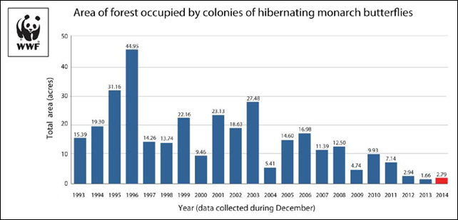
Area of forest occupied by monarch butterfly colonies in Mexico, 1993-2014
By Jeremy Hance
28 January 2015 (mongabay.com) – The world’s migrating monarch butterfly population has bounced back slightly from its record low last year, but the new numbers are still the second smallest on record. According to WWF-Mexico and the Mexican government, butterflies covered 2.79 acres (1.13 hectares) in nine colonies this year in the Mexican forests where the insects overwinter. This is a 69 percent increase from last year’s nadir of just 1.65 acres (0.67 hectares), however, the new numbers remain hugely concerning. “The population increase is welcome news, but the monarch must reach a much larger population size to be able to bounce back from ups and downs,” said researcher Tierra Curry with the Center for Biological Diversity, adding that “this much-loved butterfly still needs Endangered Species Act protection to ensure that it’s around for future generations.” A decade ago, conservationists were largely concerned with deforestation and illegal logging in Mexico’s overwintering forests. However, due to work by indigenous groups, locals, and the Mexican government that threat has been largely neutralized, at least for the time being. Today the biggest threat is the loss of food and habitat across the U.S. and Canada due to herbicides and increasingly intensified agriculture. According to WWF, herbicide use in the U.S. for soy and corn killed off 58 percent of the country’s milkweed from 1999 to 2010, resulting in a monarch decline of 81 percent. The development of genetically modified crops has exacerbated the situation as these crops are resistant to the popular herbicide, Roundup. However, Roundup and other herbicides containing glyphosate decimate milkweed populations. Monarch butterfly caterpillars feed solely on milkweed, meaning the species requires a road of milkweed from Canada through Eastern and Central U.S. down to Mexico in order to survive. But agriculture policy in the last couple of decades, especially in the U.S., has resulted in a massively fragmented milkweed route.
Monarch butterfly population still perilously low, new survey finds —
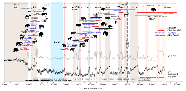
Megafauna extinctions compared with climate changes during the Late Pleistocene, 60,000 to 12,000 YBP
25 July 2015 (LiveScience) – During the unstable climate of the Late Pleistocene, about 60,000 to 12,000 years ago, abrupt climate spikes, called interstadials, increased temperatures between 7 and 29 degrees Fahrenheit (4 and 16 degrees Celsius) in a matter of decades. Large animals likely found it difficult to survive in these hot conditions, possibly because of the effects it had on their habitats and prey, the researchers said. Interstadials “are known to have caused dramatic shifts in global rainfall and vegetation patterns,” the study’s first author Alan Cooper, director for the Australian Centre for Ancient DNA at the University of Adelaide in Australia, said in a statement emailed to Live Science. “In many ways, the rise of atmospheric carbon dioxide levels and resulting warming effects are expected to have a similar rate of change to the onset of past interstadials, heralding another major phase of large mammal extinctions,” Cooper said.
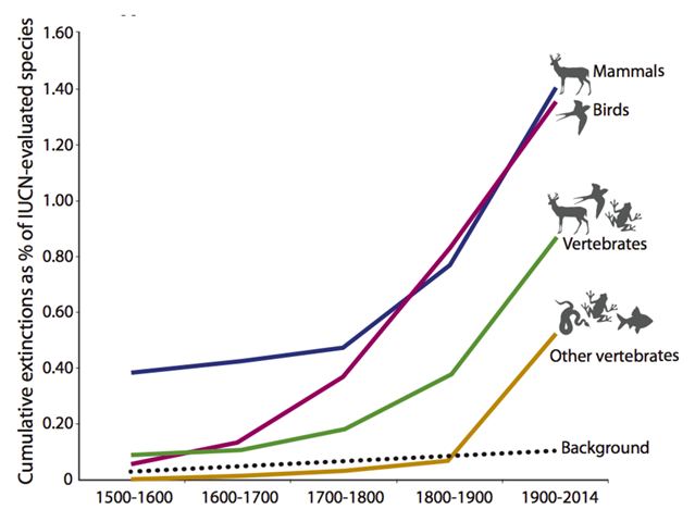
Cumulative vertebrate species extinctions, historical to 2014
19 June 2015 (The Conversation) – We are currently witnessing the start of a mass extinction event the likes of which have not been seen on Earth for at least 65 million years. This is the alarming finding of a new study published in the journal Science Advances. The research was designed to determine how human actions over the past 500 years have affected the extinction rates of vertebrates: mammals, fish, birds, reptiles and amphibians. It found a clear signal of elevated species loss which has markedly accelerated over the past couple of hundred years, such that life on Earth is embarking on its sixth greatest extinction event in its 3.5 billion year history.
Earth’s sixth mass extinction has begun, new study confirms —
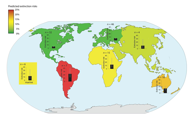
Predicted extinction risks from climate change by region
4 May 2015 (America Herald) – A massive 16 percent of our planet’s species may be facing extinction by 2100 as a result of the havoc that climate change is wreaking, a recent study published in Science states. According to a team of researchers, the ever-increasing temperatures will contribute to the wipe-out of one in six animal species on Earth. In the following 100 years, Earth temperatures will rise by 4.3 degrees Celsius, bringing the overall temperatures well over those of the pre-industrial era.
Climate change to cause the extinction of one in six species by 2100 —
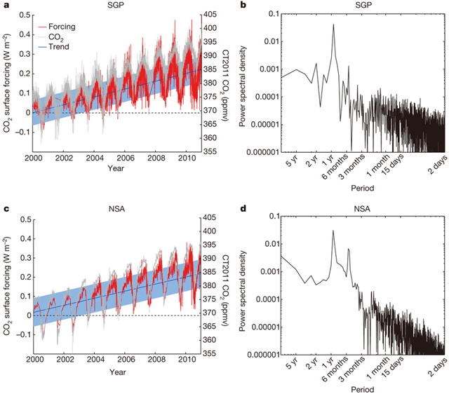
Observed surface radiative forcing by CO2, 2000-2010
ABSTRACT: The climatic impact of CO2 and other greenhouse gases is usually quantified in terms of radiative forcing1, calculated as the difference between estimates of the Earth’s radiation field from pre-industrial and present-day concentrations of these gases. Radiative transfer models calculate that the increase in CO2 since 1750 corresponds to a global annual-mean radiative forcing at the tropopause of 1.82 ± 0.19 W m−2 (ref. 2). However, despite widespread scientific discussion and modelling of the climate impacts of well-mixed greenhouse gases, there is little direct observational evidence of the radiative impact of increasing atmospheric CO2. Here we present observationally based evidence of clear-sky CO2 surface radiative forcing that is directly attributable to the increase, between 2000 and 2010, of 22 parts per million atmospheric CO2. The time series of this forcing at the two locations—the Southern Great Plains and the North Slope of Alaska—are derived from Atmospheric Emitted Radiance Interferometer spectra3 together with ancillary measurements and thoroughly corroborated radiative transfer calculations4. The time series both show statistically significant trends of 0.2 W m−2 per decade (with respective uncertainties of ±0.06 W m−2 per decade and ±0.07 W m−2 per decade) and have seasonal ranges of 0.1–0.2 W m−2. This is approximately ten per cent of the trend in downwelling longwave radiation5, 6, 7. These results confirm theoretical predictions of the atmospheric greenhouse effect due to anthropogenic emissions, and provide empirical evidence of how rising CO2 levels, mediated by temporal variations due to photosynthesis and respiration, are affecting the surface energy balance.
Graph of the Day: Observed surface radiative forcing by CO2, 2000-2010 —
20 January 2015 (NOAA) – Each winter, sea ice expands to fill nearly the entire Arctic Ocean basin, reaching its maximum extent in March. Each summer, the ice pack shrinks, reaching its smallest extent in September. The ice that survives at least one summer melt season tends to be thicker and more likely to survive future summers. Since the 1980s, the amount of this perennial ice (sometimes called multiyear) has declined. This animation tracks the relative amount of ice of different ages from 1987 through early November 2014. The first age class on the scale (1, darkest blue) means “first-year ice,” which formed in the most recent winter. (In other words, it’s in its first year of growth.) The oldest ice (>9, white) is ice that is more than nine years old. Dark gray areas indicate open water or coastal regions where the spatial resolution of the data is coarser than the land map.
Video: Decline of Arctic sea ice, 1987-2014 —
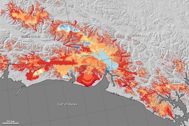
Glacier decline in southern Alaska, 1994-2013
7 July 2015 (NASA) – This map shows changes to glaciers between 1994 and 2013 in southern Alaska’s Wrangell and St. Elias mountain ranges. Specifically, the map shows the region’s mass balance — the difference between the ice each glacier has gained and lost each year. The change is shown in meters of meltwater equivalent; that is, the depth of water that would result if that ice were melted. In general, red colors show where glaciers have thinned, and blue colors are where they have thickened.
Graph of the Day: Glacier decline in southern Alaska, 1994-2013 —
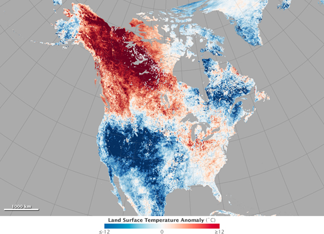
Satellite view of Alaska heat wave in May 2015
27 May 2015 (NASA) – In the third week of May, it was warmer in Fairbanks, Alaska, than in Washington, D.C. The small town of Eagle, Alaska, was hotter on May 23 than it has been on any day in Houston or Dallas this year. In what has become a frequent occurrence in the past few years, temperature profiles in North America appeared to be upside down. The map above shows North American land surface temperatures from May 17–24, 2015, compared to the 2001–2010 average for the same eight-day period. Shades of red depict areas that were hotter than the long-term average; areas in blue were below average for the week. White pixels were normal, and gray pixels did not have enough data, most likely due to excessive cloud cover. On May 23, the air temperature at Fairbanks International Airport reached 86 degrees Fahrenheit (30 degrees Celsius), breaking the record of 80°F (26.7°C) from 2002. That same day, thermometers hit 91°F (32.8°C) in Eagle, marking the earliest 90-degree day in state history. The town had nine consecutive days above 80°F. In Barrow, Alaska, on the shores of the Arctic Ocean, temperatures climbed to 47°F on May 21, close to 18°F above normal. Temperatures normally do not reach that high until mid-June.
Image of the Day: Satellite view of Alaska heat wave in May 2015 —
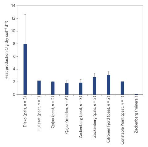
Heat production from microbial metabolism of organic material in permafrost during incubation at 16C
8 April 2015 (Climate Progress) – Scientists might have to change their projected timelines for when Greenland’s permafrost will completely melt due to man-made climate change, now that new research from Denmark has shown it could be thawing faster than expected. Published Monday in the journal Nature Climate Change, the research shows that tiny microbes trapped in Greenland’s permafrost are becoming active as the climate warms and the permafrost begins to thaw. As those microbes become active, they are feeding on previously-frozen organic matter, producing heat, and threatening to thaw the permafrost even further. In other words, according to the research, permafrost thaw could be accelerating permafrost thaw to a “potentially critical” level. “The accompanying heat production from microbial metabolism of organic material has been recognized as a potential positive-feedback mechanism that would enhance permafrost thawing and the release of carbon,” the study, conducted by researchers at the University of Copenhagen’s Center for Permafrost, said. “This internal heat production is poorly understood, however, and the strength of this effect remains unclear.” [Is this causing the explosive craters we’ve seen recently in Siberia? –Des]
Why this new study on Arctic permafrost is so scary – ‘You can’t re-freeze the permafrost’ —
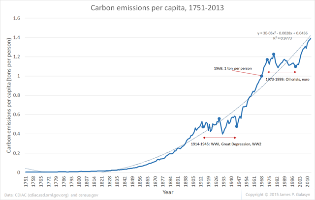
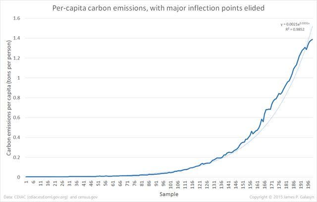
Global carbon emissions per capita, 1751-2013
13 June 2015 (Desdemona Despair) – Data show that growth of human carbon emissions in the modern era is pretty close to exponential (cf. “Graph of the Day: Global carbon emissions from fossil fuels, 1751-2013”). Per-capita carbon emissions also increase at a supralinear rate. Excel’s default polynomial curve fit shows quadratic growth, with an R2 value of 0.977. This curve fit probably isn’t physically meaningful, but it might be useful for extrapolation. Removing the two periods of flat growth, the “natural” rate of emissions growth is very nearly exponential, with an R2 value of 0.985 for the default Excel curve fit. Carbon emitted per capita surpassed 1 ton per person in 1968 and has never fallen below this value since then. Extrapolating the quadratic curve, emissions per capita will surpass 2 tons per person around the year 2050. This analysis suggests an interesting conclusion: as human population grows, it emits carbon at an exponentially greater rate per person. Only two periods in modern history have broken this rule, both characterized by abrupt, global economic dislocations. As soon as the conditions that caused the dislocations are resolved, exponential growth returns immediately.
Graph of the Day: Carbon emissions and human population, 1751-2013 —
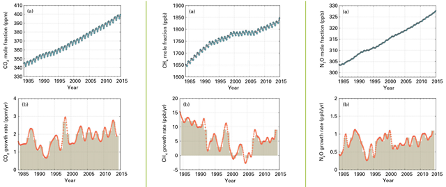
Globally averaged CO2, CH4, and N2O mole fraction and growth rate, 1984-2014
9 November 2015 (WMO) – The amount of greenhouse gases in the atmosphere reached yet another new record high in 2014, continuing a relentless rise which is fuelling climate change and will make the planet more dangerous and inhospitable for future generations. The World Meteorological Organization’s Greenhouse Gas Bulletin says that between 1990 and 2014 there was a 36% increase in radiative forcing – the warming effect on our climate – because of long-lived greenhouse gases such as carbon dioxide (CO2), methane (CH4) and nitrous oxide (N2O) from industrial, agricultural and domestic activities. “Every year we report a new record in greenhouse gas concentrations,” said WMO Secretary-General Michel Jarraud. “Every year we say that time is running out. We have to act NOW to slash greenhouse gas emissions if we are to have a chance to keep the increase in temperatures to manageable levels.”
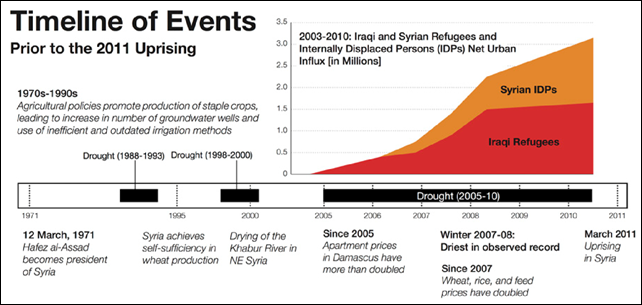
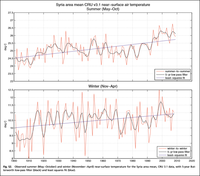
Timeline of events leading up to the civil uprising in Syria
ABSTRACT: Before the Syrian uprising that began in 2011, the greater Fertile Crescent experienced the most severe drought in the instrumental record. For Syria, a country marked by poor governance and unsustainable agricultural and environmental policies, the drought had a catalytic effect, contributing to political unrest. We show that the recent decrease in Syrian precipitation is a combination of natural variability and a long-term drying trend, and the unusual severity of the observed drought is here shown to be highly unlikely without this trend. Precipitation changes in Syria are linked to rising mean sea-level pressure in the Eastern Mediterranean, which also shows a long-term trend. There has been also a long-term warming trend in the Eastern Mediterranean, adding to the drawdown of soil moisture. No natural cause is apparent for these trends, whereas the observed drying and warming are consistent with model studies of the response to increases in greenhouse gases. Furthermore, model studies show an increasingly drier and hotter future mean climate for the Eastern Mediterranean. Analyses of observations and model simulations indicate that a drought of the severity and duration of the recent Syrian drought, which is implicated in the current conflict, has become more than twice as likely as a consequence of human interference in the climate system.
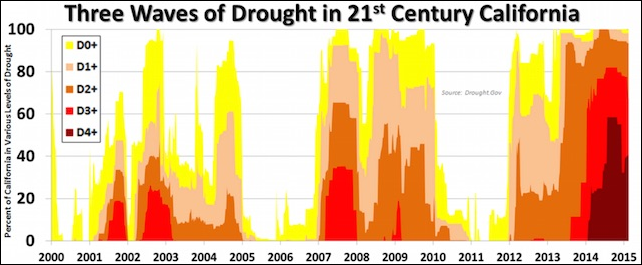
Three waves of drought in 21st Century California
27 February 2015 (Weather Underground) – California is entering its fourth consecutive year of widespread drought, as measured by the U.S. Drought Monitor, which takes into account soil conditions and streamflow as well as precipitation. This is the third multiyear drought in California since 2000, and as Figure 3 shows, it’s the worst of the three in terms of the geographic extent of the most dire drought categories. Each year of consecutive drought magnifies the impact, as progressively tougher adaptations must be called on.
Graph of the Day: Three waves of drought in 21st Century California —
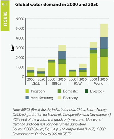
Global water demand in 2000 and projected to 2050
20 MARCH 2015, NEW DELHI (AP) – The world could suffer a 40 percent shortfall in water in just 15 years unless countries dramatically change their use of the resource, a U.N. report warned Friday [The United Nations World Water Development Report 2015]. Many underground water reserves are already running low, while rainfall patterns are predicted to become more erratic with climate change. As the world’s population grows to an expected 9 billion by 2050, more groundwater will be needed for farming, industry, and personal consumption. The report predicts global water demand will increase 55 percent by 2050, while reserves dwindle. If current usage trends don’t change, the world will have only 60 percent of the water it needs in 2030, it said.
U.N. warns world could have 40 percent water shortfall by 2030 —
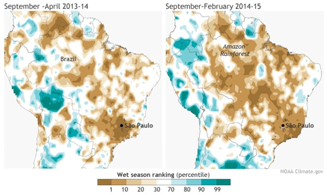
Two very dry wet seasons in Brazil: 2013-14 and 2014-15
26 June 2015 (The Conversation) – Exceptional drought, extreme temperatures, unprecedented drops in reservoir levels, and threatening water shortages for millions of people have dominated headlines in California in recent years. Unfortunately, Californians are not the only people being stressed with the “water crisis.” Citizens of one of the most densely populated areas in South America – the São Paulo metropolitan area (SPMA) in southeastern Brazil – are struggling with one of the nastiest water crises in decades. With over 20 million people and the main financial and economic center of Brazil, this region is under the influence of the South American monsoon system and receives the largest fraction of its precipitation during the Austral summer, from October to March. Yet in the last four years, rain gauge stations near the most important reservoirs supplying water to the city have been reporting growing deficits in precipitation. Last year saw the worst since at least 1961, which has been followed by another dry year. To aggravate these conditions, daily records of high temperatures during these summers have increased evapotranspiration, accelerating drought conditions, similar to what has been observed in California.
Megacity drought: São Paulo withers after dry ‘wet season’ It’s supposed to be the rainy season in Brazil, so where has all the water gone? —
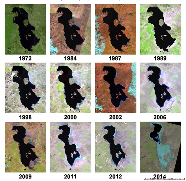
Satellite images of the dessication of Lake Urmia, Iran, 1972-2014
ABSTRACT: Lake Urmia, one of the largest saltwater lakes on earth and a highly endangered ecosystem, is on the brink of a major environmental disaster similar to the catastrophic death of the Aral Sea. With a new composite of multi-spectral high resolution satellite observations, we show that the area of this Iranian lake has decreased by around 88% in the past decades, far more than previously reported (~25% to 50%). The lake’s shoreline has been receding severely with no sign of recovery, which has been partly blamed on prolonged droughts. We use the lake basin’s satellite-based gauge-adjusted climate record of the Standardized Precipitation Index data to demonstrate that the on-going shoreline retreat is not solely an artifact of prolonged droughts alone. Drastic changes to lake health are primarily consequences of aggressive regional water resources development plans, intensive agricultural activities, anthropogenic changes to the system, and upstream competition over water. This commentary is a call for action to both develop sustainable restoration ideas and to put new visions and strategies into practice before Lake Urmia falls victim to the Aral Sea syndrome.
Lake Urmia: How Iran’s most famous lake is disappearing —
Average temperature for April-March in California, 1895-2014
10 April 2015 (Bloomberg) – The California heat of the past 12 months is like nothing ever seen in records going back to 1895. The 12 months before that were similarly without precedent. And the 12 months before that? A freakishly hot year, too. What’s happening in California right now is shattering modern temperature measurements—as well as tree-ring records that stretch back more than 1,000 years. It’s no longer just a record-hot month or a record-hot year that California faces. It’s a stack of broken records leading to the worst drought that’s ever beset the Golden State.
California’s new era of heat destroys all previous records – Sadly, this is only the beginning —
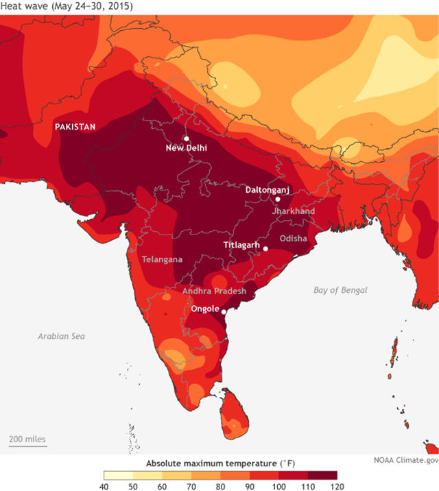
Hottest daytime high temperatures in India and Pakistan, week of 24 May 2015
6 June 2015 (The New York Times) – The most deadly weather-related disasters aren’t necessarily caused by floods, droughts or hurricanes. They can be caused by heat waves, like the sweltering blanket that’s taken over 2,500 lives in India in recent weeks. Temperatures broke 118 degrees in parts of the country. The death toll is still being tallied, and many heat-related deaths will be recognized only after the fact. Yet it’s already the deadliest heat wave to hit India since at least 1998 and, by some accounts, the fourth- or fifth-deadliest worldwide since 1900. These heat waves will only become more common as the planet continues to warm. But as anyone who’s spent a summer in the eastern United States knows, it’s not just the heat; it’s also the humidity. Together, they can be lethal, even if the heat doesn’t seem quite so extreme. Scientists measure the combination using a metric known as wet-bulb temperature. It’s called that because it can be measured with a thermometer wrapped in a wet cloth, distinguishing it from the commonly reported dry-bulb temperature, measured in open air. Wet-bulb temperature can also be calculated from relative humidity, surface pressure and air temperature. It’s essentially a measure of how well you can cool your skin by sweating, which is how humans stay alive in the worst heat. But high humidity can defeat that cooling system; it makes the heat that much more dangerous. A person who is physically active at a wet-bulb temperature of 80 degrees will have trouble maintaining a constant core temperature and risks overheating. A sedentary person who is naked and in the shade will run into the same problem at a wet-bulb temperature of 92 degrees. A wet-bulb temperature of 95 degrees is lethal after about six hours. In the Indian state of Andhra Pradesh, the highest wet-bulb temperatures of the latest heat wave have peaked around 86 degrees — levels approaching the worst of the 1995 Midwest heat wave, which set records in the United States for humid heat.
The deadly combination of heat and humidity —
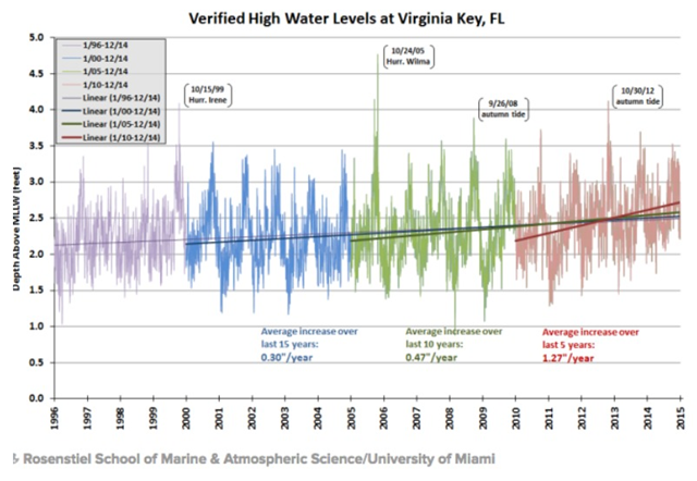
High water levels at Virginia Key, Florida, 1996-2014
23 February 2015 (New Times Miami) – Living in Miami in 2015 and harboring any doubts about sea level rise is roughly equivalent to being a volcano truther in Pompeii circa 79 AD. The catastrophe is happening. The only question is just how quickly climate change will sink parts of South Florida. The answer, according to new work by a University of Miami researcher: even more quickly than we thought. “People ask me all the time: ‘When is it going to happen? When will we start seeing sea level rise?'” says Brian McNoldy, a senior research associate at UM’s Rosenstiel School of Marine and Atmospheric Sciences. “We’ve already passed that. It’s happening.” The data suggest the trend is accelerating. By charting just the highest tide each day and breaking that info into five-year chunks, McNoldy found that the high-water mark rose by an average of 0.3 inches per year overall — but a much higher 1.27 inches per year over the past five years.
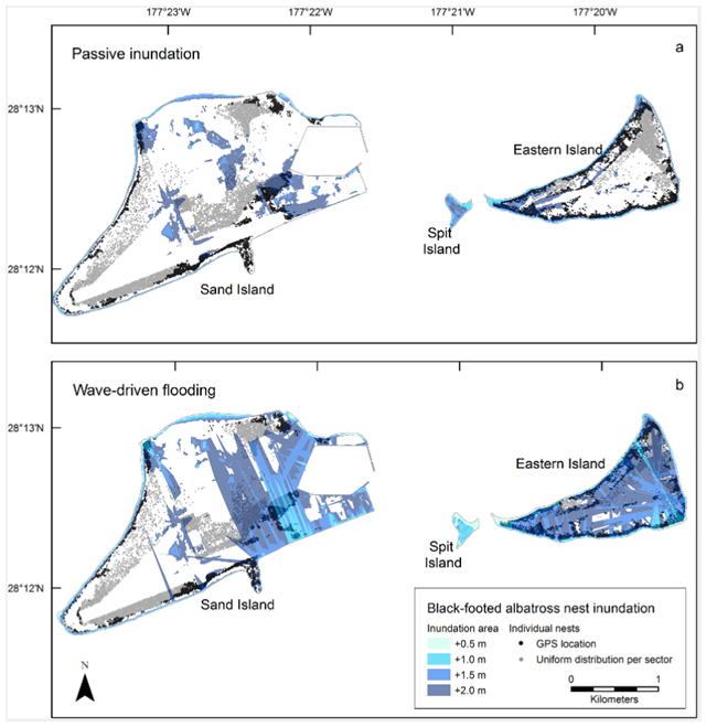
Projected inundation of black-footed albatross nests at Midway Atoll for four sea-level rise scenarios
8 October 2015 (Audobon) – This model shows that rising waters alone present little threat to nesting birds in the near future—when sea level increases by 1.5 meters, less than 10 percent of any given nesting habitat will be submerged. But the threat of winter storms hastens the danger. In this model, after 1.5 meters of sea level rise, storm waves washed out 25 percent of Midway Atoll’s land area, taking 40 percent of ground nests (as well as 20 percent of grass nests, and 15 percent of tree nests). And after 2 meters of sea level rise, storms flooded more than half of the land area, washing out 60 percent of the nests—affecting more than 600,000 breeding albatrosses and petrels, which is equal to about one-quarter of their Midway populations. While it’s still unclear exactly when sea level will reach these heights, according to NASA, scientific estimates confirm that we’ve already committed to nearly one meter of rise, at least.
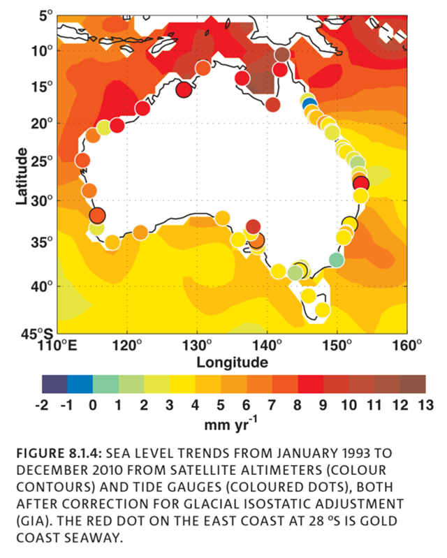
Australia sea level trends, 1993-2010
27 January 2015 (CSIRO) – The rates of sea level rise are not uniform around Australia. Over the period from 1993 when satellite altimeter data are available, the sea level trends are larger than the GMSL trend in northern Australia and similar to the GMSL trend in southern Australia (Figure 8.1.4; White, et al., 2014). The tide gauge and altimeter trends are generally similar, with several exceptions: the tide gauge rates at Hillary’s (northern Perth) and Adelaide are larger because of downward land motion; at the Gold Coast Seaway there is an instrumental issue; and the gauges at Eden and Bunbury have trends that are anomalous compared with nearby locations to the north and south that may be related to unresolved datum or vertical land motion issues. Off south-eastern Australia, the altimeter shows a larger trend offshore than the tide gauge trends. This is thought to be associated with a strengthening of the ocean circulation in the South Pacific Ocean and southward extension of the East Australian Current (Hill, et al., 2011, Deng, et al., 2010), resulting in lower trends at the coast compared with off shore. The larger rates in northern Australia are largely associated with interannual variability and these larger rates are not representative of a longer term trend (Zhang and Church, 2012, White, et al., 2014).
Graph of the Day: Australia sea level trends, 1993-2010 —
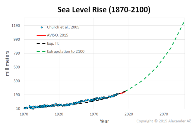
Global sea level rise extrapolated to 2100
By Alexander Ač
9 October 2015 (Desdemona Despair) – I combined the published data of Church, et al. (2006) dating back to 1870 and combined them with modern satellite-based AVISO data where the last data point is from July of this year. The rate of sea level rise (SLR) was about 0.6 mm/y between 1870-1930, then 1.4 mm/y between 1930-1992 and about 3.3 mm/y from 1993 till present (see Hansen). However, over the past 5 years or so, the sea level rose at rate of about 5 mm/year. Given the accelerated (nonlinear) heating of the global ocean, and recent abundant evidence on the rapid destabilization of both the Greenland and Antarctica ice sheets, I am quite confident the rate of SLR will follow an exponential, rather than a linear trend. Certainly, the most conservative estimates of SLR as provided by IPCC turn out to be wrong. In fact, some of them already are.
Are we experiencing exponentially increasing sea level rise? —
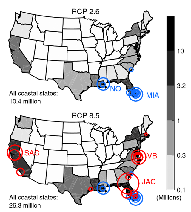
U.S. population below projected high tide lines in two global warming scenarios
State and total populations on land and major cities in which the majority of the U.S. population occupies land committed to fall below future high tide lines given emissions through 2100 under RCP 2.6 (blue city markers on both maps) or 8.5 (red city markers) and assuming the baseline Antarctic case. Only implicated cities with total populations exceeding 100,000 are shown; the marker radius is proportional to the total city population, ranging from 105,162 (Cambridge, MA) to 819,050 (Jacksonville, FL) persons. Graphic: Strauss, et al., 2015 / PNAS
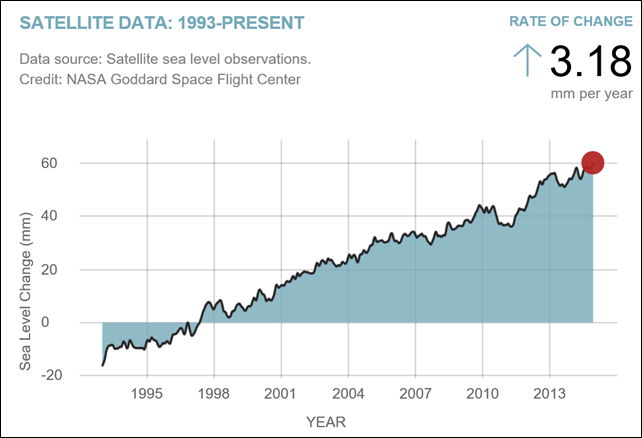
Global sea level rises to record high in December 2014
(NASA) – Sea level rise is caused primarily by two factors related to global warming: the added water coming from the melting of land ice and the expansion of sea water as it warms. This chart tracks the change in sea level since 1993 as observed by satellites.
Global sea level rises to record high —
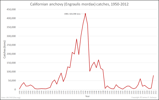
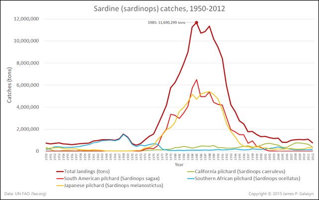
Pacific forage fish depletion, 1950-2012
22 March 2015 (Desdemona Despair) – You may have noticed the ongoing mass-starvation event among California sea lions. (“Why are California sea lion pups starving?”; “Sick sea lions flood shelters in California – Pups wash ashore all along the coast amid what scientists say are strains on the ocean”) The sea lions are starving because humans have fished out two of their main forage fish, sardines and anchovies. These are classic resource depletion curves that follows logistic growth and decline (Hubbert curve). It confirms that the sardinops and anchovy resources are depleted, and “any fishing on sardines right now is overfishing”. So, two of the main forage fish species at the base of the Pacific ocean food web have been fished out by humans. It’s no wonder that sea lions are starving en masse; imagine what other species are suffering as this trophic cascade propagates through the ecosystem.
Graph of the Day: Sardine (sardinops) depletion, 1950-2012 Graph of the Day: Californian anchovy (Engraulis mordax) depletion, 1950-2012 Why are California sea lion pups starving? ‘Any fishing on sardines right now is overfishing, as the population is not even replacing itself, much less providing a surplus’ —
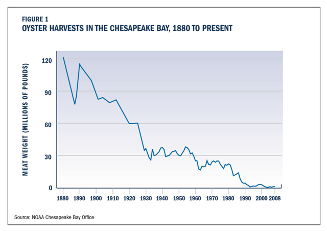
Oyster harvests in Chesapeake Bay, 1880-2008
(Chesapeake Bay Foundation) – Oyster harvests tumbled by two-thirds between the 1890s and 1930, but then remained relatively stable at a lower level until the 1950s. Then a pair of diseases hit. MSX and Dermo are both caused by parasites that attack and frequently kill oysters, although they are harmless to people. Compounded by continued overharvesting and pollution, these diseases devastated oyster populations in the Chesapeake. The losses to disease were especially severe in the 1980s, and have tended to be worse in Virginia than in Maryland because both parasites thrive in the saltier waters of the Southern Bay. But Maryland has also suffered, with oyster reefs in this state’s portion of the Bay declining by about 80 percent in the last 25 years alone. During this time period, oyster harvests have fallen by 90 percent and the number of oystermen has plummeted by 75 percent. Harvests across the Bay today have fallen to less than one percent of their historic highs in the late 19th century. In 2009, there are only about 1,000 people in Maryland and Virginia with oyster harvesting licenses—roughly two percent the number of oystermen in the late 19th century. And many of those who have oyster licenses today are no longer active.
Graph of the Day: Oyster harvests in the Chesapeake Bay, 1880-2008 —
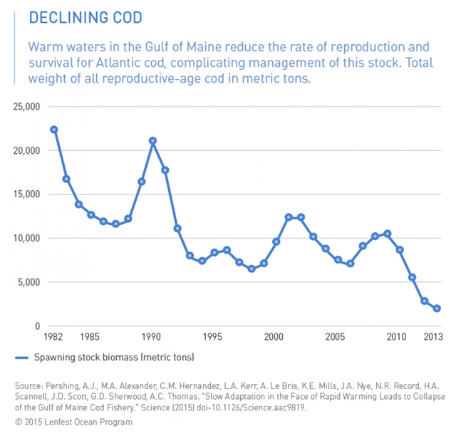
Decline of Atlantic cod biomass in the Gulf of Maine, 1982-2013
29 October 2015 (Washington Post) – A new scientific study says that rapidly warming waters off the New England coast have had a severe consequence — the collapse of a cod fishery that saw too many catches even as overall cod numbers declined due to warmer seas. It’s just the latest in a series of findings and occurrences — ranging from gigantic snows in Boston last winter, which scientists partly linked with warm seas, to a sudden and “extreme” sea level rise event in 2009-2010 — suggesting that this particular stretch of water is undergoing profound changes. “2004 to 2013, we ended up warming faster than really any other marine ecosystem has ever experienced over a 10 year period,” says Andrew Pershing of the Gulf of Maine Research Institute, lead author of the new study just out in the journal Science. Pershing conducted the work with researchers from his institution and several others in the U.S. including NOAA’s Earth System Research Laboratory in Boulder, Colo., and Stony Brook University in New York.
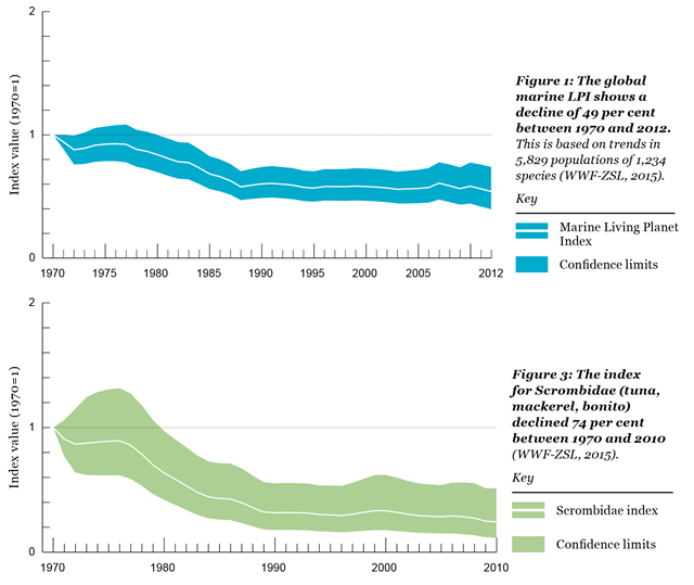
Decline of tuna and mackerel species, 1970-2010
Above: The global marine Living Planet Index (LPI) shows a decline of 49 per cent between 1970 and 2012. This is based on trends in 5,829 populations of 1,234 species. Below: The index for Scrombidae (tuna, mackerel, bonito) declined 74 per cent between 1970 and 2010. Graphic: WWF / ZSL
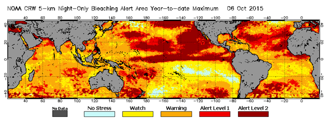
Maximum coral bleaching thermal stress alert area for January-October 2015
8 October 2015 (The Washington Post) – For just the third time on record, scientists say they are now watching the unfolding of a massive worldwide coral bleaching event, spanning the globe from Hawaii to the Indian Ocean. And they fear that thanks to warm sea temperatures, the ultimate result could be the loss of more than 12,000 square kilometers, or over 4,500 square miles, of coral this year — with particularly strong impacts in Hawaii and other U.S. tropical regions, and potentially continuing into 2016. The event is being brought on by a combination of global warming, a very strong El Nino event, and the so-called warm “blob” in the Pacific Ocean, say the researchers, part of a consortium including the National Oceanic and Atmospheric Administration as well as XL Catlin Seaview Survey, The University of Queensland in Australia, and Reef Check. “This is only the third time we’ve seen what we would refer to as a global bleaching event, an event that causes mass bleaching in the Indian Ocean, the Pacific Ocean, and the Atlantic-Caribbean basin,” said Mark Eakin, who heads NOAA’s Coral Reef Watch. The prior events, Eakin continues, “were in 1998 and 2010, and those were pretty much one-year events. We’re looking at a similar spatial scale of bleaching across the globe, but spanning across at least 2 years. So that means a lot of these corals are being put under really prolonged stress, or are being hit 2 years in a row.”
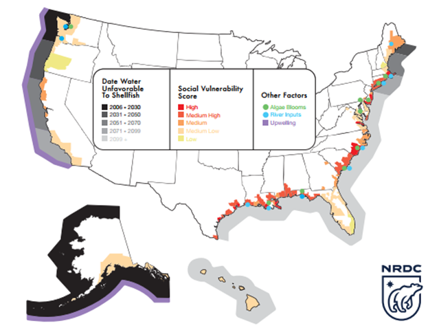
Projected dates of unfavorable ocean acidification effects along the North America coast
23 February 2015 (IBT) – The NRDC report, published on 23 February 2015 in the journal Nature Climate Change, is the first to explore how local communities could be harmed by increasingly corrosive waters. Researchers found the threat of ocean acidification to U.S. fisheries is wider than previously understood. “It’s hitting a lot more of our coasts than we realized,” Lisa Suatoni, a co-author on the report and a senior scientist with NRDC’s oceans program, said.
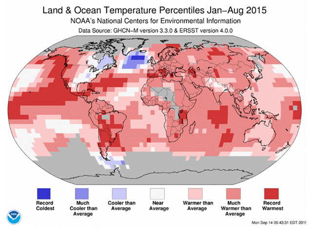
The “blue blob” in the North Atlantic ocean, August 2015
4 November 2015 (Coastal Review) – There it is, hanging out in the northern Atlantic Ocean, off the southern tip of Greenland, a patch of unusually cold, fresh water in an otherwise warming, salty sea. It’s described, inelegantly, as the big, blue blob because of its color on maps of sea temperatures. Scientists who are studying the mechanisms behind this cooling phenomenon, suggest that ocean circulation — what they call the Atlantic meridional overturning circulation, or AMOC — in this part of the world is slowing down. And if you think of the ocean as a living organism, like a human, when circulation decreases in one part, it affects the entire system. This slowing and cooling, which some scientists say is happening decades ahead of schedule, could affect sea level rise on the East Coast, and climate patterns and marine life worldwide. “We can turn off the AMO circulation by adding fresh water, which could shut it down,” deYoung says. Although that is unlikely, he adds, “It is still possible that we can substantially disrupt circulation on a larger scale in the ocean.”
Simulated catastrophic decline of plankton in warming oceans
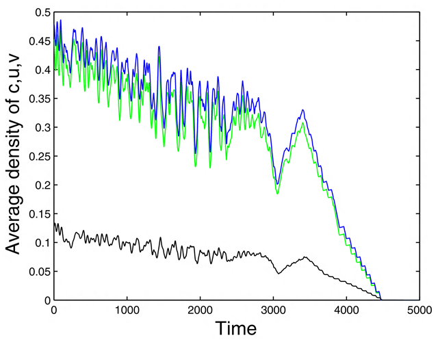
12 November 2015 (Bulletin of Mathematical Biology) – We have studied the oxygen–plankton dynamics using a mathematical model that takes into account oxygen production in photosynthesis, plankton respiration, and the effect of zooplankton predation on phytoplankton. The model is described by a system of three coupled ODEs in the nonspatial (well-mixed) case and by three corresponding diffusion–reaction PDEs in the spatially explicit case. The system dynamics have been revealed by some analytical approaches and extensive numerical simulations. Using a model of coupled oxygen–plankton dynamics, we have identified another possible consequence of the global warming that can potentially be more dangerous than all others. We have shown that the oxygen production by marine phytoplankton can stop suddenly if the water temperature exceeds a certain critical value. Since the ocean plankton produces altogether more than one half of the total atmospheric oxygen, it would mean oxygen depletion not only in the water but also in the air. Should it happen, it would obviously kill most of life on Earth.
Graph of the Day: Simulated catastrophic decline of plankton in warming oceans —
Satellite-detected indonesia forest fires in 2015 compared to other years in the modern satellite record
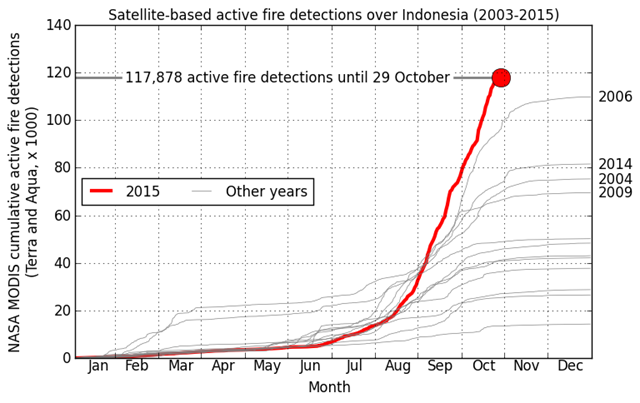
KUALA LUMPUR, Malaysia, 19 October 2015 (AFP) – International efforts to douse raging Indonesia fires will fail and Southeast Asia could face several more weeks of choking smoke until the rainy season starts, Malaysia’s environment minister warned on Monday, October 19. Indonesian National Disaster Management Agency spokesman Sutopo Purwo Nugroho also offered sobering comments Monday, saying the fires were “yet to be overcome.” Sutopo said satellite data indicated Indonesia now had more than 1,500 “hotspots”, which are loosely defined as areas where fires are either burning or where conditions are ripe for blazes to break out. “The actual number is higher as the satellite is not able to penetrate the thickness of the haze in Sumatra and (Borneo),” he added.
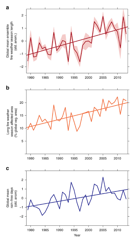
Global mean fire weather season length, 1979-2013
19 July 2015 (Independent Record) – The length of wildfire seasons across the globe and the burnable areas of Earth’s surface have drastically increased in the past three decades due to climate change, according to a groundbreaking new study supported by years of research from the U.S. Forest Service’s Missoula Fire Sciences Laboratory. In a paper published Tuesday in the international journal Nature Communications, a team of researchers concluded that from 1979 to 2013, fire weather seasons have lengthened across 18.39 million square miles of Earth’s vegetated surface, resulting in an 18.7 percent increase in the global average fire season length. The global burnable area affected by long fire seasons has doubled in that time, and from 1996 until 2013 there has been a 53.4 percent increase in the frequency of long fire seasons.
Study finds climate change is increasing length of wildfire seasons across globe – ‘Climate change isn’t a future projection, it actually started around 1980’ Graph of the Day: Change in length and frequency of fire seasons, 1979-2013 —
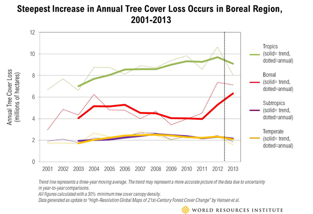
Global tree cover loss, 2001-2013
2 April 2015 (WRI) – New, high-resolution satellite-based maps released today by the University of Maryland and Google on Global Forest Watch, a partnership of over 60 organizations convened by the World Resources Institute, reveal a significant recent surge in tree cover loss largely in Russia and Canada during 2013. There is also some good news, with a slowing of tree cover loss in Indonesia, though rates of loss continue a troubling rise across the tropics as a whole. These 2013 data are the first annual update to the influential “High-Resolution Global Maps of 21st-Century Forest Cover Change” published in Science, and are the latest globally consistent estimates of tree cover loss available. Global tree cover loss in 2013 continued to be high at over 18 million hectares (69,500 square miles)—about twice the size of Portugal—slightly lower than 2012, but a troubling 5.2 percent increase over the 2000-2012 average. In 2011-2013, Russia and Canada topped the list (mostly due to forest fires), jointly accounting for 34 percent of total loss.
Tree-cover loss spikes in Russia and Canada, remains high globally —
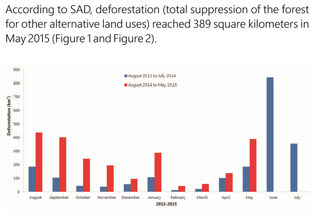
Deforestation in the Brazilian Amazon, August 2013 – May 2015
(Imazon) – In May 2015, SAD detected 389 square kilometers of deforestation in the Brazilian Amazon with a cloud cover of 39% over the territory. That represented an increase of 110% in relation to May 2014 when deforestation totaled 185 square kilometers and the cloud cover was 38%. The deforestation accumulated during the period from August 2014 to May 2015, corresponding to the first ten months of the calendar for measuring deforestation, reached 2,286 square kilometers. There was a 170% increase in of deforestation in relation to the previous period (August 2013 to May 2014) when it reached 846 square kilometers.
Deforestation in Brazilian Amazon increased by more than 200 percent in previous 6 months Amazon deforestation increased by 110 percent in May 2015 —
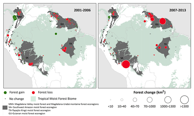
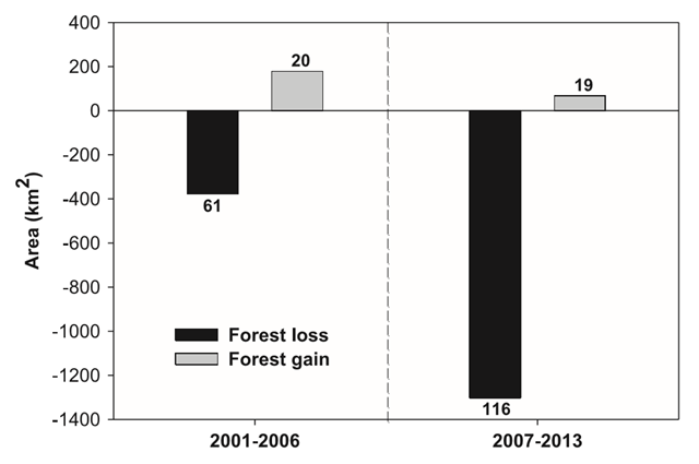
Deforestation in South America due to gold mining, 2001-2013
28 July 2015 (Institute of Physics) – A global “gold rush” has led to a significant increase of deforestation in the tropical forests of South America. This is according to a study published in IOP Publishing’s journal Environmental Research Letters, which has highlighted the growing environmental impact of gold mining in some of the most biologically diverse regions in the tropics. Researchers from the University of Puerto Rico have shown that between 2001 and 2013, around 1680 km2 of tropical forest was lost in South America as a result of gold mining, which increased from around 377 km2 to 1303km2 since the global economic crisis in 2007. Furthermore, around 90 percent of this forest loss occurred in just four areas and a large proportion occurred within the vicinity of conservation areas. Lead author of the research Nora L. Álvarez-Berríos said: “Although the loss of forest due to mining is smaller in extent compared to deforestation caused by other land uses, such as agriculture or grazing areas, deforestation due to mining is occurring in some of the most biologically diverse regions in the tropics. For example, in the Madre de Dios Region in Perú, one hectare of forest can hold up to 300 species of trees.”
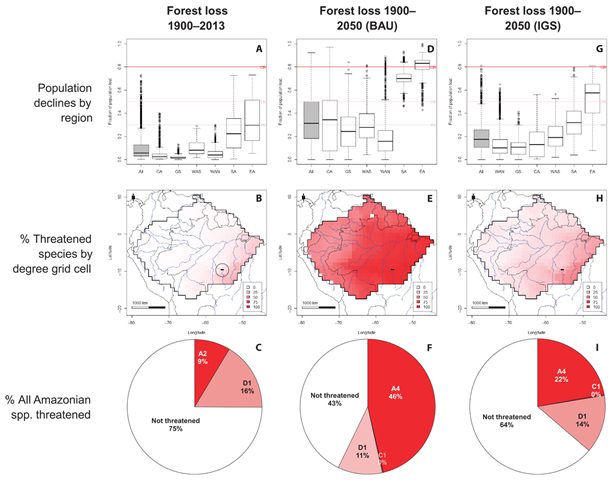
Amazon tree species threatened with extinction, projected to 2050
20 November 2015 (The Guardian) – More than half the myriad tree species in the Amazon could be heading for extinction, according to a study that makes the first comprehensive estimate of threatened species in the world’s largest rainforest. Among the species expected to suffer significant falls in numbers are the Brazil nut, and wild cacao and açai trees, all important food sources. The world’s most diverse forest has endured decades of deforestation, with loggers, farmers, and miners responsible for the removal of 12% of its area. If that continues in the decades ahead, 57% of the 15,000 tree species will be in danger, according to the researchers. Rafael Salomão, of Emílio Goeldi Museum in Belem, Brazil, and a member of the research team, said: “The vast majority of protected areas in the Amazon have no management plan or budget and few resident qualified personnel.”
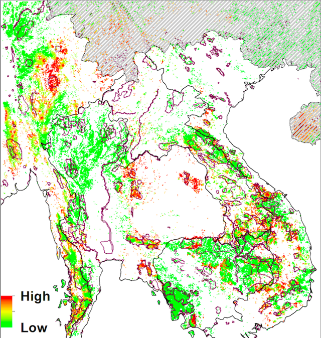
Risk of conversion of wildland forests to rubber plantations in Southeast Asia
20 July 2015 (mongabay.com) – Your car tires may be treading over forests and wildlife in Southeast Asia. As the global demand for tires soars, so does the demand for natural rubber sourced from Hevea brasiliensis, the para-rubber tree. This rising demand is driving a rapid expansion of rubber plantations into biodiversity-rich forests and croplands of Southeast Asia, according to a new study published in Global Environmental Change. Between 2005 and 2010, for instance, rubber plantations replaced over 110,000 hectares of forests identified as key biodiversity areas and protected areas, the authors write. “I think it’s very alarming,” William Laurance, a professor and conservationist at James Cook University in Cairns, Australia, who was not involved in the study, told mongabay.com. “Rubber is spreading rampantly in Southeast Asia-sort of a ‘second tsunami,’ following the explosive expansion of oil palm plantations in the region. I’ve personally seen vast swaths of native forest being converted into rubber plantations in southern China, Malaysia, and Cambodia.”
Unrestrained rubber expansion wreaking havoc on forests —
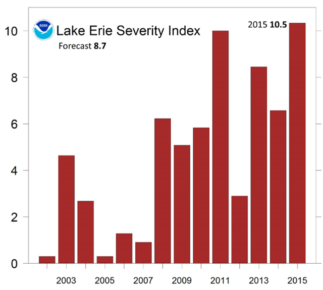
Lake Erie algae bloom severity index for 2002-2015
12 November 2015 (Washington Post) – The algae in Lake Erie was more severe and more highly concentrated this summer than in any summer since NOAA began measuring the blooms in 2002. This year’s harmful green bloom was due to excessive Midwest rainfall in spring and summer, and the fertilizer that rain picks up and carries to rivers which empty into the lake. [Lake Erie HABs Bulletin] The algae isn’t just an eyesore — it’s incredibly harmful to humans. It produces a toxin called microcystin that, in August of 2014, reached such high levels that officials declared a water ban in Toledo — you couldn’t even drink it if you boiled it. When swallowed, mycrocystin can cause stomach pain, nausea, vomiting, severe headaches and fever. The toxic algae feed off of nutrients that run into Lake Erie primarily from the Maumee River, which snakes through the fertile farmlands of Ohio and Indiana. The runoff from these farms contains nitrogen from fertilizer and phosphorus from livestock manure and sewage, which sends the algae in Lake Erie into overdrive.
2015 algae bloom in Lake Erie is most severe on record —
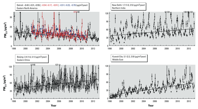
Air pollution increases in India, China, and Kuwait, 1998-2012
ABSTRACT: We estimated that global population-weighted ambient PM2.5 concentrations increased 0.55 μg/m3/year (95% CI: 0.43, 0.67) (2.1%/year; 95% CI: 1.6, 2.6) from 1998 through 2012. Increasing PM2.5 in some developing regions drove this global change, despite decreasing PM2.5 in some developed regions. The estimated proportion of the population of East Asia living above the World Health Organization (WHO) Interim Target-1 of 35 μg/m3 increased from 51% in 1998–2000 to 70% in 2010–2012. In contrast, the North American proportion above the WHO Air Quality Guideline of 10 μg/m3 fell from 62% in 1998–2000 to 19% in 2010–2012. We found significant agreement between satellite-derived estimates and ground-based measurements outside North America and Europe (r = 0.81; n = 210; slope = 0.68). The low bias in satellite-derived estimates suggests that true global concentrations could be even greater.
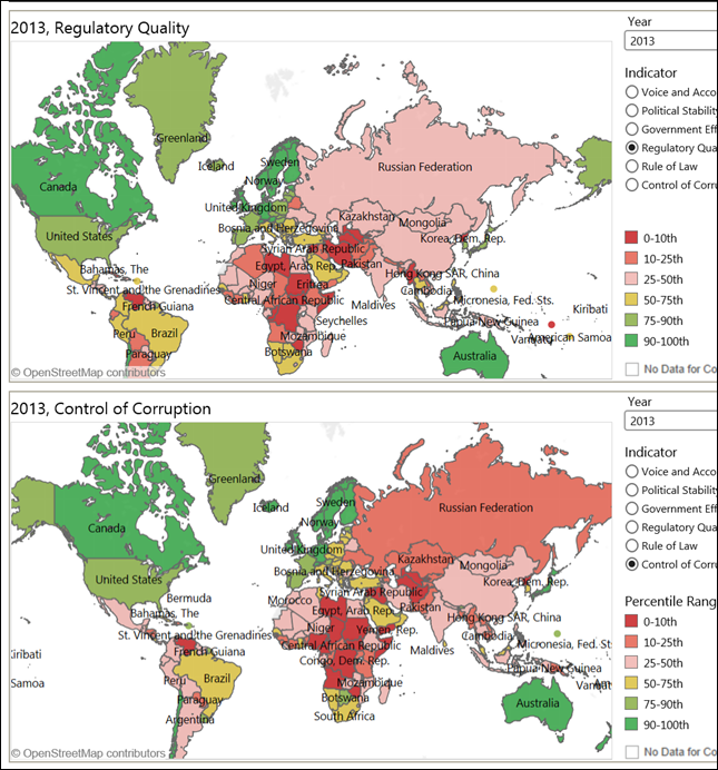
Worldwide governance indicators for regulatory quality and corruption, 2013
(World Bank) – The Worldwide Governance Indicators (WGI) project reports aggregate and individual governance indicators for 215 economies over the period 1996–2013. These aggregate indicators combine the views of a large number of enterprise, citizen and expert survey respondents in industrial and developing countries. They are based on 32 individual data sources produced by a variety of survey institutes, think tanks, non-governmental organizations, international organizations, and private sector firms.
Graph of the Day: Worldwide governance indicators for regulatory quality and corruption, 2013 —
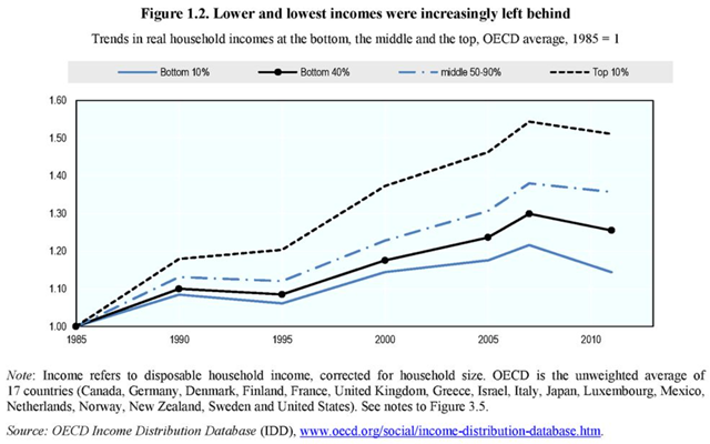
Trends in real household incomes at the bottom, the middle, and the top, 1985-2012
Paris, 21 May 2015 (AFP) – The gap between the rich and poor in most of the world’s advanced economies is at record levels, according to an OECD study that also found glaring differences between men and women. In most of the 34 countries in the Organisation for Economic Cooperation and Development the income gap is at its highest level in three decades, with the richest 10 percent of the population earning 9.6 times the income of the poorest 10 percent. In the 1980s this ratio stood at 7 to 1, the OECD said in a report [In It Together: Why Less Inequality Benefits All]. The wealth gap is even larger, with the top 1 percent owning 18 percent and the 40 percent only 3 percent of household wealth in 2012.
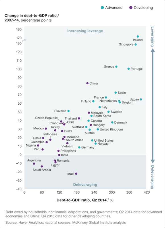
Change in debt-to-GDP ratio in advanced and developing nations, 2007-2014
February 2015 (McKinsey Global Institute) – A new McKinsey Global Institute (MGI) report, Debt and (not much) deleveraging [pdf], examines the evolution of debt across 47 countries—22 advanced and 25 developing—and assesses the implications of higher leverage in the global economy and in specific sectors and countries. The analysis, which follows our July 2011 report Debt and deleveraging: The global credit bubble and its economic consequences and our January 2012 report Debt and deleveraging: Uneven progress on the path to growth, focuses on the debt of the “real economy”: governments, nonfinancial corporations, and households. It finds that debt-to-GDP ratios have risen in all 22 advanced economies in the sample, by more than 50 percentage points in many cases.
Graph of the Day: Change in debt-to-GDP ratio in advanced and developing nations, 2007-2014 —
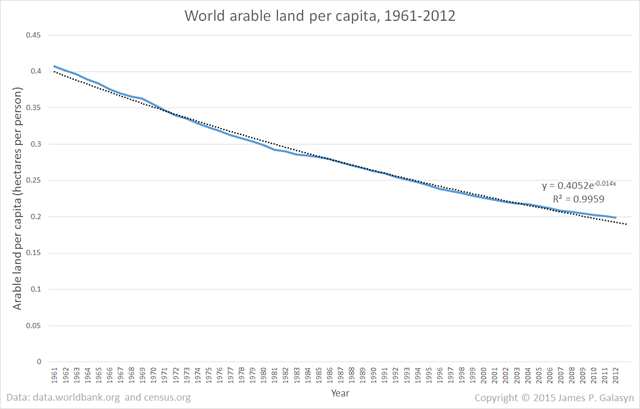
World arable land per capita, 1961-2012
3 July 2015 (Desdemona Despair) – This graph makes it clear that arable land per capita is monotonically decreasing. The decline isn’t linear; in fact, it’s almost perfectly exponential, with R2 = 0.996 for the default Excel curve fit. Currently, the world has 0.2 hectares (0.49 acres) of arable land per person, down from 0.4 in 1962. Extrapolating the exponential curve, we’ll be down to 0.1 by around 2050, and 0.05 by 2100. So, every 50 years, arable land per capita declines by half. By the year 2100, each person will be supported by just 0.05 hectares (0.12 acres) of agricultural land.
Graph of the Day: World arable land per capita, 1961-2012 —
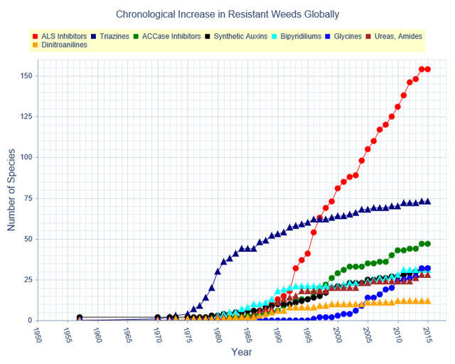
Global increase in herbicide-resistant weeds, 1957-2015
15 April 2015 (weedscience.org) – The International Survey of Herbicide Resistant Weeds is a collaborative effort between weed scientists in over 80 countries. Our main aim is to maintain scientific accuracy in the reporting of herbicide resistant weeds globally. This collaborative effort is supported by government, academic, and industry weed scientists worldwide. This project is funded by the Global Herbicide Resistance Action Committee and CropLife International.
Graph of the Day: Global increase in herbicide-resistant weeds, 1957-2015 —
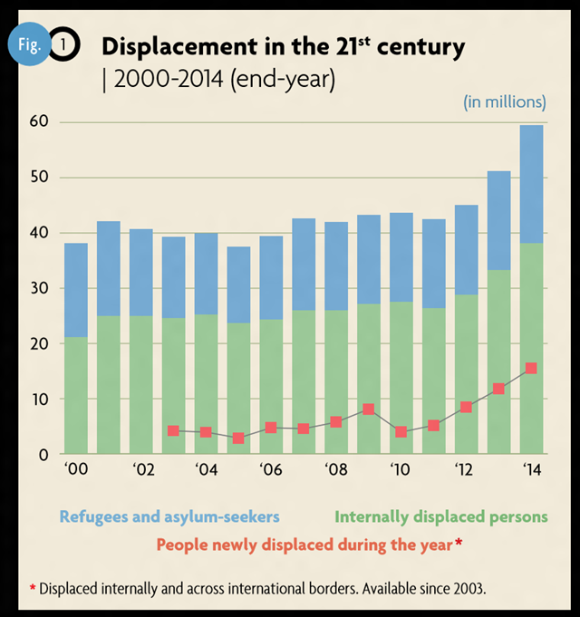
Displacement in the 21st century, 2000-2014
18 June 2015 (UNHCR) – Wars, conflict, and persecution have forced more people than at any other time since records began to flee their homes and seek refuge and safety elsewhere, according to a new report from the UN refugee agency. UNHCR’s annual Global Trends Report: World at War [pdf], released on Thursday (June 18), said that worldwide displacement was at the highest level ever recorded. It said the number of people forcibly displaced at the end of 2014 had risen to a staggering 59.5 million compared to 51.2 million a year earlier and 37.5 million a decade ago. The increase represents the biggest leap ever seen in a single year. Moreover, the report said the situation was likely to worsen still further.
Worldwide displacement hits all-time high as war and persecution increase – Biggest increase ever seen in a single year, situation likely to worsen 2015 on track to see worldwide forced displacement exceeding 60 million people for the first time —
Planetary stability boundaries threatened by humans
15 January 2015 (Washington Post) – At the rate things are going, the Earth in the coming decades could cease to be a “safe operating space” for human beings. That is the conclusion of a new paper published Thursday in the journal Science by 18 researchers trying to gauge the breaking points in the natural world. The paper contends that we have already crossed four “planetary boundaries.” They include the extinction rate; deforestation; the level of carbon dioxide in the atmosphere; and the flow of nitrogen and phosphorous (used on land as fertilizer) into the ocean. “What the science has shown is that human activities — economic growth, technology, consumption – are destabilizing the global environment,” said Will Steffen, who holds appointments at the Australian National University and the Stockholm Resilience Center and is the lead author of the paper. These are not future problems, but rather urgent matters, according to Steffen, who said that the economic boom since 1950 and the globalized economy have accelerated the transgression of the boundaries. No one knows exactly when push will come to shove, but he said the possible destabilization of the “Earth System” as a whole could occur in a time frame of “decades out to a century.”
Scientists: Human activity has pushed Earth beyond four of nine ‘planetary boundaries’ – The planet ‘is likely to be much less hospitable to the development of human societies’ — 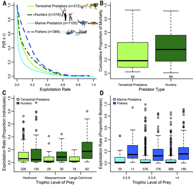
20 August 2015 (UVic) – You need not look far to find the world’s “super predator,” a term used by UVic scientists to describe how human dominance has bred an unrelenting predacious global culture that threatens nature’s balance. Research published in the Aug. 21 edition of the journal Science by a team led by Dr. Chris Darimont, the Hakai-Raincoast professor of geography at the University of Victoria, shows how extreme human predatory behavior is responsible for widespread wildlife extinctions, shrinking fish sizes and disruptions to global food chains. “These are extreme outcomes that non-human predators seldom impose,” Darimont and colleagues write in the article, “The Unique Ecology of Human Predators.” “Our wickedly efficient killing technology, global economic systems and resource management that prioritize short-term benefits to humanity have given rise to the human super predator,” says Darimont, also science director for the Raincoast Conservation Foundation. “Our impacts are as extreme as our behaviour and the planet bears the burden of our predatory dominance.”


Thanks for all this work, Des! Posted at the FB group, The Panic Room.
I wrote to the author of your first in the list, about the trees dying from pollution, and he replied:
Hi Gail, As my area of expertise is with energy, I wasn’t aware of this phenomena. Due to your email, I have spent some time researching and find this troubling. Thanks for the heads up. You’ve peaked my interest. Words are failing to convey the enormity of our plight. Take care, js
No Comment but 1: ..do you have a microphone in my house ..?