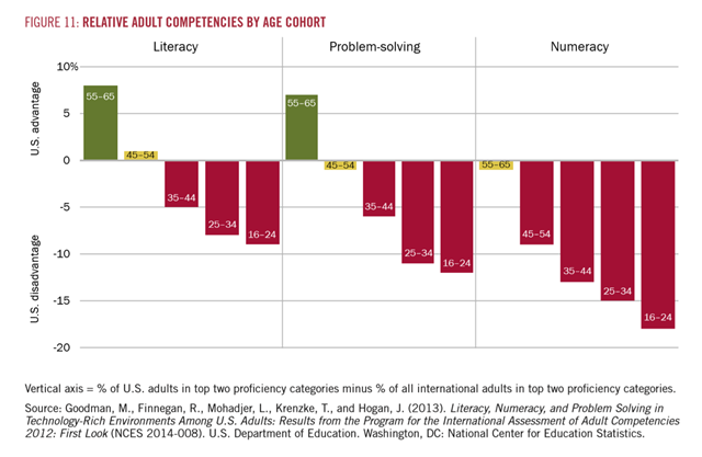
Graph of the Day: Relative competencies of U.S. adults versus international averages, by age cohort
September 2014 (Harvard Business School) – Figure 11 shows that America faces similar challenges in problem-solving and numeracy skills. What were once American advantages in human capital have turned into disadvantages. Relative performance matters in global competition, where American workers must out-produce and out-innovate the world’s best. Vertical axis = % of U.S. adults in top two proficiency categories minus % of all international adults in top two proficiency categories. Some would argue (and we would agree) that Figure 11 reveals an ethical issue: our society is not fulfilling its promise to children to educate and prepare them. Others would argue (and again we would agree) that the figures point to a political problem: our democracy cannot work well when many citizens are denied the opportunities that strong educations afford. We would add that the figures highlight a fundamental business problem: companies operating in the U.S. cannot succeed without well-educated, highly skilled employees. Moreover, the living standards of most Americans will not rise if their workplace skills lag much of the world’s. The situation captured in the OECD data—and reflected also in the mediocre performance of U.S. students on international tests—does not allow business leaders to sit on the sidelines.

Uh, I work in market research (forgive me) and I hate charts like this because they never tell the whole story. For one thing, it doesn't show the rate at which the international baseline has improved. Yes, it's true the U.S. has fallen behind – but that doesn't mean the U.S. has gotten worse. It could be that the rest of the world has just gotten better relative to the U.S.. Also, a demographic view of the U.S. results would be helpful. We know that across this timeframe Blacks and Hispanics have become a larger part of the population. If U.S. Whites are still doing well relative to the rest of the world but others are not it could be evidence of systemic racism (lack of investment in education for these groups)and/or a reflection on the academic capacity of these groups (call me a racist if it makes you feel better, but that's not my motivation here). Whenever you see a single chart presented like this without context you should suspect it was selected to make a political/ideological point.
You'll have to forgive yourself. Are you trying to compare your life's work of selling more unnecessary shit to people with that of a sociologists? Because you both use stats? That you would even suggest such a thing is a perfect example of the dumbing down in action. You should be counting the days until your life's work is replaced by more algorithms.