November 17, 2013
These maps show where the Earth’s forests are vanishing
By Brad Plumer
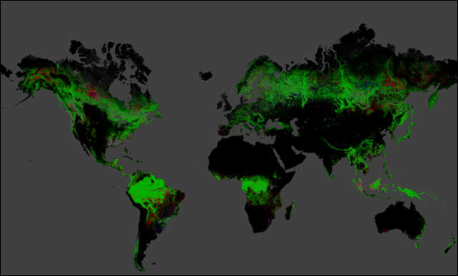
14 November 2013 (Washington Post) – Want to know where we’re destroying the world’s forests? Here’s the very first high-resolution map showing the change in the world’s tree cover between 2000 and 2012. That comes from a new study published Thursday in the journal Science — the first effort to quantify in detail how forests are changing and disappearing over the past decade. The research team, led by the University of Maryland, used Landsat satellite images and Google’s Earth Engine to assemble detailed new maps. A few notable points:
- The Earth lost 2.3 million square kilometers of forest between 2000 and 2012 and added 0.8 square kilometers. That’s a net loss of an area roughly as large as Western Europe.
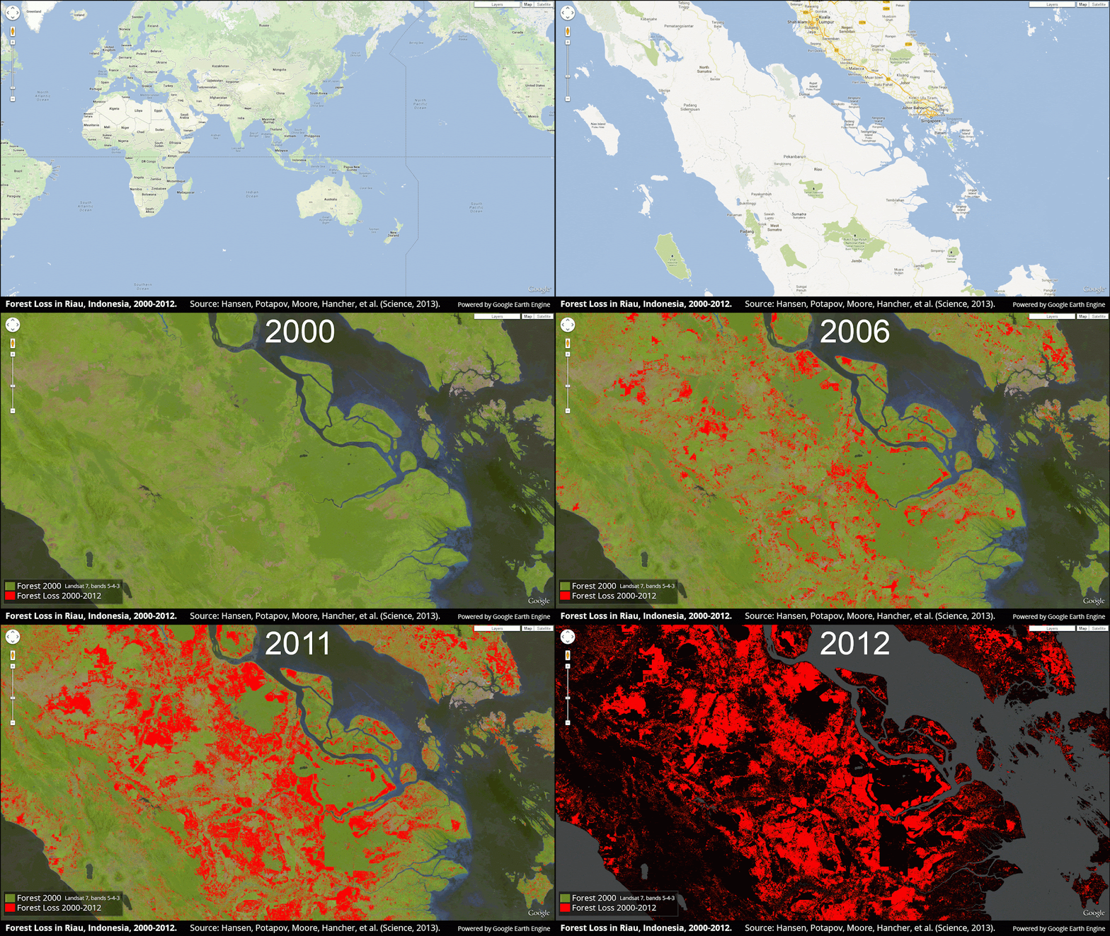
- Deforestation is still increasing in the tropical regions by about 2,101 square kilometers per year—the one clear global trend. Here’s a stunning animation of what that looks like in the rainforests on the Indonesian island of Sumatra, which has lost half of its natural forest cover in the past three decades:
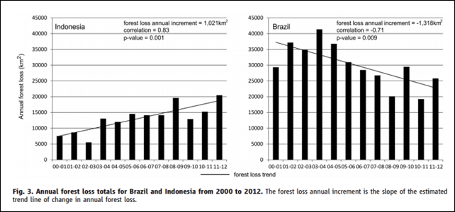
- There’s some good news: Deforestation is way, way down in Brazil over the past decade, thanks to stricter enforcement of land-use laws. The nation used to be the largest single source of deforestation. But Brazil has essentially cut its rate of forest loss in half, from 40,000 square kilometers in 2000 down to about 20,000 square kilometers in 2011.
- But there’s a flip side: Brazil’s progress has been more than offset by increasing forest loss in Malaysia, Paraguay, Bolivia, Zambia, Angola, and especially Indonesia, which saw the most deforestation of any country since 2000:
- The maps reveal that policies in some countries to halt deforestation have been wholly ineffective. After the Indonesian government imposed a moratorium on new logging licenses in 2011, the rate of deforestation actually went up over the next two years. [more]
These maps show where the Earth’s forests are vanishing
Technorati Tags: deforestation,Brazil,Indonesia,habitat loss,ecosystem disruption,wildfire,forest fire,Asia,North America


