Climate report favored by antiscience forces is filled with misrepresentations of data
By Tamino
19 October 2013
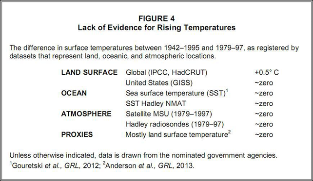
(Open Mind) – Many of you are probably aware of a “report” which is intended to contradict the IPCC (Intergovernmental Panel on Climate Change) report. Its authors call it the “NIPCC” report for “Non-governmental International Panel on Climate Change.” It’s supposed to represent the very best that so-called “skeptics” have to offer. But in my opinion, a much more accurate acronym would be “ICP” report — for “Intentional Cherry-Picking.” You don’t have to look any further than their “Summary for Policymakers” (SPM) to see cherry-picking taken to the extreme. And I do mean, extreme. One of the most obvious, most egregious, and frankly most ridiculous examples is Figure 4 from their SPM. It looks like this:
Here’s what they have to say when referring to this figure:
“… a wide variety of datasets other than the HadCRUT global air temperature curve favored by the IPCC do not exhibit a warming trend during the second half of the twentieth century. See Figure 4.”
Let’s find out whether or not their claim is correct. The first thing to notice is that there’s a significant difference between what’s in the text of their reference to figure 4, and what’s in figure 4. Their reference says “during the second half of the twentieth century” but the figure says “between 1942-1995 and 1979-1997.” What they’ve done is take the time span from 1942 to 1995 and called that “the second half of the twentieth century.” It isn’t. It leaves out everything after 1995. Can you guess what happened in those datasets they refer to after 1995? Incidentally, for two of the data sets (satellite MSU and Hadley radiosondes) they don’t start with 1942, instead they start with 1979. We can’t blame them regarding satellite MSU data because those don’t start until 1979. But the Hadley radiosonde data start in 1950. Isn’t that the very definition of the start of “the second half of the twentieth century”? And, they still end with 1997, which leaves out everything after. Can you guess what happened in those datasets after 1997? The reason for their choices is blatantly obvious. The time spans were specifically chosen to minimize the observed warming, so they could claim “do not exhibit a warming trend.” There’s a name for the practice of leaving out data which contradicts one’s desired conclusion. It’s called “cherry-picking.” Make no mistake about it, this figure from the
NIPCCICP report is a great big blatant blob of cherry-picking. What if we looked at these data sets without the cherry-picking? Can you guess what they show? Let’s start with land surface temperature from the United States, specifically the 48 conterminous states of the U.S. I don’t have access to the data from GISS, but I do have it from NCDC (the National Climate Data Center) and it’ll give the same result. Here it is: [more]
