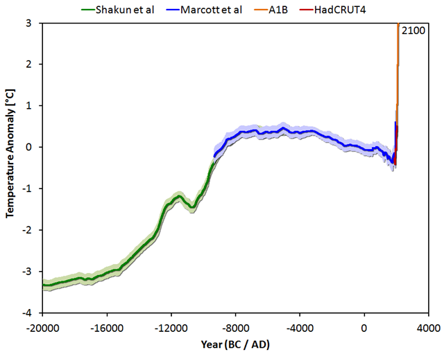
Graph of the Day: Global average surface temperature, 20,000 BC-present, with projection to 2100
[Also see Tamino’s analysis: Global Temperature Change — the Big Picture] By Jos Hagelaars
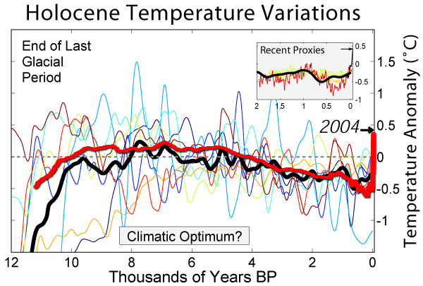
19 March 2013 The big picture (or as some call it: the Wheelchair): Global average temperature since the last ice age (20,000 BC) up to the not-too distant future (2100) under a middle-of-the-road emission scenario. Earlier this month an article was published in Science about a temperature reconstruction regarding the past 11,000 years. The lead author is Shaun Marcott from Oregon State University and the second author Jeremy Shakun, who may be familiar from the interesting study that was published last year on the relationship between CO2 and temperature during the last deglaciation. The temperature reconstruction of Marcott is the first one that covers the entire period of the Holocene. Naturally this reconstruction is not perfect, and some details will probably change in the future. A normal part of the scientific process. The temperature reconstruction ends mid-20th century, so the rapid temperature rise since 1850 is clearly visible in the graphs presented in their study. And what do we see? Again something that looks like a hockey stick as in the graph from Mann, et al., 2008. […] Are the results from Marcott, et al., surprising? Not really. The well-known graph of Holocene temperature variations on Global Warming Art, which is often encountered on the internet, is actually a comparable image. One could say that Marcott et al managed to scientifically confirm the average thick black line of the Global Warming Art image. [more]

