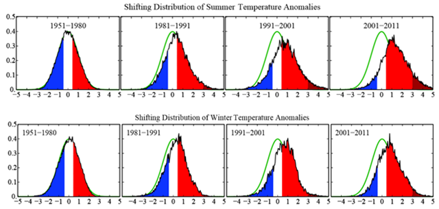
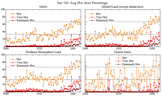
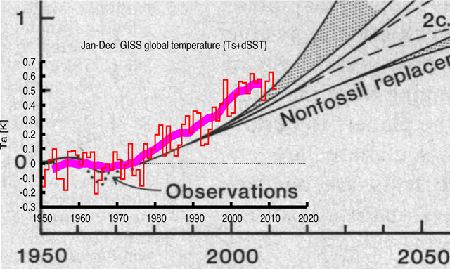
50 doomiest graphs of 2012
In 2012, “the new normal” is how observers from Christiane Amanpour to The Onion characterized the various forms of extreme weather that wrought havoc around the globe. This is a practical definition of “climate change”, and Dr. James Hansen showed clearly what this means quantitatively:
— Record low Arctic sea-ice extent, 26 August 2012 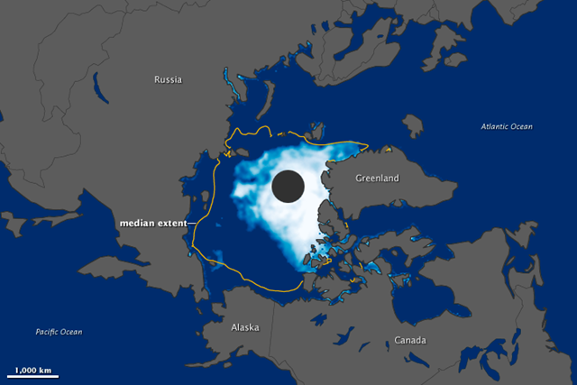
On 26 August 2012, the extent of Arctic water covered by sea ice fell below 4.17 million square kilometers (1.61 million square miles), the record minimum set in 2007. Arctic sea ice stood at 4.10 million square kilometers (1.58 million square miles), the National Snow and Ice Data Center (NSIDC) and NASA reported on August 27.
Arctic sea ice reached previous record lows in 2002, 2005, and 2007. (The 2007 record low was previously recorded as 4.13 million square kilometers, or 1.59 million square miles. Slightly different processing and quality-control procedures used by NASA Goddard Space Flight Center led to revised estimates of sea ice extent.) Over the past decade, sea ice extent in the Arctic has been well below the 1979–2000 average.
Image of the Day: Satellite view of record minimum Arctic sea ice, 26 August 2012
— Greenland melting index, 1979 – 2012 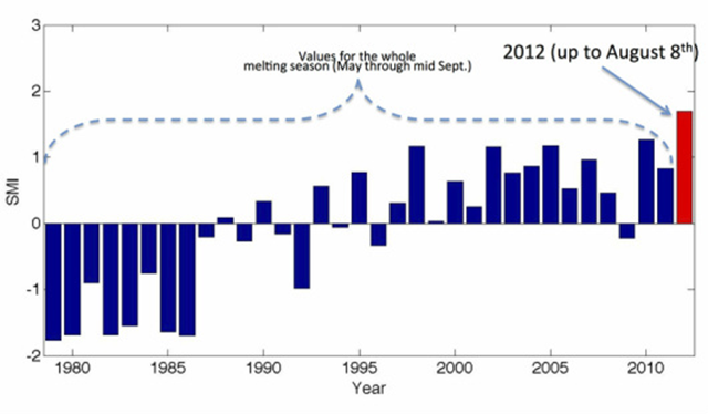
By Marco Tedesco
15 August 2012 Melting in Greenland set a new record before the end of the melting season. Over the past days, the cumulative melting index over the entire Greenland ice sheet (defined as the number of days when melting occurs times the area subject to melting) on August 8th exceeded the record value recently set in 2010 for the whole melting season (which usually ends around the beginning or mid September). The melting index is computed from passive microwave satellite measurements and it can be seen as a measure of the ‘strength’ of the melting season: the higher the index the more melting occurred. With more melting yet to come during August, 2012 will position itself way above the old records, likely becoming the ‘Goliath’ of the melting years during the satellite record (1979 – to date). … The cumulative melting index record is due to extensive increased melting occurring all over Greenland, especially at high elevations where melting lasted up to 50-60 days longer than the average. This means that some of the areas at high elevations in south Greenland are generally subject to a few days of melting (if it happens at all) and this year they underwent melting for more than 2 months (so far).
‘Goliath’ melting year for Greenland ice sheet shatters record, four weeks before close of melting season
— Outlet Glacier Accelerations in Greenland, 2000-2010 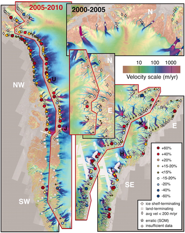
Outlet glacier categories and rates of velocity change (percentage change from beginning of 5-year period). Black-outlined images show 2000 to 2005 results, and red-outlined images are 2005 to 2010 results. The background velocity map for both periods is a 2007 to 2010 composite, with the five ice-sheet regions indicated: north (N), northwest (NW), southwest (SW), southeast (SE), and east (E). There was no change for the north during 2005 to 2010. Jakobshavn (J), Upernavik North (U), Helheim (H), Kangerdlugssuaq (K), and Ikeq Fjord (I) glaciers are indicated. Moon, et al., 2012 ABSTRACT: Earlier observations on several of Greenland’s outlet glaciers, starting near the turn of the 21st century, indicated rapid (annual-scale) and large (>100%) increases in glacier velocity. Combining data from several satellites, we produce a decade-long (2000 to 2010) record documenting the ongoing velocity evolution of nearly all (200+) of Greenland’s major outlet glaciers, revealing complex spatial and temporal patterns. Changes on fast-flow marine-terminating glaciers contrast with steady velocities on ice-shelf–terminating glaciers and slow speeds on land-terminating glaciers. Regionally, glaciers in the northwest accelerated steadily, with more variability in the southeast and relatively steady flow elsewhere. Intraregional variability shows a complex response to regional and local forcing. Observed acceleration indicates that sea level rise from Greenland may fall well below proposed upper bounds.
Graph of the Day: Outlet Glacier Accelerations in Greenland, 2000-2010
— Cumulative mass balance for Himalaya glaciers, 1975-2010 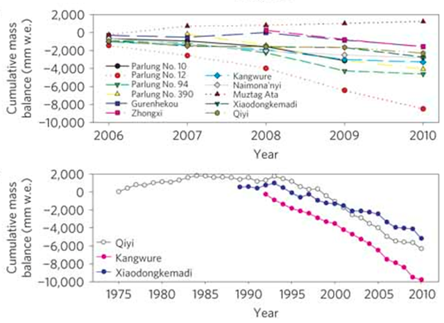
Above, Cumulative mass balance for 11 glaciers in 2006–2010 (Supplementary Table S6 and Figs S3–S13). Below, Cumulative mass balance for the three longest time series of glacier mass-balance measurements along transect 1 (Supplementary Table S7 and Figs S14 and S15).
Graph of the Day: Cumulative mass balance for Himalaya glaciers, 1975-2010 — Trends in number of global freeflowing rivers greater than 1,000km in length 
Trends in number of global freeflowing rivers greater than 1,000km in length. Trends from pre-1900 to the present day and estimated to 2020 (line), in comparison with the number of rivers dammed over time (bars). WWF
Graph of the Day: Number of Global Freeflowing Rivers, pre-1900 – Present
— Global distribution of physical water scarcity by major river basin, 2011 
Water scarcity is growing and salinization and pollution of groundwater and degradation of water bodies and water-related ecosystems are rising, the State of the World’s Land and Water Resources for Food and Agriculture (SOLAW) reports. Large inland water bodies are under pressure from a combination of reduced inflows and higher nutrient loading — the excessive build up of nutrients like nitrogen and phosphorus. Many rivers do not reach their natural end points and wetlands are disappearing. In key cereal producing areas around the world, intensive groundwater withdrawals are drawing down aquifer storage and removing the accessible groundwater buffers that rural communities have come to rely on. “Because of the dependence of many key food production systems on groundwater, declining aquifer levels and continued abstraction of non-renewable groundwater present a growing risk to local and global food production,” FAO’s report cautions.
Graph of the Day: Global Distribution of Physical Water Scarcity by Major River Basin
— Maplecroft Water Stress Index for 2012 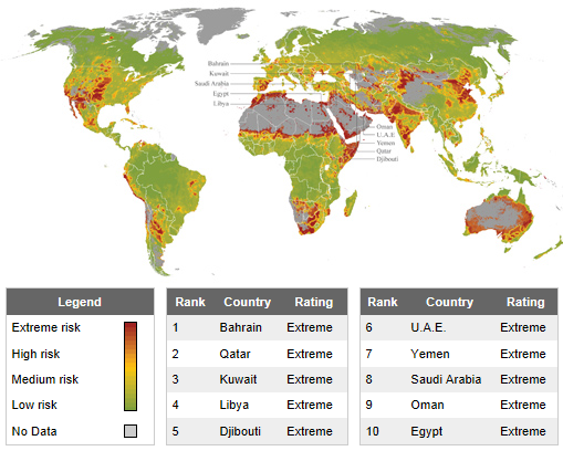
10 May 2012 (Maplecroft) – The viability of water supplies throughout key regions of China, India, Pakistan, South Africa and the US are under threat from unsustainable domestic, agricultural, and industrial demands, according to a new study that maps water use down to 10km² worldwide. The growth economies of China and India, and the world’s largest economy USA are identified by risk analysis company Maplecroft, in its newly released Water Stress Index, as having vast geographical regions and sector areas where unsustainable water use is outstripping supply. Maplecroft states that the situation so serious, it has the potential to limit economic growth by constraining business activities, as well as hampering agricultural outputs. Resulting reductions in crop harvests in these countries will also negatively impact local food supplies and global food prices, while the socio-economic impacts of water shortages, especially in India and China, have the potential to create unrest and affect stability, as populations and business compete for dwindling supplies. Water stress has major implications for global supply chains, especially within the major growth economies. According to the index, countries such as South Africa and Pakistan are at ‘high risk’ overall, but have large pockets of ‘extreme risk’ areas. Investors in these countries, especially those in the water intensive mining sector in South Africa, need to take steps to ensure the long-term viability of projects and supply partners. Maplecroft has calculated levels of water stress in 168 countries by evaluating renewable supplies of water from precipitation, streams and rivers against domestic, industrial and agricultural use. The Water Stress Index also includes an interactive sub-national map, which has been developed to pinpoint areas of extreme water stress that pose significant risks to populations and business operations at a local level right down to 10km². The arid Middle East and North Africa region is the most at risk region in the index, with Bahrain (1), Qatar, (2), Kuwait (3), Libya (4) and Djibouti (5), UAE (6), Yemen (7), Saudi Arabia (8), Oman (9) and Egypt (10) categorised as the most water stressed countries. However, the widespread use of irrigation for agriculture, combined with increasing domestic and industrial water demand in India (ranked 34th in the index), China (50) and the US (61) mean that increasing pressure is being placed on available water resources in these key economies, which may impact the wider world.
Unsustainable water use threatens agriculture, business, and populations in China, India, Pakistan, South Africa, and U.S.: global study
— Record U.S. weather events for the week of 25 March 2012 – 1 April 2012 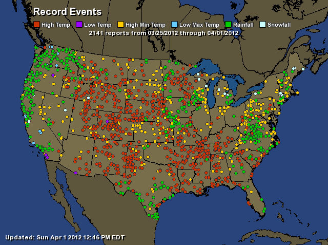
By Brian K. Sullivan
1 April 2012 Chicago had its all-time warmest March, while New York’s Central Park had its second-hottest as thousands of new weather records were set or tied across the U.S., according to the National Weather Service. The average temperature for the month in Chicago was 53.5 degrees Fahrenheit (11.9 Celsius). That topped the previous mark of 48.6 degrees, set in 1910 and matched in 1945, the weather service said, citing data compiled since 1873. In New York, the average temperature was 50.9 degrees, which was 8.9 degrees above normal, while below the record 51.1 degrees in 1945, according to the weather service. “To put it in perspective, if it was April, it would still be in the top 10, as far as warmest. It is mind-boggling,” said Tom Kines, a meteorologist for AccuWeather Inc. in State College, Pennsylvania. “There are many areas across the upper Midwest that have had their warmest March ever. That seems to be where the core of the warmth was.” Across the U.S., 7,577 all-time daily high temperatures were set or matched in March, according to the National Climate Data Center in Asheville, North Carolina. The warm weather contributed to a decline in natural gas prices, as less of the energy was needed to heat homes and business.
‘Mind boggling’ U.S. warmth set or tied 7,577 record high temperatures in March
— Temperature and wildfire numbers in the U.S. West, 1970-2010 
Among the Western States, Arizona, California, Colorado, Idaho, and Montana have seen the most dramatic increases in wildfires since 1970. According to our analysis, the average annual number of large fires has nearly quadrupled in Arizona and Idaho, and at least doubled in California, Colorado, Montana, New Mexico, Nevada, Oregon, Utah, and Wyoming.
Graph of the Day: Temperatures and Wildfire Numbers in the U.S. West, 1970-2010
— Global surface temperatures, 1937-2011
Global temperatures have warmed significantly since 1880, the beginning of what scientists call the “modern record.” At this time, the coverage provided by weather stations allowed for essentially global temperature data. As greenhouse gas emissions from energy production, industry and vehicles have increased, temperatures have climbed, most notably since the late 1970s. In this animation of temperature data from 1880-2011, reds indicate temperatures higher than the average during a baseline period of 1951-1980, while blues indicate lower temperatures than the baseline average. (Data source: NASA Goddard Institute for Space Studies. Visualization credit: NASA Goddard Space Flight Center Scientific Visualization Studio)
Video: Global surface temperatures, 1937-2011 — Frequency of extreme downpours in the United States, 1948-2011 
Global warming is happening now and its effects are being felt in the United States and around the world. Among the expected consequences of global warming is an increase in the heaviest rain and snow storms, fueled by increased evaporation and the ability of a warmer atmosphere to hold more moisture. An analysis of more than 80 million daily precipitation records from across the contiguous United States reveals that intense rainstorms and snowstorms have already become more frequent and more severe. Extreme downpours are now happening 30 percent more often nationwide than in 1948. In other words, large rain or snowstorms that happened once every 12 months, on average, in the middle of the 20th century now happen every nine months. Moreover, the largest annual storms now produce 10 percent more precipitation, on average.
Graph of the Day: Frequency of Extreme Downpours in the United States, 1948-2011
— Moisture content and groundwater depletion in the U.S., September 2012 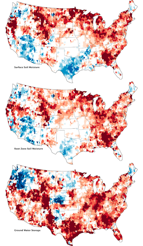
A deep and persistent drought struck vast portions of the continental United States in 2012. Though there has been some relief in the late summer, a pair of satellites operated by NASA shows that the drought lingers in the underground water supplies that are often tapped for drinking water and farming. The maps above combine data from the twin satellites of the Gravity Recovery and Climate Experiment (GRACE) with ground-based measurements to map the relative amount of water stored near the surface and underground as of September 17, 2012. The top map shows moisture content in the top 2 centimeters (0.8 inches) of surface soil; the middle map depicts moisture in the “root zone,” or the top meter (39 inches) of soil; and the third map shows groundwater in aquifers. The wetness, or water content, of each layer is compared to the average for mid-September between 1948 and 2009. The darkest red regions represent dry conditions that should occur only 2 percent of the time (about once every 50 years). For a long-term view, download the animation below the third image, which shows the storage of groundwater from August 2002 through August 2012. (The animation is also available on YouTube.) In all of the maps above, September 2012 conditions remain significantly drier than the norm, particularly in the eastern third of the United States, the Midwest, the High Plains and Rockies, and along the California–Oregon border. Surface and root moisture recently rebounded in the south central and southwestern states, largely due to Hurricane Isaac and other rainfall in 2012. But even there, the severe droughts of 2011 and 2012 persist below ground in aquifers. Groundwater supplies in the Southeast, the Rockies, the Midwest, New Mexico, and Texas are still far below the norm, according to GRACE.
Graph of the Day: Moisture Content and Groundwater Depletion in the U.S., September 2012
— Water storage at O. H. Ivie Reservoir in Texas, 1991-2012 
Reservoir stage data are collected every day from USGS, IBWC, and USACE websites. These data are preliminary and subject to revision. Reservoir storage (in acre-feet) is derived from these stage data (elevation in feet above mean sea level), by using the latest rating curve datasets available to TWDB.
Graph of the Day: Water Storage at O. H. Ivie Reservoir in Texas, 1991-2012
— Cumulative rainfall anomalies for Southeastern Australia, January 1997 – December 2011 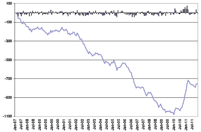
Cumulative rainfall anomalies for southeastern Australia starting from January 1997 to December 2011 in mm. Individual monthly anomalies are shown in the columns. An alternative way to consider the impact of the rainfall declines and recent rainfall is to look at the cumulative rainfall anomalies for southeastern Australia. The cumulative rainfall anomalies provide a measure of just how much rainfall the region has ‘missed out on’ in the past 15 years. While the systematic accumulation of rainfall deficits was reversed with the heavy spring and summer rainfall of 2010, the total two-year record rainfall makes up for about one third of the total rainfall ‘missed out on’ since 1996. Additionally, the recovery peaked in autumn 2011, with a return to deficits from that time on. In other words, the accumulated below-normal rainfall during the ‘Big Dry’ remains substantially greater than the extra spring and summer rainfall that has fallen during the past two years.
Graph of the Day: Cumulative Rainfall Anomalies for Southeastern Australia, January 1997 – December 2011
— Annual inflow to Perth dams, 1911-2012, showing stepwise changes 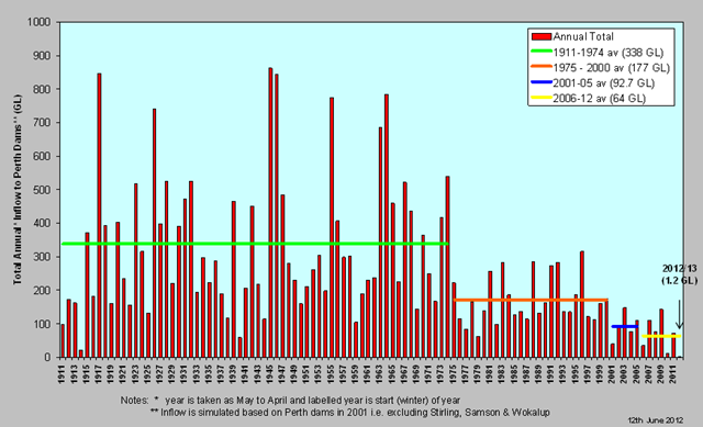
This graph shows how the average amount of water received into Perth dams has dropped dramatically in recent times. In order to provide an accurate comparison Stirling, Wokalup, and Samson Brook Dams are not included in this data, as these Dams only came online in 2001. Inflow is therefore simulated based on Perth dams pre 2001.
Graph of the Day: Total Annual Inflow to Perth Dams, 1911-2012
— Projected overall capital investment gap for U.S. water infrastructure, 2010-2040 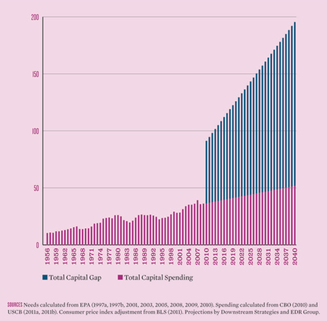
For drinking-water, wastewater, and storm water, this figure presents past and projected spending (blue bars) and the capital gap that is likely to occur should future spending follow this path. … The overall capital gap for water infrastructure—which includes drinking-water, wastewater, and wet weather—is already significant: $54.8 billion in 2010. If spending increases at the modest but historically consistent rate shown in the figure, the gap will increase to $84.4 billion by 2020 and $143.7 billion by 2040 (in constant 2010 dollars).
Graph of the Day: Projected Overall Capital Investment Gap for U.S. Water Infrastructure, 2010-2040
— Projected food security outcomes in East Africa, July-September, 2012 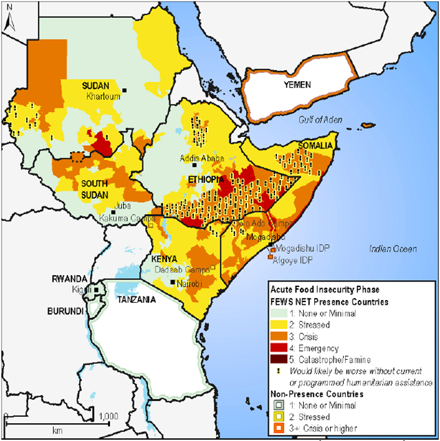
27 July 2012 (Famine Early Warning System Network) – There are about 16 million people facing Stressed (IPC Phase 2) to Emergency (IPC Phase 4) levels of food insecurity in Djibouti, Ethiopia, Sudan, South Sudan, Kenya, and Uganda. The main drivers of food insecurity in these countries are poor rains, conflict, high food prices, and in some cases an inability to access humanitarian assistance. Climate forecast by the Greater Horn of Africa Climate Outlook Forum (GHACOF 31) for the June to September rains stated that the performance of these rains will be normal to above normal in areas of East Africa that typically receive this rain. These rains are the main rains in most parts of Ethiopia, Sudan, South Sudan and Djibouti. Northern Uganda and northern and coastal parts of Somalia also receive rains during this season.
Food security worsens in Sudan – 16 million people face stressed/emergency levels in East Africa
— Food insecurity in West Africa, June 2012 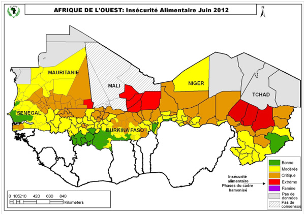
By Rohit Kachroo, NBC News in Niger, West Africa
19 June 2012 One-and-a-half-million children are in imminent danger of starvation in West Africa, according to The United Nations Children’s Fund, despite recent pledges of international aid. As world leaders gathered for the Rio+20 conference on sustainable development, aid workers warned there were only four weeks left to treat the effects of acute hunger before the rainy season makes huge swathes of the Sahel region inaccessible. Across western Africa, communities are caught between climate change, conflict, and poverty — yet the global economic crisis means international priorities lie elsewhere. For example, during its financial crisis Greece has received a hundred times more from the International Monetary Fund (IMF) than Niger during the last few years.
1.5 million children in imminent danger of starvation in West Africa due to climate change, conflict, and poverty
— Obesity and overweight rates in 7 OECD countries 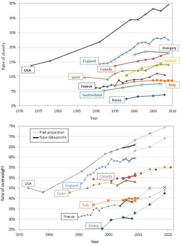
Until 1980, fewer than one in ten people were obese. Since then, rates doubled or tripled and in 19 of 34 OECD countries the majority of the population is now overweight or obese. OECD projections suggest that more than two out of three people will be overweight or obese in some OECD countries by 2020.
Graph of the Day: Progression of Obesity and Overweight Rates in Seven OECD countries
— 1000-year records of CO2, N2O, and CH4 
1000-year records of southern hemisphere background concentrations of CO2 parts per million (ppm – orange), N2O parts per billion (ppb – blue) and CH4 (ppb – green) measured at Cape Grim Tasmania and in air extracted from Antarctic ice and near surface levels of ice known as firn. Global CO2, methane (CH4), and nitrous oxide (N2O) concentrations have risen rapidly during the past two centuries. The amount of these long-lived greenhouse gases in the atmosphere reached a new high in 2011. The concentration of CO2 in the atmosphere in 2011 was 390 parts per million (ppm) – much higher than the natural range of 170 to 300 ppm during the past 800,000 years.
Graph of the Day: 1000-year Records of Southern Hemisphere Background Concentrations of CO2, N2O, and CH4
— Counts of U.S. earthquakes of magnitude 3 or greater, 1973-2012 
By Deborah Zabarenko, Environment Correspondent; Editing by Marilyn W. Thompson and Philip Barbara 17 April 2012 (Reuters) – The number of earthquakes in the central United States rose “spectacularly” near where oil and gas drillers disposed of wastewater underground, a process that may have caused geologic faults to slip, U.S. government geologists report. The average number of earthquakes of magnitude 3 or greater in the U.S. midcontinent – an area that includes Arkansas, Colorado, Oklahoma, New Mexico and Texas – increased to six times the 20th century average last year, scientists at the U.S. Geological Survey said in an abstract of their research. The abstract does not explicitly link rising earthquake activity to fracking – known formally as hydraulic fracturing – that involves pumping water and chemicals into underground rock formations to extract natural gas and oil. But the wastewater generated by fracking and other extraction processes may play a role in causing geologic faults to slip, causing earthquakes, the report suggests. “A remarkable increase in the rate of (magnitude 3) and greater earthquakes is currently in progress,” the authors wrote in a brief work summary to be discussed Wednesday at a San Diego meeting of the Seismological Society of America. “While the seismicity rate changes described here are almost certainly manmade, it remains to be determined how they are related to either changes in extraction methodologies or the rate of oil and gas production,” the abstract said.
Human-made earthquakes reported in central U.S
— Premature deaths from ground-level ozone, projected to 2050 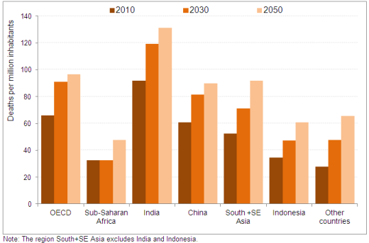
Urban air pollution is set to become the top environmental cause of mortality worldwide by 2050, ahead of dirty water and lack of sanitation. The number of premature deaths from exposure to particulate air pollutants leading to respiratory failure could double from current levels to 3.6 million every year globally, with most occurring in China and India. Because of their ageing and urbanised populations, OECD countries are likely to have one of the highest rate of premature death from ground-level ozone in 2050, second only to India.
Graph of the Day: Premature Deaths from Ground-level Ozone, Projected to 2050
— Map of mercury emissions from U.S. power plants 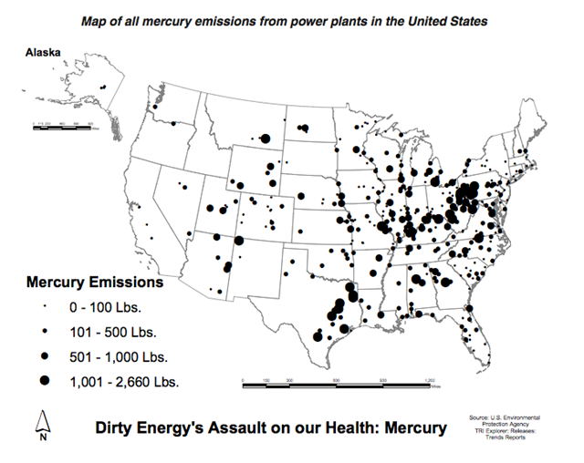
By Sue Sturgis Rank of coal-fired power plants among America’s biggest sources of air pollution: 1 Of the five leading causes of death in the United States, number to which coal plant pollution contributes: 4 Number of U.S. water bodies impaired by mercury, a particularly toxic component of coal plant pollution: 3,781 Of the 50 U.S. states, number that have fish consumption advisories due to unsafe mercury pollution levels: 50 Factor by which one study found mercury concentrations in fish have increased from the 1930s to today: 10 Portion of U.S. women of childbearing age who have enough mercury in their bloodstream to put their offspring at risk of health effects: 1 in 6 Percentage of U.S. women of childbearing age that had inorganic mercury in their blood in 1999: 2 That percentage in 2006: 30
Graph of the Day: Map of All Mercury Emissions from U.S. Coal-fired Power Plants, November 2011
— Distribution of fertilizers and ocean dead zones 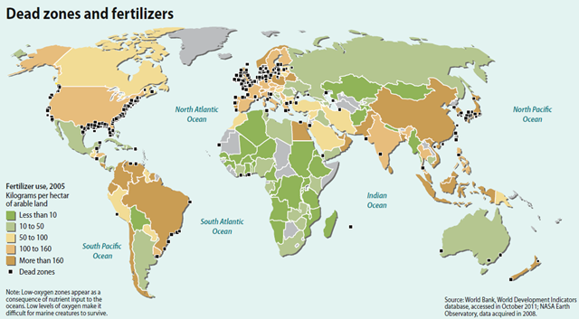
The environmental and socioeconomic impacts of nutrient pollution are massive and occurring over wide areas globally. The occurrence of coastal hypoxic zones caused by eutrophication has increased exponentially in recent years, and nitrate pollution is one of the main groundwater contaminants in the developed and also increasingly in the developing world. Coastal hypoxia impacts fisheries, tourism and various ecosystem services provided by healthy coastal ecosystems. For the EU alone, the economic costs of damage to the aquatic environment from excess reactive nitrogen are estimated at up to € 320 billion per year. Initial evidence from the EU and US suggests that the overall benefits from improved nutrient management exceed costs and that this cost/benefit calculus occurs in other parts of the world.
Graph of the Day: Fertilizers and Ocean Dead Zones
— Radioactive seawater impact from Fukushima Daiichi nuclear plant, March 2012 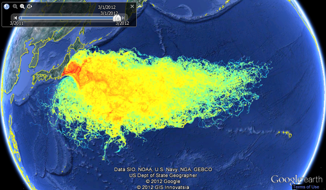
We use a Lagrangian particles dispersal method to track where free floating material (fish larvae, algae, phytoplankton, zooplankton…) present in the sea water near the damaged Fukushima Daiichi nuclear power station plant could have gone since the earthquake on March 11th. This is not a representation of the radioactive plume concentration. Since we do not know exactly how much contaminated water and at what concentration was released into the ocean, it is impossible to estimate the extent and dilution of the plume. However, field monitoring by TEPCO showed concentration of radioactive Iodine and Cesium higher than the legal limit during the next two months following the event (with a peak at more than 100 Bq/cm3 early April 2011 for I-131).
Graph of the Day: Radioactive Seawater Impact from Fukushima Daiichi Nuclear Plant, March 2012
— Decline in Coral Cover of the Great Barrier Reef, 1985-2012 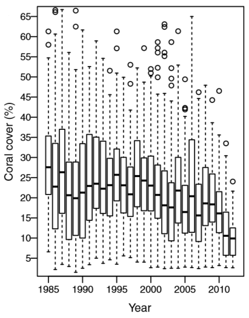
ABSTRACT: The world’s coral reefs are being degraded, and the need to reduce local pressures to offset the effects of increasing global pressures is now widely recognized. This study investigates the spatial and temporal dynamics of coral cover, identifies the main drivers of coral mortality, and quantifies the rates of potential recovery of the Great Barrier Reef. Based on the world’s most extensive time series data on reef condition (2,258 surveys of 214 reefs over 1985–2012), we show a major decline in coral cover from 28.0% to 13.8% (0.53% y−1), a loss of 50.7% of initial coral cover. Tropical cyclones, coral predation by crown-of-thorns star fish (COTS), and coral bleaching accounted for 48%, 42%, and 10% of the respective estimated losses, amounting to 3.38% y−1 mortality rate.
Graph of the Day: Decline in Coral Cover of the Great Barrier Reef, 1985-2012
— Expansion and Impact of World Fishing Fleets, 1950 and 2006 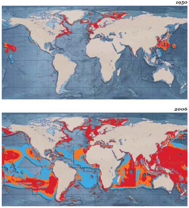
The expansion and impact of world fishing fleets in a) 1950 and b) 2006. The maps show the geographical expansion of world fishing fleets from 1950 to 2006 (the latest available data). Since 1950, the area fished by global fishing fleets has increased ten-fold. By 2006 100 million km2, around 1/3 of the ocean surface, was already heavily impacted by fishing. Primary production rate (PPR) is a value that describes the total amount of food a fish needs to grow within a certain region. Blue: At least 10% PPR extraction; orange: At least 30% PPR extraction; red: At least 20% PPR extraction. The consequences of increased fishing intensity have been dramatic for the marine environment. Between 1950 and 2005, “industrial” fisheries expanded from the coastal waters of the North Atlantic and Northwest Pacific southward into the high seas and the Southern Hemisphere. A nearly five-fold increase in global catch, from 19 million tonnes in 1950 to 87 million tonnes in 2005 (Swartz et al., 2010), has left many fisheries overexploited (FAO, 2010b). In some areas fish stocks have collapsed, such as the cod fisheries of the Grand Banks of Newfoundland (FAO, 2010b). Catch rates of some species of large predatory fishes – such as marlin, tuna and billfish – have dramatically declined over the last 50 years, particularly in coastal areas of the North Atlantic and the North Pacific (Tremblay-Boyer et al., 2011). This continuing trend also applies to sharks and other marine species.
Graph of the Day: Expansion and Impact of World Fishing Fleets, 1950 and 2006
— Arrival of Spring in the U.S. in 2012, relative to 1981-2010 average 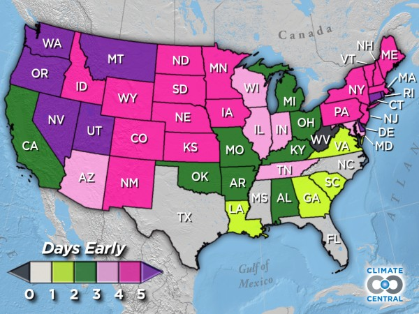
23 March 2012 (Climate Central) – For most of the country spring has sprung earlier this year, but is this anything more than a single warm year? It seems that it is. During the past several decades, with the exception of the Southeast, spring weather has, indeed, been arriving earlier. In the interactive map, you can see how much earlier spring has arrived state-by-state, measured by the date of “first leaf.” As you hover over any state, it’ll display two boxes: a gray box that represents the day spring used to arrive (based on the 1951-1980 average) and a colored box that represents how much earlier spring has arrived in recent years (based on the 1981-2010 average). Nationwide, the date of “first leaf” has clearly shifted — arriving roughly three days earlier now on March 17th (1981-2010 average) from March 20th (1951-1980 average). This shift affects all sorts of biological processes that are triggered by warmer temperatures — not just flowering, but animal migration and giving birth and the shedding of winter coats and the emergence from cocoons. How much will an earlier spring disrupt the intricate natural balance between the tens of thousands of species that depend on each other for food, reproduction and ultimately, survival? No one really knows. The data behind the map comes from an index for the onset of spring developed by Mark D. Schwartz (University of Wisconsin-Milwaukee) and USA National Phenology Network colleagues.
State-by-state look at how early spring has arrived
— Total annual area occupied by overwintering monarch butterflies, 1994-2011 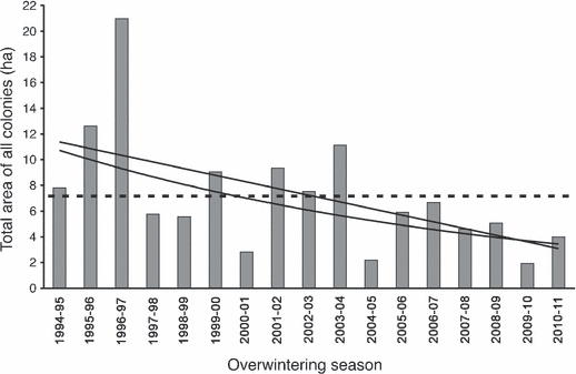
Abstract: During the 2009–2010 overwintering season and following a 15-year downward trend, the total area in Mexico occupied by the eastern North American population of overwintering monarch butterflies reached an all-time low. Despite an increase, it remained low in 2010–2011. Although the data set is small, the decline in abundance is statistically significant using both linear and exponential regression models. Three factors appear to have contributed to reduce monarch abundance: degradation of the forest in the overwintering areas; the loss of breeding habitat in the United States due to the expansion of GM herbicide-resistant crops, with consequent loss of milkweed host plants, as well as continued land development; and severe weather. This decline calls into question the long-term survival of the monarchs’ migratory phenomenon.
Graph of the Day: Total Annual Area Occupied by Overwintering Monarch Butterflies, 1994-2011
— Survival of adult Hawaiian forest birds captured during January-March 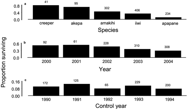
Native birds at Hakalau Forest National Wildlife Refuge are in unprecedented trouble, according to a paper recently published in the journal PLoS ONE. The paper, titled “Changes in timing, duration, and symmetry of molt of Hawaiian forest birds,” was authored by University of Hawai‘i at Mānoa Zoology Professor Leonard Freed and Cell and Molecular Biology Professor Rebecca Cann. In the paper, Freed and Cann report that birds are now so food-deprived that they take up to twice as long replace their feathers, an annual process known as molt. The authors confirmed the hypothesis that Japanese white-eye (Zosterops japonicus) birds are effectively competing with most species of native birds. Their research found that both young and adult birds took longer to complete their molt. Young birds normally complete their juvenile molt in five months, beginning before June and ending in October. Now it is taking the birds as late as March of the following year to finish that molt. Adults are also taking that much longer to replace their feathers. Freed and Cann propose that this change in molt matches those in studies that experimentally starve birds.
Native forest birds in Hawaii in unprecedented trouble
— U.S. coastal population and energy facilities located below 4 feet 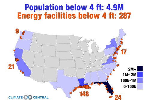
By Benjamin H. Strauss
20 April 2012 Good morning, Senator Bingaman and colleagues. Thank you for your attention to this important topic. I am Dr. Ben Strauss, coauthor of two recent peer-reviewed papers making an assessment of sea level risk to the lower 48 states, as well as the summary report submitted with my written testimony. I am also Director of the Program on Sea Level Rise at Climate Central, a nonprofit research organization that conveys scientific information to the public. We take no policy positions. In my testimony today, as in my research, I will address two topics: first, how sea level rise is amplifying the risk from coastal storm surges, and then, what communities and assets are exposed at the lowest elevations.
Senate testimony on sea level rise by Ben Strauss
— Record Amazon River flood level in Iquitos, 22 April 2012 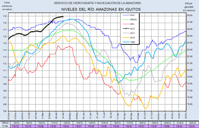
The Amazon has reached record breadth, width, and height this rainy season. According to Peru’s Health Ministry, the river has grown at least 6.5 feet during the floods, with the Marañón River, which feeds the Amazon, increasing some 13 feet. Neither river has swelled this much since the 1970s, when a similar flood affected the area. [Flooding ravages Peru and Colombia – Amazon River reaches record breadth, width, and height]
Graph of the Day: Record Amazon River Level in Iquitos, 22 April 2012
— Flood extent and standing water in Pakistan, 9 October 2012 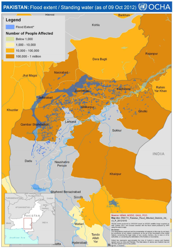
16 October 2012 (ReliefWeb) – Flash floods prompted by monsoon rains across Pakistan in the third week of August 2012 affected Khyber Pakhtunkhwa (KP) and Gilgit Baltistan (GB) provinces, and Azad Jammu and Kashmir (AJ & K) state. A second spell of monsoon rainfall started over the southern parts of the country from the end of the first week of September, peaking on 9 and 10 September across Pakistan resulting in flooding across the provinces of Punjab, Sindh, and Balochistan. The hardest hit districts in the first and second wave of the monsoon were Rajanpur, Dera Ghazi Khan (Punjab), Kashmore, Jacobabad, Shikarpur (Sindh), Nasirabad and Jaffarabad, Killa Saifullah, Jhal Magsi and Loralai (Balochistan) with widespread loss of life, livelihoods and infrastructure recorded across the country. Many of the affected districts, particularly in Balochistan and Sindh, were already struggling to recover from the floods of 2010 and 2011. Currently river flows and weather are normal in all parts of the country. There is still flood water in parts of Kashmore, Jacobabad, and Shikarpur in Sindh and Jaffarabad and Nasirabad in Balochistan provinces covering almost 4,000 square kilometres with effects including contamination of water sources, disease outbreaks, infrastructural damage, and loss of livelihoods. Water-logged crop and grazing land will also have adverse consequences on the agro-based economy of the region and result in food deficits.
Graph of the Day: Flood Extent and Standing Water in Pakistan, 9 October 2012
— Global number of weed populations resistant to two or more types of herbicides, 1980-2010 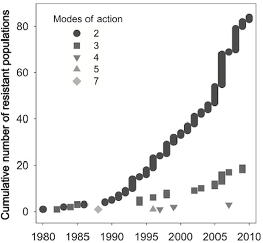
By Brandon Keim
1 May 2012 Herbicide-resistant superweeds threaten to overgrow U.S. fields, so agriculture companies have genetically engineered a new generation of plants to withstand heavy doses of multiple, extra-toxic weed-killing chemicals. It’s a more intensive version of the same approach that made the resistant superweeds such a problem — and some scientists think it will fuel the evolution of the worst superweeds yet. These weeds may go a step further than merely being able to survive one or two or three specific weedkillers. The intense chemical pressure could cause them to evolve resistance that would apply to entire classes of chemicals. “The kind of resistance we’ll select for with these kinds of crops will be different from what we’ve seen in the past,” said agroecologist Bruce Maxwell of Montana State University. “They’ll select a kind of resistance that’s more metabolism-based, and likely resistant to everything.”
New genetically modified crops could make superweeds even stronger
— Observed and experimental sensitivity of plants to global warming 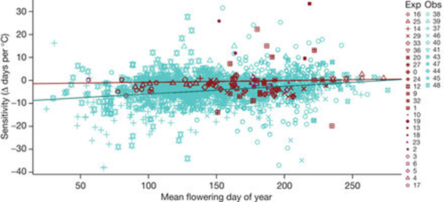
This trend is seen in the observational studies (blue) but not in the experimental studies (red). The numbers correspond to those in Fig. 1 and to site information given in the Supplementary Information. ABSTRACT: Warming experiments are increasingly relied on to estimate plant responses to global climate change. For experiments to provide meaningful predictions of future responses, they should reflect the empirical record of responses to temperature variability and recent warming, including advances in the timing of flowering and leafing. We compared phenology (the timing of recurring life history events) in observational studies and warming experiments spanning four continents and 1,634 plant species using a common measure of temperature sensitivity (change in days per degree Celsius). We show that warming experiments underpredict advances in the timing of flowering and leafing by 8.5-fold and 4.0-fold, respectively, compared with long-term observations. For species that were common to both study types, the experimental results did not match the observational data in sign or magnitude. The observational data also showed that species that flower earliest in the spring have the highest temperature sensitivities, but this trend was not reflected in the experimental data. These significant mismatches seem to be unrelated to the study length or to the degree of manipulated warming in experiments. The discrepancy between experiments and observations, however, could arise from complex interactions among multiple drivers in the observational data, or it could arise from remediable artefacts in the experiments that result in lower irradiance and drier soils, thus dampening the phenological responses to manipulated warming. Our results introduce uncertainty into ecosystem models that are informed solely by experiments and suggest that responses to climate change that are predicted using such models should be re-evaluated.
Graph of the Day: Observed and Experimental Sensitivity of Plants to Global Warming
— Vibrio infections and Baltic Sea temperature 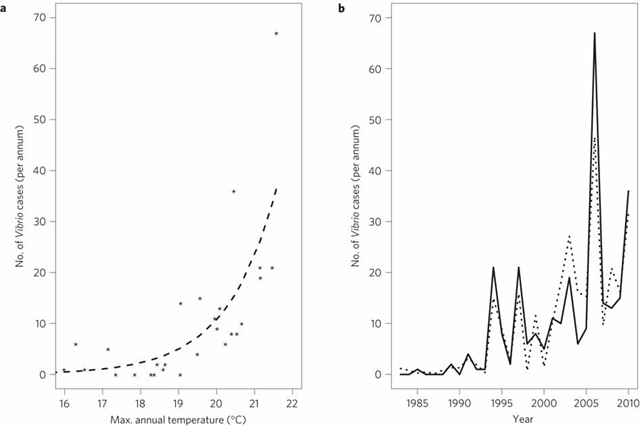
By Nina Chestney
22 July 2012 LONDON – Manmade climate change is the main driver behind the unexpected emergence of a group of bacteria in northern Europe which can cause gastroenteritis, new research by a group of international experts shows. The paper, published in the journal Nature Climate Change on Sunday, provided some of the first firm evidence that the warming patterns of the Baltic Sea have coincided with the emergence of Vibrio infections in northern Europe. Vibrios is a group of bacteria which usually grow in warm and tropical marine environments. The bacteria can cause various infections in humans, ranging from cholera to gastroenteritis-like symptoms from eating raw or undercooked shellfish or from exposure to seawater. A team of scientists from institutions in Britain, Finland, Spain, and the United States examined sea surface temperature records and satellite data, as well as statistics on Vibrio cases in the Baltic. They found the number and distribution of cases in the Baltic Sea area was strongly linked to peaks in sea surface temperatures. Each year the temperature rose one degree, the number of vibrio cases rose almost 200 percent. “The big apparent increases that we’ve seen in cases during heat wave years (…) tend to indicate that climate change is indeed driving infections,” Craig Baker-Austin at the UK-based Centre for Environment, Fisheries, and Aquaculture Science, one of the authors of the study, told Reuters.
Vibrio bacteria outbreak in Northern Europe due to ocean warming
— Progression of Colorado Mountain Pine Beetle, 1996-2011  Graph of the Day: Spread of Colorado Mountain Pine Beetle, 1996-2011
— Distribution of remaining forest patches in Brazil’s Atlantic forest, 2012 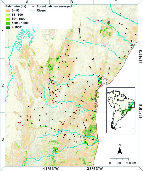
By KELLY SLIVKA
14 August 2012 The Atlantic Forest in Brazil, which runs along the country’s southeastern shore near Rio de Janeiro, has been fragmented by centuries of human habitation. While the rain forest originally spanned over half a million square miles – an area comparable to the size of South Africa – almost 90 percent of it is now gone. Fields, roads, and cities have taken the place of trees. Pockets of forest that survived clear-cutting and fires are scattered across the original domain of the forest. Some are the size of a football field, some half the size of Long Island, and although they are small by comparison with the forest’s former dimensions, they remain important refuges for the enormous biodiversity that the region still boasts. Yet these scattered patches are not providing many important species the protection that they need to thrive, according to a study published online on Tuesday in the journal PLoS One. Researchers quantified the presence of 18 types of mammals in a sample of 196 Atlantic Forest patches and found that only about 22 percent of the animals that originally inhabited the areas continue to survive there. “Five large mammal species – tapirs, giant anteaters, jaguar, wooly spider monkeys and white-lipped peccaries — are essentially extinct throughout the whole region,” said Carlos Peres, an ecologist at the University of East Anglia in Britain and one of the study’s authors.
In fragmented Brazil forest, few species survive – ‘The results are actually pretty gloomy’
— Change in vegetation cover by biome across Latin America, 2001-2010 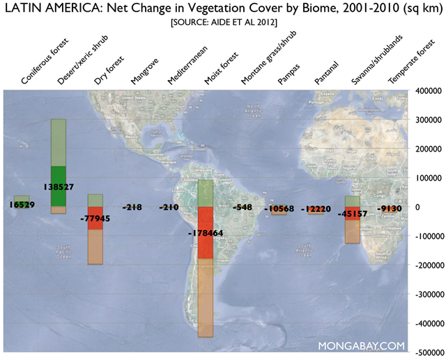
By Rhett A. Butler, www.mongabay.com
20 August 2012 Latin America lost nearly 260,000 square kilometers (100,000 square miles) of forest — an area larger than the state of Oregon — between 2001 and 2010, finds a new study [pdf] that is the first to assess both net forest loss and regrowth across the Caribbean, Central and South America. The study, published in the journal Biotropica by researchers from the University of Puerto Rico and other institutions, analyzes change in vegetation cover across several biomes, including forests (dry, temperate, moist, mangroves and coniferous), grasslands (pampas, shrublands, montane grasslands, savanna, desert/xeric shrublands), and wetlands (pantanal). It finds that the bulk of vegetation change occurred in forest areas, mostly tropical rainforests and lesser-known dry forests. The largest gains in woody vegetation area occurred in desert vegetation and shrublands. Gross deforestation amounted to 542,000 sq km, while recovery of woody vegetation occurred across 362,000 sq km. Argentina experienced the largest net loss across all biomes, losing 101,734 square kilometers, mostly in the form of dry forests (67,140 sq km) and grasslands (15,729 sq km). Brazil followed with a loss of 99,424 sq km, primarily in the form of moist forests (145,511 sq km). Brazil had the highest gross loss of vegetation cover during the period (245,767 sq km), but that was partly offset by the highest gross gain (146,342 sq km). Mexico had the largest net increase in biome area at 96,089 sq km mostly due to a rise in land classified as “desert/xeric shrub” cover (79,085) and regrowth of dry forests (12,810) and coniferous forest (11,907 sq km).
Graph of the Day: Change in Vegetation Cover by Biome across Latin America, 2001-2010
— Value of logs and sawn timber imports into China, 2000-2011 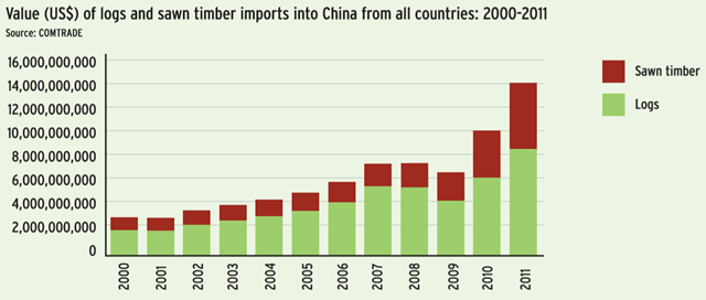
China is now the biggest importer, exporter, and consumer of illegal timber in the world. Its footprint impacts vital forest ecosystems ranging from neighbouring countries such as Myanmar to remote areas of Africa. With domestic forests incapable of meeting surging demand, China has a gaping and growing timber deficit that can only be filled by imports. In 2011, China imported a massive 180 million cubic metres (RWE), a three-fold increase since 2000.
Graph of the Day: Value of Logs and Sawn Timber Imports Into China From All Countries, 2000-2011
— Total ozone maps for 16 September 2010, 2011, and 2012 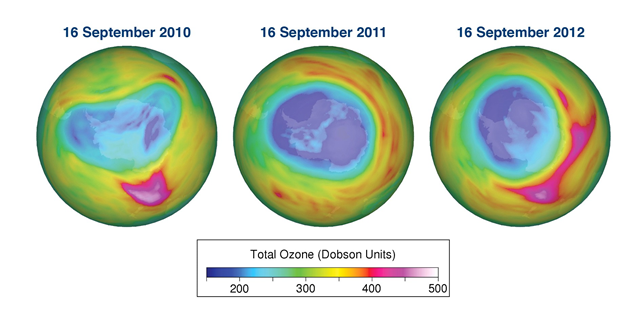
Despite the success of the Montreal Protocol in cutting the production and consumption of ozone-destroying chemicals, these chemicals have a long atmospheric lifetime and it will take several decades before their concentrations are back to pre-1980 levels. The amount of ozone depleting gases in the Antarctic stratosphere reached a maximum around year 2000 and is now decreasing at a rate of about 1% per year. Over the past decade, stratospheric ozone in the Arctic and Antarctic regions as well as globally is no longer decreasing, but it has not yet started to recover either. The ozone layer outside the Polar regions is projected to recover to its pre-1980 levels before the middle of this century. In contrast, the ozone layer over the Antarctic is expected to recover much later.
Ozone layer recovery to take 40 years: World Meteorological Organization
— National current-account balances as a percentage of world gross product, 1996-2013 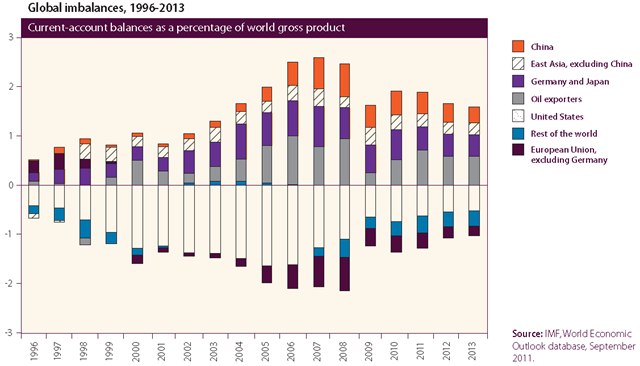
The large and persistent external imbalances in the global economy that have developed over the past decade remain a point of concern for policymakers. Reducing these imbalances has been the major focus of consultations among G20 Finance Ministers under the G20 Framework for Strong, Sustainable and Balanced Growth and the related Mutual Assessment Process (MAP) during 2011. The imbalances have declined during the current economic downturn, but there is concern that in the absence of corrective actions, they will rise again as the world economy recovers. The Cannes Action Plan for Growth and Jobs, adopted by the G20 leaders at the Cannes Summit on 4 November 2011, includes some concrete policy commitments towards such corrective action.
Graph of the Day: National Current-Account Balances as a Percentage of World Gross Product, 1996-2013
— Price indices of commodity groups, 2000-2011 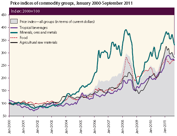
After sliding considerably in the first half of 2010, the agricultural commodity price indices of the United Nations Conference on Trade and Development (UNCTAD) rose sharply, reaching peaks around February 2011 (figure II.9). Despite subsequent falls, prices remain comparatively high. The food price index averaged 268 points from January to September 2011, up 21.8 per cent from the same period in 2010. Within this category, the average price of the main cereals (wheat, maize, and rice) has continued its upward movement, although rising at a slower pace than in the previous year. Meat, vegetable oils, and sugar prices have also been on the rise.
Graph of the Day: Price Indices of Commodity Groups, January 2000 – September 2011
— Change in median and net worth of U.S. households, 2001-2010 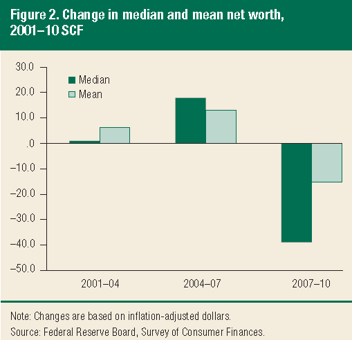
By Tim Mullaney, USA TODAY
12 June 2012 The median U.S. household lost nearly 39% of its wealth from 2007 to 2010, the Federal Reserve said Monday, emphasizing anew the impact of the financial crisis and the recession on ordinary Americans. [“Changes in U.S. Family Finances from 2007 to 2010: Evidence from the Survey of Consumer Finances”, Bricker, et al., 2012 [pdf].] Middle-class families took the biggest hit to their net worth during the crunch because much of their wealth was in their homes, whose values plunged during the recession and in its aftermath, the Fed report said. Wealthier families saw a smaller drop in their incomes, but nowhere near as much impact on their net worth. Median incomes among the richest 10% of Americans fell 5.3%, compared with 7.7% for all Americans. The median net worth of the wealthiest 10% actually rose. The median is the point where half are above and half below. Overall, median household net worth slid to 1992 levels after adjusting for inflation, wiping out the gains of the late-1990s Internet boom and the post-2000 housing surge, the Fed said.
U.S. families’ wealth dives 39 percent in 3 years – Wealthiest gain 2 percent – ‘We were in free fall’
— Share of U.S. households collecting food stamps, 2011 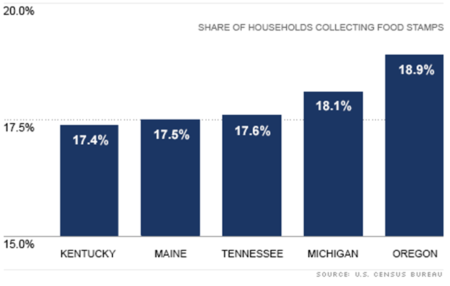
By Tami Luhby
28 November 2012 NEW YORK (CNNMoney) – The number of American households receiving food stamps jumped nearly 10% in 2011. Nearly 15 million households were on food stamps at some point last year, up from 13.6 million in 2010, newly released Census data shows. That’s an increase to 13%, up from 11.9% in 2010. Some 47 states and the nation’s capital experienced an increase in their residents receiving nutrition assistance, with the District of Columbia, Alabama and Hawaii seeing the largest jump. No state experienced a statistically significant decrease. Oregon had the highest share of households receiving food stamps at 18.9%. Wyoming had the lowest at 5.9%. The food stamp program has become a source of controversy in political circles as a record number of Americans signed up for nutrition assistance during the Great Recession. An alternate measure of food stamps shows that though the economy is improving, more people are signing up. A record 47.1 million people received food stamps this past August, according to the U.S. Department of Agriculture.
Nearly 15 million U.S. households on food stamps
— Years to recover U.S. employment rate to pre-2008 level 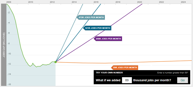
Each month, The Hamilton Project examines the “jobs gap,” which is the number of jobs that the U.S. economy needs to create in order to return to pre-recession employment levels while also absorbing the people who enter the labor force each month. This chart shows how the jobs gap has evolved since the start of the Great Recession in December 2007, and how long it will take to close under different assumptions for job growth. If the economy adds about 208,000 jobs per month, which was the average monthly rate for the best year of job creation in the 2000s, then it will take until June 2020—or 8 years—to close the jobs gap. Given a more optimistic rate of 321,000 jobs per month, which was the average monthly rate for the best year of job creation in the 1990s, the economy will reach pre-recession employment levels by August 2016—not for another 4 years.
Graph of the Day: Years to Recover U.S. Employment Rate to Pre-2008 Level
— Projected U.S. public debt as a share of GDP, 2001-2019 
By Ezra Klein
28 August 2012 You can see it kind of looks like a layer cake. In fact, the folks at the Center on Budget and Policy Priorities call it “the parfait graph.” The top layer, the orange one, that’s the Bush tax cuts. There is no single policy we have passed that has added as much to the debt, or that is projected to add as much to the debt in the future, as the Bush tax cuts, which Republicans passed in 2001 and 2003 and Obama and the Republicans extended in 2010. To my knowledge, all elected Republicans want to make the Bush tax cuts permanent. Democrats, by and large, want to end them for income over $250,000. In second place is the economic crisis. That’s the medium blue. Recessions drive tax revenue down because people lose their jobs, and when you lose your job, you lose your income, and when you lose your income, you can’t pay taxes. Tax revenues in recent years have been 15.4 percent of GDP — the lowest level since the 1950s. Meanwhile, they drive social spending up, because programs like unemployment insurance and Medicaid automatically begin spending more to help the people who have been laid off. Then comes the wars in Iraq and Afghanistan. That’s the red. And then recovery measures like the stimulus. That’s the light blue, and the part for which you can really blame Obama and the Democrats– though it’s worth remembering that the stimulus had to happen because of a recession that began before Obama entered office, and that the Senate Republicans proposed and voted for a $3 trillion tax cut stimulus that would have added almost four times what Obama’s stimulus added to the debt. Then there’s the financial rescue measures like TARP, which is the dark blue line. That’s almost nothing, as much of that money has been paid back.
Tax cuts, wars account for nearly half of U.S. public debt by 2019
— Electronic eavesdropping authorizations by the U.S. Justice Department, 2004-2011 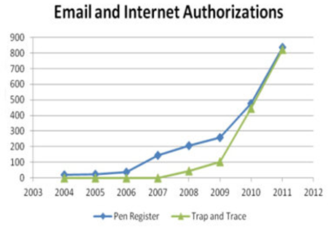
By Naomi Gilens, ACLU Speech, Privacy and Technology Project
27 September 2012 Justice Department documents released today by the ACLU reveal that federal law enforcement agencies are increasingly monitoring Americans’ electronic communications, and doing so without warrants, sufficient oversight, or meaningful accountability. The documents, handed over by the government only after months of litigation, are the attorney general’s 2010 and 2011 reports on the use of “pen register” and “trap and trace” surveillance powers. The reports show a dramatic increase in the use of these surveillance tools, which are used to gather information about telephone, email, and other Internet communications. The revelations underscore the importance of regulating and overseeing the government’s surveillance power. (Our original Freedom of Information Act request and our legal complaint are online.)
Graph of the Day: Electronic Eavesdropping Authorizations by the U.S. Justice Department, 2004-2011
— Limits to Growth projections from 1972 compared with observed trends, 1970-2000 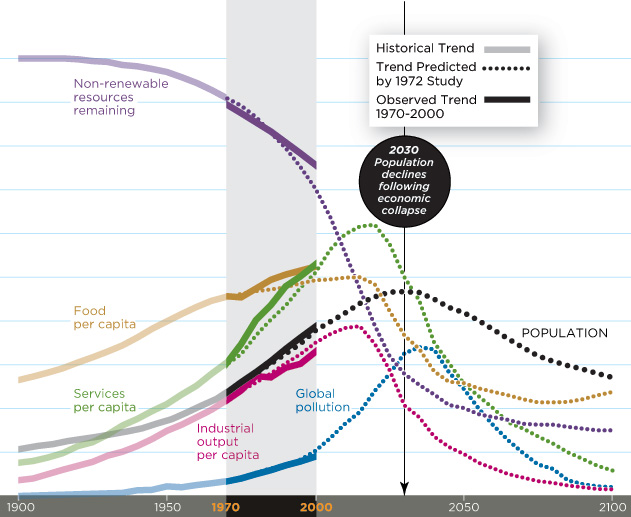
By Eric Pfeiffer, The Sideshow
4 April 2012 A new study from researchers at Jay W. Forrester’s institute at MIT says that the world could suffer from “global economic collapse” and “precipitous population decline” if people continue to consume the world’s resources at the current pace. [Here’s a pdf of Dr. Turner’s 2008 paper: “A comparison of the Limits to Growth with thirty years of reality”.] Smithsonian Magazine writes that Australian physicist Graham Turner says “the world is on track for disaster” and that current evidence coincides with a famous, and in some quarters, infamous, academic report from 1972 entitled, The Limits to Growth. Produced for a group called The Club of Rome, the study’s researchers created a computing model to forecast different scenarios based on the current models of population growth and global resource consumption. The study also took into account different levels of agricultural productivity, birth control and environmental protection efforts. Twelve million copies of the report were produced and distributed in 37 different languages. Most of the computer scenarios found population and economic growth continuing at a steady rate until about 2030. But without “drastic measures for environmental protection,” the scenarios predict the likelihood of a population and economic crash.
MIT researchers predict ‘global economic collapse’ by 2030 – ‘We are not on a sustainable trajectory’
— Average grade level of U.S. congressional speeches, 1996-2012 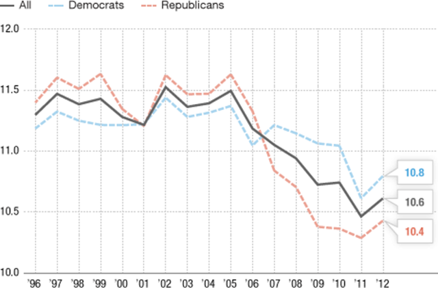
By Tamara Keith
21 May 2012 Members of Congress are often criticized for what they do — or rather, what they don’t do. But what about what they say and, more specifically, how they say it? It turns out that the sophistication of congressional speech-making is on the decline, according to the open government group the Sunlight Foundation. Since 2005, the average grade-level at which members of Congress speak has fallen by almost a full grade. Every word members of Congress say on the floor of the House or Senate is documented in the Congressional Record. The Sunlight Foundation took the entire Congressional Record dating back to the 1990s and plugged it into a searchable database. Lee Drutman, a political scientist at Sunlight, took all those speeches and ran them through an algorithm to determine the grade level of congressional discourse. “We just kind of did it for fun, and I was kind of shocked when I plotted that data and I saw that, oh my God, there’s been a real drop-off in the last several years,” he says.
Average grade level of U.S. congressional speeches dropping since 2005