50 doomiest graphs of 2011
2011 saw a spike in climate disasters around the world, with a corresponding spike in global food prices. It’s no exaggeration to attribute the “Arab Spring” to widespread food insecurity caused by rapidly changing climate. The human perturbation to the carbon cycle increased to nearly 9 gigatons per year, in spite of the global financial collapse – there’s every reason to suspect that nations are switching from the increasingly expensive 20th-century fuel (petroleum) to the still-cheap 19th-century fuel (coal), which means more carbon and mercury emissions. In addition, new studies showed that perturbations to the nitrogen and phosphorus cycles are far beyond levels that cause eutrophication in freshwater and oceans. Humans continued to wreck the biosphere in numerous other creative ways. Farmers in Brazil used Agent Orange to defoliate the Amazon River basin, but mostly they still used good old slash-and-burn to destroy rainforest illegally. Poaching continued to drive tuna toward extinction, with a reported gap of over 16,000 metric tons between allowed takes and total takes in 2010. Japan used earthquake-relief funds to poach whales in the Southern Ocean. Financial collapse continued to overtake the developed economies, as the global debt crisis brought closer the inevitable dissolution of the eurozone. Nearly 30 percent of U.S. mortgages slipped underwater, and the wealth gap between rich and poor soared to historic levels. Hunger and poverty stalked the once-affluent U.S. suburbs. The fossil fuel industry continued to spend hundreds of millions of dollars on lobbying and propaganda, arguing that we must keep burning oil and coal for jobs.
- 2013 doomiest graphs, images, and stories
- 2012 doomiest graphs, images, and stories
- 2011 doomiest graphs, images, and stories
- 2010 doomiest graphs, images, and stories
— Rate of Growth in Atmospheric Carbon Dioxide Emissions, 1960-2010 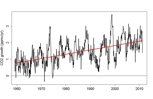
CO2 is rising faster now than it was just a few decades ago. We can even estimate how the rate of increase is changing, by calculating the difference between CO2 concentration each month, and its value 12 months previously, to figure its annual change. Clearly the annual change in CO2 concentration fluctuates. A lot. But it’s consistently positive, CO2 is growing. And there’s a trend there as well as fluctuation, an upward trend, because the rate of increase is itself increasing. I’ve superimposed a trend line on the above graph. CO2 continues to grow, significantly faster now than just a few decades ago. And it will continue to grow over the coming decades. How fast it grows depends on what we, as a global society, choose to do about it.
Tamino: Rate of human carbon dioxide emission has accelerated in recent decades Global CO2 Emissions from Fossil Fuels and Cement Production Per Region, 1990-2010 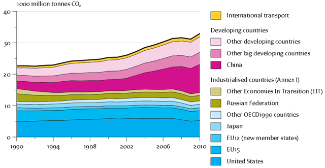
Global emissions of carbon dioxide (CO2) – the main cause of global warming – increased by 45% between 1990 and 2010, and reached an all-time high of 33 billion tonnes in 2010. Increased energy efficiency, nuclear energy and the growing contribution of renewable energy are not compensating for the globally increasing demand for power and transport, which is strongest in developing countries. This increase took place despite emission reductions in industrialised countries during the same period. The report shows that the current efforts to change the mix of energy sources cannot yet compensate for the ever increasing global demand for power and transport.
Steep increase in global CO2 emissions despite reductions by industrialized countries Build Rate of Coal-fired Power Plants in China and the US, 1998-2010 
We hear all kinds of stats thrown around about how much coal-fired electricity generation China has added during its recent period of explosive economic development. The most commonly repeated – and my personal “favorite” – is that China is completing the construction of new coal-fired power plants at a rate of 2-3 per week, a truly astonishing figure. But that statistic alone begs a few questions: 1) How does China’s rate of coal plant construction compare to that of the U.S., the next biggest coal consuming country on the planet? 2) How long will China continue to build at that break-neck pace? The above chart does a phenomenal job of answering both of those questions in graphical form (China in blue; U.S. in red, yellow). While the proliferation of new coal-fired generation in China has subsided, at least somewhat, the legacy of all those hundreds of gigawatts of new plants will be with us for a long time to come.
Graph of the Day: Build Rate of Coal-fired Power Plants in China and the US, 1998-2010 World Energy-related Carbon Dioxide Emissions by Fuel, 1990-2035 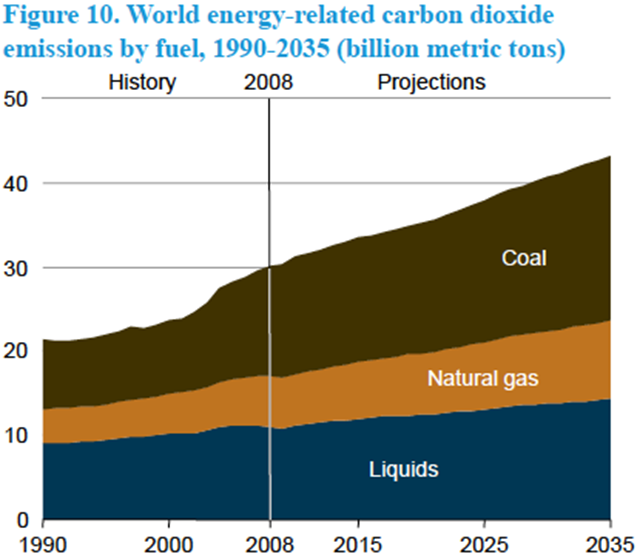
Graph from the EIA’s International Energy Outlook, projecting carbon emissions out to 2035. The EIA is correct to note the surge in emissions from coal. see: World Energy Related Carbon Dioxide Emissions by Fuel 1990-2035 in billion MT.
Coal’s terrible forecast Loss of Headwater Streams to Mountaintop Mines and Valley Fills in Central Appalachian Coalfields, 2011 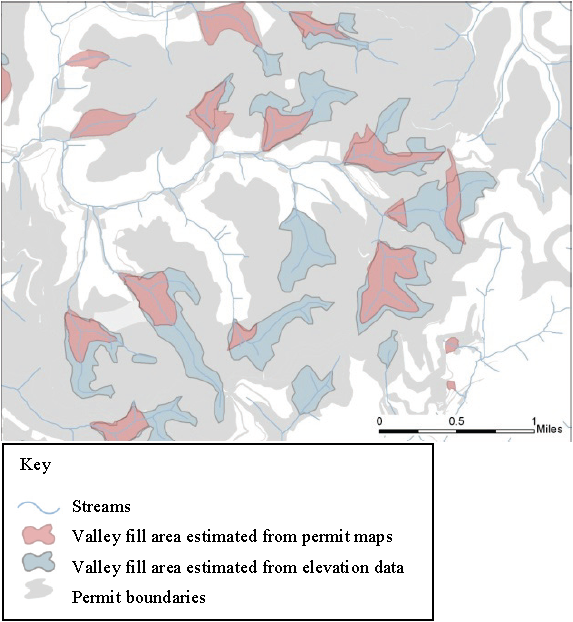
Map showing loss of headwater streams to mountaintop mines and valley fills (MTM-VF). This diagram depicts the loss of stream miles and channel complexity that can result from extensive mountaintop mining and valley filling. Solid blue lines inside valley fill areas represent buried streams. Note that some headwaters above filled areas are disconnected from the rest of the stream network.
Graph of the Day: Loss of Headwater Streams to Mountaintop Mines and Valley Fills in Central Appalachian Coalfields, 2011 Mercury Concentrations in Breast Feathers of Pacific Albatross, pre-1940 and post-1990 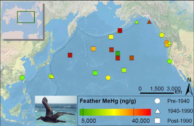
Using 120 years of feathers from natural history museums in the United States, Harvard University researchers have been able to track increases in the neurotoxin methylmercury in the black-footed albatross (Phoebastria nigripes), an endangered seabird that forages extensively throughout the Pacific. “Methylmercury has no benefit to animal life and we are starting to find high levels in endangered and sensitive species across marine, freshwater, and terrestrial ecosystems, indicating that mercury pollution and its subsequent chemical reactions in the environment may be important factors in species population declines,” said study co-author Michael Bank, a research associate in the Department of Environmental Health at Harvard School of Public Health (HSPH).
Mercury on the rise in endangered Pacific seabirds Change in Northern Hemisphere Cryospheric Climate Forcing, 1979-2008 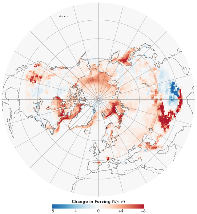
The image shows how the energy being reflected from the cryosphere has changed between 1979 and 2008. When snow and ice disappear, they are replaced by dark land or ocean, both of which absorb energy. The image shows that the Northern Hemisphere is absorbing more energy, particularly along the outer edges of the Arctic Ocean, where sea ice has disappeared, and in the mountains of Central Asia. “On average, the Northern Hemisphere now absorbs about 100 PetaWatts more solar energy because of changes in snow and ice cover,” says Flanner. “To put it in perspective, 100 PetaWatts is seven-fold greater than all the energy humans use in a year.” Changes in the extent and timing of snow cover account for about half of the change, while melting sea ice accounts for the other half.
Graph of the Day: Change in Northern Hemisphere Cryospheric Climate Forcing, 1979-2008 Global Surface Temperature Anomalies, 2000-2010 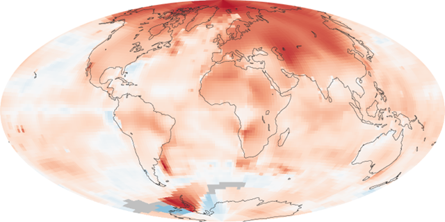
The map above shows temperature anomalies, or changes, for 2000-2009. The map does not depict absolute temperature, but how much warmer or colder a region is compared to the norm for that same region from 1951-1980. That period was chosen largely because the U.S. National Weather Service uses a three-decade period to define “normal” or average temperature. The GISS temperature analysis effort began around 1980, so the most recent 30 years were 1951-1980. It is also a period when many of today’s adults grew up, so it is a common reference that many people can remember.
Graph of the Day: Global Surface Temperature Anomalies, 2000-2010 Anomaly Map of Greenland Melting Days for 2010 
Anomaly map of Greenland melting days for 2010 derived from passive microwave data. Hatched regions indicate where MAR-simulated meltwater production exceeds the mean by at least two standard deviations. Analyses of remote sensing data, surface observations and output from a regional atmosphere model point to new records in 2010 for surface melt and albedo, runoff, the number of days when bare ice is exposed and surface mass balance of the Greenland ice sheet, especially over its west and southwest regions. Early melt onset in spring, triggered by above-normal near-surface air temperatures, contributed to accelerated snowpack metamorphism and premature bare ice exposure, rapidly reducing the surface albedo. Warm conditions persisted through summer, with the positive albedo feedback mechanism being a major contributor to large negative surface mass balance anomalies. Summer snowfall was below average. This helped to maintain low albedo through the 2010 melting season, which also lasted longer than usual.
Graph of the Day: Anomaly Map of Greenland Melting Days for 2010 Greenland Ice Melt Area, 1979–2010 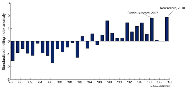
The figure shows the standardized melting index anomaly for the period 1979 – 2010. In simple words, each bar tells us by how many standard deviations melting in a particular year was above the average. For example, a value of ~2 for 2010 means that melting was above the average by two times the ‘variability’ of the melting signal along the period of observation.The increasing melting trend over Greenland can be observed from the figure. Over the past 30 years, the area subject to melting in Greenland has been increasing at a rate of ~ 17,000 Km2/year. This is equivalent to adding a melt-region the size of Washington State every ten years. Or, in alternative, this means that an area of the size of France melted in 2010 which was not melting in 1979.
Graph of the Day: Greenland Ice Melt Area, 1979–2010 Age of Arctic Sea Ice, 1983-2011 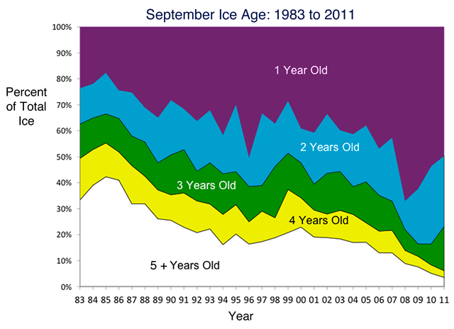
Why did ice extent fall to a near record low without the sort of extreme weather conditions seen in 2007? One explanation is that the ice cover is thinner than it used to be; the melt season starts with more first-year ice (ice that formed the previous autumn and winter) and less of the generally thicker multi-year ice (ice that has survived at least one summer season). First- and second-year ice made up 80% of the ice cover in the Arctic Basin in March 2011, compared to 55% on average from 1980 to 2000.
Graph of the Day: Age of Arctic Sea Ice, 1983-2011 Polar Ice Mass Balance, 1992-2010 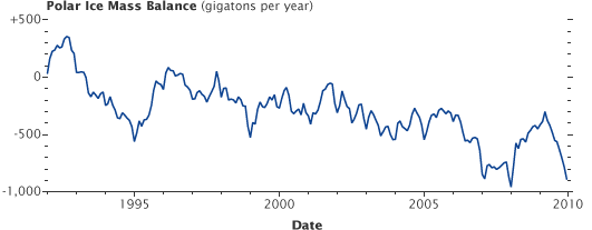
According to a new NASA-funded satellite study, the Greenland and Antarctic ice sheets are losing mass at an accelerating pace and are overtaking ice loss from mountain glaciers and ice caps to become the dominant contributor to global sea level rise. The graph above shows the gain and loss of ice mass from the world’s two largest ice sheets. Though there are gains within individual years, the overall trend from 1992 to 2010 has been toward losses. Each year over the course of the 18-year study, the two ice sheets lost a combined average of 36.3 billion tons more than they did the year before. The Greenland ice sheet lost mass faster at an average of 21.9 billion tons more per year. In Antarctica, the year-over-year speedup in lost ice mass averaged 14.5 billion tons.
Graph of the Day: Polar Ice Mass Balance, 1992-2010 Arctic Sea Ice Extent, July 1979-2011 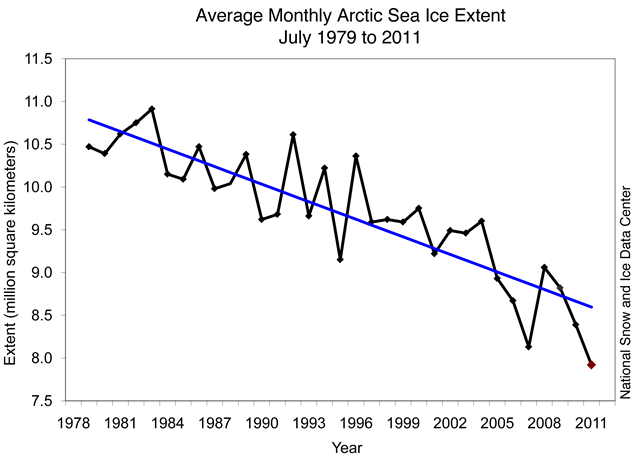
Arctic sea ice extent averaged for July 2011 reached the lowest level for the month in the 1979 to 2011 satellite record. Shipping routes in the Arctic have less ice than usual for this time of year, and new data indicate that more of the Arctic’s store of its oldest ice disappeared.Average ice extent for July 2011 was 7.92 million square kilometers (3.06 million square miles). This is 210,000 square kilometers (81,000 square miles) below the previous record low for the month, set in July 2007, and 2.18 million square kilometers (842,000 square miles) below the average for 1979 to 2000.
Arctic sea ice at record low for July Maximum Arctic sea ice extent, 22 March 2011 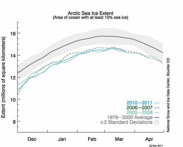
Arctic sea ice extent reached its maximum extent for the year on March 7, marking the beginning of the melt season. This year’s maximum tied for the lowest in the satellite record.
Annual maximum Arctic sea ice extent reached – Ties lowest on record Arctic Sea Ice Melt ‘Unprecedented’ in Past 1,450 Years 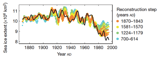
Recent arctic sea ice loss is ‘unprecedented’ over the past 1,450 years, concludes a reconstruction of ice records published in the journal Nature. The study, which was led by Christophe Kinnard of Chile’s Centro de Estudios Avanzados en Zonas Aridas, used terrestrial proxies including ice cores, lake sediments, tree ring data, and historical sea ice observations from the Arctic region to reconstruct past summer sea ice extent, the period when Arctic sea ice is at its minimum. They conclude that “both the duration and magnitude of the current decline in sea ice seem to be unprecedented for the past 1,450 years” and blame higher Atlantic water temperatures, which they link to human-caused climate change, for the trend. “These results reinforce the assertion that sea ice is an active component of Arctic climate variability and that the recent decrease in summer Arctic sea ice is consistent with anthropogenically forced warming,” the authors write.
Arctic sea ice melt ‘unprecedented’ in past 1,450 years Relative Sea Level Trends along the U.S. East Coast 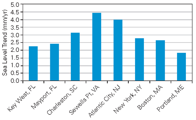
Relative sea level trends (millimeters/year) along the U.S. East Coast. The rate of annual sea level rise measured at Sewells Point in Norfolk is the highest of all stations along the U.S. East Coast at nearly 4.5 millimeters per year.
Graph of the Day: Sea Level Trends along the U.S. East Coast Trends in Arctic Phytoplankton Blooms, 1997-2010 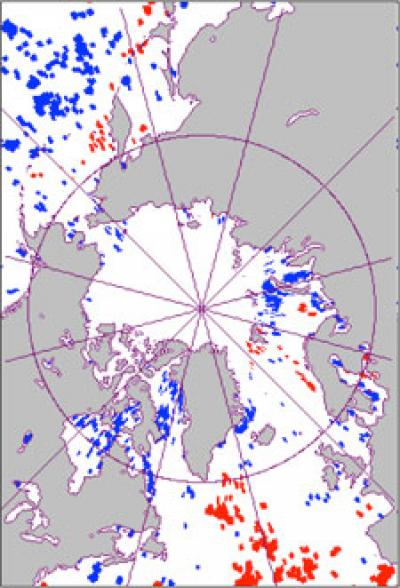
Over the past decade, the Arctic’s annual “bloom” of phytoplankton has been arriving earlier each year. The trend in earlier blooms of this crucial, primary producer of the Arctic’s food web is occurring largely along coastal and ice edge areas within the Arctic circle, with the exception of large patches in the northern Pacific Ocean. The problem is that large numbers of fish depend, directly or indirectly, on phytoplankton. The greatest increase in the fish population is tied to the peak plankton numbers of these one to two week bloom periods. If, however, many of these plankton blooms are trending earlier each year, then the seasonal return/growth of the fish population in these areas is gradually becoming “out of sync” with the primary producers in this region. This may mean insufficient food supply to maintain robust fish populations. The team used satellite from 1997-2010 to create their bloom maps. The results were published in the journal Global Change Biology (March 9, 2011).
Researchers discover Arctic plankton blooms occurring earlier – Phytoplankton peak occurs up to 50 days early Temporal Change of Krill and Salps in the Southern Ocean, 1926-2003
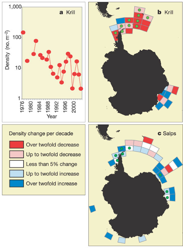
Antarctic krill (Euphausia superba) and salps (mainly Salpa thompsoni) are major grazers in the Southern Ocean, and krill support commercial fisheries. Their density distributions have been described in the period 1926–51, while recent localized studies suggest short-term changes. To examine spatial and temporal changes over larger scales, we have combined all available scientific net sampling data from 1926 to 2003. This database shows that the productive southwest Atlantic sector contains >50% of Southern Ocean krill stocks, but here their density has declined since the 1970s. Salps, by contrast, occupy the extensive lower-productivity regions of the Southern Ocean and tolerate warmer water than krill. As krill densities decreased last century, salps appear to have increased in the southern part of their range. These changes have had profound effects within the Southern Ocean food web.
Graph of the Day: Temporal Change of Krill and Salps in the Southern Ocean, 1926-2003 Global Phytoplankton Decline Over the Past Century 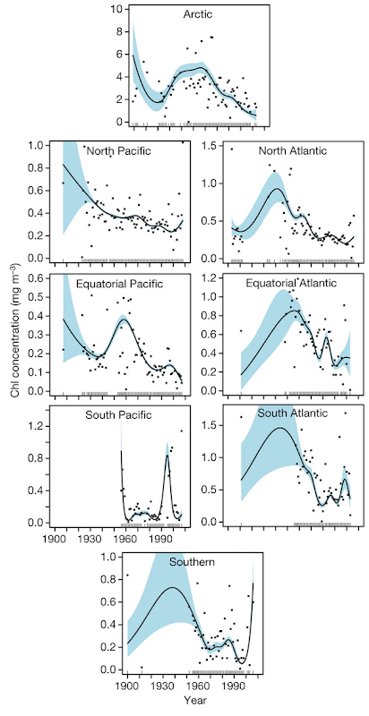
Global phytoplankton decline over the past century. Observed phytoplankton declines have occurred in eight out of ten ocean regions. The global rate of decline is estimated to be ~1% of the global median per year.
Graph of the Day: Global Phytoplankton Decline Over the Past Century Chinstrap Penguin Breeding Pair Abundance, 1977-2009 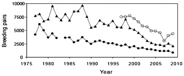
The West Antarctic Peninsula (WAP) and adjacent Scotia Sea support abundant wildlife populations, many of which were nearly extirpated by humans. This region is also among the fastest-warming areas on the planet, with 5–6 °C increases in mean winter air temperatures and associated decreases in winter sea-ice cover. These biological and physical perturbations have affected the ecosystem profoundly. Populations of both ice-loving Adélie and ice-avoiding chinstrap penguins have declined significantly. There now is overwhelming evidence that both Adélie and chinstrap penguin populations are declining throughout the WAP and broader Scotia Sea region.
Graph of the Day: Chinstrap Penguin Breeding Pair Abundance, 1977-2009 Spread of White-nose Syndrome Across North America, 2006-2010 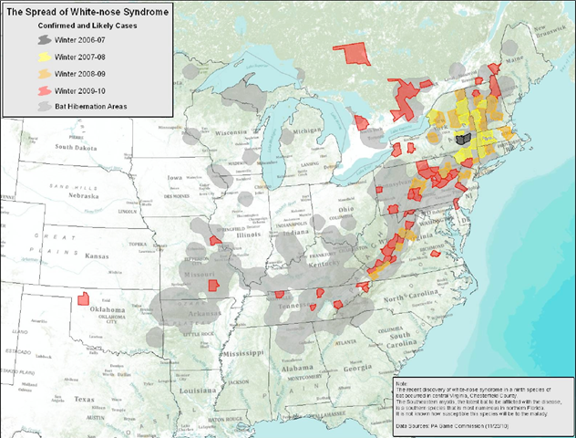
In the span of just four winters, a deadly new disease called white-nose syndrome (WNS) that devastates bat populations has spread rapidly across the country from east to west. The bat illness was first documented in a cave in upstate New York in 2006, and as of spring 2010, the whitenose pathogen had been reported as far west as western Oklahoma. In affected bat colonies, mortality rates have reached as high as 100 percent, virtually emptying caves once harboring tens of thousands of bats and leaving cave floors littered with the innumerable small bones of the dead. At least six bat species are known to be susceptible, and the fungus associated with the disease has been found on another three species. Two federally listed endangered bat species are among those affected thus far. Scientists and conservationists are gravely concerned that if current trends continue, one or more bat species could become extinct in the next couple of decades or sooner.
Graph of the Day: The Spread of White-nose Syndrome Across North America, 2006-2010 Global Aquifer Depletion and Equivalent Sea-level Rise, 1960-2010 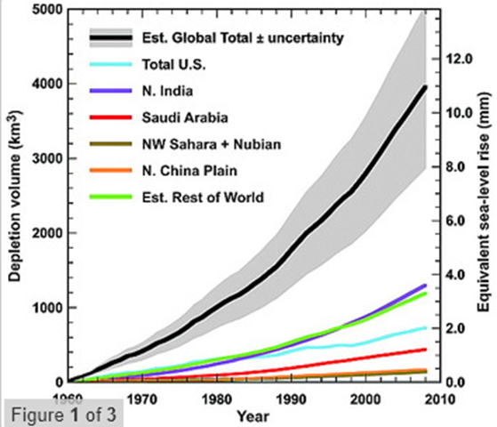
Not many scientists even consider the effects of groundwater on sea level, says Leonard Konikow of the United States Geological Survey in Reston, Virginia. Konikow measured how much water had ended up in the oceans by looking at changes in groundwater levels in 46 well-studied aquifers, which he then extrapolated to the rest of the world. He estimates that about 4500 cubic kilometers of water was extracted from aquifers between 1900 and 2008. That amounts to 1.26 centimeters of the overall rise in sea levels of 17 cm in the same period. That 1.26 cm may not seem like much, but groundwater depletion has accelerated massively since 1950, particularly in the past decade. Over 1300 cubic kilometers of the groundwater was extracted between 2000 and 2008, producing 0.36 cm of the total 2.79-cm rise in that time. “I was surprised that the depletion has accelerated so much,” Konikow says.
Groundwater greed driving sea level rises Water Levels of Lake Powell and Lake Mead, 1996-2010 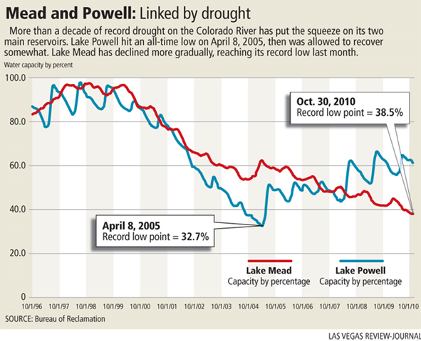
Federal forecasters say it is likely that Lake Mead will receive a larger than usual release of water from Lake Powell in the coming year, as conditions in the two reservoirs approach a trigger point for so-called “equalization.” The extra water for Lake Mead — 9 million acre-feet instead of the standard 8.23 million acre-feet — could raise the level of the reservoir by 7 feet or more and delay an unprecedented shortage declaration that would require Nevada and Arizona to cut their river use.
Graph of the Day: Water Levels of Lake Powell and Lake Mead, 1996-2010 Greenness Reduction of Amazon Vegetation Caused by 2010 Drought 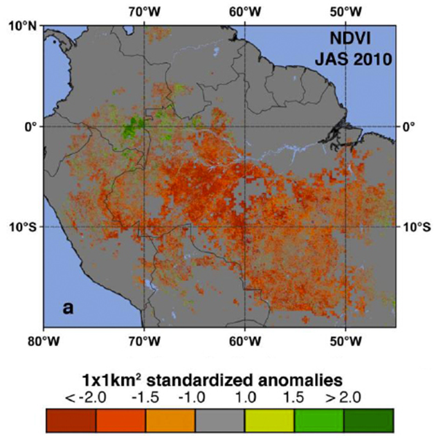
A new NASA-funded study has revealed widespread reductions in the greenness of the forests in the vast Amazon basin in South America caused by the record-breaking drought of 2010. “The greenness levels of Amazonian vegetation – a measure of its health – decreased dramatically over an area more than three and one-half times the size of Texas and did not recover to normal levels, even after the drought ended in late October 2010,” said Liang Xu, the study’s lead author from Boston University. “Last year was the driest year on record based on 109 years of Rio Negro water level data at the Manaus harbor. For comparison, the lowest level during the so-called once-in-a-century drought in 2005, was only eighth lowest,” said Marcos Costa, coauthor from the Federal University in Vicosa, Brazil.
NASA satellites detect extensive drought impact on Amazon forests – ‘2010 was the driest year on record based on 109 years of Rio Negro water level data’ Forest Degradation in the Brazilian Amazon, 2009-2010 and 2010-2011 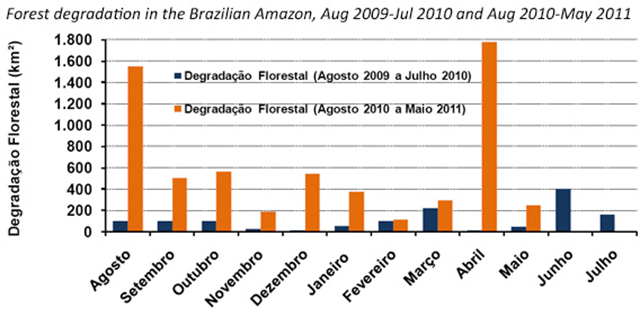
Deforestation in the Brazilian Amazon continued to rise as Brazil’s Congress weighed a bill that would weaken the country’s Forest Code, according to new analysis by Imazon. Imazon’s near-real time deforestation tracking system found that 165 square kilometers (103 square miles) of forest was cleared last month, a 72 percent rise over May 2010. Accumulated deforestation in the period from August 2010 to May 2011 amounted to 1,435 sq km (1090 sq km), an increase of 24 percent over the same time-frame a year earlier.
Deforestation in Brazil’s Amazon continues to rise; clearing highest near Belo Monte dam site Anthropogenic Footprint in Canada Boreal Forest, 2011 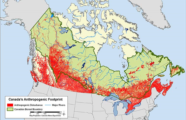
While industrial disturbances have to date been largely concentrated in the south, expansion northward continues. According to a new report by the Pew Environment Group, Canada’s boreal forest contains the world’s largest and most pristine freshwater ecosystem on Earth.
Graph of the Day: Anthropogenic Footprint in Canada Boreal Forest, 2011 Gap Between Bluefin Tuna Quotas and Recorded Sales, 2004-2010 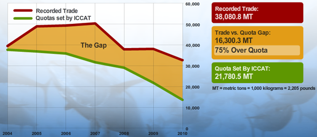
More than twice as many tonnes of Atlantic bluefin tuna were sold last year compared with official catch records for this threatened species, according to a report released on Tuesday. This “bluefin gap” occurred despite enhanced reporting and enforcement measures introduced in 2008 by the 48-member International Commission for the Conservation of Atlantic Tunas (ICCAT), which sets annual quotas by country, it said. “The current paper-based catch documentation system is plagued with fraud, misinformation and delays in reporting,” said Roberto Mielgo, a former industry insider and author of the report.
Far more bluefin tuna sold than reported caught – ‘Catch documentation system is plagued with fraud’ Number of Natural Disasters Declared by FEMA, 1953-2011 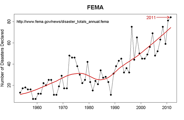
September 26 – This year just set the record for most Federal Emergency Management Agency declared disasters. And we’ve still got 3 months to go. It is strictly a coincidence, of course, that most of those disasters are climate related and climate scientists predicted that as we pour more heat-trapping gases into the atmosphere we would see more record-smashing extreme events (see “Two seminal Nature papers join growing body of evidence that human emissions fuel extreme weather, flooding that harm humans and the environment“).
2011 sets U.S. record for most natural disasters – Republicans demand relief funding be offset by clean-energy cuts Twelve Weeks of Exceptional Drought in the U.S., Summer 2011 
Southern Plains, September 5: The beat goes on across the southern Plains. In Texas and southern Oklahoma, another week of above-normal temperatures (up to 14°F above normal, with highs eclipsing 110°F) and sunny skies further offset the benefits of early month rainfall. Consequently, drought intensified over many of the remaining D2 and D3 areas (Severe to Extreme Drought), with the vast majority of Texas and Oklahoma under Exceptional Drought (D4). As of August 29, pasture and range condition was rated 98 and 92 percent poor to very poor in Texas and Oklahoma, respectively.
Summer 2011: Twelve weeks of exceptional drought in the U.S. Texas’s Worst 6-12 Month Droughts through July 2011 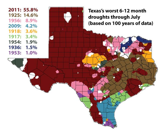
This figure shows the year of the worst 6-12 month drought for various areas in Texas. For 55.8 percent of the state, the current drought is the worst on record. No other drought was as bad in so many places. The previous standard for a one year drought, 1925, can now only be considered the worst ever in 14.6 percent of the state.
Graph of the Day: Worst Texas Droughts, 1911-2011 Texas State Population Change by County, 2000-2010 
One of the major reasons that there’s such a radical population shift is that central Texas is changing from arid grassland to uninhabitable desert, in part due to greenhouse pollution from the fossil fuels once buried under the ground. Other unsustainable practices, such as overpumping of groundwater, unregulated sprawl, and poor conservation practices are accelerating the desertification. The region has been in a drought since 1995-1996, with brief respites in 2007 and 2010 from catastrophic, flooding rains.
Global boiling: Population flight from the growing desert of Central Texas U.S. Extremes in 1-Day Precipitation, 1910-2010 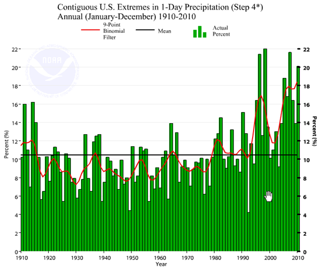 Graph of the Day: U.S. Extremes in 1-Day Precipitation, 1910-2010 Number of Extreme Storms and Floods Per Year in the U.S., 1900–2010
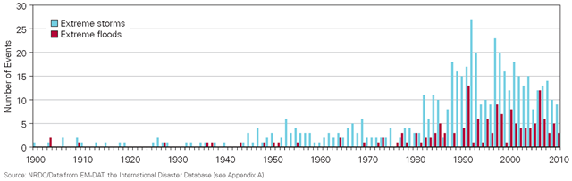
According to data collected by the International Disaster Database, the frequency of disastrous storms and floods has increased over the past 100 years, particularly in the past three decades. Extreme storms reached a peak in the mid-1990s, but floods appear to be occurring at a steadier rate. Given the extreme storms and floods that have occurred recently, 2011 may turn out to be another peak year. Indeed, April 2011 was the wettest on record for the Central climate region, which includes Illinois. March 2011 was the second-wettest March on record for Washington, the fifth-wettest for Oregon, and the ninth-wettest for California.
Graph of the Day: Number of Extreme Storms and Floods Per Year in the U.S., 1900-2010 April Tornado Count for the U.S., 1950–May 2011 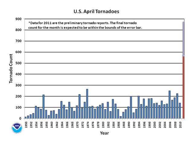
The preliminary count for April 2011 is 875 tornados, which is more than three times as many as the previous record of 267 back in 1974. Yeah, more than three times as many. This year’s April count is only preliminary, and may well be revised downward as duplicate reports are identified. But it’s still one hell of a hockey stick. [The final count was 753 tornadoes for April 2011.] Total tornados in April isn’t the only record broken this year. According to NOAA reports of 2011 tornado information, this April also broke the record for most tornados in any month, the previous record being 542 in May 2003 (May is the most active month for tornados in the U.S.).
Graph of the Day: April Tornado Count for the U.S., 1950–May 2011 FAO Food Price Index, January 2011 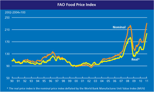
The FAO Food Price Index (FFPI) rose for the seventh consecutive month, averaging 231 points in January 2011, up 3.4 percent from December 2010 and the highest (in both real and nominal terms) since the index has been backtracked in 1990. Prices of all the commodity groups monitored registered strong gains in January compared to December, except for meat, which remained unchanged. Changes in the composition of the meat price index (read more) have resulted in adjustments to the historical values of the FFPI. One implication of this revision is that the December value of the FFPI, which previously was the highest on record, is now the highest since July 2008.
World food prices rise for seventh consecutive month, reach new historic peak U.S. Rivers and Streams Saturated with Carbon 
Rivers and streams in the United States are releasing enough carbon into the atmosphere to fuel 3.4 million car trips to the moon, according to Yale researchers in Nature Geoscience. Their findings could change the way scientists model the movement of carbon between land, water and the atmosphere. The researchers assert that a significant amount of carbon contained in land, which first is absorbed by plants and forests through the air, is leaking into streams and rivers and then released into the atmosphere before reaching coastal waterways.
U.S. rivers and streams saturated with carbon Arctic Ozone Loss from 2010 to 2011 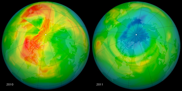
These maps of ozone concentrations over the Arctic come from the Ozone Monitoring Instrument (OMI) on NASA’s Aura satellite. The left image shows March 19, 2010, and the right shows the same date in 2011. March 2010 had relatively high ozone, while March 2011 has low levels. The large animation file (linked below the images) shows the dynamics of the ozone layer from January 1 to March 23 in both years.
Graph of the Day: Arctic Ozone Loss from 2010 to 2011 Survey of Health Effects in Plaquemines Parish Caused by BP Deepwater Horizon Oil Spill, 2010 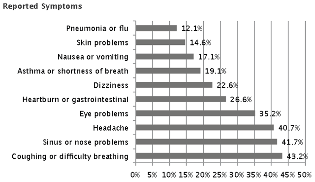
Perspectives on how the community has changed since the oil spill
- Katrina brought everyone together and the oil spill has split everyone apart. (Restaurant Owner: 9.29.10)
- Afraid for the health, to lose BP jobs. Can’t fish, shrimp, crab or swim anymore. Aggravated by all the lying, knew there was much more than oil (dispersants). “You could see the dispersants in the air.” (Fisherman: 9.28.10)
Perspectives on how livelihoods are impacted
- “I’m waiting for money from BP. They gave me a check but it bounced. I don’t have any work. I’m cutting grass to make ends meet. I got two little girls; one needs a bone marrow transplant. Haven’t gotten a check since July. Nothing for August or September. Can’t go to the show, can’t go roller-skating, can’t give anything to my girls. My girl turned 17 this month and I couldn’t give her anything. I’m hurting, and I need help.” (Commercial fisherman/unemployed: 9.30.10)
- “We worry about when the seafood will sell like normal again and I need to take care of my family. Everyone is worried about how to survive.” (Fisherman/unemployed: 9.29.10)
Graph of the Day: Survey of Health Effects in Plaquemines Parish Caused by BP Deepwater Horizon Oil Spill, 2010 Ground Level Radiation Dose Rate in Fukushima, 29 April 2011 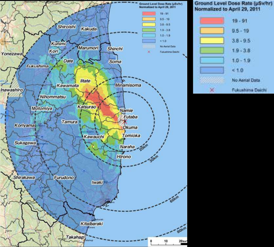
The first map of ground surface contamination within 80 kilometers of the crippled Fukushima No. 1 nuclear power plant shows radiation levels higher in some municipalities than those in the mandatory relocation zone around the Chernobyl plant. The map, released May 6, was compiled from data from a joint aircraft survey undertaken by the Ministry of Education, Culture, Sports, Science and Technology and the U.S. Department of Energy. It showed that a belt of contamination, with 3 million to 14.7 million becquerels of cesium-137 per square meter, spread to the northwest of the nuclear plant.
U.S.-Japan joint survey reveals high radiation beyond evacuation zone Planetary Boundaries and Current Status of the Phosphorus Cycle, 2010 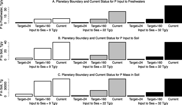
Phosphorus (P) is a critical factor for food production, yet surface freshwaters and some coastal waters are highly sensitive to eutrophication by excess P. A planetary boundary, or upper tolerable limit, for P discharge to the oceans is thought to be ten times the pre-industrial rate, or more than three times the current rate. However this boundary does not take account of freshwater eutrophication. We analyzed the global P cycle to estimate planetary boundaries for freshwater eutrophication. Planetary boundaries were computed for the input of P to freshwaters, the input of P to terrestrial soil, and the mass of P in soil. Each boundary was computed for two water quality targets, 24 mg P m–3, a typical target for lakes and reservoirs, and 160 mg m–3, the approximate pre-industrial P concentration in the world’s rivers. Planetary boundaries were also computed using three published estimates of current P flow to the sea. Current conditions exceed all planetary boundaries for P.
Graph of the Day: Planetary Boundaries and Status of the Phosphorus Cycle, 2010 Exceedance of Critical Eutrophication Loads by Nitrogen Deposition, 2010 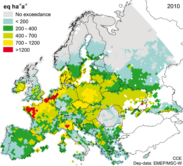
Nitrogen deposition remains a threat to biodiversity across large areas of Europe (CCE, 2008). This concern is reflected in the incorporation of an indicator for nitrogen deposition under the Streamlining European Biodiversity Indicators 2010 (SEBI, 2010) programme (EEA, 2007), which helps measure progress towards the European target to halt the loss of biodiversity by 2010. Common assessment methods, such as critical loads, are already well established for use in European air pollution policy development. Critical load exceedance maps identify areas at risk from atmospheric nitrogen deposition. They show that a substantial area of semi-natural habitat in Europe exceeds the critical loads.
Graph of the Day: Exceedance of Critical Eutrophication Loads by Nitrogen Deposition, 2010 Increase in Nitrophilous Herbaceous Plants in Spain, 1900-2008 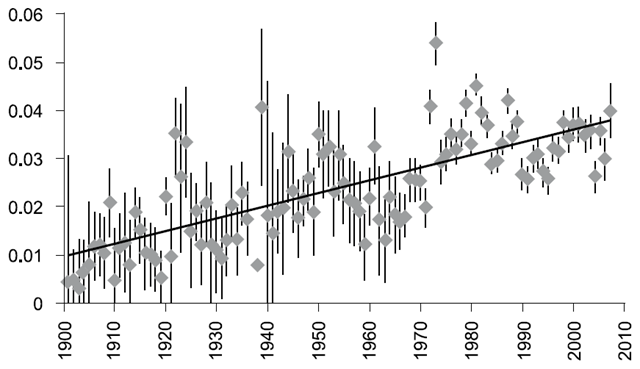
The bioindicator index developed by the study showed a continuous increase of nitrophilous plants for the period 1900-2008, thus suggesting a change in biodiversity composition related to nitrogen enrichment in ecosystems. This increase seemed to peak in the 1970 and 1980 decades, decreasing slightly in the last decade of the 20th century, and increasing again in the first decade of the 21st century.
Graph of the Day: Increase in Nitrophilous Herbaceous Plants in Spain, 1900-2008 Mean Duration of U.S. Unemployment, 1948-2011 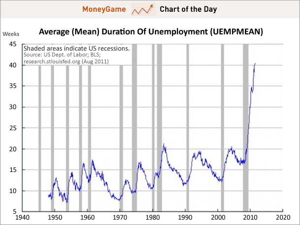
It’s the average duration of unemployment — which surges without any sign of slowing down — that’s really scary right now. Not only is this number taking off like a rocket, but it potentially represents people permanently and structurally kept out of the jobs market. Be afraid.
Graph of the Day: Mean Duration of U.S. Unemployment, 1948-2011 U.S. Civilian Participation Rate, 1948-2011 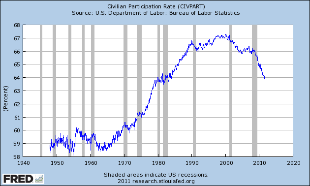
In the never-ending tug-of-war between “labor” and “capital,” there has rarely—if ever—been a time when “capital” was so clearly winning.
Graph of the Day: Peak Employment: U.S. Civilian Participation Rate, 1948-2011 Average US Household Income and Change in Share of Income, 1979-2007 
A huge share of the nation’s economic growth over the past 30 years has gone to the top one-hundredth of one percent, who now make an average of $27 million per household. The average income for the bottom 90 percent of us? $31,244.
Graph of the Day: Average US Household Income and Change in Share of Income, 1979-2007 Foreclosure Actions to U.S. Housing Units, March 2011 
U.S. home values fell in the first quarter at the fastest rate since late 2008, real estate data firm Zillow said on Monday, suggesting that a bottom will not be seen until 2012 at the earliest. Zillow said its home value index fell 3 percent in the first three months of the year from the previous quarter, and was down 8.2 percent year-over-year. The number of homeowners under water—or, those who owe more on the mortgage than their house is currently worth—amounted to 28.4 percent of single-family homeowners, representing a peak since Zillow began calculating the data in 2009.
Nearly 30 percent of U.S. home mortgages underwater – Home values see biggest drop since 2008 European Bond Spreads, January 2010 – July 2011 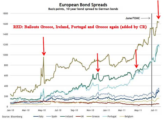
Here is a look at European bond spreads from the Atlanta Fed weekly Financial Highlights released today (graph as of July 20th). The spreads have declined sharply since the Euro Zone announcement. I added arrows pointing to the various bailouts starting with the first bailout for Greece, followed by Ireland, Portugal, and then Greece again.
Graph of the Day: European Bond Spreads, January 2010 – July 2011 The Global Debt Clock, screen capture on 14 December 2011 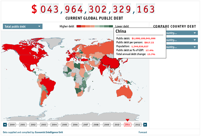
The clock is ticking. Every second, it seems, someone in the world takes on more debt. The idea of a debt clock for an individual nation is familiar to anyone who has been to Times Square in New York, where the American public shortfall is revealed. Our clock shows the global figure for all (or almost all) government debts in dollar terms.
Graph of the Day: The Global Debt Clock Annual Lobbying Money Spent by the Oil & Gas Industry, 1998-2011 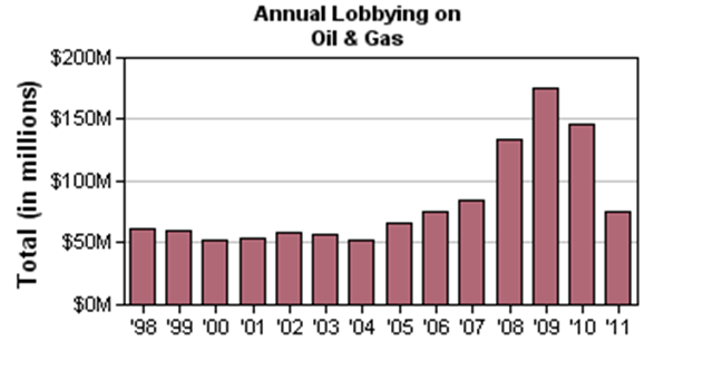
Clients in the oil and gas industry unleashed a fury of lobbying expenditures in 2009, spending $175 million — easily an industry record — and outpacing the pro-environmental groups by nearly eight-fold, according to a Center for Responsive Politics analysis. Some of the largest petroleum companies in the world together spent hundreds of millions of dollars in various attempts to influence politics during the past 18 months.
Fossil fuel industry outspends pro-environment groups by eight-fold in battle over climate change legislation Change in Cognitive Scores for a 10-fold Increase in Prenatal Organophosphate Pesticide Concentrations 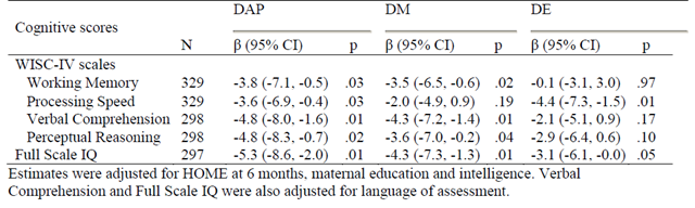
Children exposed to high pesticide levels in the womb have lower average IQs than other kids, according to three independent studies released today in Environmental Health Perspectives. The studies involved more than 400 children, followed from before birth through ages 6 to 9, from both urban and rural areas. Researchers were from the University of California-Berkeley, Columbia University in New York and Mount Sinai School of Medicine in New York. The Berkeley study found that the most heavily exposed children scored an average of 7 points lower on IQ tests compared with children with the lowest pesticide exposures, lead author Brenda Eskenazi. says. On IQ tests, the average score is around 100. Even a difference of 2 or 3 points — the size of the IQ loss caused by lead, which is known to cause brain damage — can have an enormous impact, says pediatrician Aaron Bernstein of Children’s Hospital Boston.
Pesticide exposure in womb reduces IQ: study Poll Results for the Question, ‘How serious of a threat is global warming to you and your family?’, in 2007-2008 and 2010 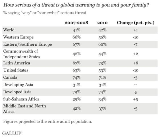
Gallup surveys in 111 countries in 2010 find Americans and Europeans feeling substantially less threatened by climate change than they did a few years ago, while more Latin Americans and sub-Saharan Africans see themselves at risk. The 42% of adults worldwide who see global warming as a threat to themselves and their families in 2010 hasn’t budged in the last few years, but increases and declines evident in some regions reflect the divisions on climate change between the developed and developing world. Majorities in developed countries that are key participants in the global climate debate continue to view global warming as a serious threat, but their concern is more subdued than it was in 2007-2008. In the U.S., a slim majority (53%) currently see it as a serious personal threat, down from 63% in previous years.
Gallup poll: Fewer Americans, Europeans view global warming as a threat