November 10, 2011
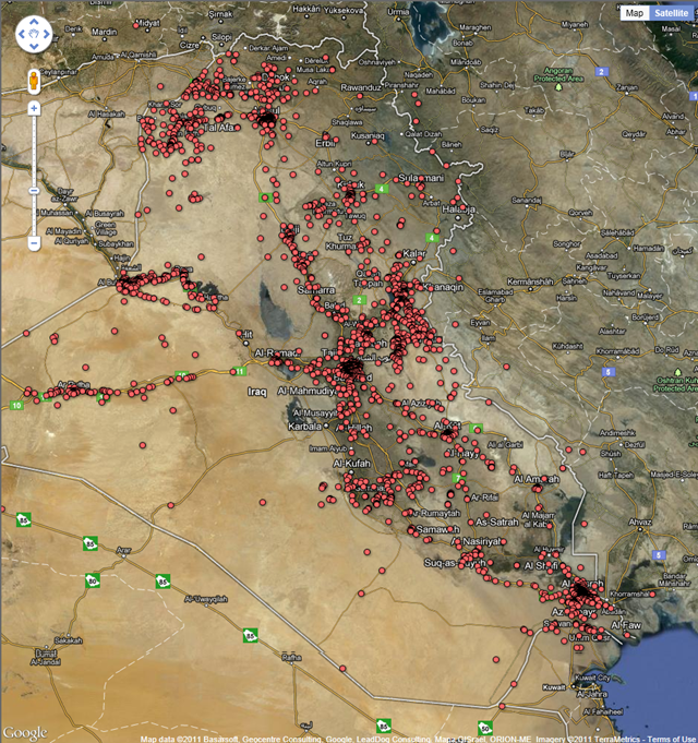
Graph of the Day: Map of All Recorded Deaths During U.S. Invasion and Occupation of Iraq
The Wikileaks Iraq war logs provide us with a unique picture of every death in Iraq. This graph shows these events mapped using Google Fusion tables. • Download the data from the Datablog

Off-topic.
The U.S. military has been widely documented covering up the many killings and assassinations performed by U.S. forces. Estimates range as high as several hundred thousand "non-reported" dead in addition to the so-called "official" reports.
Go HERE to see a close up, it's entirely covered in red dots.
Now using the plus and minus link on the left side, zoom and zoom out. Try and get a feel for the vast amount of human slaughter inflicted upon this country.
Now just imagine if all the deaths had been accurately reported and recorded, what this country would look like.
Solid red dots.
Oh, I forgot to mention — what if this type of data could be used to represent all the illegal killings by the thousand of drone bombs dropped, special forces assassinations and mercenary teams slaughter being deployed around the world, especially in the Middle East against our "enemies"?
What would that actually show?
More solid red countries, drenched in blood. Entire countries with nothing but red blotches representing decades of human slaughter and maimed people.
People. Same as you and me. Who desire to be left alone and wish for the simple things like being allowed to live, breathe, work and have families. Attacked mercilessly by the United States and the blood thirsty generals and politicians engaged in promoting the Empire for corporate Amerika.
Our military is out of control, and so is our government.