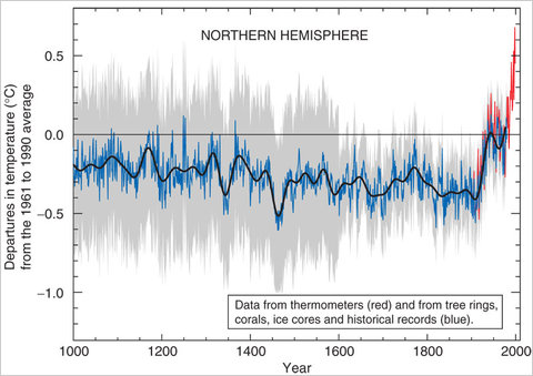
Evidence supporting the ‘Hockey Stick’ graph continues to accumulate
By JOHN COLLINS RUDOLF
September 23, 2010, 8:12 am Few images in the climate change debate have stirred as much controversy as the storied “hockey stick” graph, which shows average temperatures in the northern hemisphere holding roughly steady for 900 years or so, until the 20th century, when they rise sharply. First unveiled in 1998 by a paleoclimatologist, Michael Mann, the graph became an icon of global warming after it was featured in the summary of a crucial report by a United Nations climate panel from 2001. A version also appeared in the documentary, An Inconvenient Truth. … Two new studies bolstering the “hockey stick” hypothesis were published just recently. One that appeared this month in the journal Geophysical Research Letters analyzed seashell deposits on the North Atlantic seafloor and determined that 20th-century warming in the region “had no equivalent during the last thousand years.” Another study, in The Journal of Geophysical Research, analyzed ice cores from glaciers in the eastern Bolivian Andes dating back to 400 A.D. “The last decades of the past millennium are characterized again by warm temperatures that seem to be unprecedented in the context of the last 1,600 years,” the researchers concluded. A study published in September 2009 in the journal Science, meanwhile, found that temperatures in the Arctic in the last decade were likely warmer than any time since the birth of Christ. … “It’s basically saying the greenhouse gas emissions are overwhelming the system,” David Schneider, a climatologist and one of the study’s co-authors, said at the time. …
