June 5, 2010
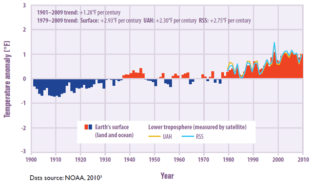
Graph of the Day: Temperatures Worldwide, 1901–2009
This figure shows how average temperatures worldwide have changed since 1901. Surface global data come from a combined set of land-based weather stations and sea surface temperature measurements, while satellite measurements cover the lower troposphere, which is the lowest level of the Earth’s atmosphere (see diagram on p. 20). “UAH” and “RSS” represent two different methods of analyzing the original satellite measurements. This graph uses the 1901 to 2000 average as a baseline for depicting change. Choosing a different baseline period would not change the shape of the trend.
