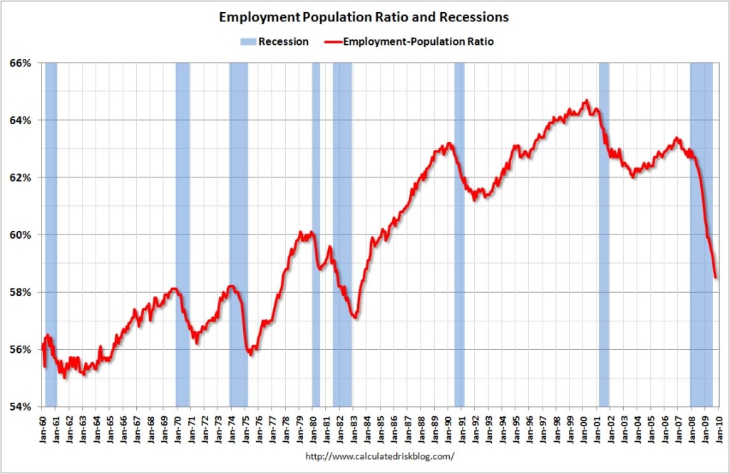
Graph of the Day: Employment-Population Ratio, 1960-2009
From Calculated Risk: 
The [un]employment report headline numbers were ugly, but the internals are even less encouraging… This graph shows the employment-population ratio; this is the ratio of employed Americans to the adult population. Note: the graph doesn’t start at zero to better show the change. The general upward trend from the early ’60s was mostly due to women entering the workforce. This measure fell in October to 58.5%, the lowest level since the early ’80s. The Labor Force Participation Rate fell to 65.1% (the percentage of the working age population in the labor force). This is also the lowest since the mid-80s. When the job market starts to recover, many of these people will reenter the workforce and look for employment – and that will keep the unemployment rate elevated for some time.
Employment-Population Ratio, Record Part Time Workers, Weak Holiday Hiring