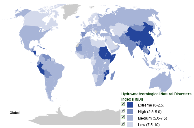
Graph of the Day: Risk of Hydro-meteorological Natural Disasters by Country
The global map of hydro-meteorological natural disasters profiles 208 countries. It displays a subset of the data used in Maplecroft’s global map of natural disasters. The rationale behind mapping subsets of natural disaster data is that each type of natural disaster presents different challenges in terms of preparedness and response and knowing the distribution of risk relating to different types of natural hazard can better inform mitigation decisions. The map explores the risk to human health from natural disasters related to hydro-meteorological natural hazards (storms, floods, droughts and associated phenomena). The map is based on historical records from between 1980 and 2008 and shows the global, long-term distribution of hydro-meteorological natural disasters, highlighting countries where the population is most at risk. Countries on the map are coloured in shades of blue to indicate the risk from hydro-meteorological natural disasters. Countries coloured in lighter shades of blue indicate lower levels of risk while the darker shades indicate higher levels of risk. Four categories have been identified based on the Hydro-meteorological Natural Disaster Index (HNDI) value for each country – extreme (0.0-2.5), high (2.5-5.0), medium (5.0-7.5), low (7.5-10.0).
