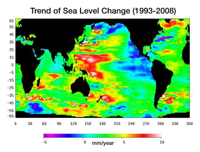
Graph of the Day: Trend of Sea Level Change, 1993-2008
Warming water and melting land ice have raised global mean sea level 4.5 centimeters (1.7 inches) from 1993 to 2008. But the rise is by no means uniform. This image, created with sea surface height data from the Topex/Poseidon and Jason-1 satellites, shows exactly where sea level has changed during this time and how quickly these changes have occurred. It’s also a road map showing where the ocean currently stores the growing amount of heat it is absorbing from Earth’s atmosphere and the heat it receives directly from the Sun. The warmer the water, the higher the sea surface rises. The location of heat in the ocean and its movement around the globe play a pivotal role in Earth’s climate. Light blue indicates areas in which sea level has remained relatively constant since 1993. White, red, and yellow are regions where sea levels have risen the most rapidly—up to 10 millimeters per year—and which contain the most heat. Green areas have also risen, but more moderately. Purple and dark blue show where sea levels have dropped, due to cooler water. … This image of sea level trend also reveals a significant area of rising sea levels in the North Atlantic where sea levels are usually low. This large pool of rapidly rising warm water is evidence of a major change in ocean circulation. It signals a slow down in the sub-polar gyre, a counter-clockwise system of currents that loop between Ireland, Greenland and Newfoundland. …
PIA11002: Portrait of a Warming Ocean and Rising Sea Levels: Trend of Sea Level Change 1993-2008
